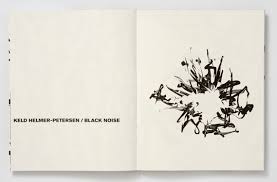
Keld-Helmer-Petersen
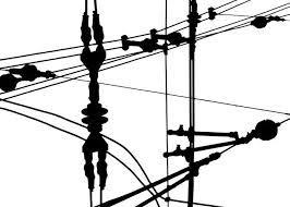
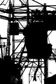
Petersens work is all about contrast; there are only shades of black and white which emphasises the contrast between colours. Peterson takes pictures of a variety of objects and the edits his photos to turn them into black and white. Many of the details on the pictures get blacked out within the dark areas of the pictures. However, some detail becomes more defined as when the images are turned black and white you can see lines more clearly due to a high contrast. Petersens work was taken in the 1960's and so creates a reminiscent feeling of how the 60's used to be. Petersen was inspired by the work of Albert-Ranger Patzsch and Harry Callahan. This inspired him to take images in a way that made ordinary objects viewed in a different way whilst making the image high contrast to exaggerate the tone of objects. Extracting the use of colour for me make the photographs a lot more interesting as then I believe people focus on tone and line a lot more so they see the detail and beauty in the object. One question I would like to ask Petersen is how he was able to tell the picture he had taken would create a good contrast and look good after editing.
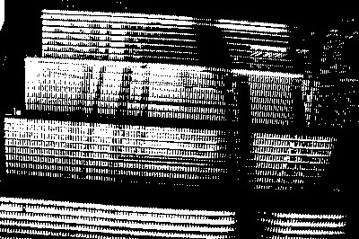
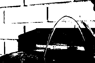
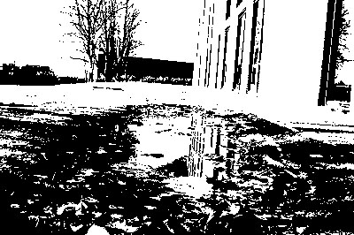
The way Petersen made the images high contrast was by adjusting the threshold of them. You can do this on may editing softwares such as photoshop. First, you select the image and then got to adjust and threshold. Once in threshold you can make the image as dark or bleached out as you want.
The way Petersen made the images high contrast was by adjusting the threshold of them. You can do this on may editing softwares such as photoshop. First, you select the image and then got to adjust and threshold. Once in threshold you can make the image as dark or bleached out as you want.
Some of my images inspired by Albert-Ranger Patzsch:
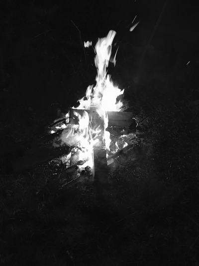
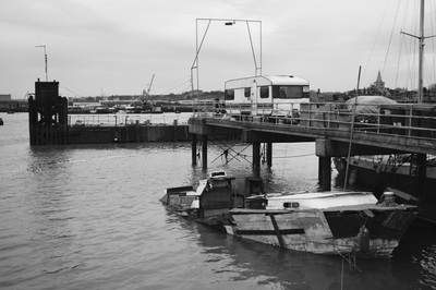
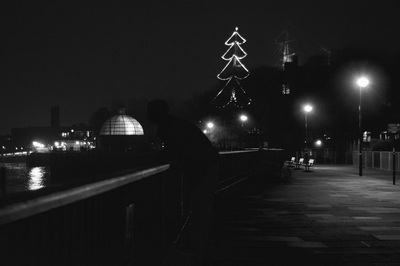
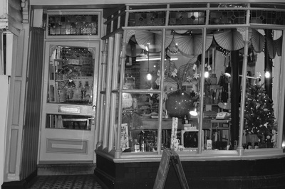
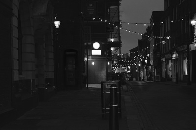
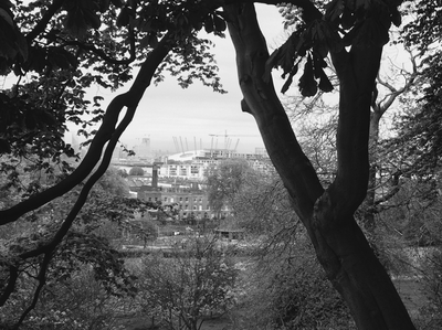
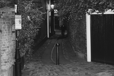
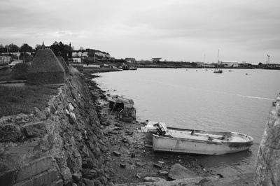
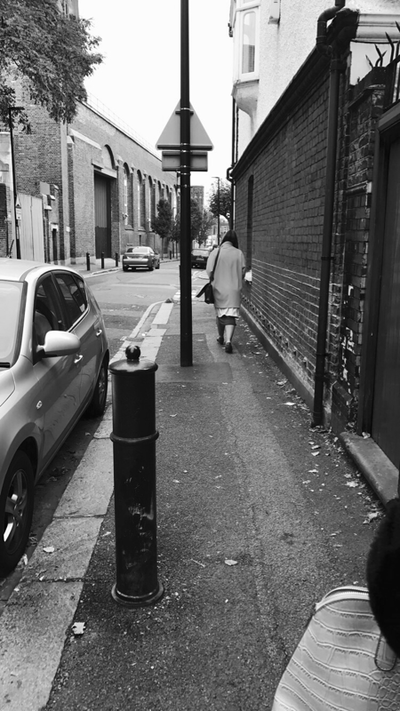
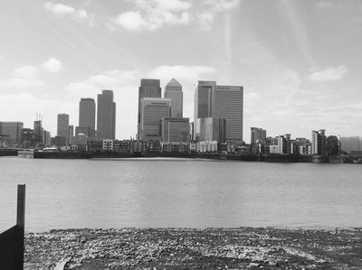
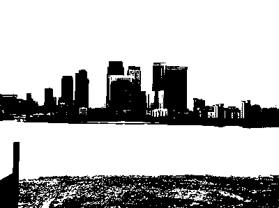
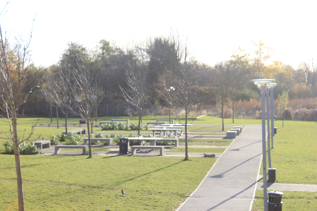
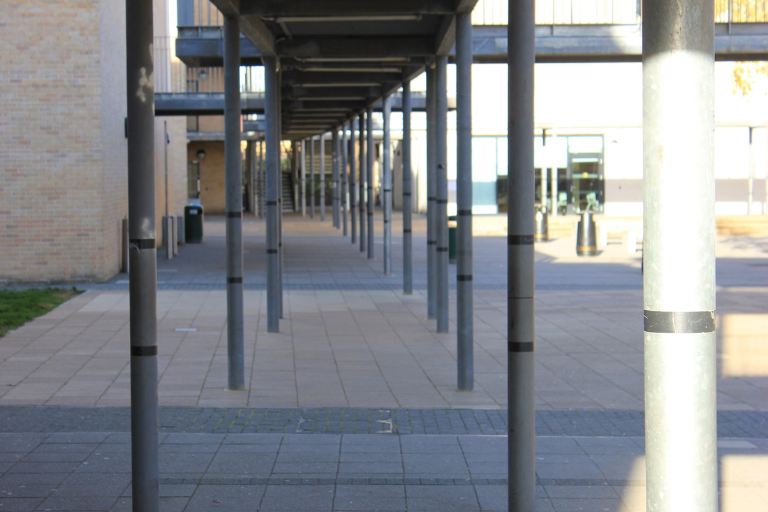
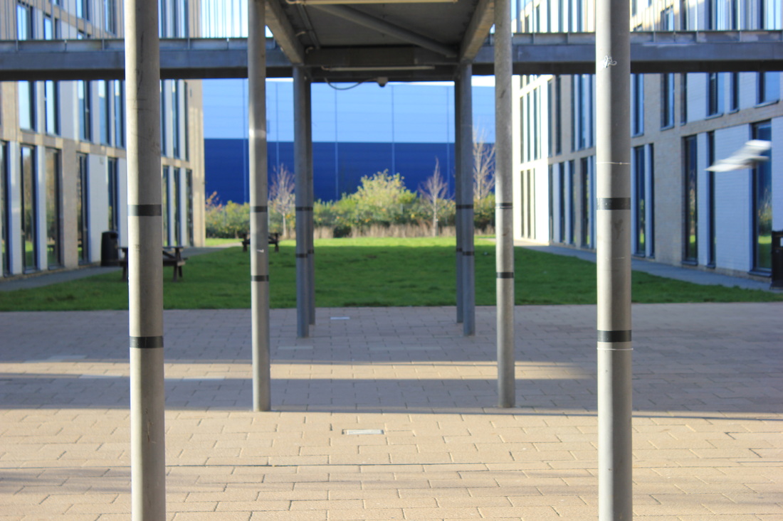
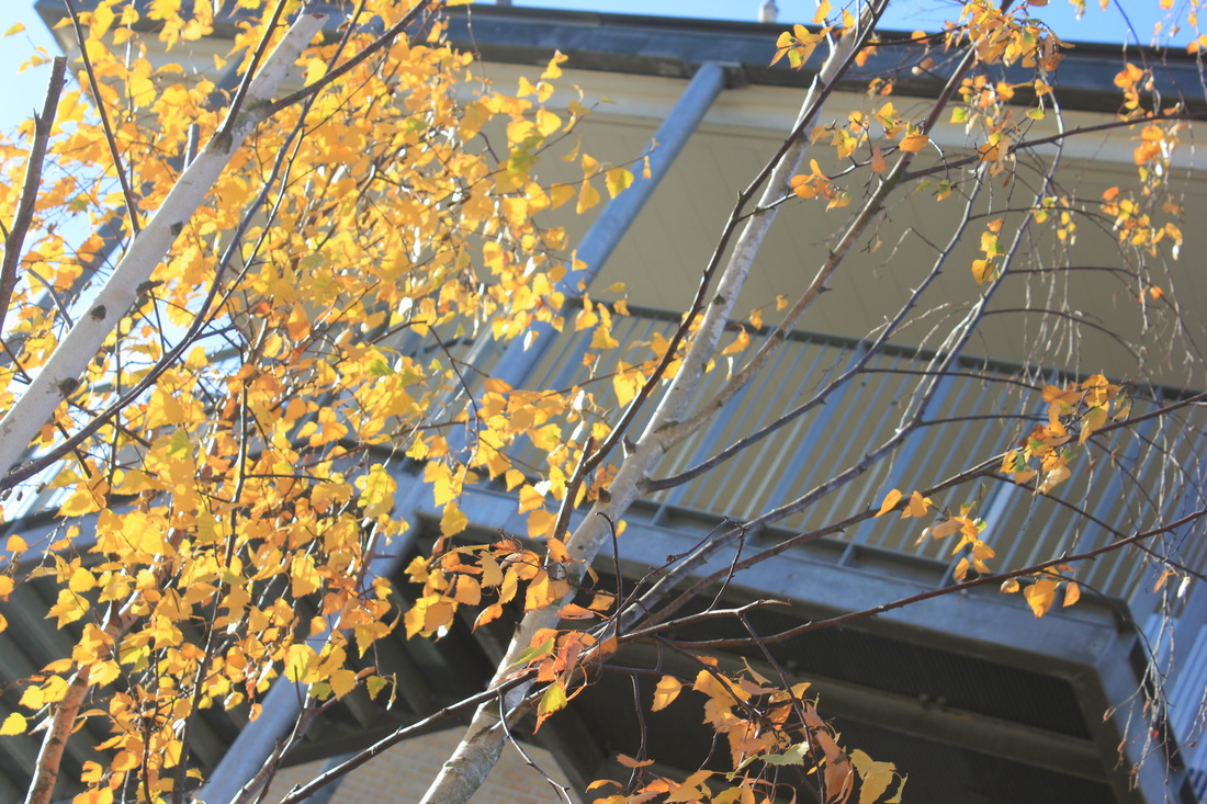
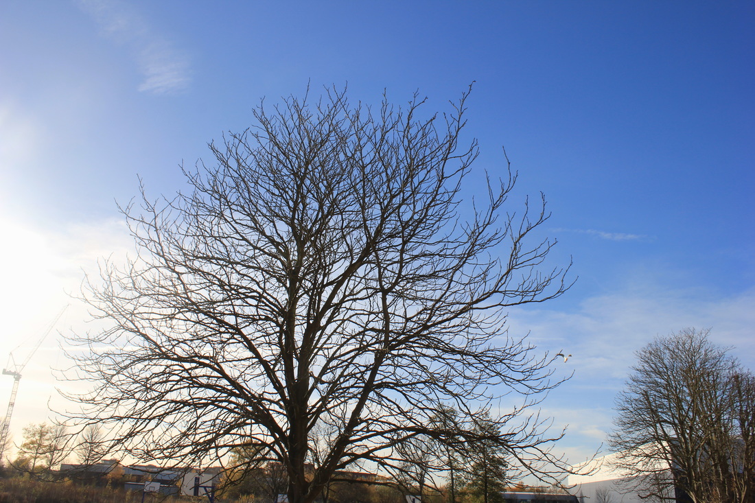
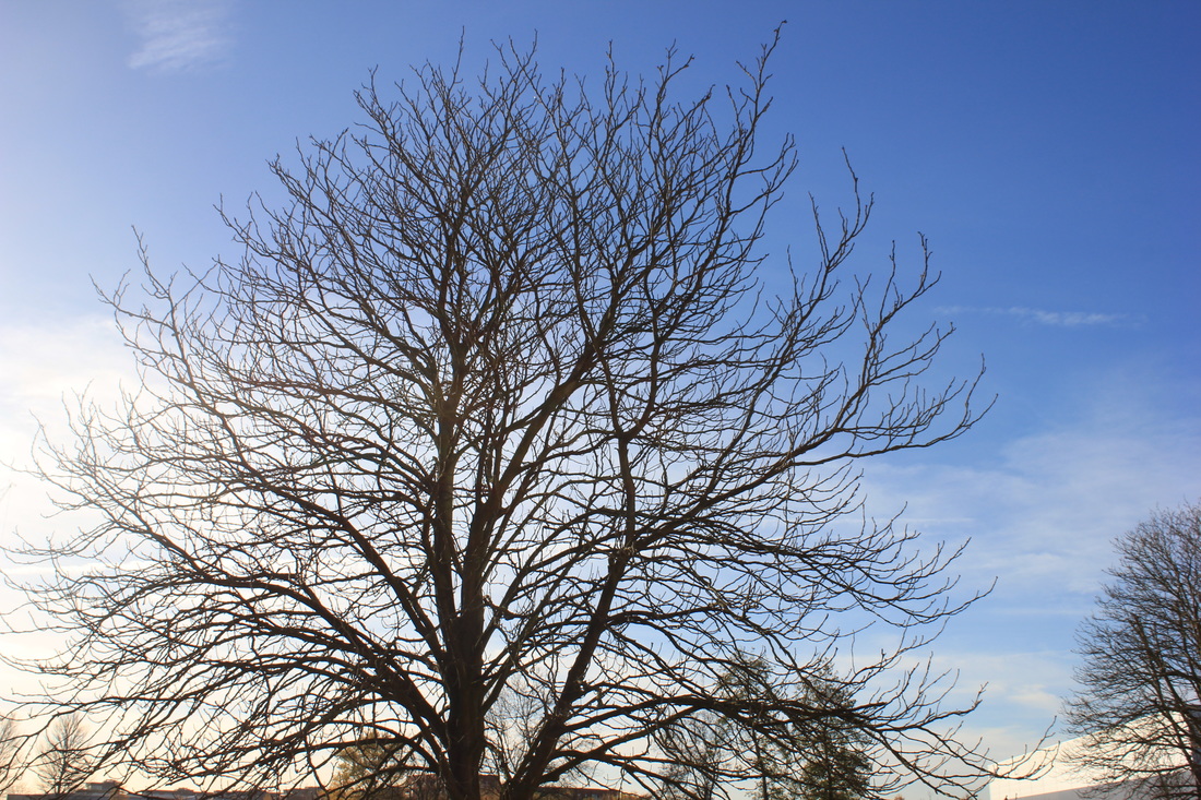
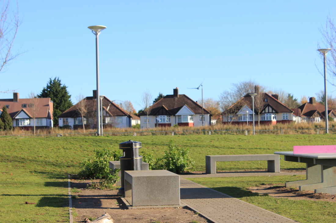
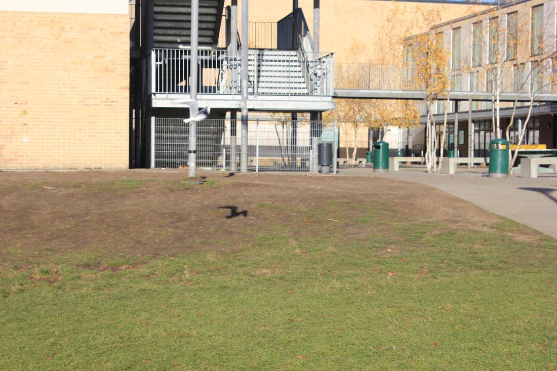
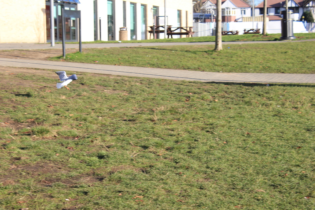
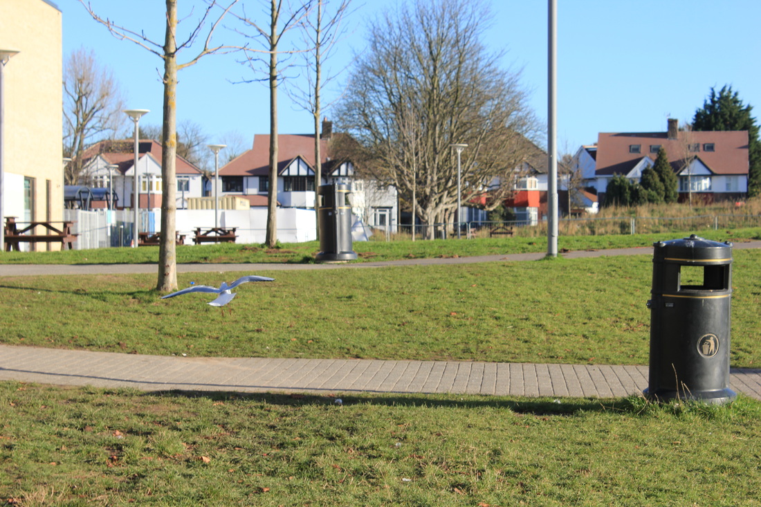
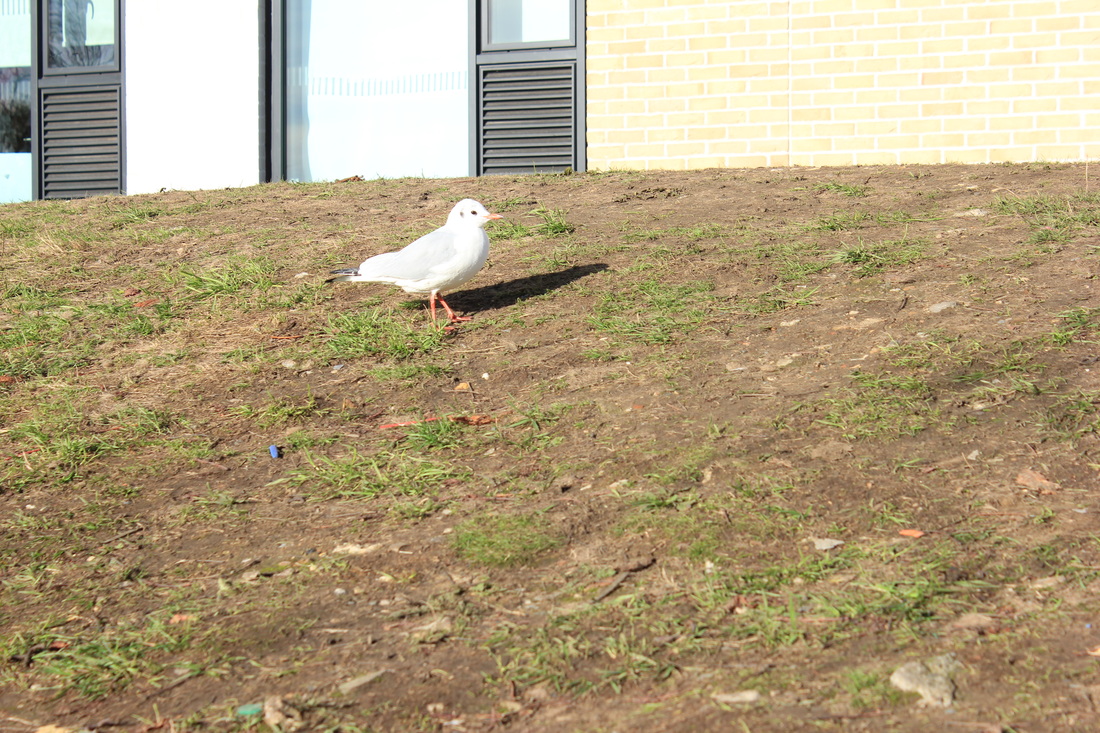
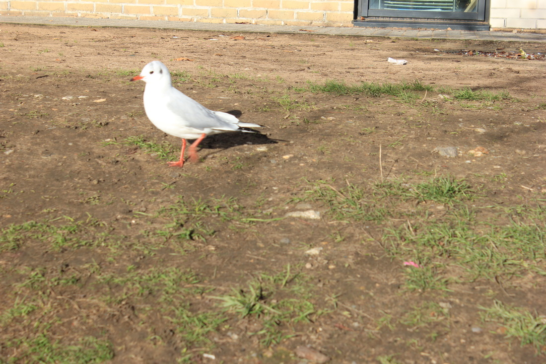
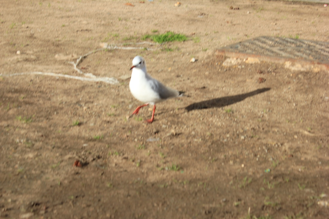
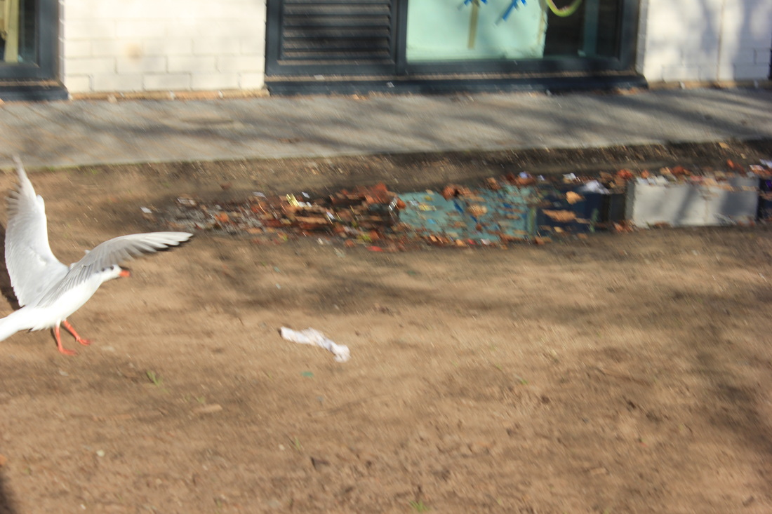
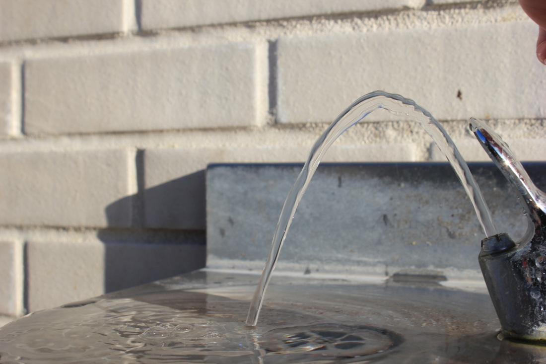
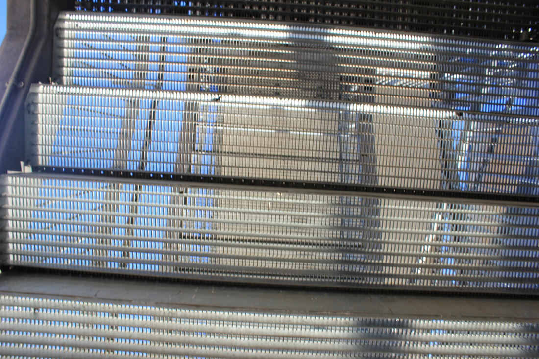
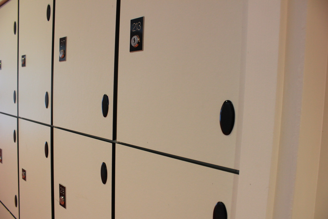
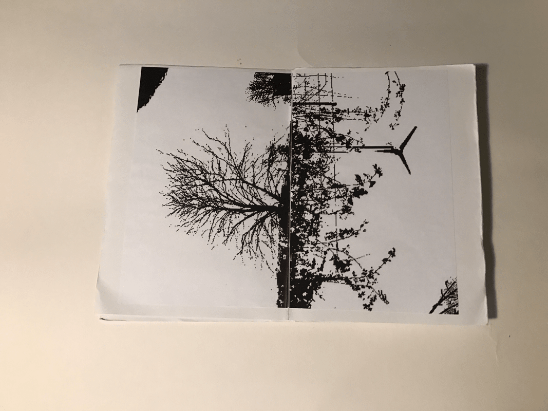
These images are before they have been edited in photo shop. At first I took them in colour but then edited them on my phone to put them all into black and white like Peterson.
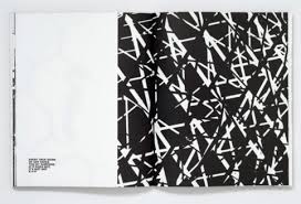
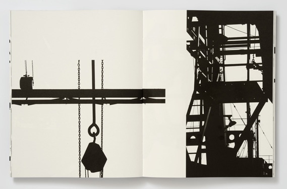
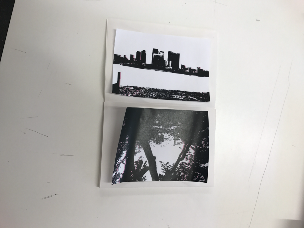
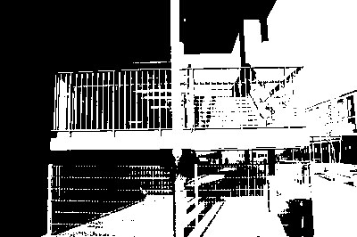
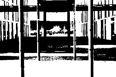
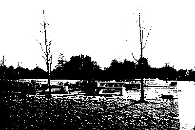
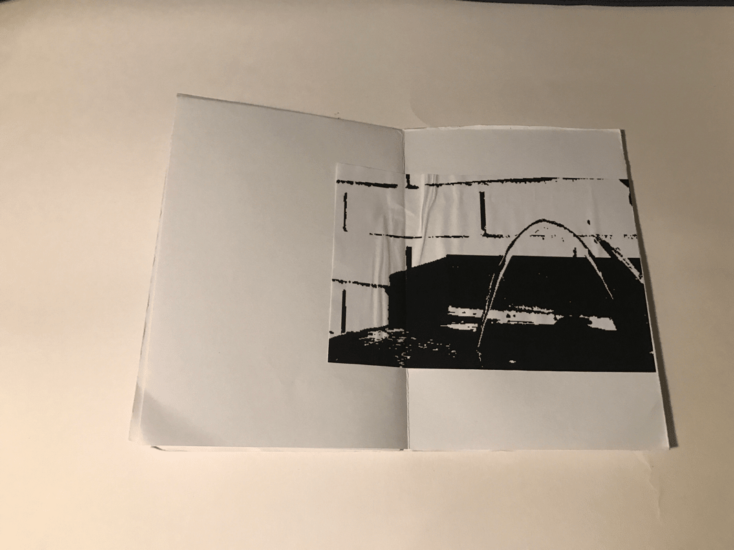
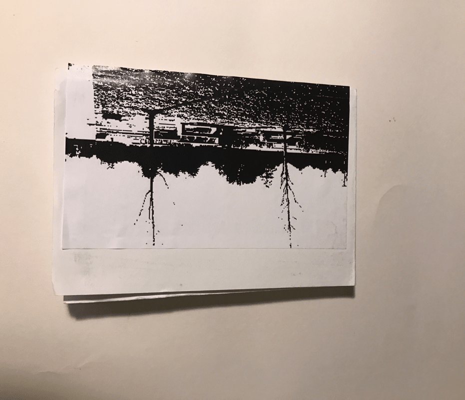
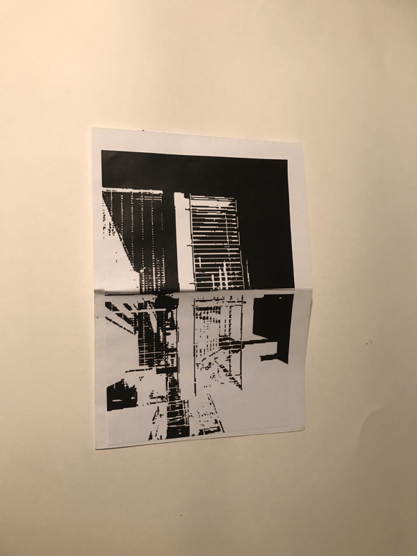
Photoshop images for book 1:
Photoshop images for book 1:
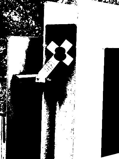
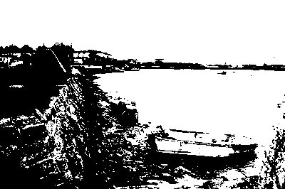
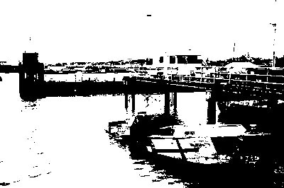
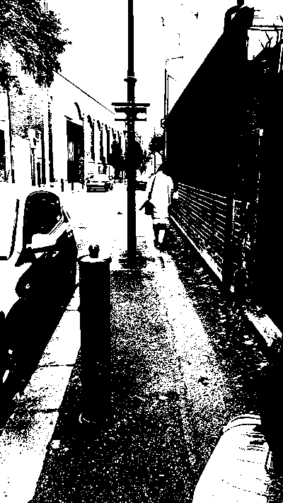
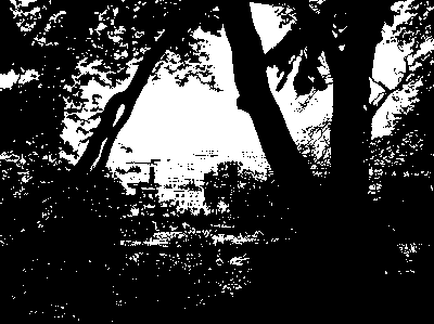
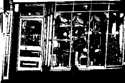
Once I had selected my 8 images that I wanted from my Renger-Patzsch I opened up photoshop and the edited them to create a high contrast in each image. The editing I did was selecting image then adjust and threshold. Once in the threshold part I either increased or decreased the noise of the image by changing the black and white which could completly bleach out tones. The reason I choose these images is because I believed, before I edited them, that they would create a high contrast and look good once the threshold had been adjusted. I also thought some of the distinct shapes would stand out such as, the buildings on the opposite side of the river because they would be really dark compared to the sky and water.
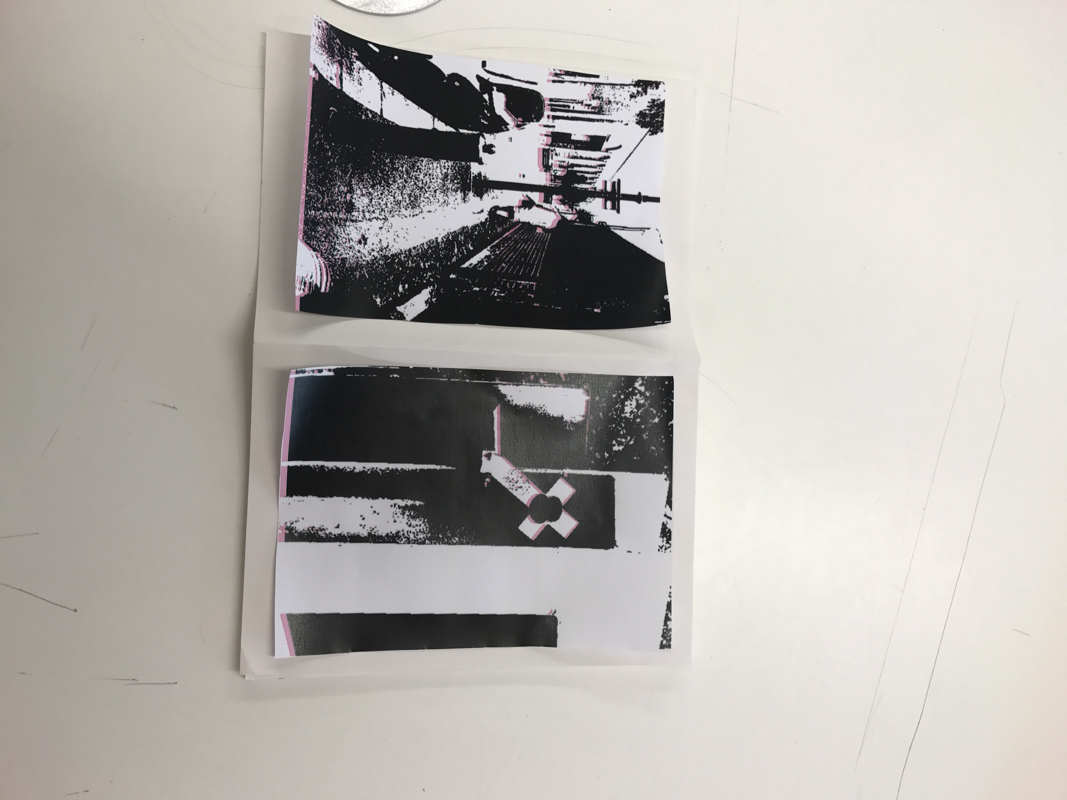
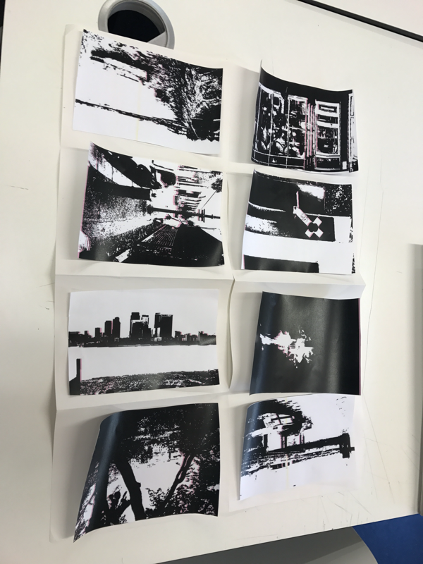
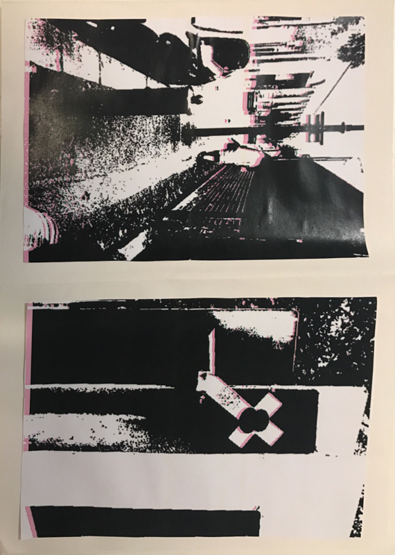
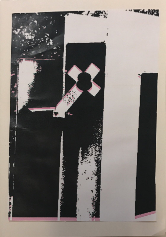
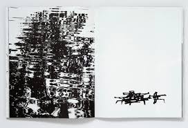
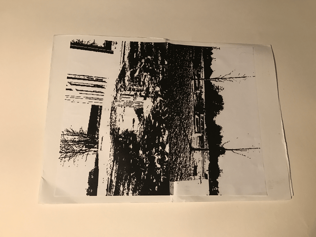
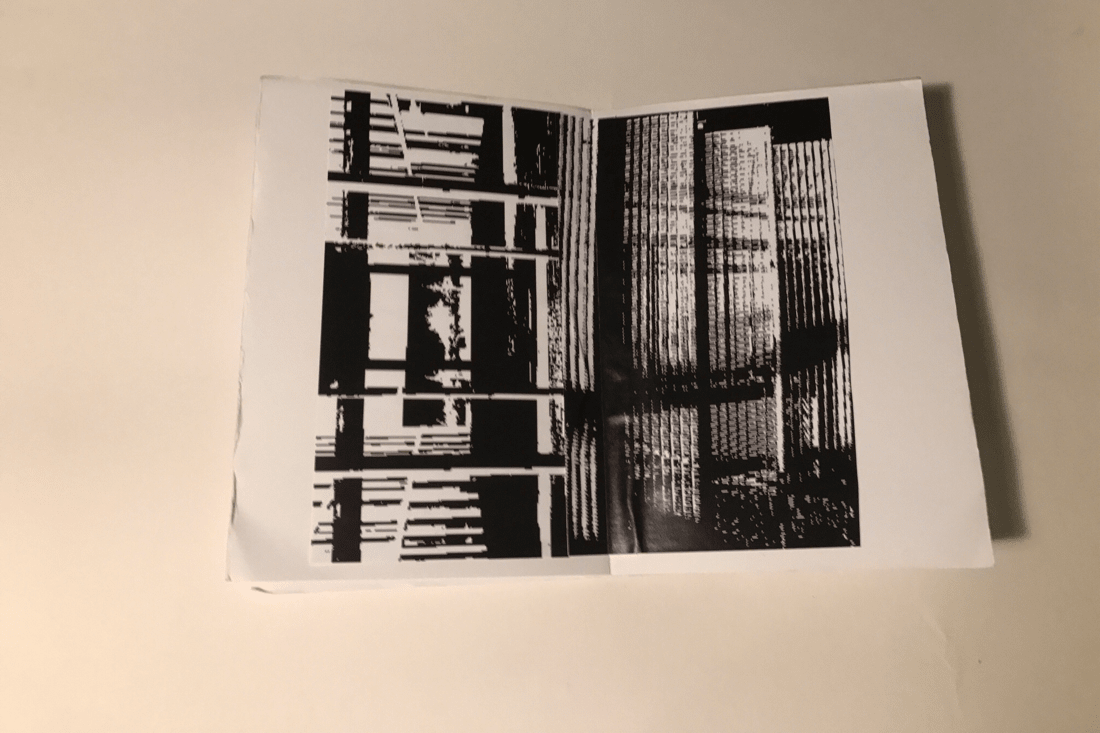
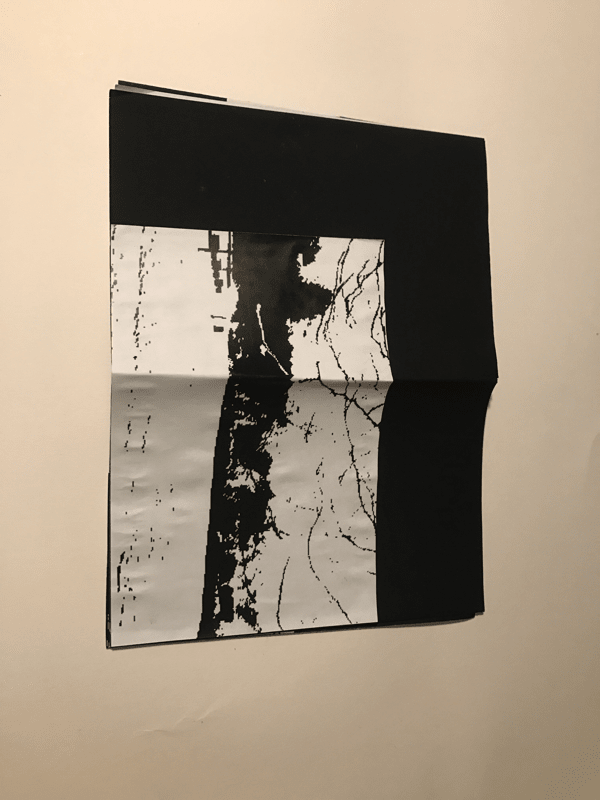
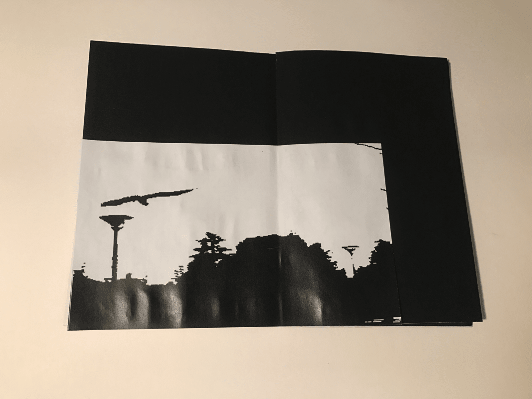
This was the first book I created and I noticed that by changing the images around so the were next to different images that had different types on contrast it made a big difference to the way my book looked and the feeling it gave off. If two dark contrast images were next to each other then for me it made the page feel too dark but if I put a page with a light and dark picture on it then the page looked more pleasing to the eye. A couple of problems that occured was the printer I used was running out of tonner and therefore, produced a pink and sometimes yellow stain on the paper. This took away the proper effect of the photoshop editing that I did. Another thing I would like to change is the paper colour of my book as I believe if the paper was more white my book would look more professional.
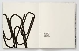
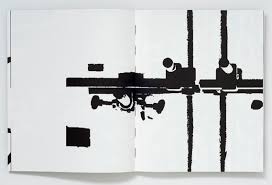
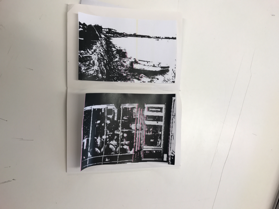
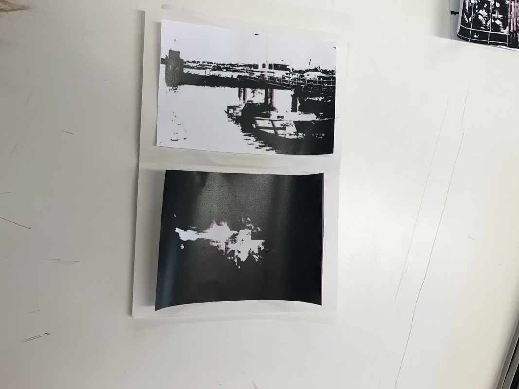
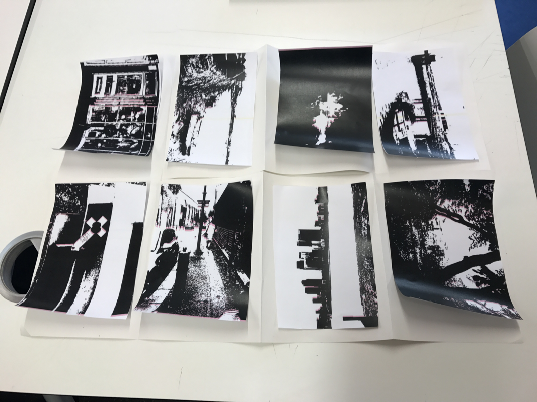
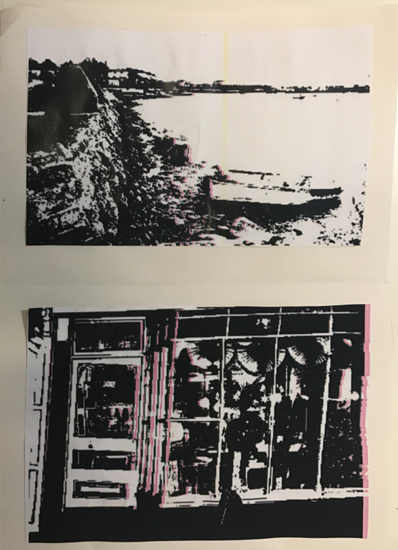
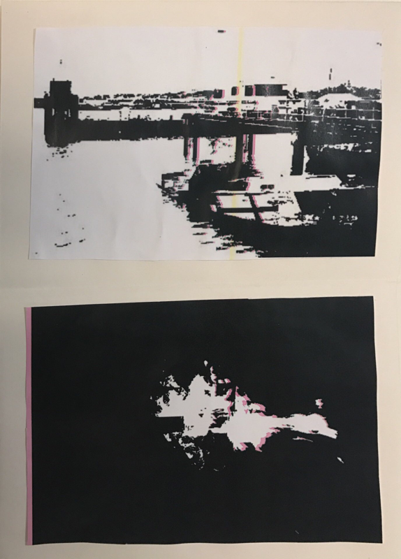
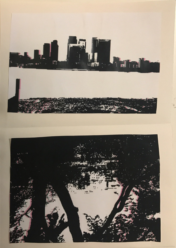
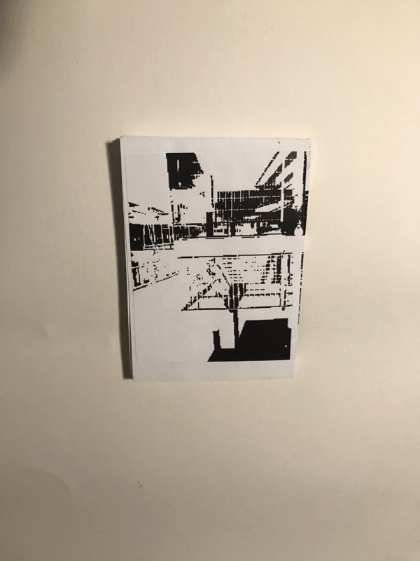
Second book photoshop images;
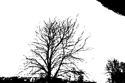
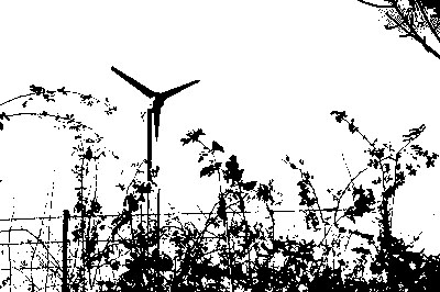
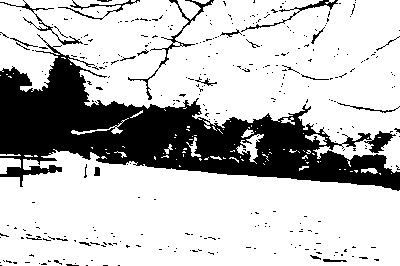
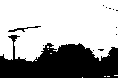
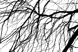
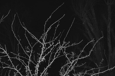
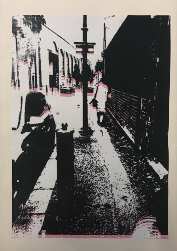
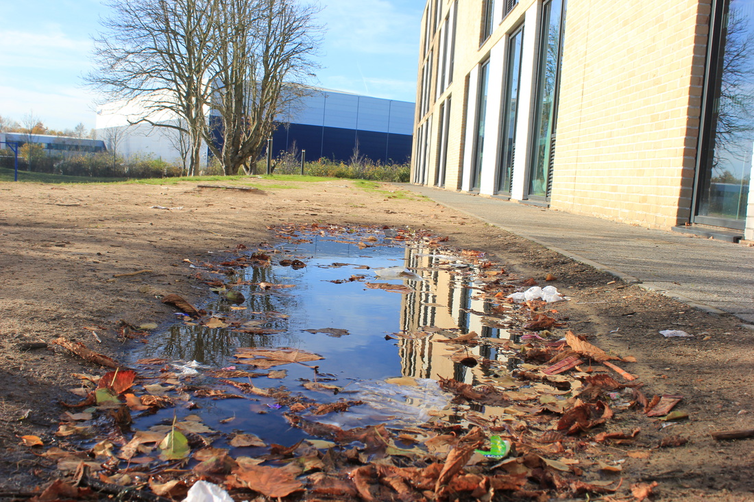
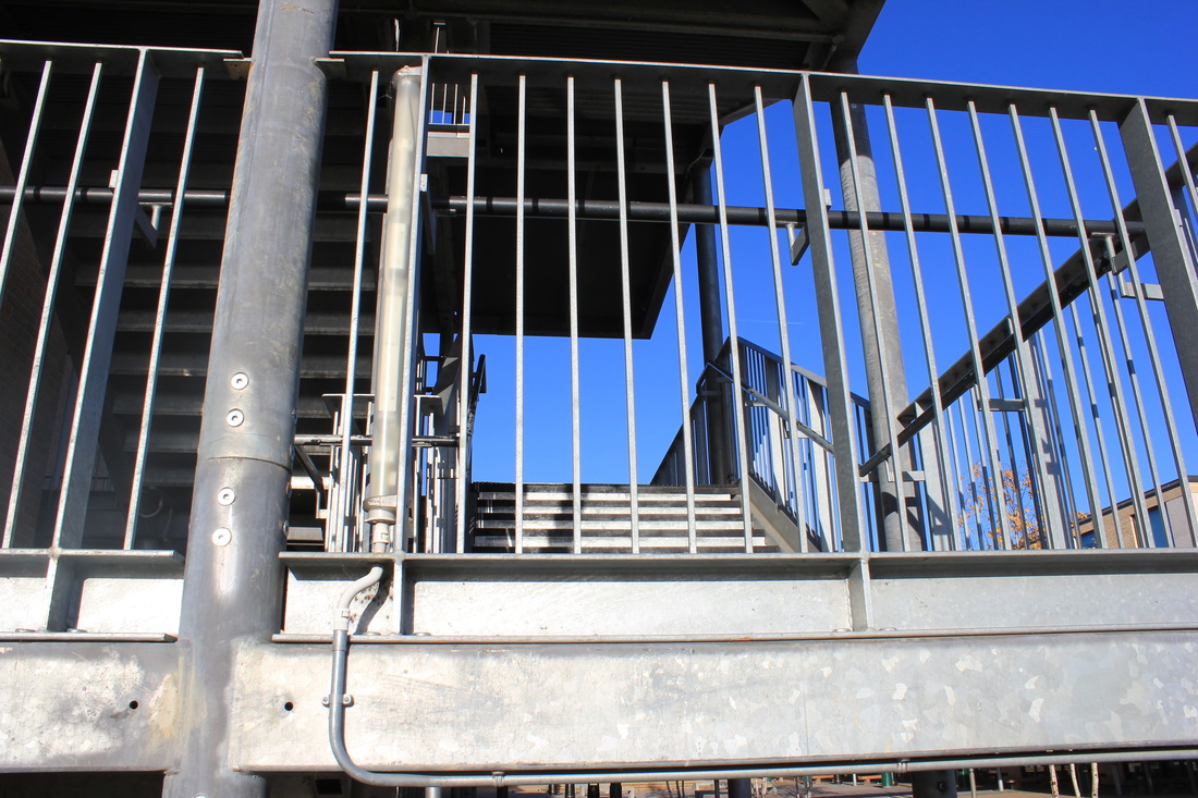
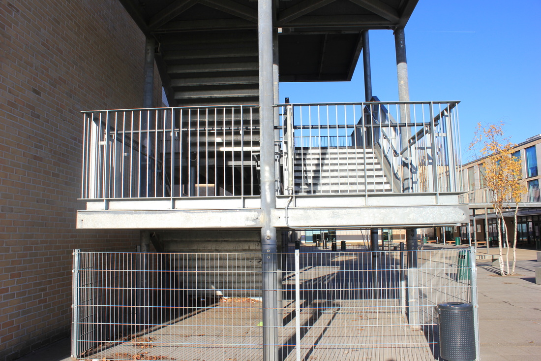
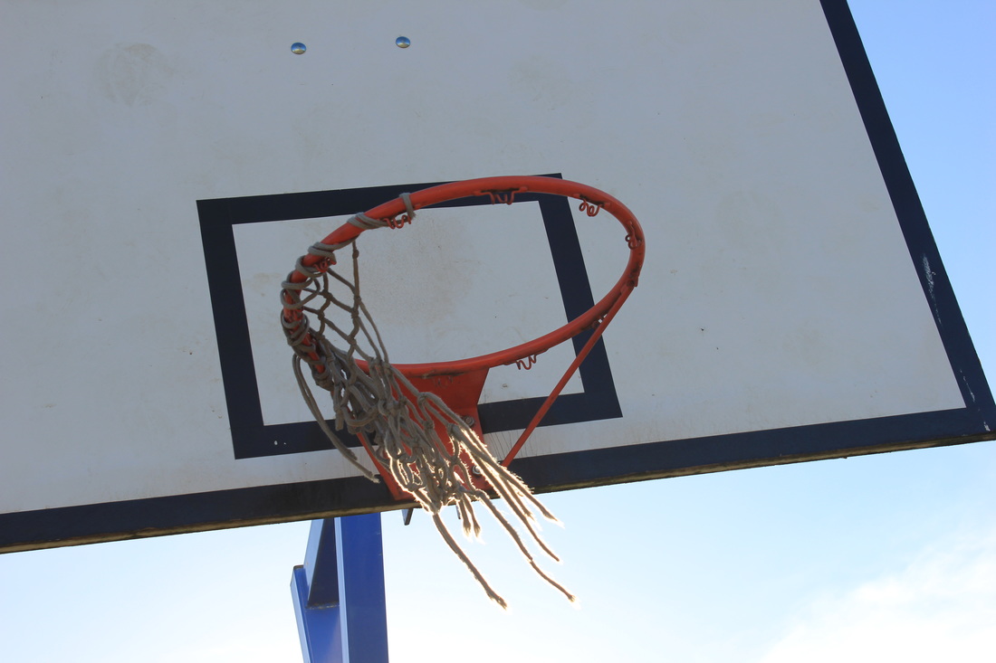
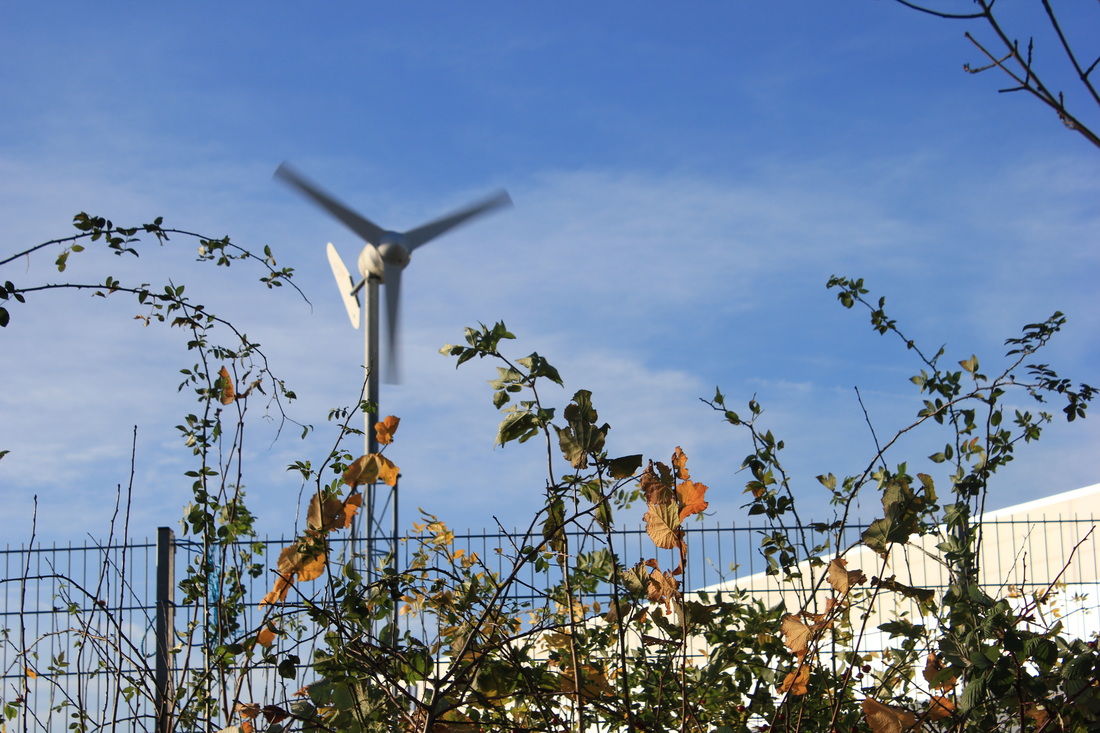
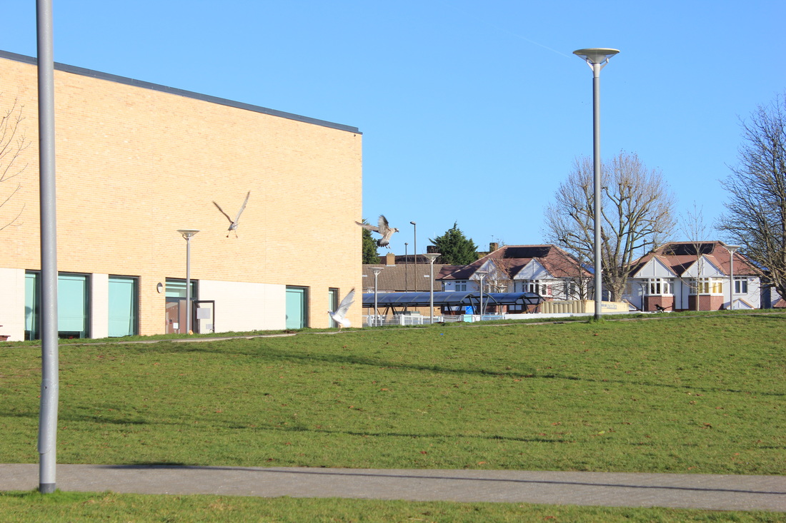
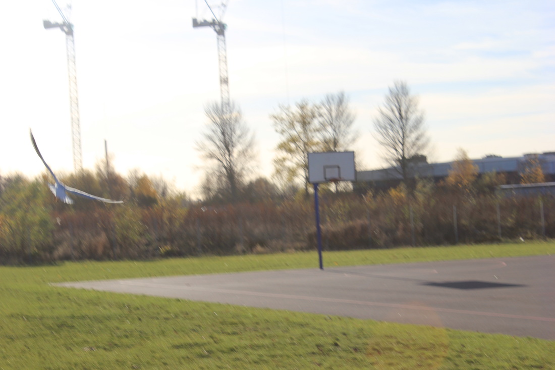
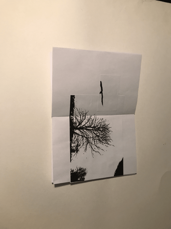
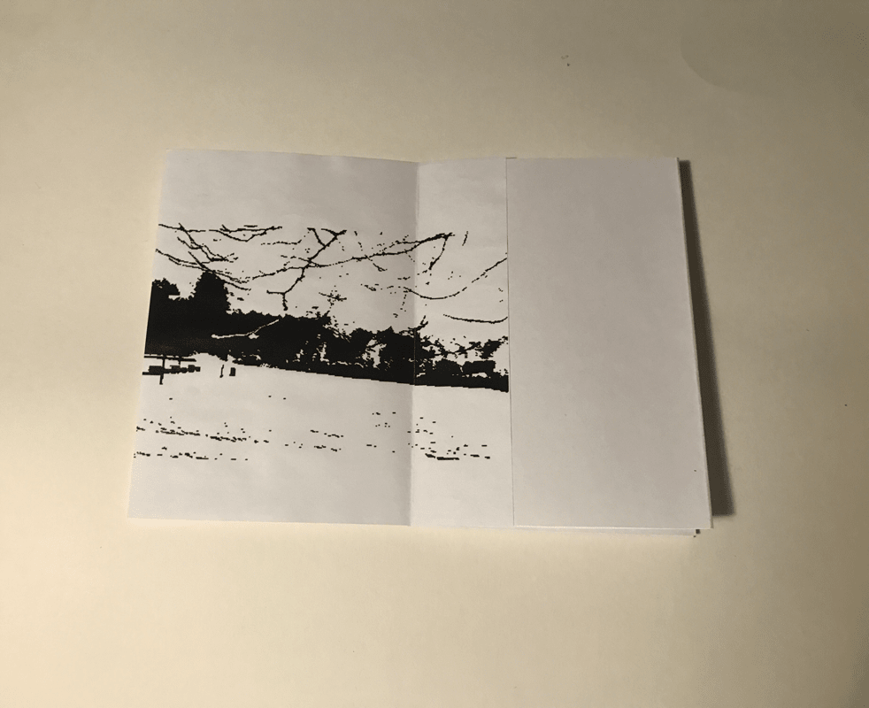
The reason I picked these images for my next book is because I believe that there is something distinct and intriguing in every image or something that just generally catches your eye and makes you want to look on. Also I like the picture of the stair case as it is very much similar to Renger-Patzch's photographs; it has a lot of shape with a good contrast. The pictures of the birds stand out as there is one defined subject in the photo and in my opinion it makes it a really good photo having the black bird against the completely white sky. Nature also looks very good when edited by the threshold as the twigs are very defined on trees and also the bushes are completely blacked out but at the ends very defined which looks really interesting.
Book two images:

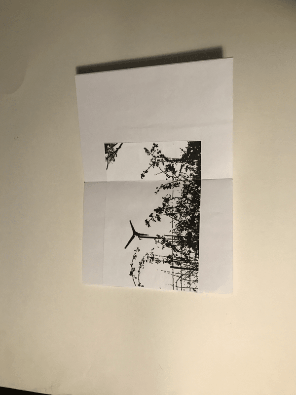
Little book images:
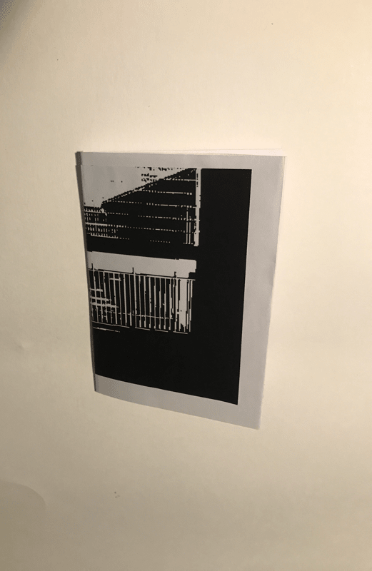
Book made on black paper:
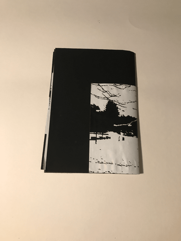
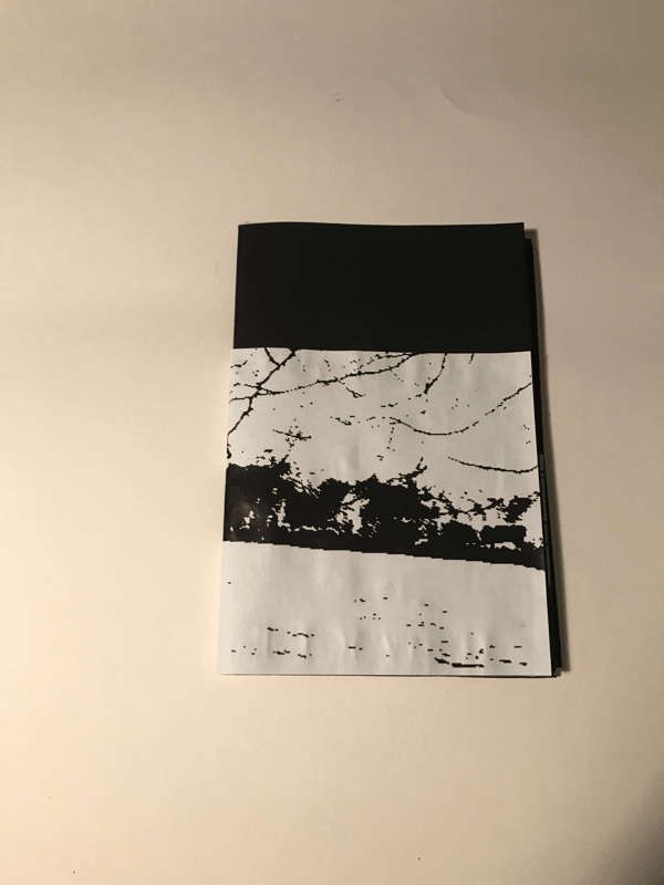
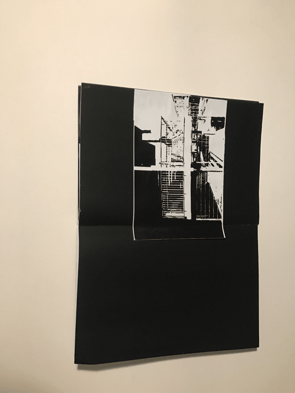
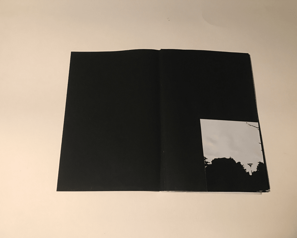
Out off all my books my favourite book is the little book, this is the book I created after the two big books. I believe it looks the best because I had experimented with images on the other two books and could see what I thought made a good page and what didn't. The little book used the space the best although I do really enjoy the look of the high contrast images in the black book. I like them because I believe the contrast is better presented on the black paper than the white paper.
