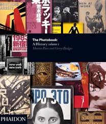
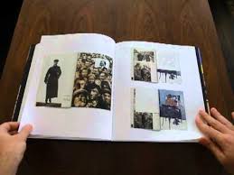
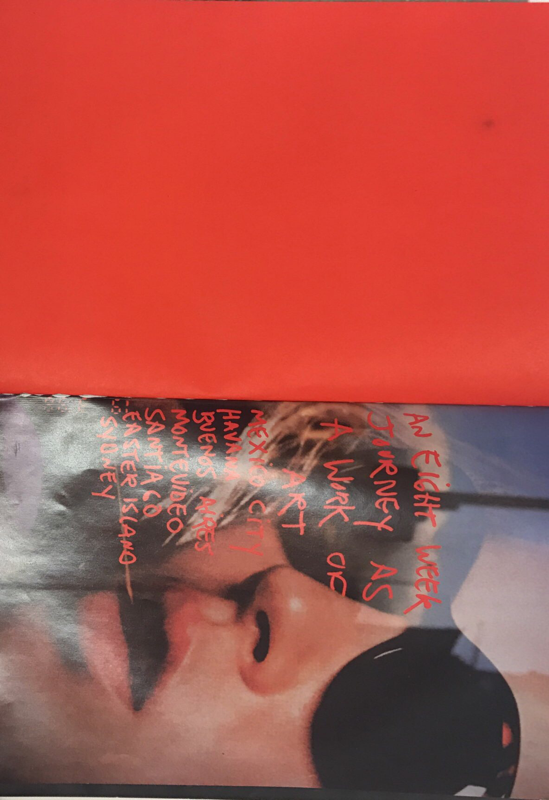
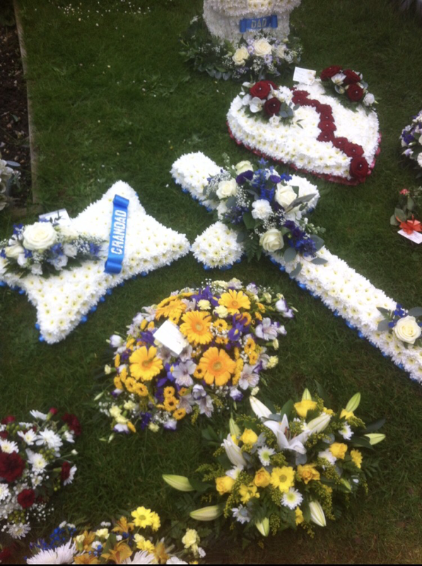
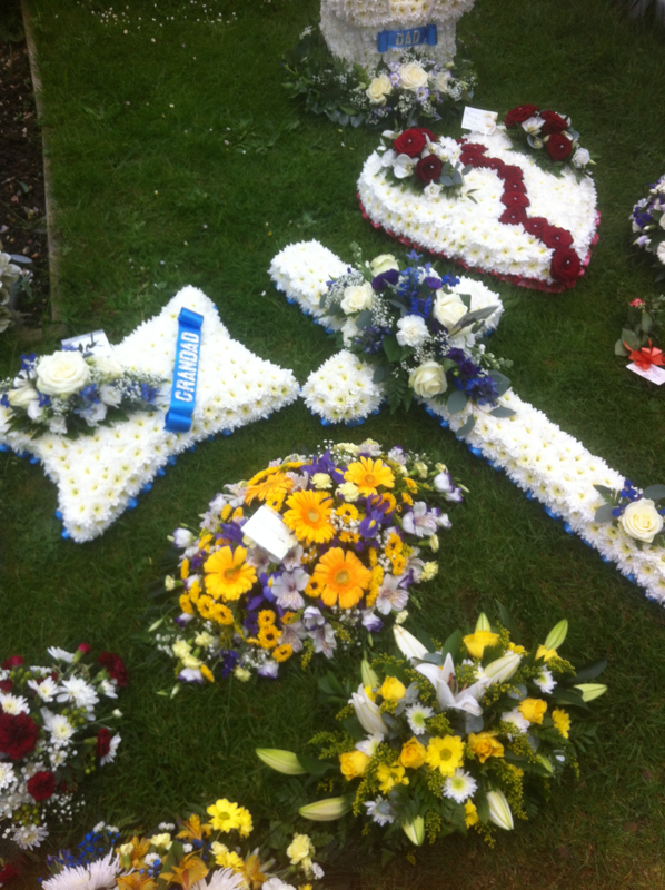
Photobooks are books that contain pictures from a specific photographer and often contain writing about their work within this book. The first proper photo book was thought to have been made around the 60s-70s by Japanese photographers and since then have become a lot more significant in the work of photography (http://uk.phaidon.com/store/photography/the-photobook-a-history-9780714842851/ source I gathered some information about photo books on) . People prefer to have a physical copy of a book as it gives them the sense of ownership over a artists work; this leads to photo books being more appreciated than digital books or images as you cannot physically touch these. Photobooks produce a different way of looking at photography as you wouldn't normally get to touch a artist work but now it seems like you can own a piece of if for cheaper than a print. As time goes on more people are self publishing their own photo books and this means that more people are becoming more attracted to the idea of a photo book which then creates more books for people to find and look at. This then leads to more people coming across photo books and purchasing them which brings a bigger audience to observe photo books. Photobooks also make photographers think about their work in different ways as they have to think about what sequences of images might compliment each other and what the images represent which makes photography a lot more interesting.
Two frame films
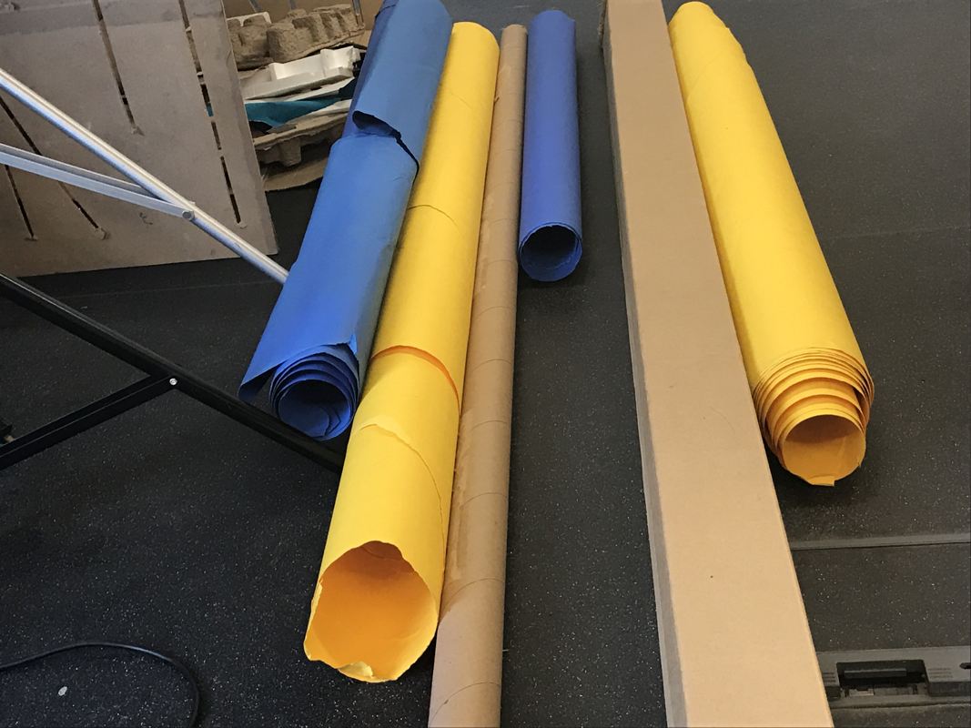
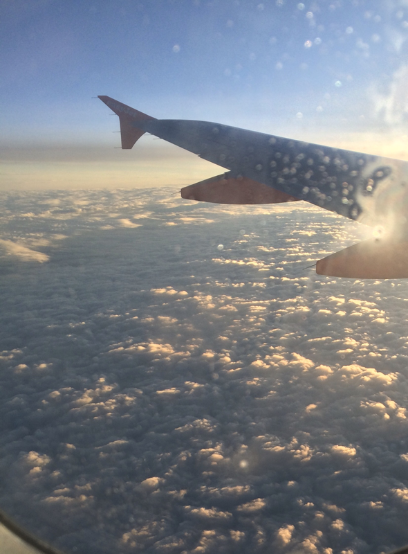
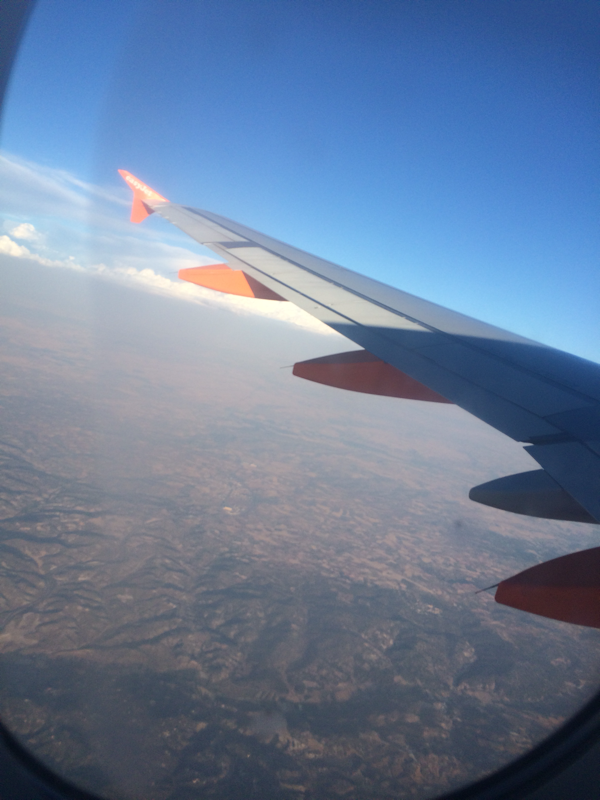
Two frame film cameras were created by Olympus pen company and came about around the 1960's. The main use for this cameras at first was to be able to fit double to amount of pictures on one role of film. This was because film is quite expensive for only 36 pictures but now photographers could take 72 pictures for the same price. However, as time advanced people began to view these camera differently and used two half images from the film to make diptychs which really intrigued people.
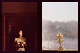
Luke Fowler
Fowler was a film maker that made a photography called "two-frame films" and he believes that photography is a less reliable film (clips). He wanted to create stories through his photography and so his diptychs are stated to be film-stills. He also enjoy's the diptychs as it forces people to make a relationship between the two images therefore, creating more of a story than just looking at a single image. Fowlers aim of photography is to create a autobiography through his images showing everyone what he is intrigued in and what he likes.
Some of Fowlers images:
Some of Fowlers images:
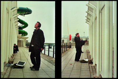
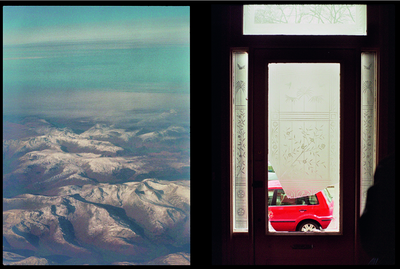
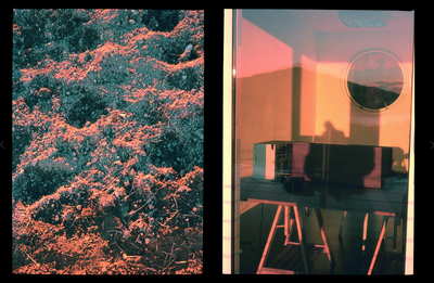
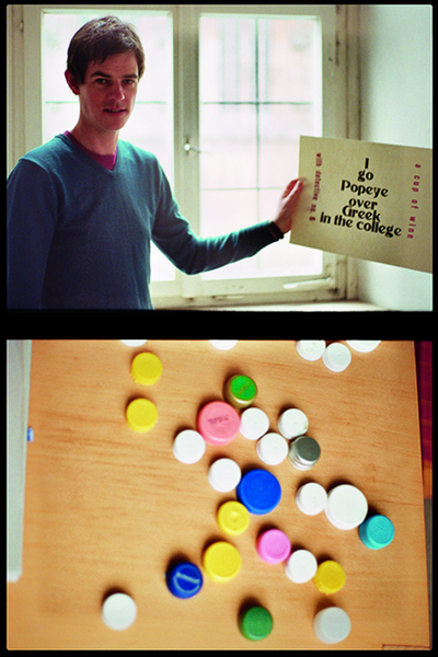
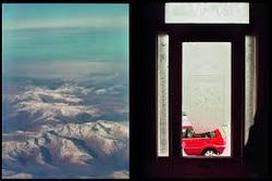
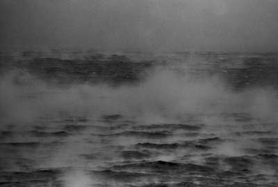
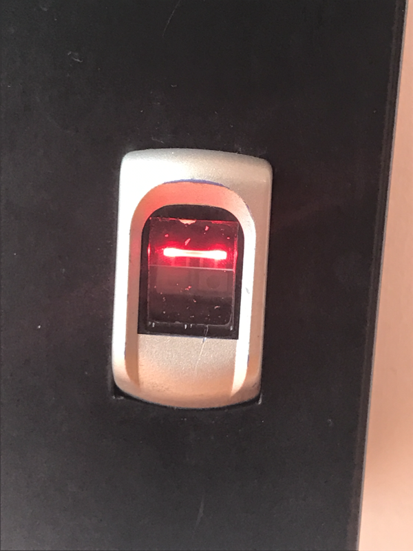
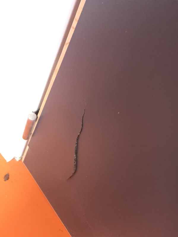
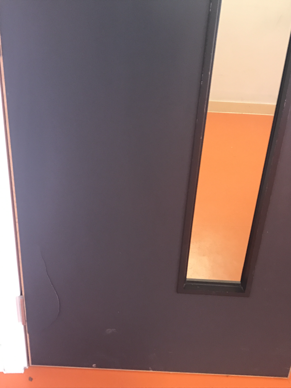
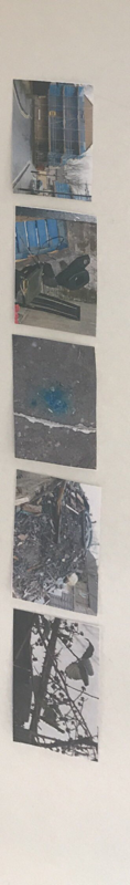
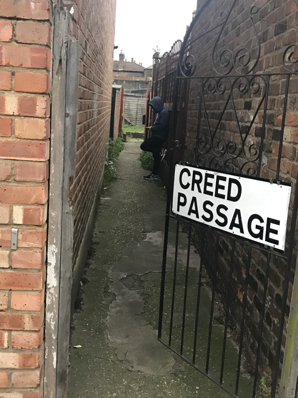
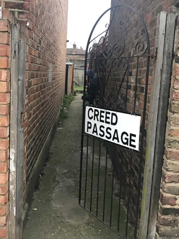
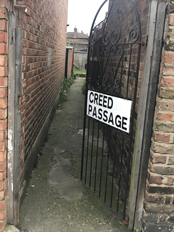
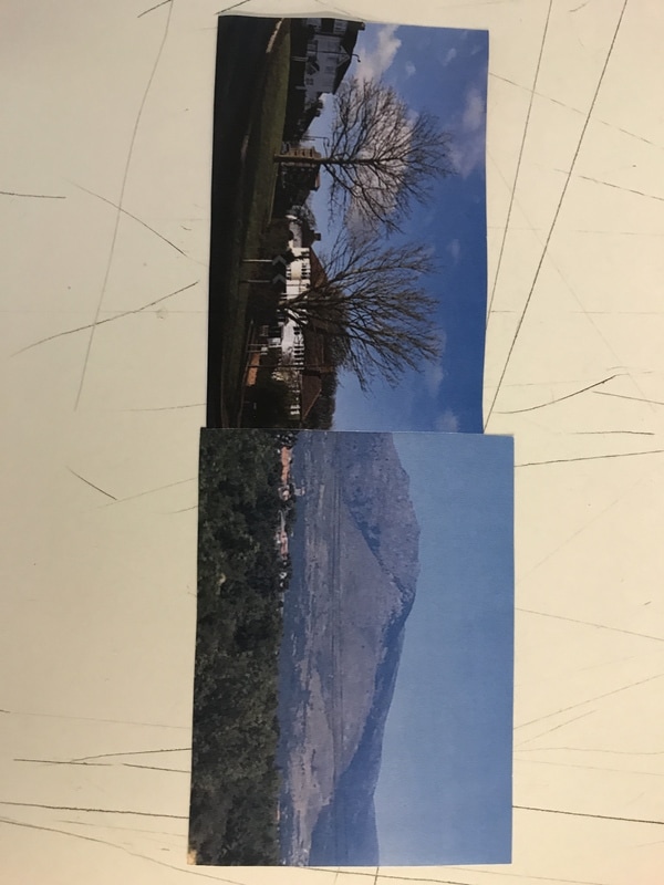
Fowler shot using a half frame camera this is so you can take 72 images instead of 36 on a film camera. The camera is also useful so that you can place images next to each other that compliment each other or also contrast each other but within doing this is brings out the beauty of the other photo. This photo is one of his photos that intrigues me as there is a lot to think about when you look at it. Some similarities of these photos are the gagged glass of the door reminds you of the gagged edges of the mountain on the picture next to it. They both may signify something also as the mountains have grown and developed over years to be what they are now and the door has become fragile due to it being there for very long as it is now broken. The use of the two primary colours (red and blue) in the opposing opposite make the two stand out more. I think fowler has purposely put them together as they compliment the other colour. They both have some bright colours as the sky and parts of the mountains are bright just as the glass on the door is illuminated. They are both shot through a window (shot through window to see the car and shot out of a aeroplane to see the landscape). However, the picture also has differences such as: the picture of the car is very much just focused on the car as it is the most colourful object in the picture and your eyes get drawn towards it where as, the mountains are very spread out and the focus isn't on one area. The strong verticals and horizontals of the door frame help to focus on the car even more as they as it is like there is a view finder and the car is the object to be focused on. Another difference is the picture of the car has very dark shades around the inside of the door but the landscape mountain photo is very brightly coloured. Furthermore, a difference is that one picture is shot from the inside and has homely features but the other is shot from the outside and is of the environment. This picture also conveys that one is peaceful and nature but on the other hand it is urban and has changed landscapes due to technology and demand for houses for people. I think the photographer has selected these images and put them together to show the difference between a beautiful landscape and a city or place with humans that has changed the environment. I believe he could of photographed the broken glass door because it represents that humanity is ruining nature and what should be there just for the cost of easier transport and better housing. I think the images do compliment each other in some way but I also believe they have quite a big contrasting meaning they could work better next to different image. This is mainly, in my opinion, because they are on two different subjects with nothing obvious in common. You really have to search and look for things you believe to be similar in order to find anything and so this is why I believe they could be better apart. These two frames make me analyse the images in more depths and so I look at them in different ways with a better eye of photography which makes me enjoy them as I pick out small details as to why they might be together instead of just seeing very obvious things that might be very easy to spot.
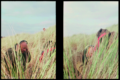
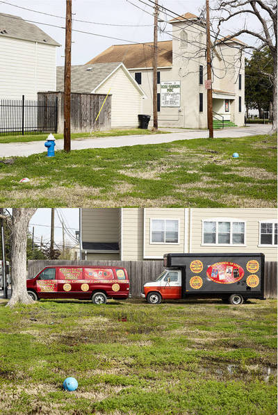
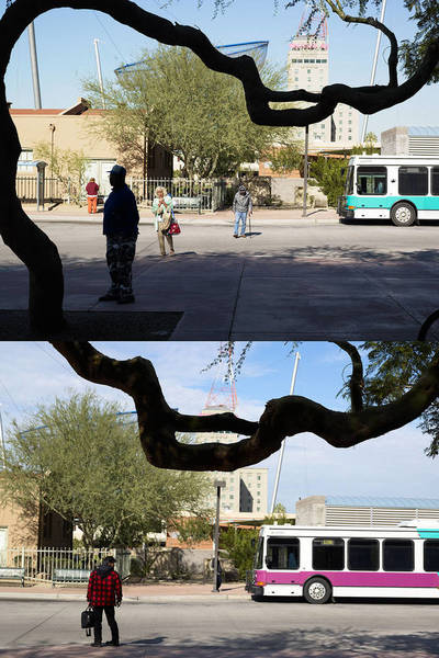
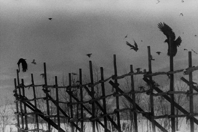
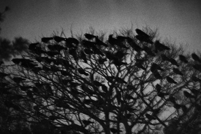
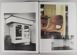
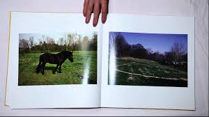
Fowler was not the only photographer to take diptychs John Maclean used a two frame camera for a different affect that Fowler used it for. Maclean used a two frame camera to rapidly take pictures of the same subject but at different view points. This is because from different angles objects are viewed differently and new perceptions are made from another angle. Another thing that changes is the lighting, which can make a photograph look completely different,and maybe the objects in the pictures as some objects in the photo may have moved. By having two pictures together at different angles is gives us a better and more real perception of things in the world as you get to see it in different ways; this also reminds us that we all view the world slightly differently so we should just look at the world through one eye but should try to create multiple perceptions from one thing.
John Maclean's photos:
John Maclean's photos:
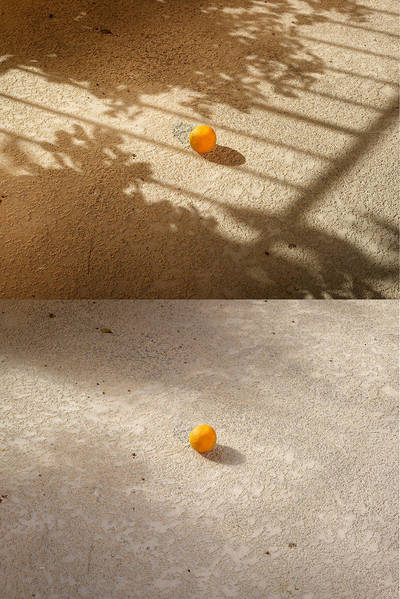
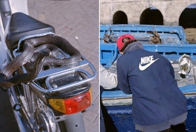
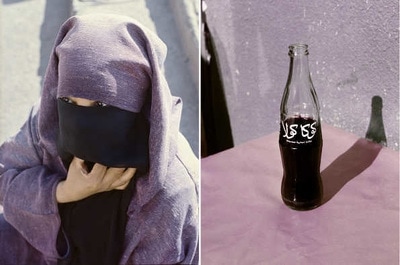
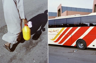
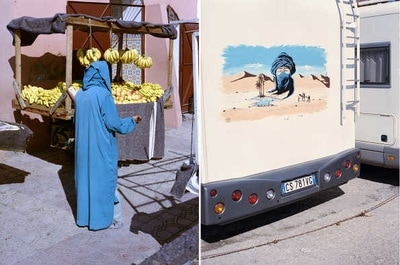
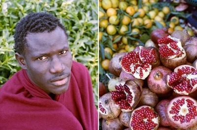
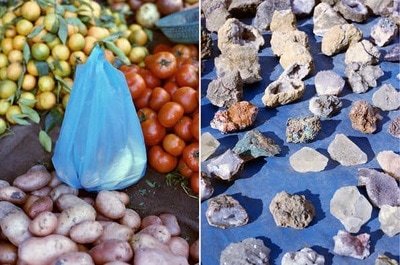
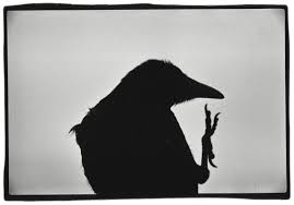
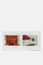
Osma Harvilahti is another photographer that uses two frame film to do something creative. Within his diptychs he uses tone, shape and colour to create visual links between the images and this engages the eye of the viewer. His photography mainly pairs street photography with pictures of objects that he believes would look good and compliment the pictures taken of street photography. For example, in one of his pictures he uses a photograph of a women with a head scarf on which is black and then uses a bottle filled with a dark black liquid in it to go next to each other. This is because the colours are similar and help the two photographs to compliment each other even though, they are very different.
Harvilahti's photography in Africa:
Harvilahti's photography in Africa:
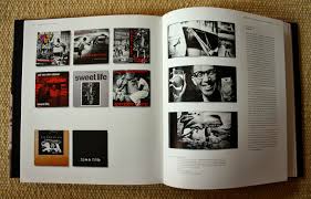
The Photobook:
Photobooks are are really good platform and opportunity for photographers to share their work to a big audience. They also increase the self publishing of photo books and increase the numbers of collectors who are interested in photobooks. This means more people see photobooks and become more interested in collecting them so the audience and popularity of photobooks becomes bigger the more people self publish books. Martin Parr, Hannah Watson and Gary Badger all work participated in creating this photo book. These three people really enjoy the idea of making photobooks and believe this is a platform that will keep expanding making the photography more appreciated and enjoyed by many people. Due to all of these people doing different types of photography their photobook became very interesting and intriguing to many people as there were images placed next to each other that the other photographer would not necessarily but there. This makes the photographer not only think about where they are placing their own images but they also have to compromise with the other person which improves the quality of the books.
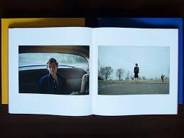
Masahisa Funkase:
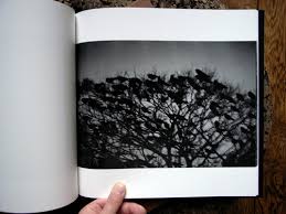
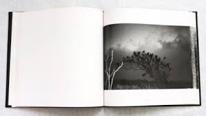
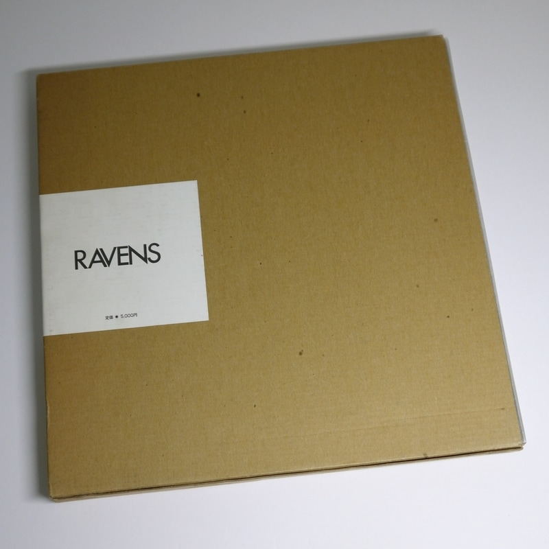
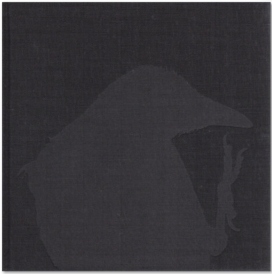
When researching photobooks, Ravens by Fukase was the first book I was drawn to. This is because I really enjoy the use of black and white images within a photobook as to me it represents deep and meaningful subject matters. For example, in many of the images the ravens are alone and from researching about the book and photographer you can tell the book is meant to represent the idea of loneliness. This is because in most of the images the ravens are by themselves. However, some of the images do contain pictures of them in groups which could lead to deeper analysis of Fukase trying to represent people feeling alone even when surrounded by people. Fukase often over exposes his images or magnifies his negatives to make people focus more on the mood that the images create than the technical distillation of the images. The first page of the raven filling the page and being the only thing on the page creates a better sense of isolation and for me I prefer it like this as it gives the book a better sense of isolation. However, the other two pages for me would be better if they filled the pages as I think it would make the images at a better focal point than when they have negative space around them. In this book Fukase usually places one image in black and white which is next to a blank page that is just white. This may be because it further extends his point of isolation and loneliness due to the images just being on their own and the only focal point of the picture. The cover of the book for me is very plane and different compared to the rest of the book. This may be to create diversity but the title "Ravens" being small may also be to created a sense of separation from the rest of the world as it is also boxed off in a different colour to the rest of the book. Again the back cover to me also evokes sad emotions as the raven is all on it own which to me is the clear message from the book.
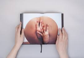
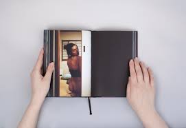
Rita Lino- Entratete
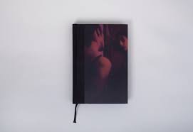
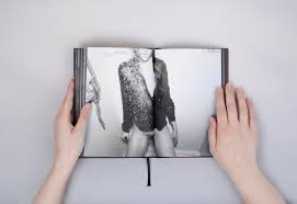
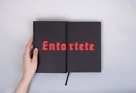
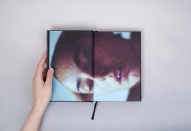
At first site the books to me looks explicit and dangerous; it does this because the pictures of the people on the front are in a red tinted light. This to me expresses that something dangerous is going to happen but it also reminds me of the light you would see in prostitute house; also by the way the people are positioned it looks like something sexual is going to happen. One of the images inside of the book is just the writing "Entartete" and this translates to degenerated in english. Degenerated is a term used when someone has "lost the physical, mental or moral qualities considered normal and desirable, showing evidence of decline". I believe this is a good title for the book as most of the people in it look explicit and sexual suggesting they have lost some self respect and do not care who sees the naked. It suggests they will present their bodies to anyone as long as they are perceived as sexual and this is not considered normal or morally right. The writing also being in bright red creates a sense of danger to me and this is the kind of position these people are putting themselves in by showing the world their naked bodies while often posing in a sexual way. The main subject of this book is sexual scenes and I think it displays them very well by filling the page with the bottom and putting it right in the middle where everybody can see it. I also believe it displays sexuality very well by only having one picture per double page as it makes people really focus on that one image. The front and back cover also are red tinted photos which look pretty sexual and so create a good sense of what is to come in the book.
At first site the books to me looks explicit and dangerous; it does this because the pictures of the people on the front are in a red tinted light. This to me expresses that something dangerous is going to happen but it also reminds me of the light you would see in prostitute house; also by the way the people are positioned it looks like something sexual is going to happen. One of the images inside of the book is just the writing "Entartete" and this translates to degenerated in english. Degenerated is a term used when someone has "lost the physical, mental or moral qualities considered normal and desirable, showing evidence of decline". I believe this is a good title for the book as most of the people in it look explicit and sexual suggesting they have lost some self respect and do not care who sees the naked. It suggests they will present their bodies to anyone as long as they are perceived as sexual and this is not considered normal or morally right. The writing also being in bright red creates a sense of danger to me and this is the kind of position these people are putting themselves in by showing the world their naked bodies while often posing in a sexual way. The main subject of this book is sexual scenes and I think it displays them very well by filling the page with the bottom and putting it right in the middle where everybody can see it. I also believe it displays sexuality very well by only having one picture per double page as it makes people really focus on that one image. The front and back cover also are red tinted photos which look pretty sexual and so create a good sense of what is to come in the book.
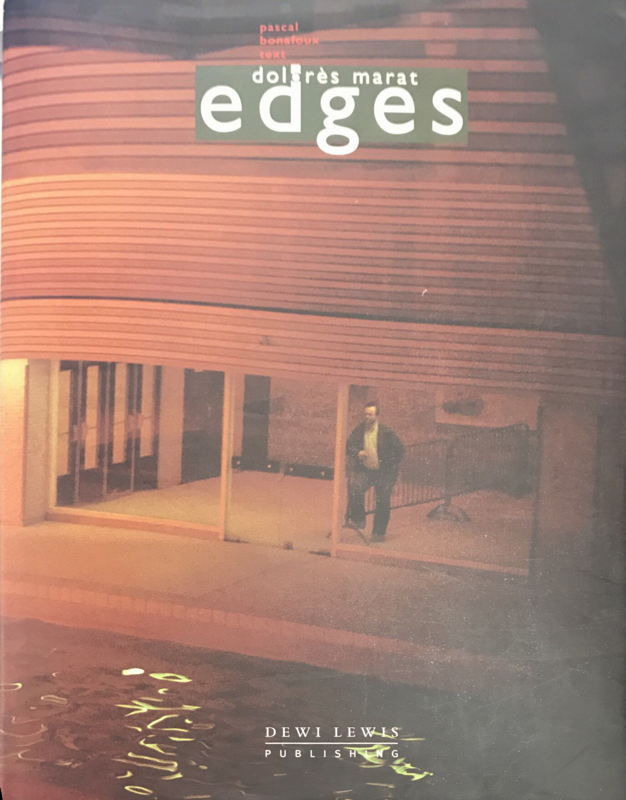
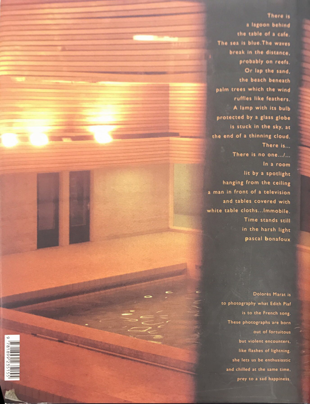
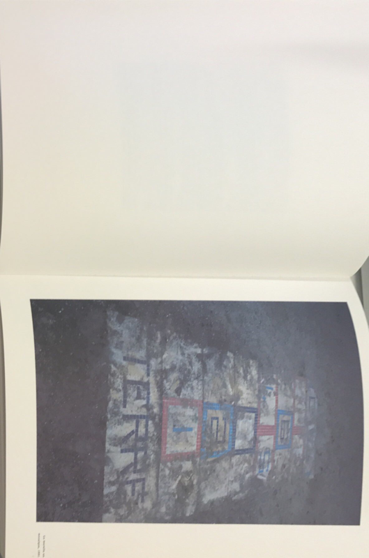
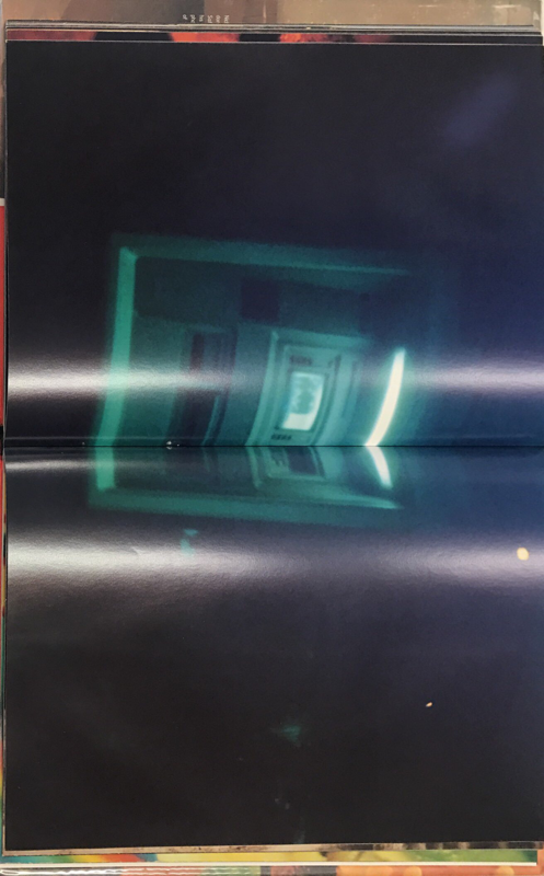
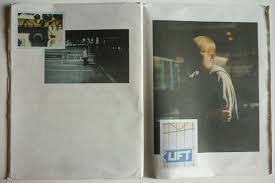
Edges- Dolores Marat
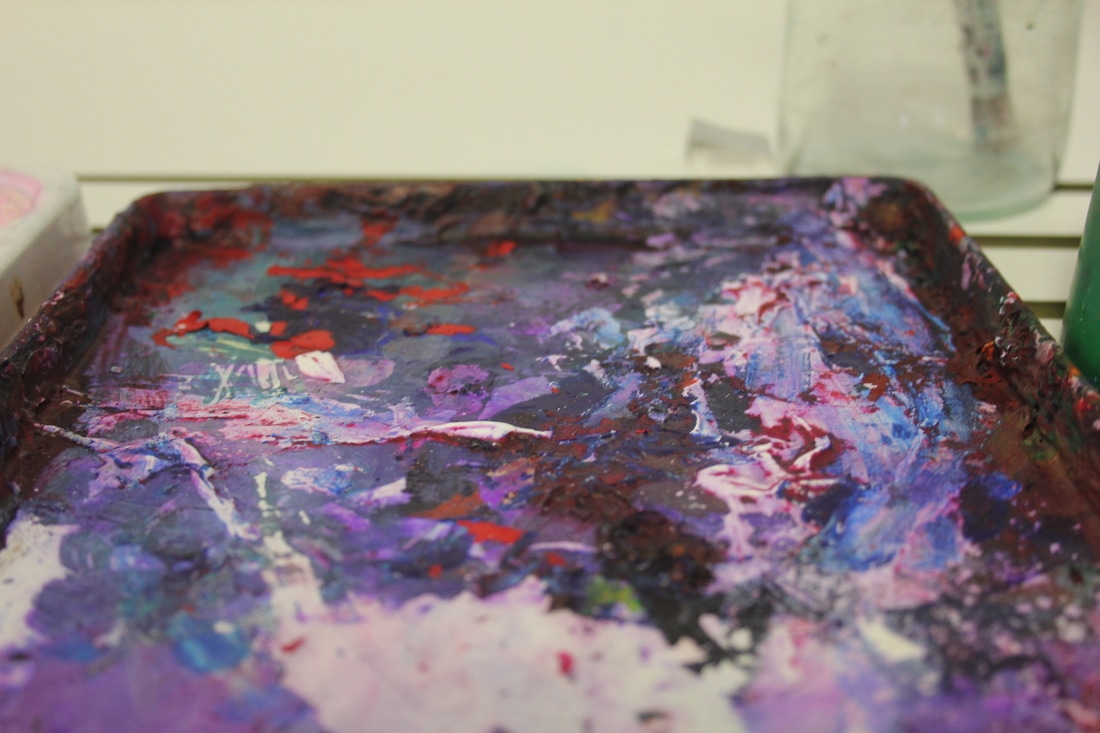
The cover and back cover of the book are very representative of the book edges as the image is very dark and mostly out of focus with flaws. The back of the book also has writing that is similar to the first couple of pages of the book. This writing is a descriptive text of what is in all of the photos and it makes you think and look at the smaller details of the photos. I really like the idea of doing this within a book as I believe the descriptive text makes people focus a lot more on the small parts of a photo and not just the photo as a whole. Through the text you could also just get someone to specifically look for one thing in the photo by describing it before hand and therefore, the writing is stuck in there head so they focus on a specific subject. Most of the photographs in the book edges could be considered as wrong as most of them are blurred and very dark however, a good photo would be represented as good lighting and in focus. All of the images in this book have negative white space around them and this may be to emphasise the darkness of the pictures because the light is a high contrast. Personally I am not a big fan of the negative space in a photo book and believe that photobooks look better when the pages are full. The only link I can see between some of the sequences of pictures are there is mostly always a certain colour that is similar; this means the pictures often compliment each other. However, other than the colour link there is not much that links to photos together in my opinion this leads me to believe that the sequencing is just based on colours. Which gives me inspiration for my book as now I can see that images can link through colour even if very different. Another way this book inspires me is to tell a story through my images as the writing at the front of the book is like a long poem. This shows me that pictures can bring about many different perceptions and so telling a story before my images are shown or just telling my story through images can put across my perspective to people.
The cover and back cover of the book are very representative of the book edges as the image is very dark and mostly out of focus with flaws. The back of the book also has writing that is similar to the first couple of pages of the book. This writing is a descriptive text of what is in all of the photos and it makes you think and look at the smaller details of the photos. I really like the idea of doing this within a book as I believe the descriptive text makes people focus a lot more on the small parts of a photo and not just the photo as a whole. Through the text you could also just get someone to specifically look for one thing in the photo by describing it before hand and therefore, the writing is stuck in there head so they focus on a specific subject. Most of the photographs in the book edges could be considered as wrong as most of them are blurred and very dark however, a good photo would be represented as good lighting and in focus. All of the images in this book have negative white space around them and this may be to emphasise the darkness of the pictures because the light is a high contrast. Personally I am not a big fan of the negative space in a photo book and believe that photobooks look better when the pages are full. The only link I can see between some of the sequences of pictures are there is mostly always a certain colour that is similar; this means the pictures often compliment each other. However, other than the colour link there is not much that links to photos together in my opinion this leads me to believe that the sequencing is just based on colours. Which gives me inspiration for my book as now I can see that images can link through colour even if very different. Another way this book inspires me is to tell a story through my images as the writing at the front of the book is like a long poem. This shows me that pictures can bring about many different perceptions and so telling a story before my images are shown or just telling my story through images can put across my perspective to people.
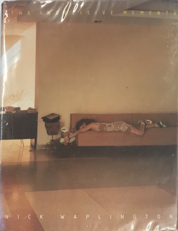
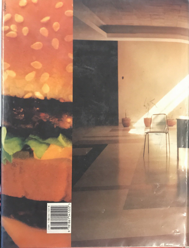
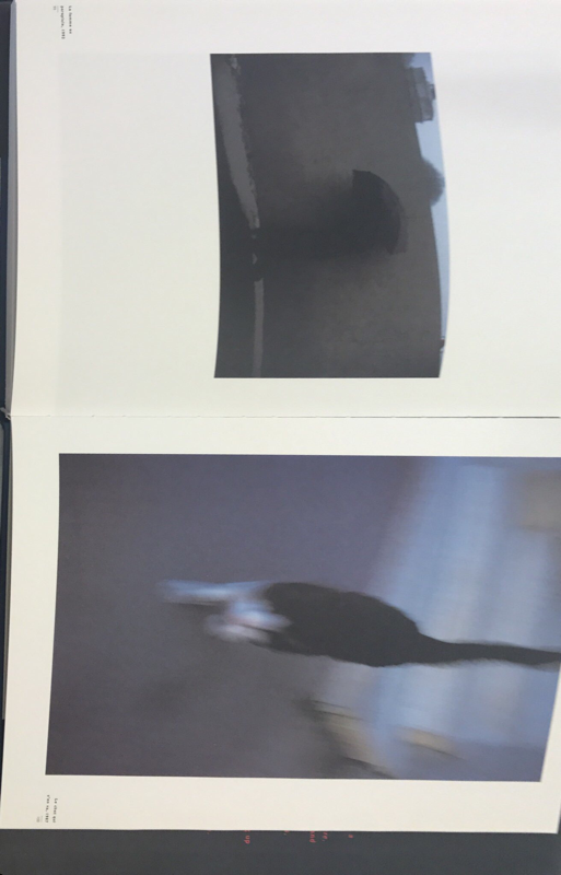
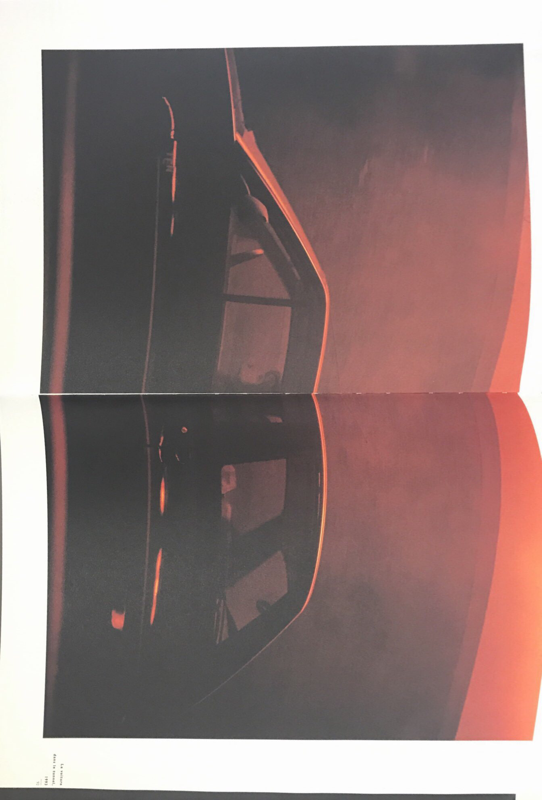
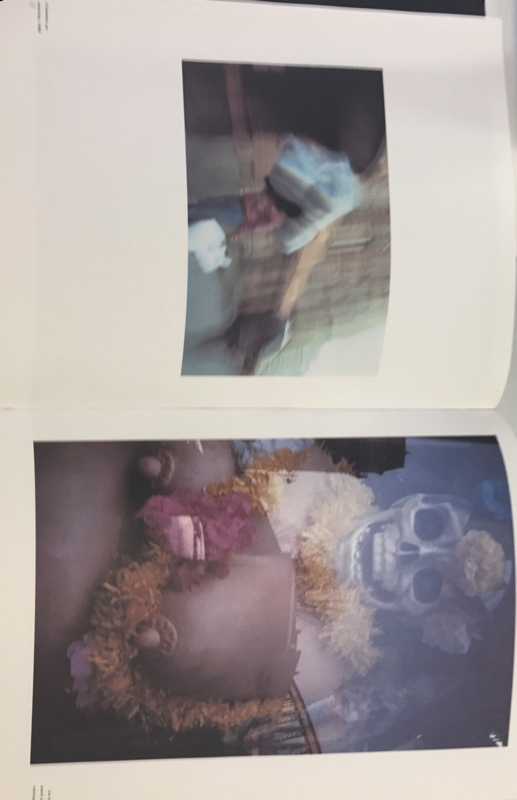
Nick Wapplington- Indecisive momento.
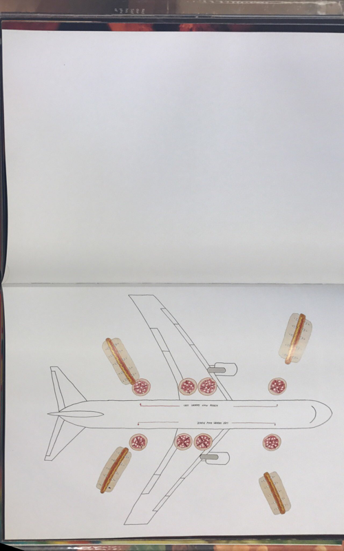
Wapplington puts most of has images across a double page and I really enjoy the look of this. I believe photo books do look a lot better when the images cover the whole page and there isn't a lot of negative space around them. This for me is because I believe it makes the images stand out more and doesn't try focus the audiences attention on too many things. His front and back cover represent the idea that things do not have to be perfect, it does this by putting a little snip it of a burger next to a picture that has no links and completely contrasts each other. It also shows it is imperfect as on an ordinary book cover there would be one image that finishes at the edge of the book however, he decided to put a little bit of a different image making his cover original and different to what is perceived as normal. Throughout his book you can see that he is putting across the message that imperfections are okay and his does this by deliberately having out of focus images, things in the way of the photo such as his finger and also spelling mistakes. I enjoy this as it is a reoccurring message that makes the audience believe you can take photos anyway you want and it is still acceptable. Wapplington sometimes has diptychs in his book and there is often a link of colour or shape between them. For example, the image of the women who has red lips then links to the full red page through colour. Wapplington picks his photos carefully and will only put photos next to each other if they have some sort of link which is shown throughout the book. I really enjoy Wapplintons book and the message it puts across as I believe having a visual representation that shares a message is a lot more effective than writing. This book has encouraged me to try and portray thing, people and places they way they actually are seen in real life or the way in which I perceive them. It has also influenced me to connect images through colour, line and shape even if they subject matters are completely different.
Wapplington puts most of has images across a double page and I really enjoy the look of this. I believe photo books do look a lot better when the images cover the whole page and there isn't a lot of negative space around them. This for me is because I believe it makes the images stand out more and doesn't try focus the audiences attention on too many things. His front and back cover represent the idea that things do not have to be perfect, it does this by putting a little snip it of a burger next to a picture that has no links and completely contrasts each other. It also shows it is imperfect as on an ordinary book cover there would be one image that finishes at the edge of the book however, he decided to put a little bit of a different image making his cover original and different to what is perceived as normal. Throughout his book you can see that he is putting across the message that imperfections are okay and his does this by deliberately having out of focus images, things in the way of the photo such as his finger and also spelling mistakes. I enjoy this as it is a reoccurring message that makes the audience believe you can take photos anyway you want and it is still acceptable. Wapplington sometimes has diptychs in his book and there is often a link of colour or shape between them. For example, the image of the women who has red lips then links to the full red page through colour. Wapplington picks his photos carefully and will only put photos next to each other if they have some sort of link which is shown throughout the book. I really enjoy Wapplintons book and the message it puts across as I believe having a visual representation that shares a message is a lot more effective than writing. This book has encouraged me to try and portray thing, people and places they way they actually are seen in real life or the way in which I perceive them. It has also influenced me to connect images through colour, line and shape even if they subject matters are completely different.
Zines are a important part of self publishing as they are often a lot cheaper and made by hand this makes it easy to custom make zines and change anything you do not like something in them. Many people have access to the equipment (a printer and paper) needed to make photobooks and so can produce many of them and readjust anything they do not like with ease. However, with a photobook once it is printed you have to stick with what you have even if you do not like it unless you get another book re-printer but this is risky as you may not like the new design of your book still. The photozines are very experimental and can be very beautiful if been though out.
Ollie Murphy:
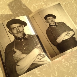
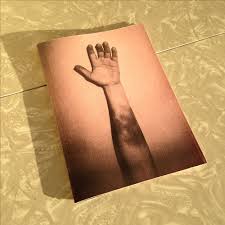
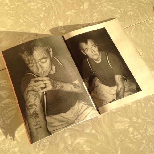
One reason why I like Ollie Murphy's zine is because the book look really old and personally made. I think through zines and photo books you can create a story of what you want people to see and know. In these zines I think they are a representation of the difference between men and women. This is because in the images the men are all tattooed and made to look more muscular where as, the women is pure and doesn't have a mark on her. To me the arm on the front also looks like a mans arm and it is very bruised which represents fighting and strength. So these zines create a story of a man masculinity and womens femininity. Murphy normally has one image that fills the page next to one image that isn't quite as big however, the picture of the women fills the whole page. Murphy only ever has one person or a certain subject on the pages for example, he would not put a picture of a man and a women on the same page. This may be because he wants people to notice that men are perceived in a number of ways so the photos show them at different angles to show different sides. On the other hand, back in the olden days women only had one job and that was to be a housewife. This may be why there is only one photo of the women on the double page instead of two separate images of her. This also kind of links to documentary/story telling photography as it shows how the people were presented in earlier years and how it has changed now.
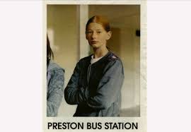
Preston bus station:
Adam Murray, Robert Parkinson and Jamie Hawksworth made this photozine after being told that preston bus station was being demolished. They took portraits of people over one weekend and used the pictures to create a representation of what the stations was like so in years to come people would still know if they wanted to. The zine mimicked free newspapers that were often given out at train stations to create a similar effect that the people are used to at the train station. It also helped to add to the effect of how people are gonna miss the train station as this is also the first and last edition they will make that replicated the station. Using local people encourages people to engage with the zine as they are in the work. I like the idea of having a documentation for a zine as then it also captures a piece of history as well as a story. This is something I would like to try to do in my photo book. They usually place one full size image that nearly fills the page next to a couple of images on the next page this is probably to replicate how a news paper used to organise their images and makes it as similar as possible to the news paper without adding words to it. The front cover is a portrait of a girl and this is because the book was meant to represent a documentation of the train station and so using people is the best way to do this as it shows the train station in the right use. Using a person as the front cover also helps to engage people as they want to see more about why this girl was at the train station and what other things may of been there. This was influential to me as I then wanted to think more deeply about how I can portray places, people and objects as if it were the last time anyone would ever see them.
Making books
|
This short video is a tutorial on how to make a good quality books. This comes from "How to make books" and this book contains many examples of how to make many different types of books to which you can portray your photos in many different ways. This is because we had to think of the idea of possible creating a zine or book for our final piece. Zines have a very different quality to them and I believe after a while they can look quite tacky and destroyed and so an actual book is more professional and would be the preferred way of me to display my work. However, the books are very creative and can be quite pretty, I prefer the published books. This is because you can then also pick what kind of book you would like for example, hard back and what coloured paper you would like etc.
|
|
Observation photos:
I believe through looking at artists work I have been inspired by them in my images. For example, Luke folwer has encouraged me to look more a colour, line and shape. I have not intentionally produced work that a similar to these artist however, in my brain while taking picture I think about processes more deeply due to analysing others work.
I believe through looking at artists work I have been inspired by them in my images. For example, Luke folwer has encouraged me to look more a colour, line and shape. I have not intentionally produced work that a similar to these artist however, in my brain while taking picture I think about processes more deeply due to analysing others work.
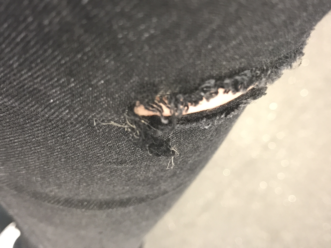
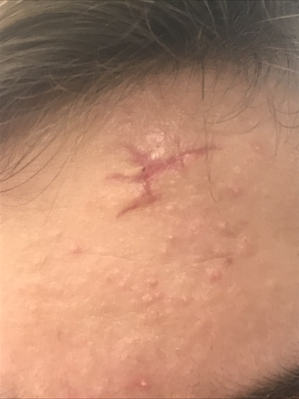
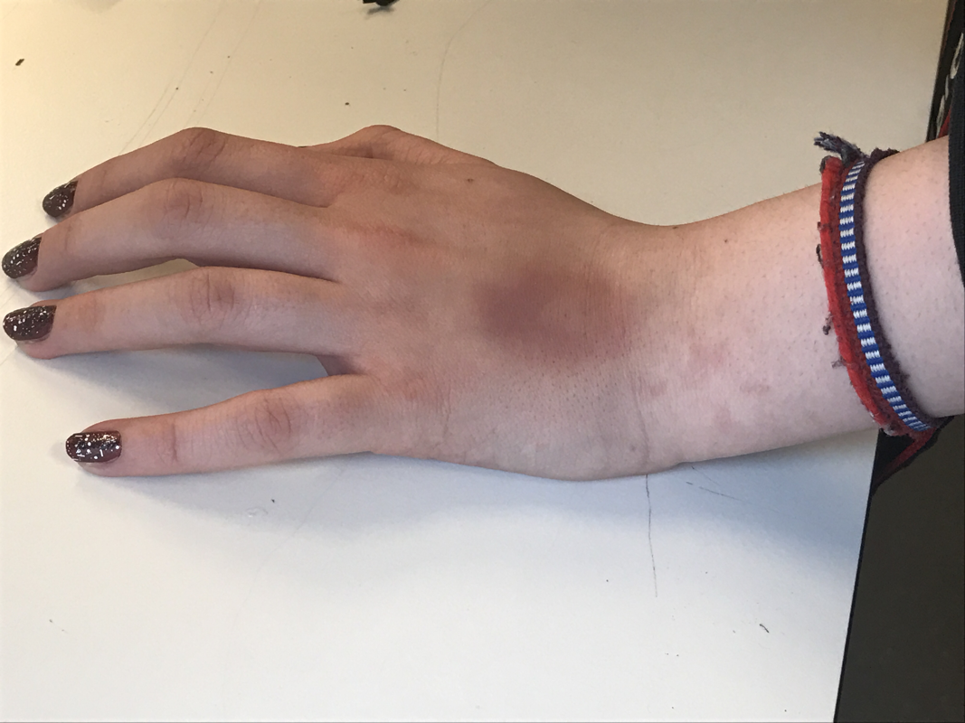
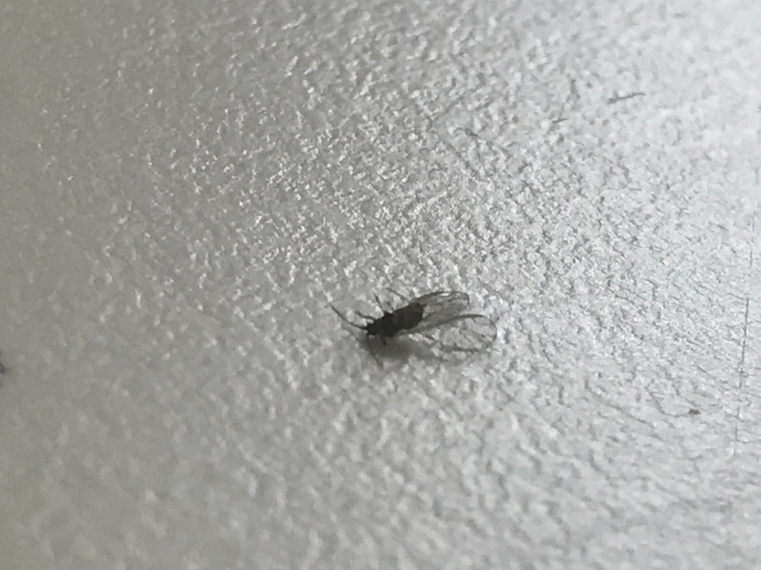
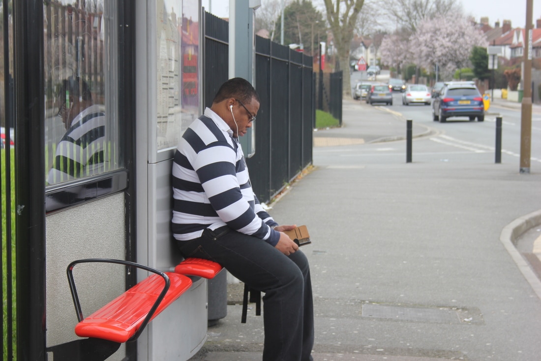
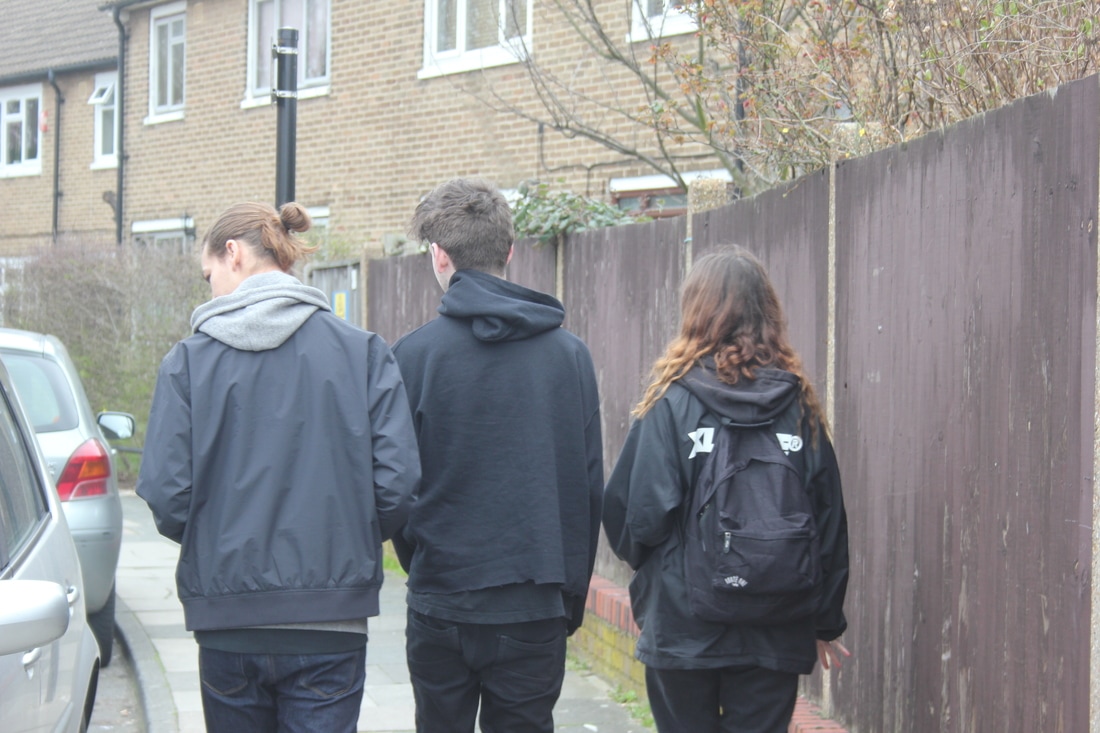
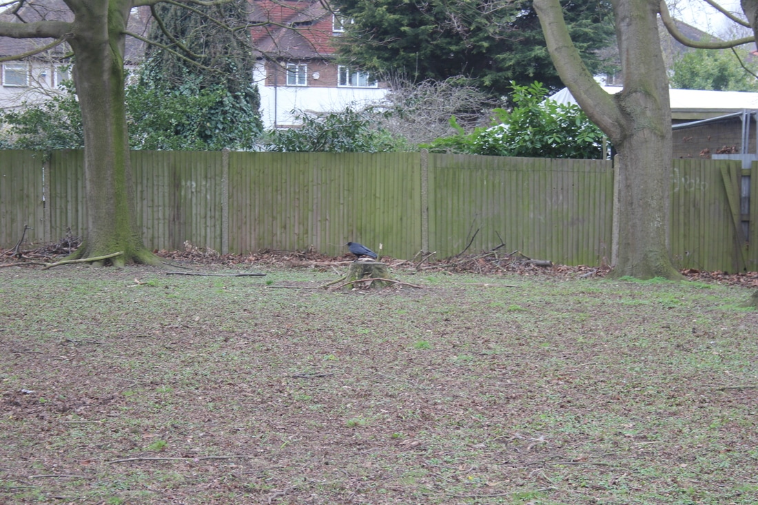
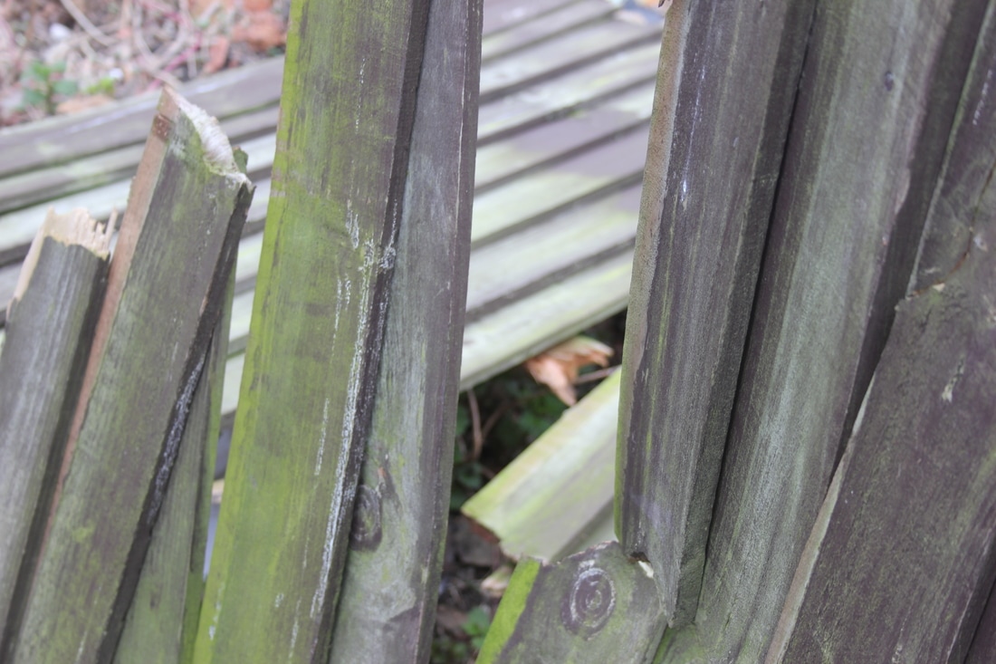
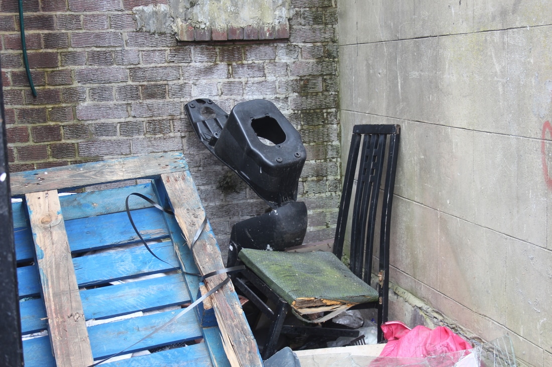
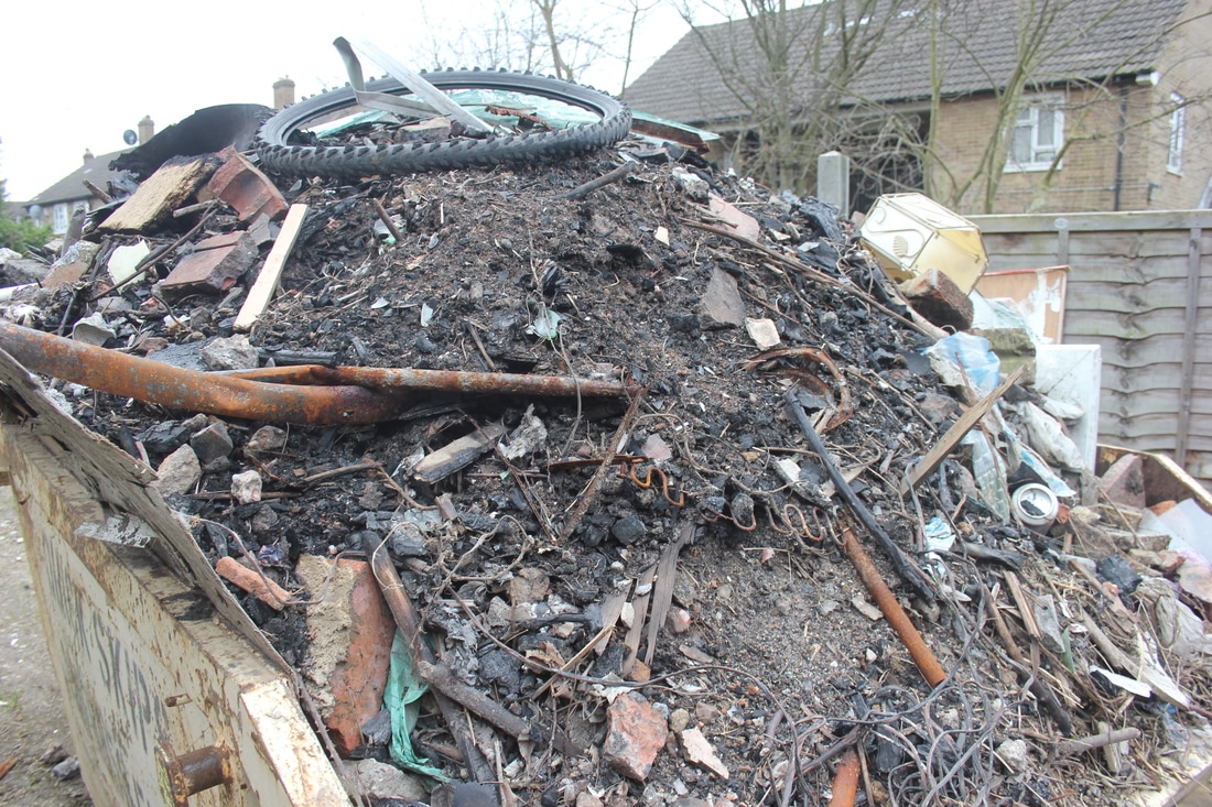
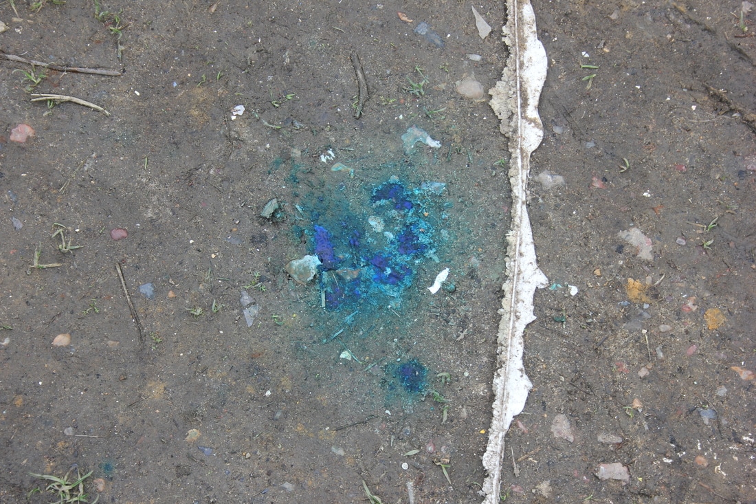
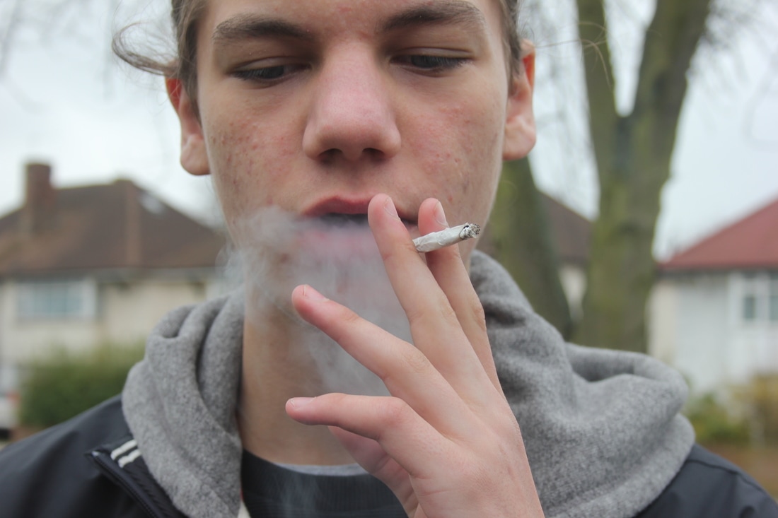
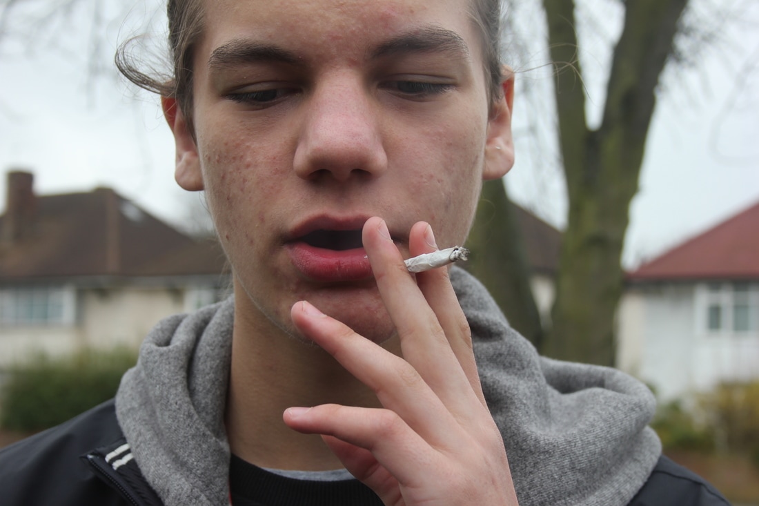
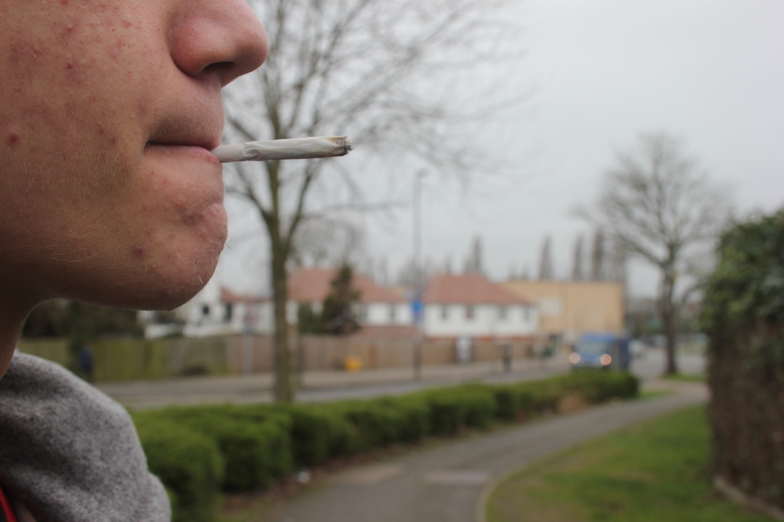
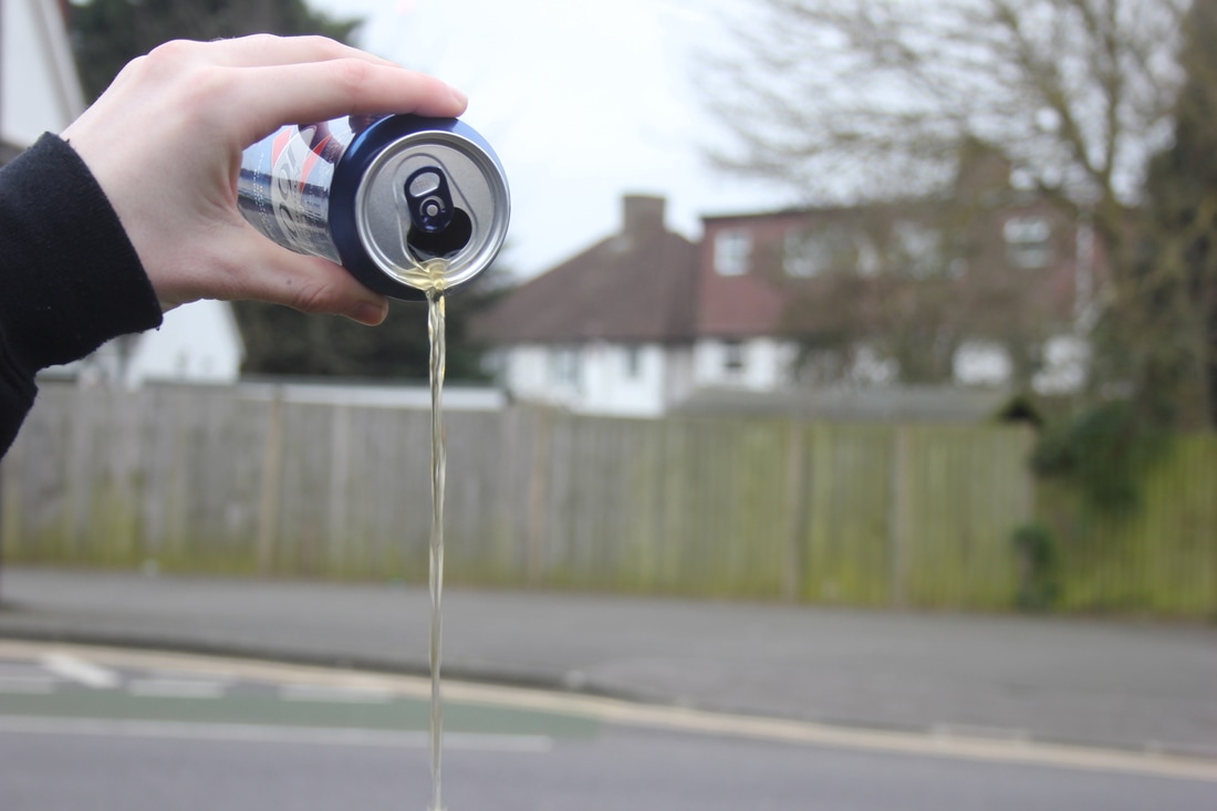
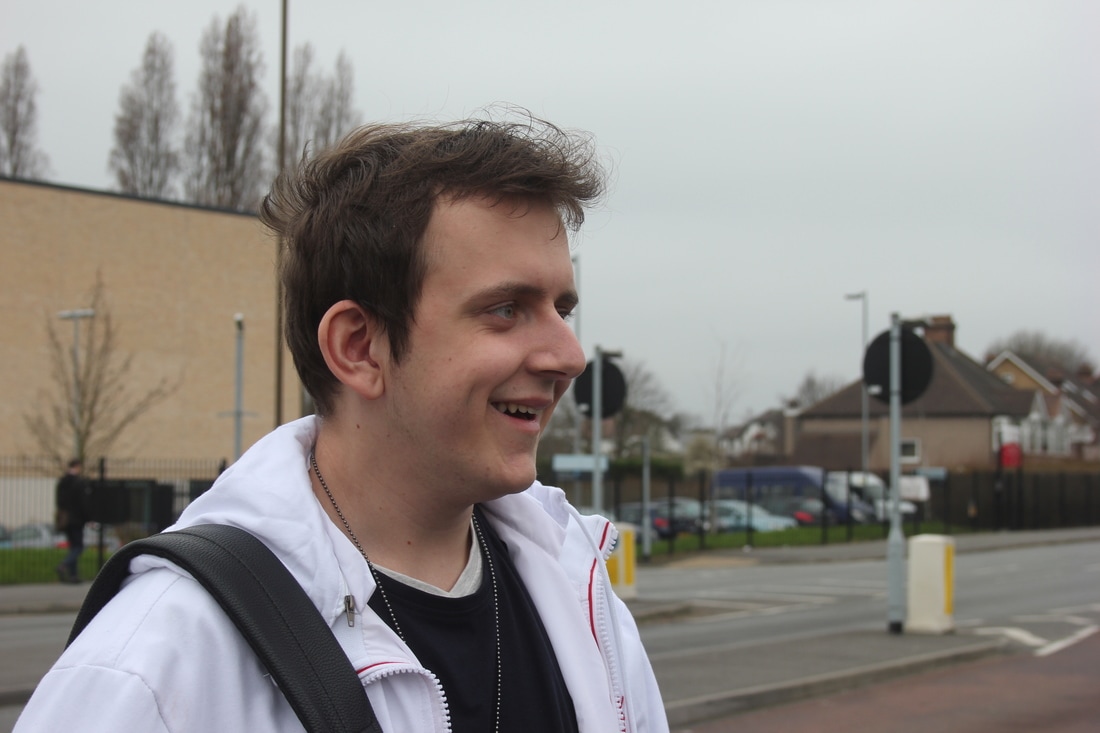
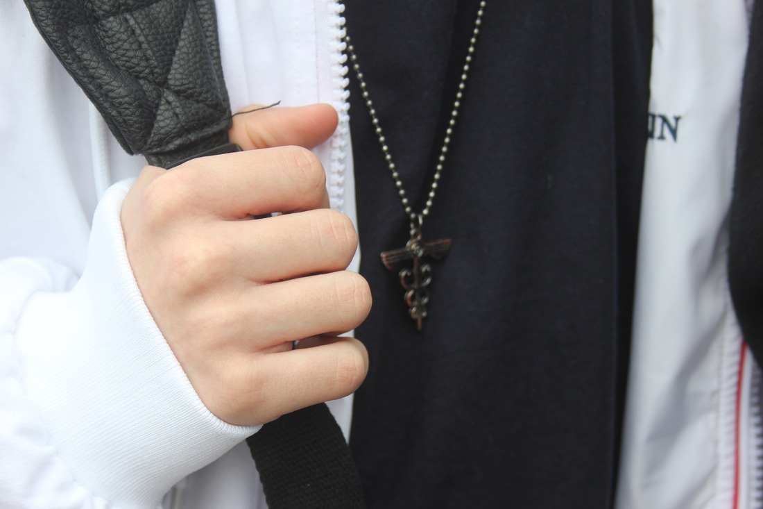
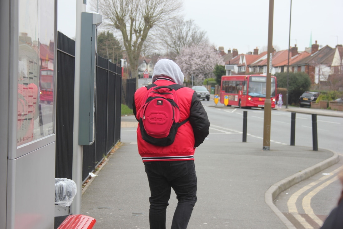
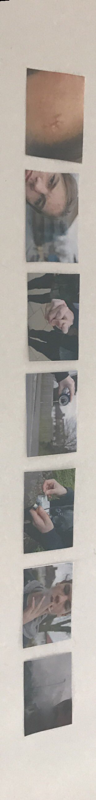
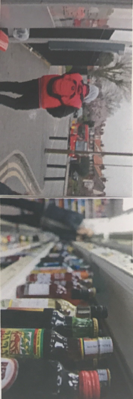
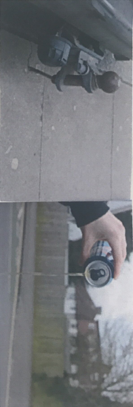
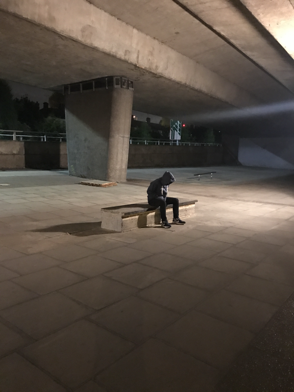
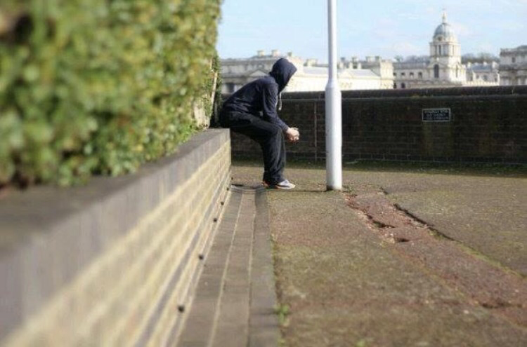
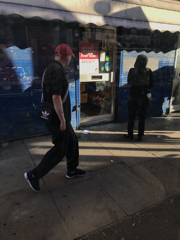
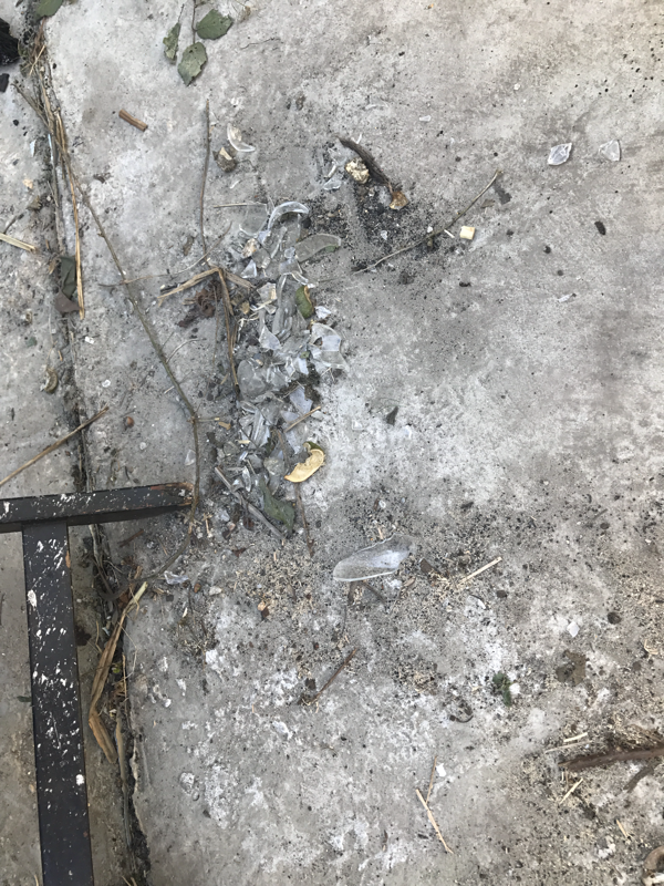
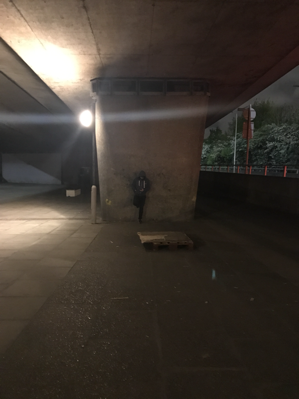
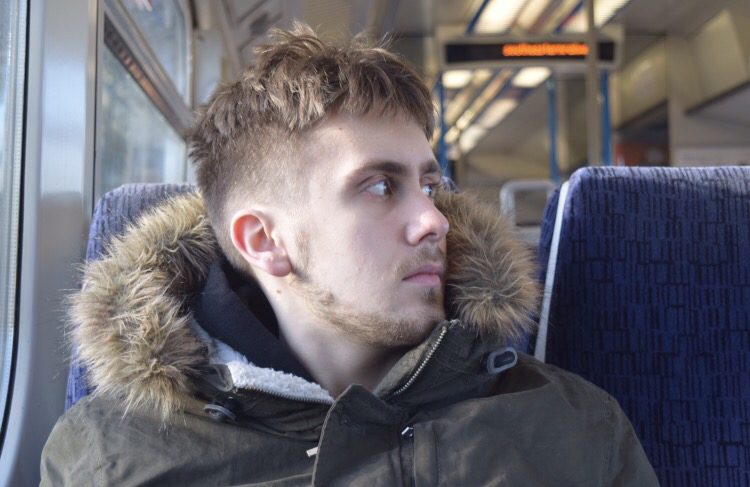
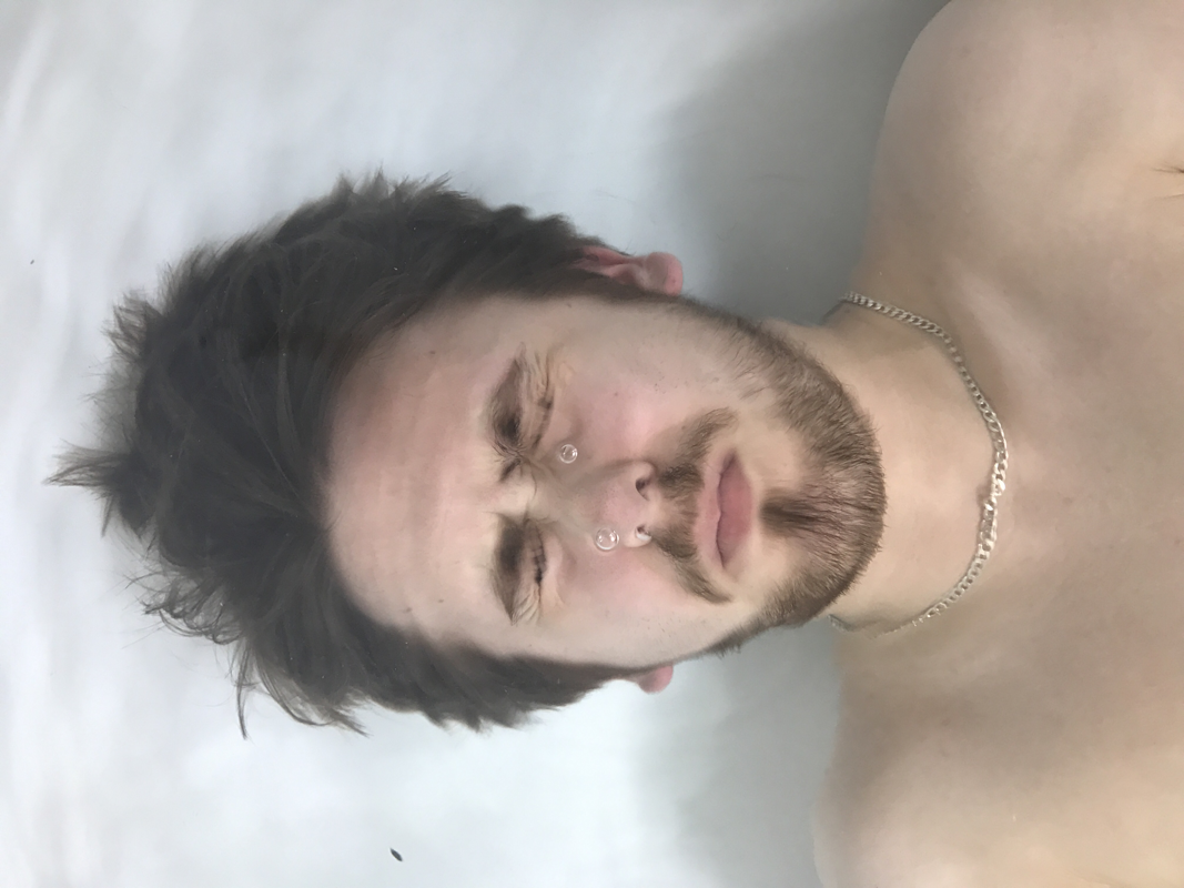
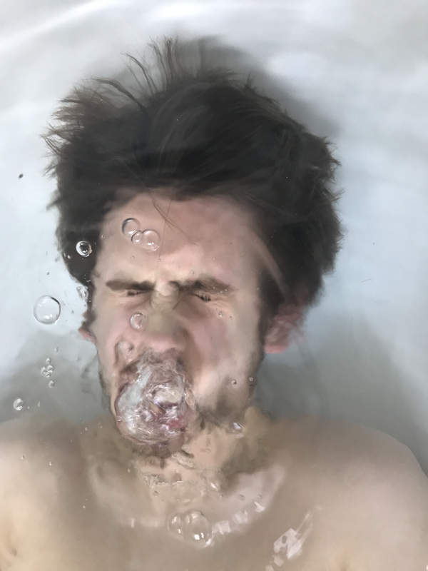
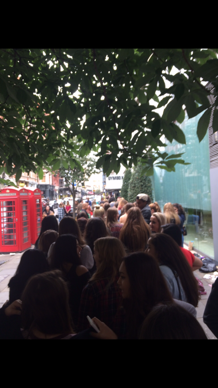
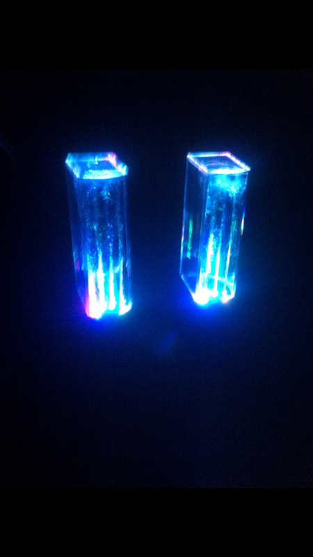
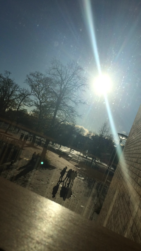
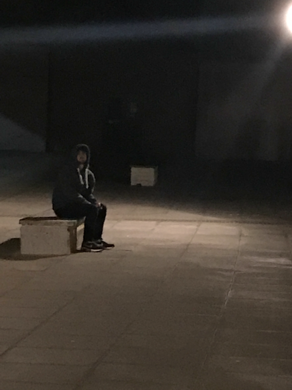
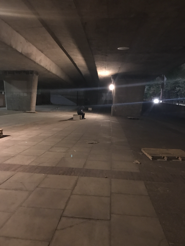
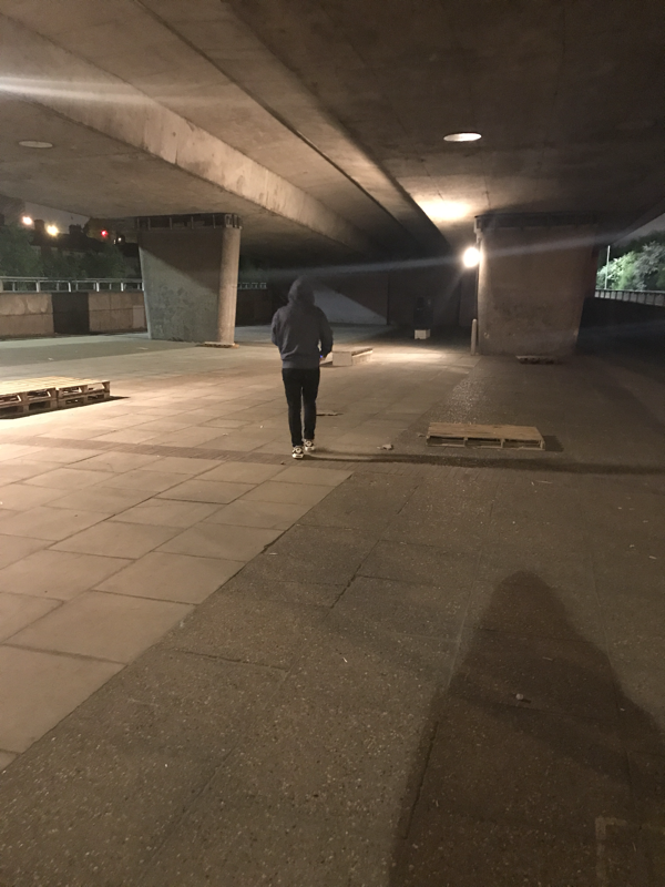
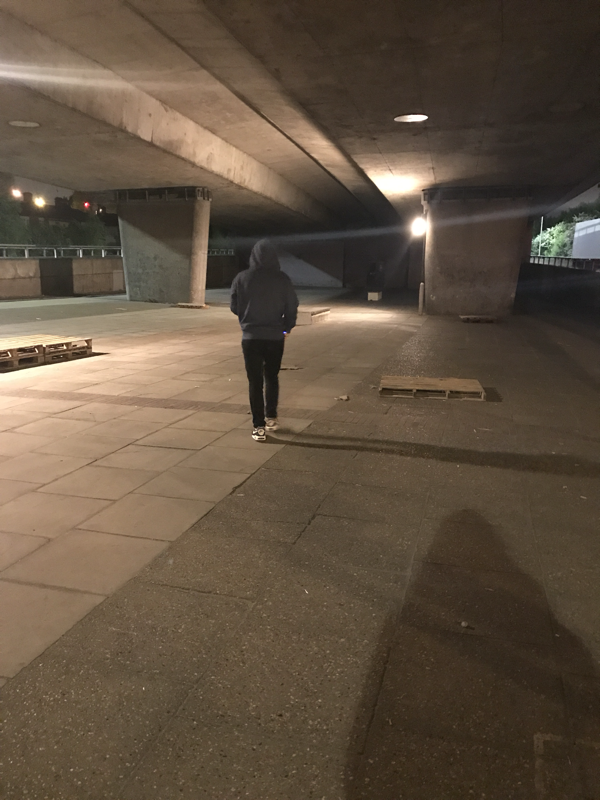
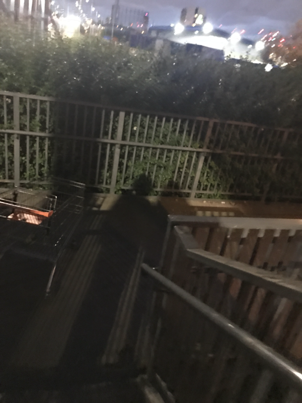
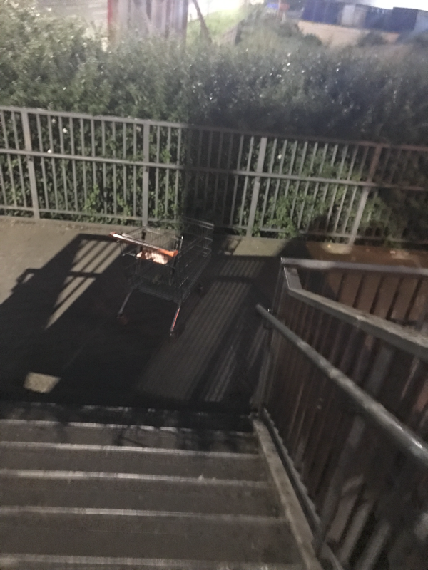
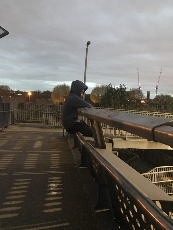
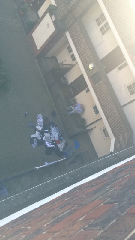
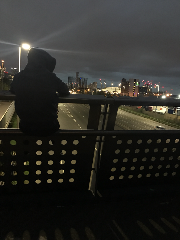
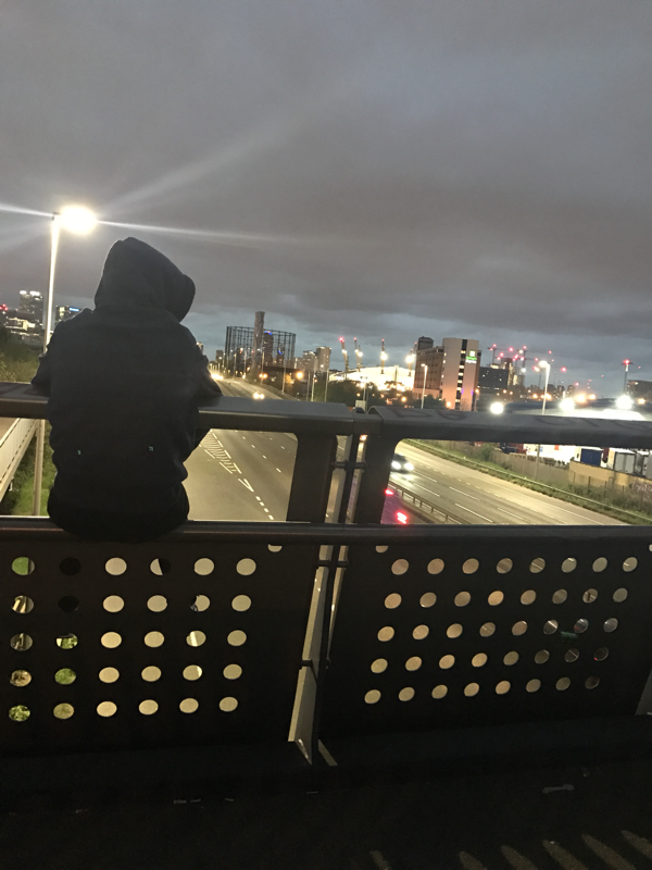
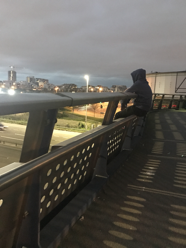
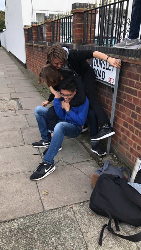
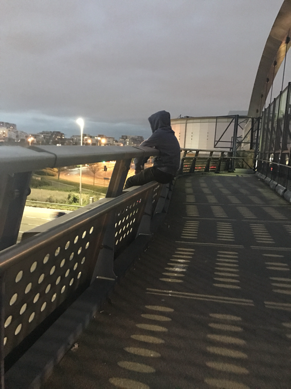
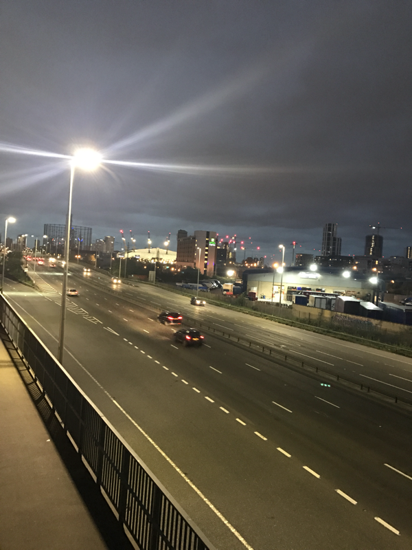
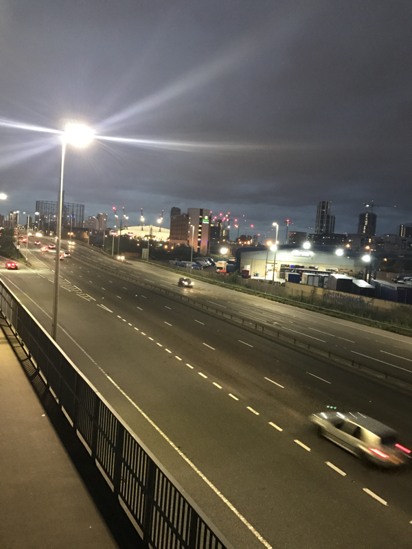
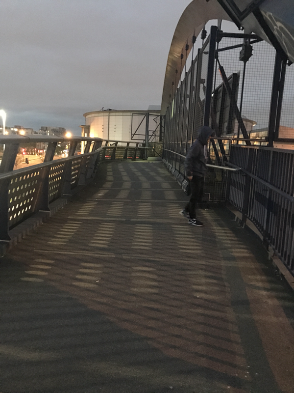
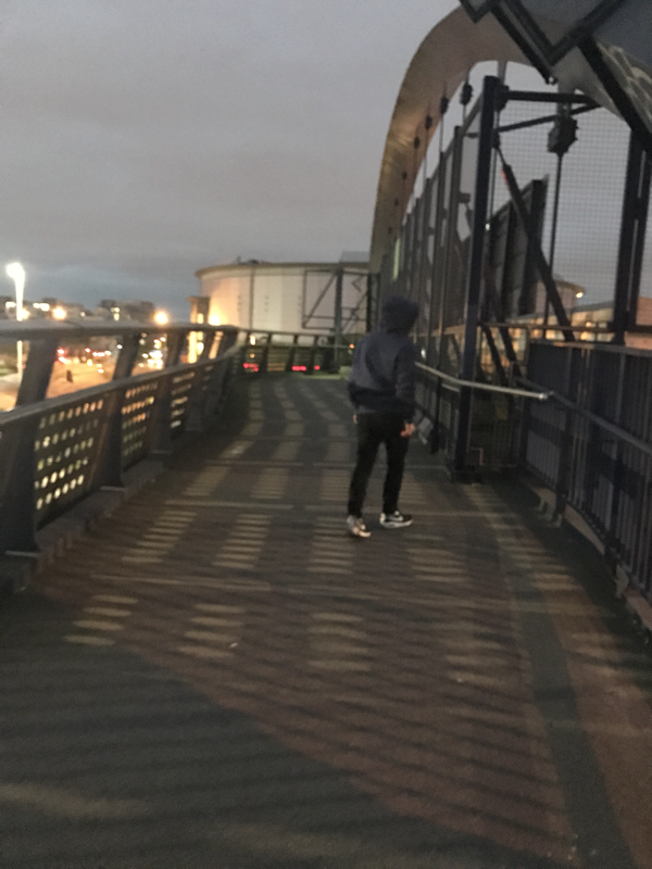
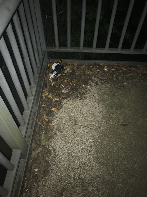
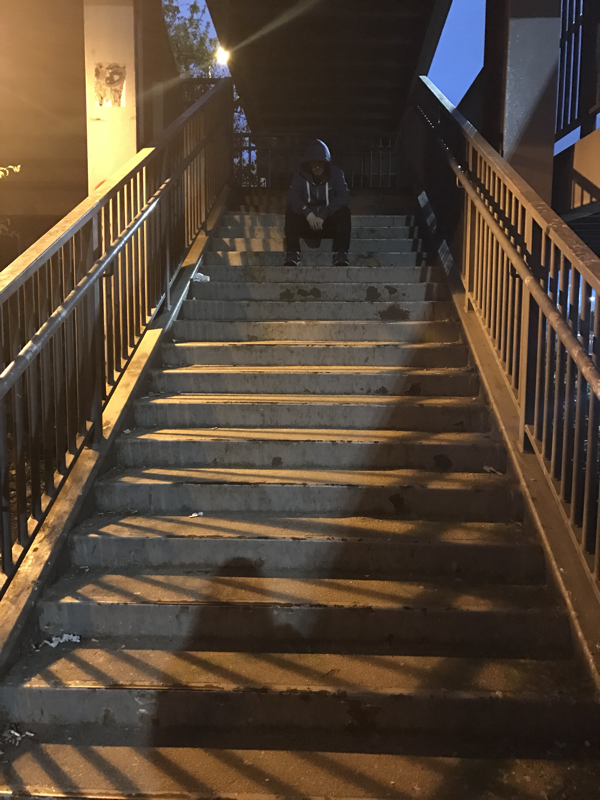
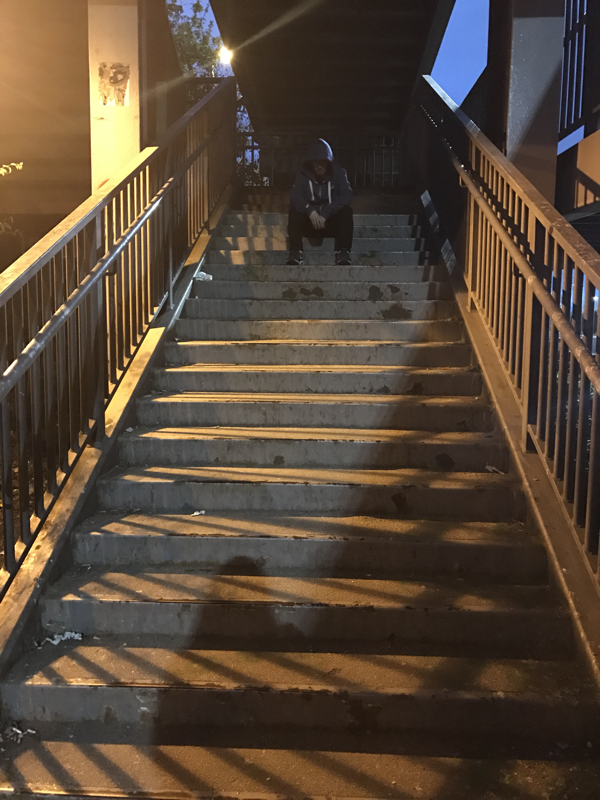
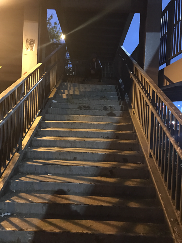
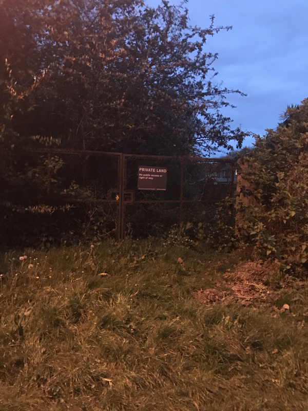
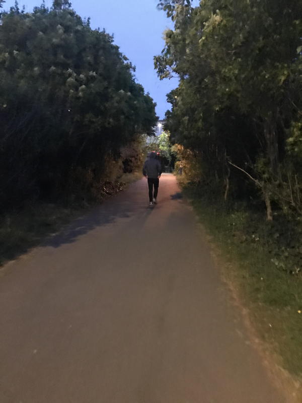
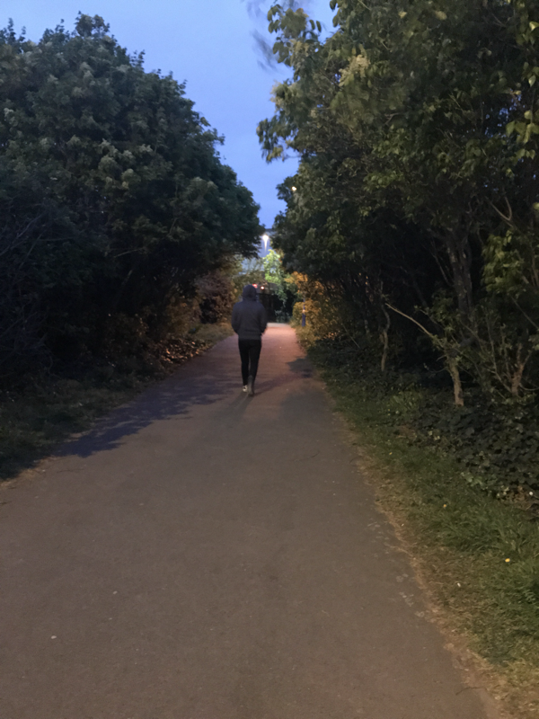
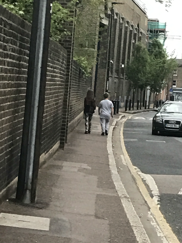
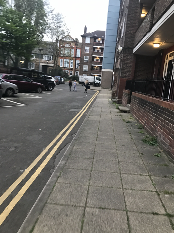
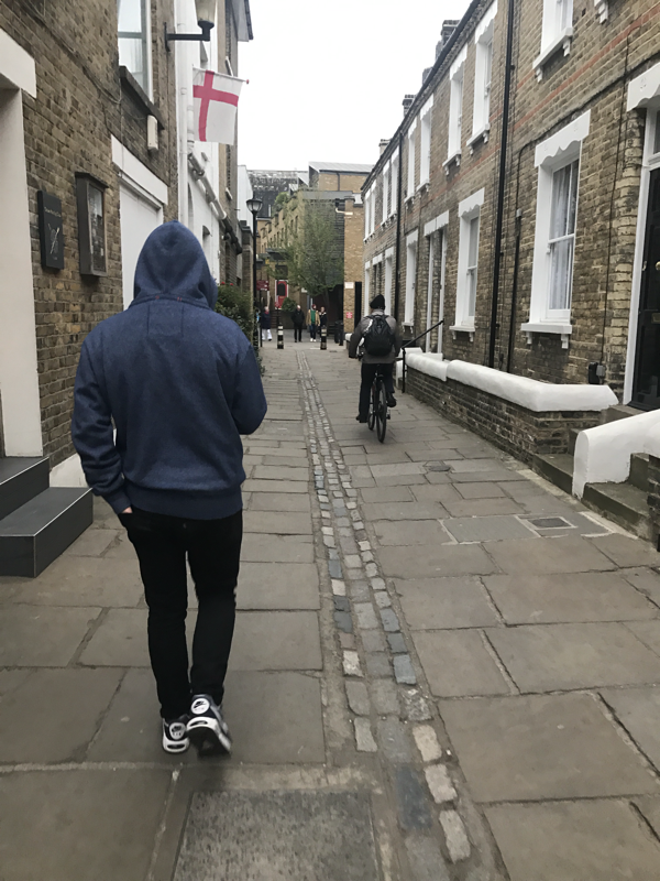
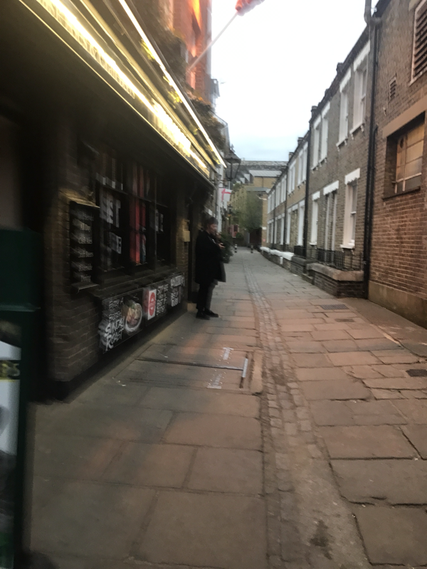
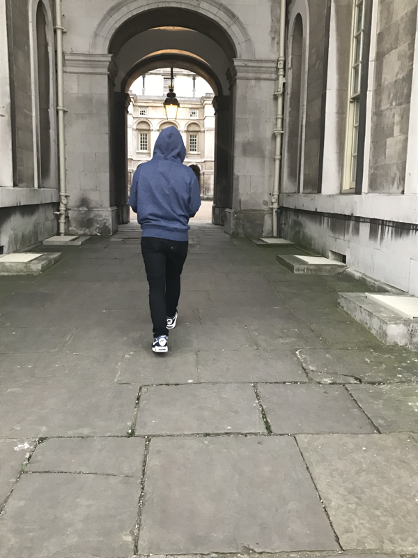
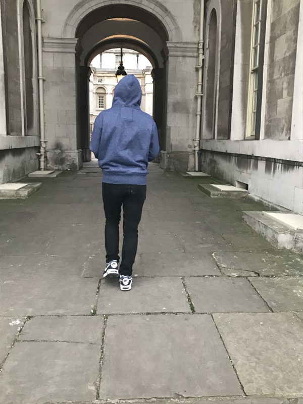
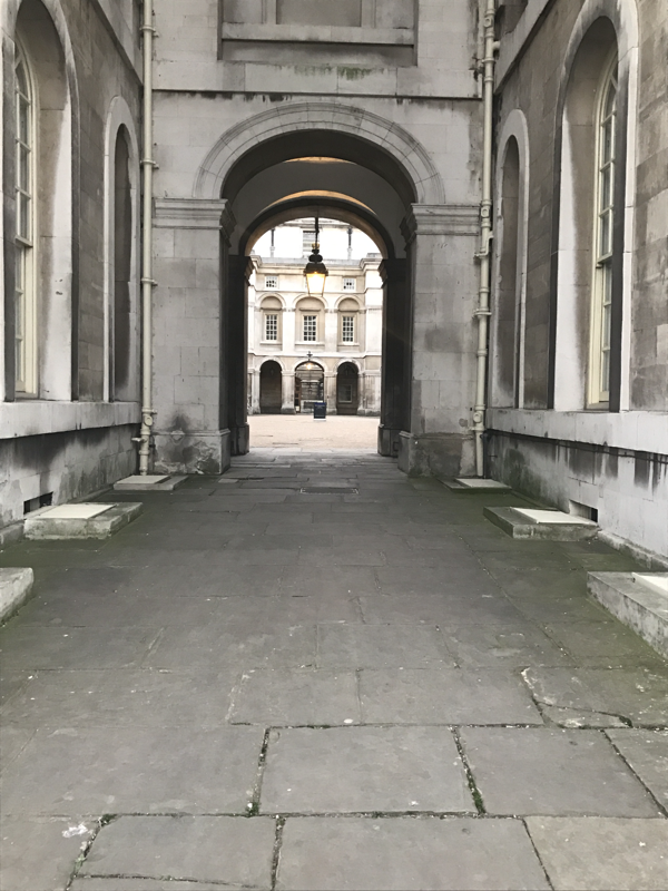
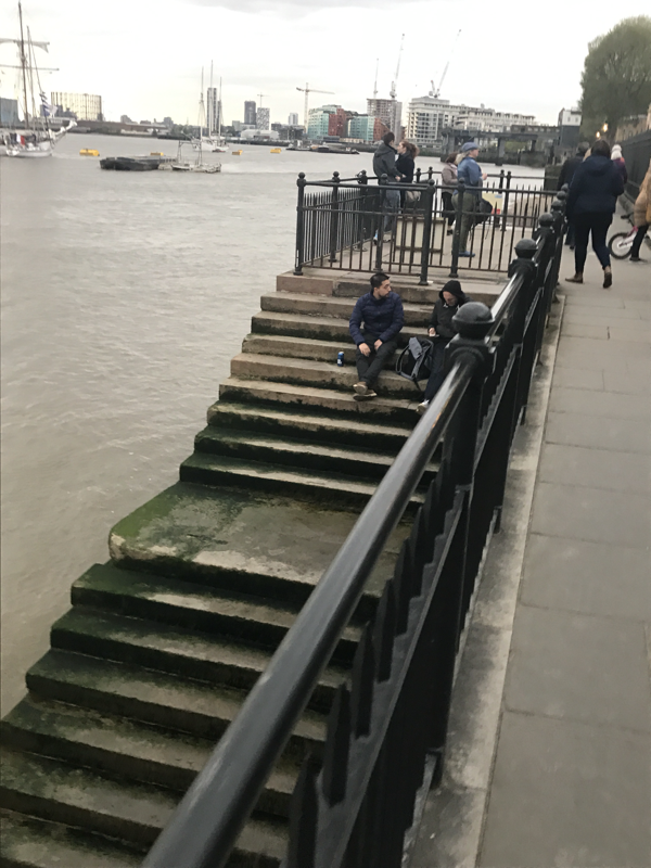
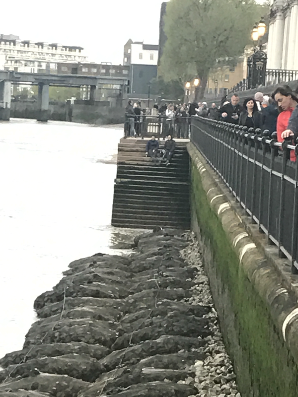
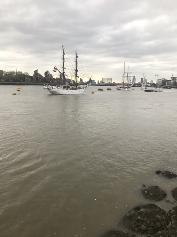
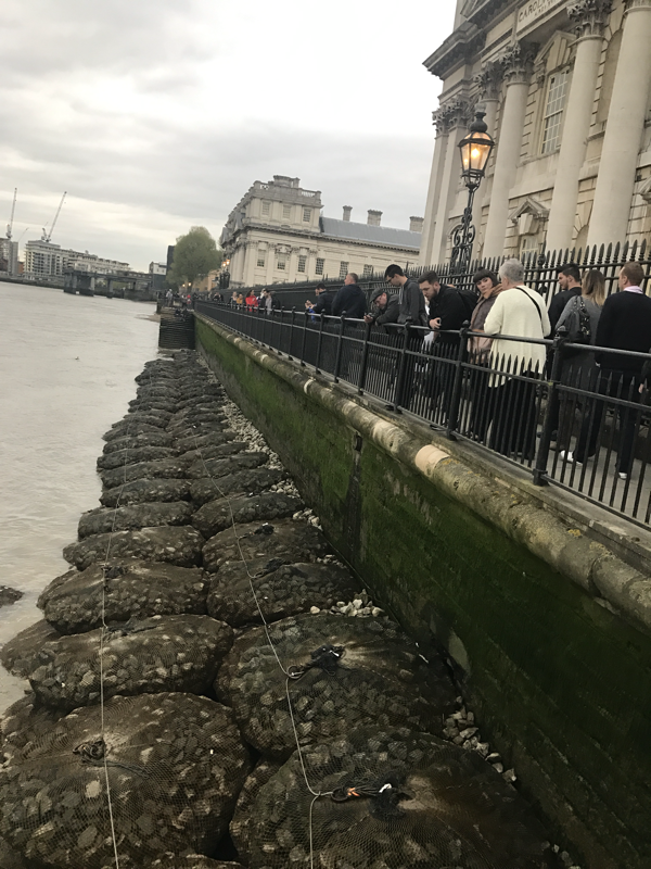
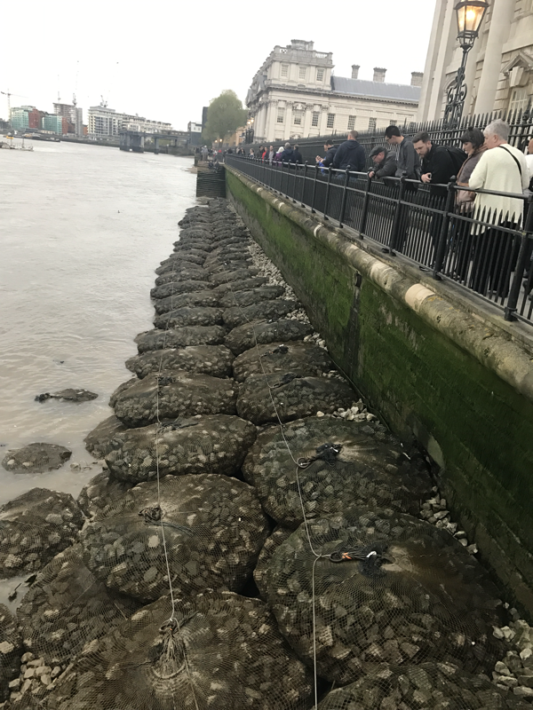
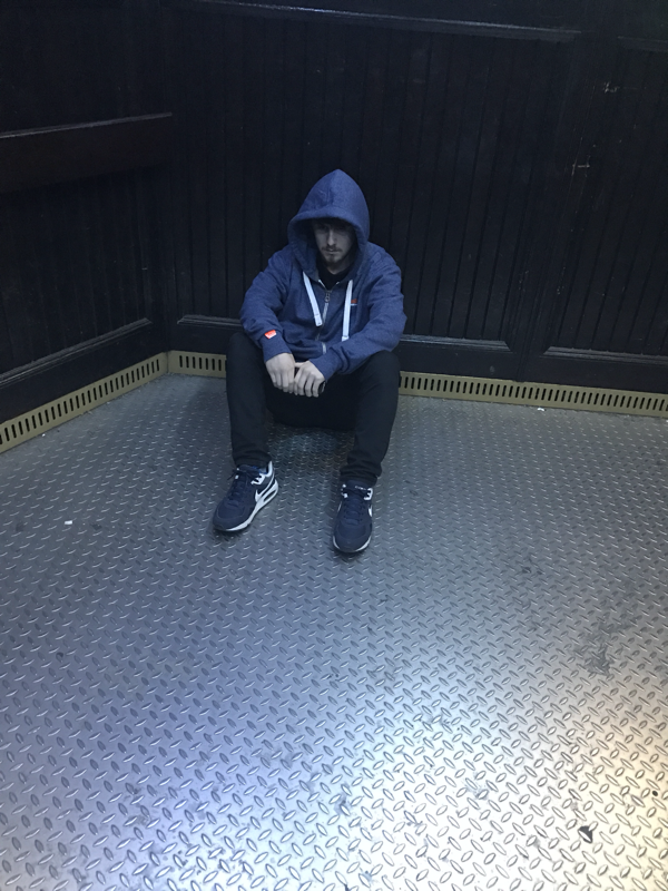
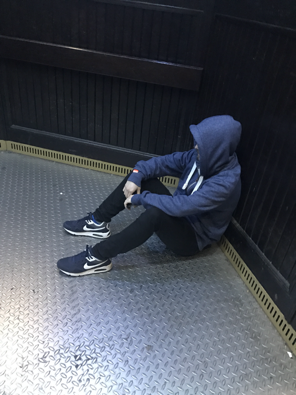
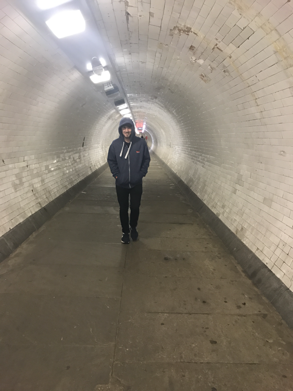
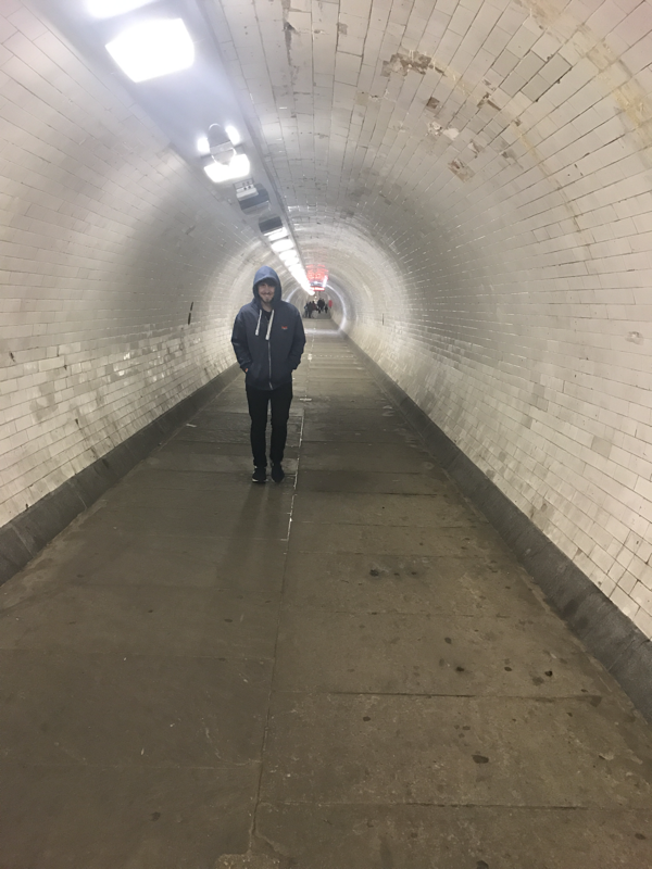
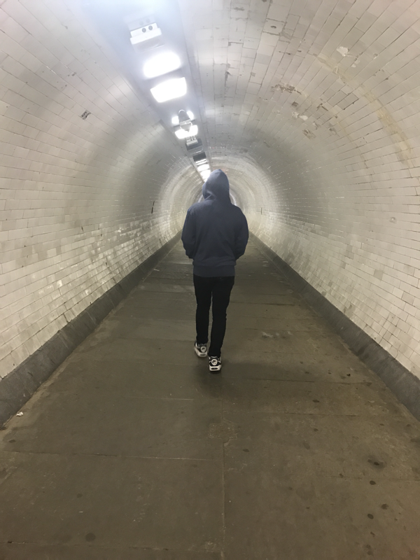
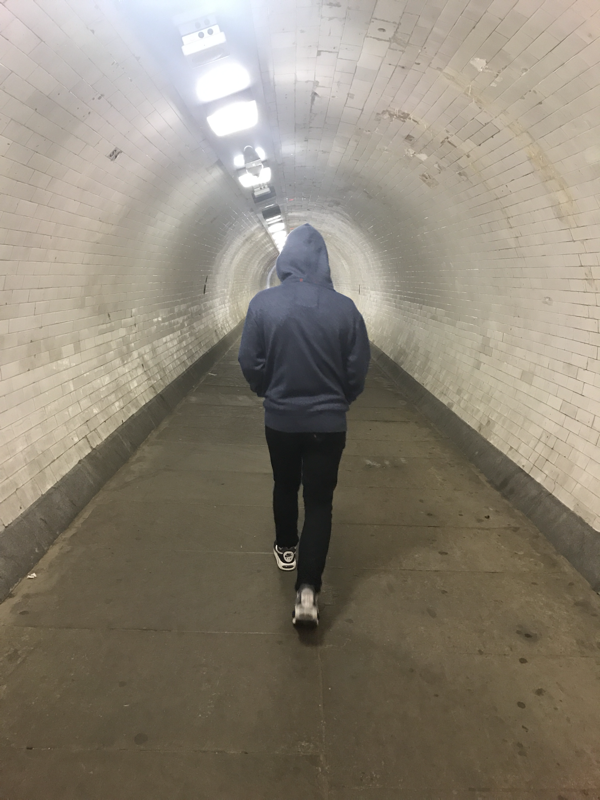
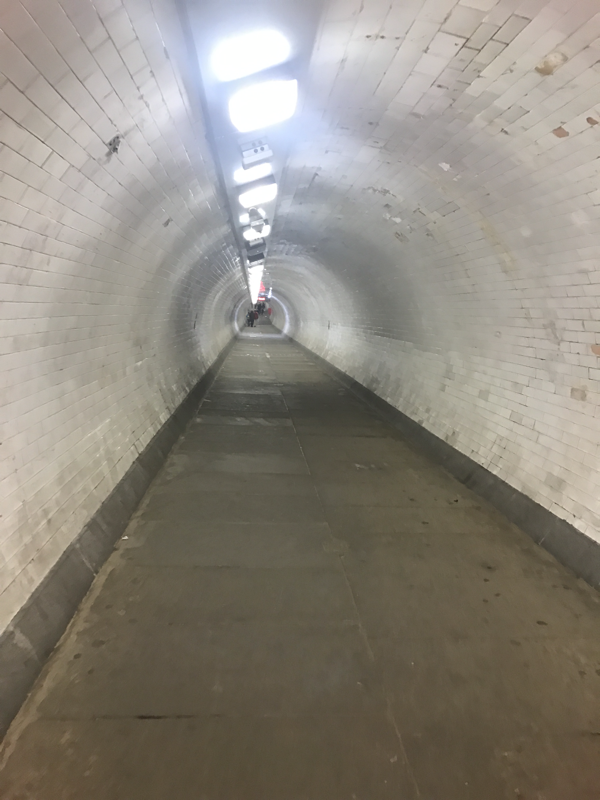
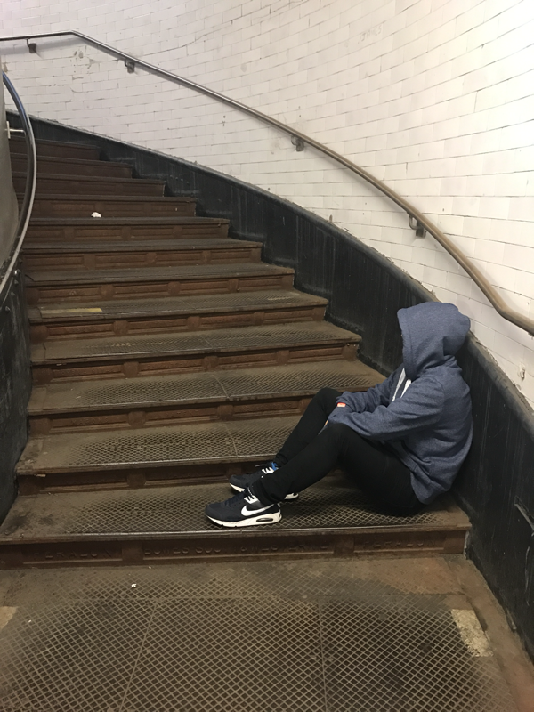
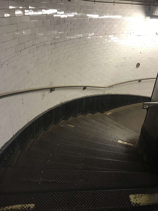
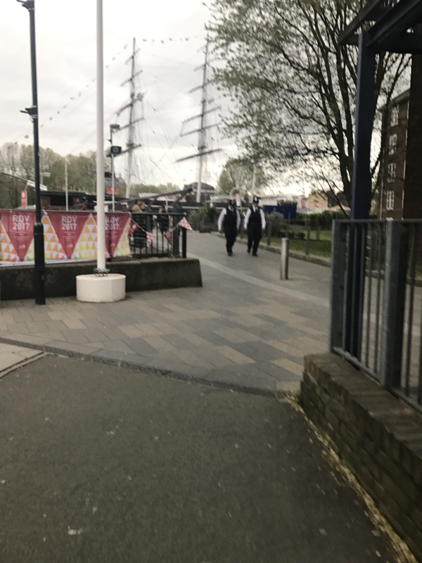
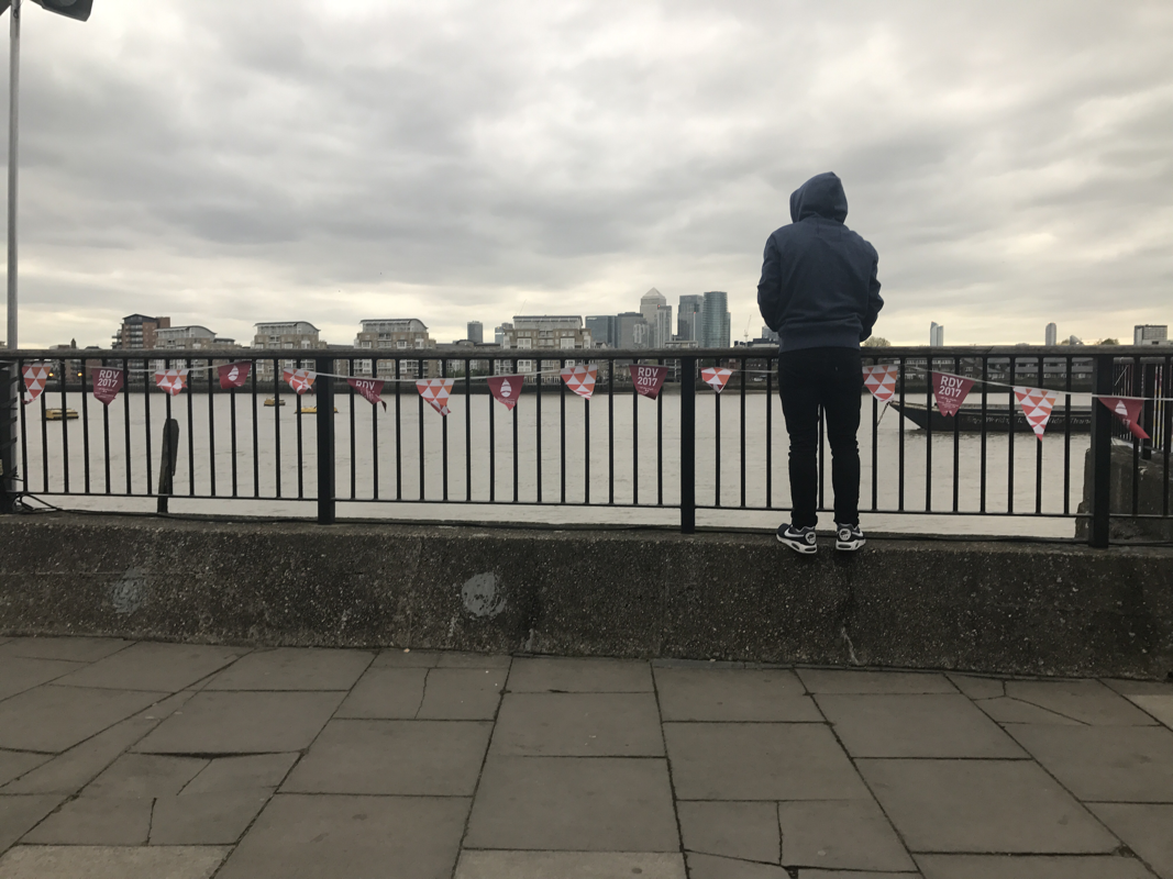
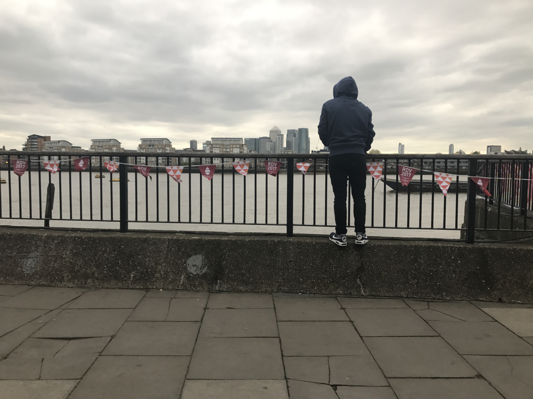
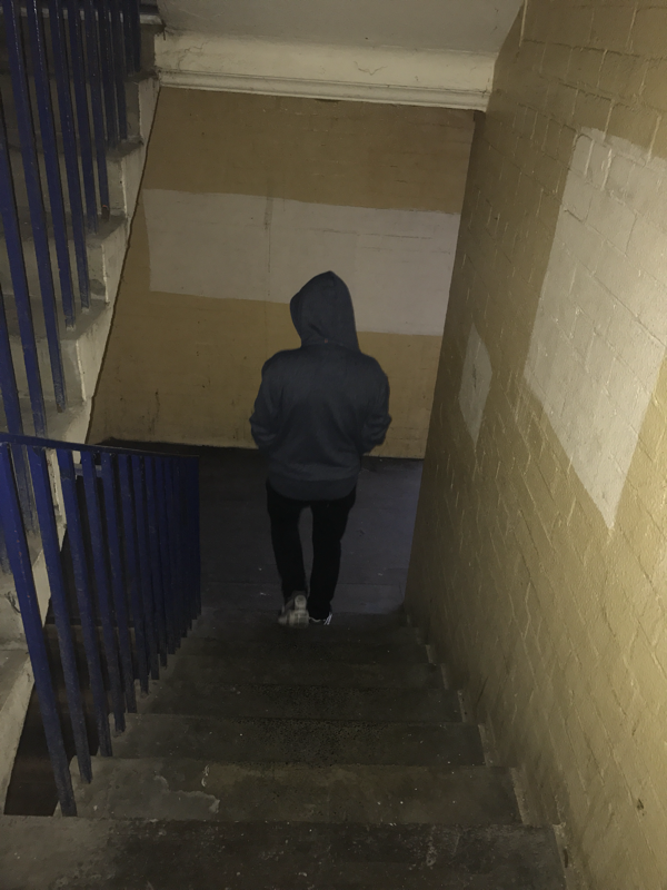
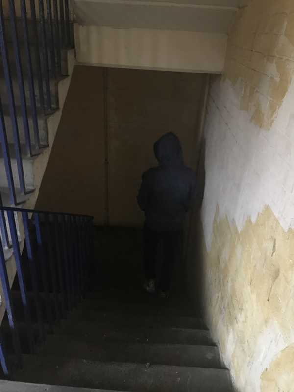
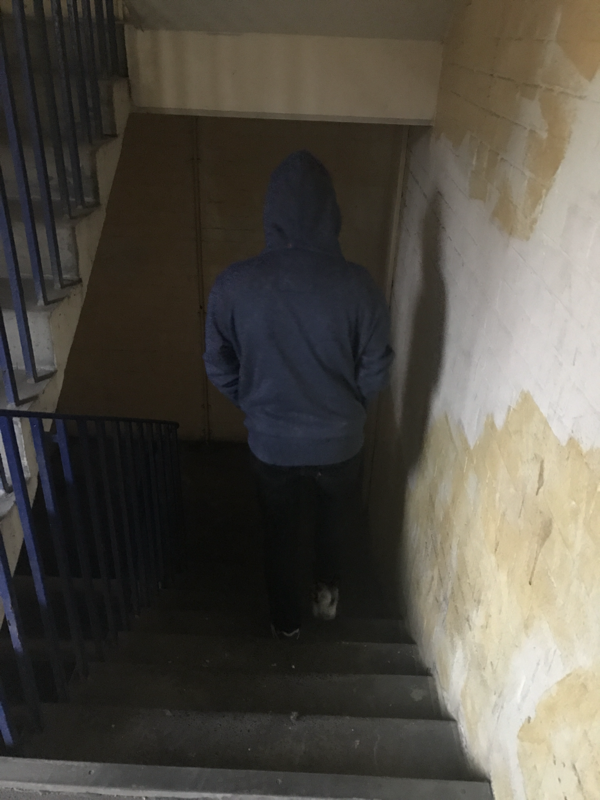
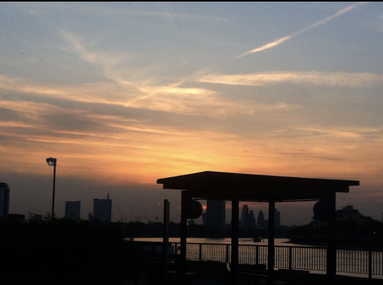
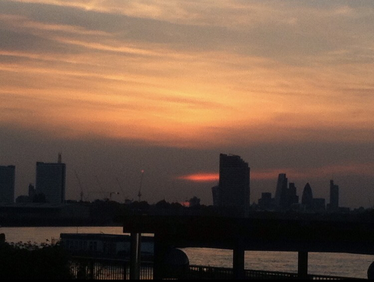
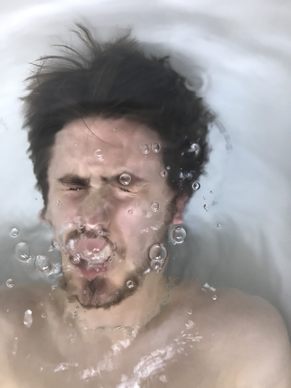
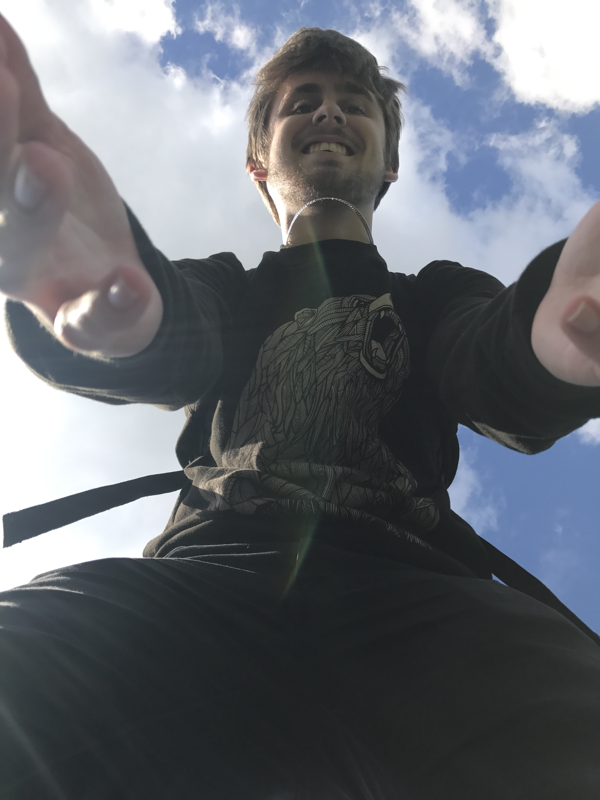
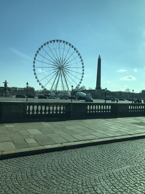
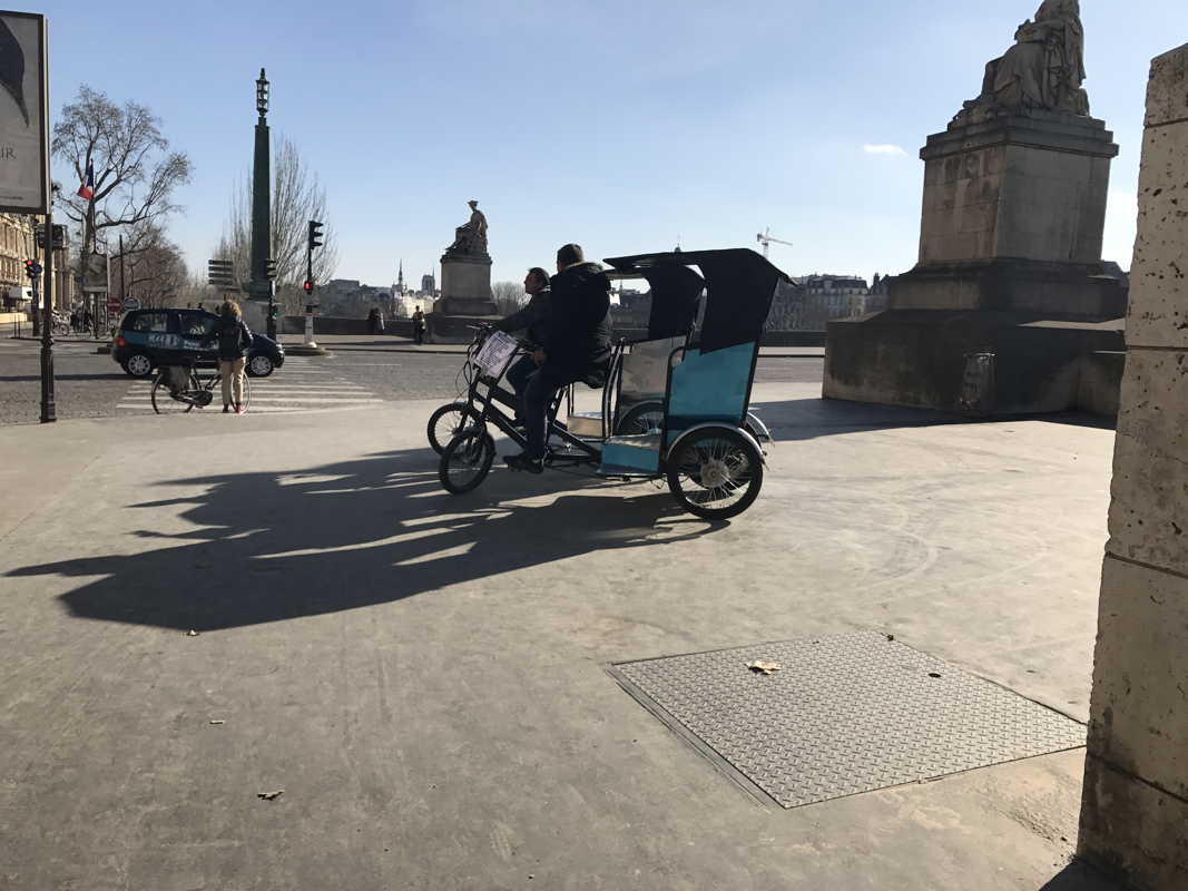
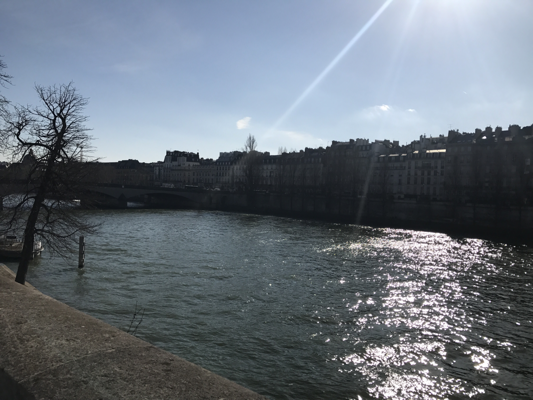
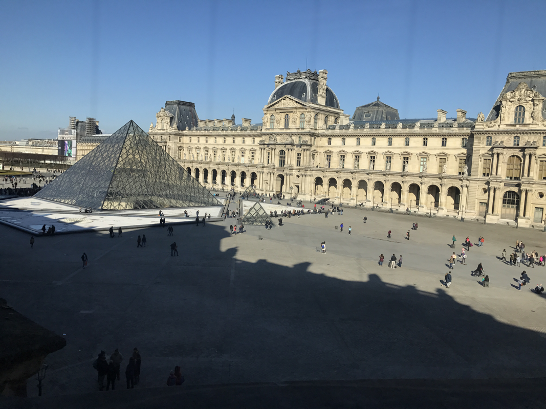
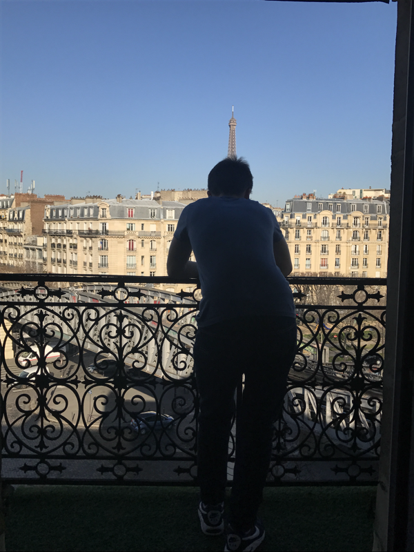
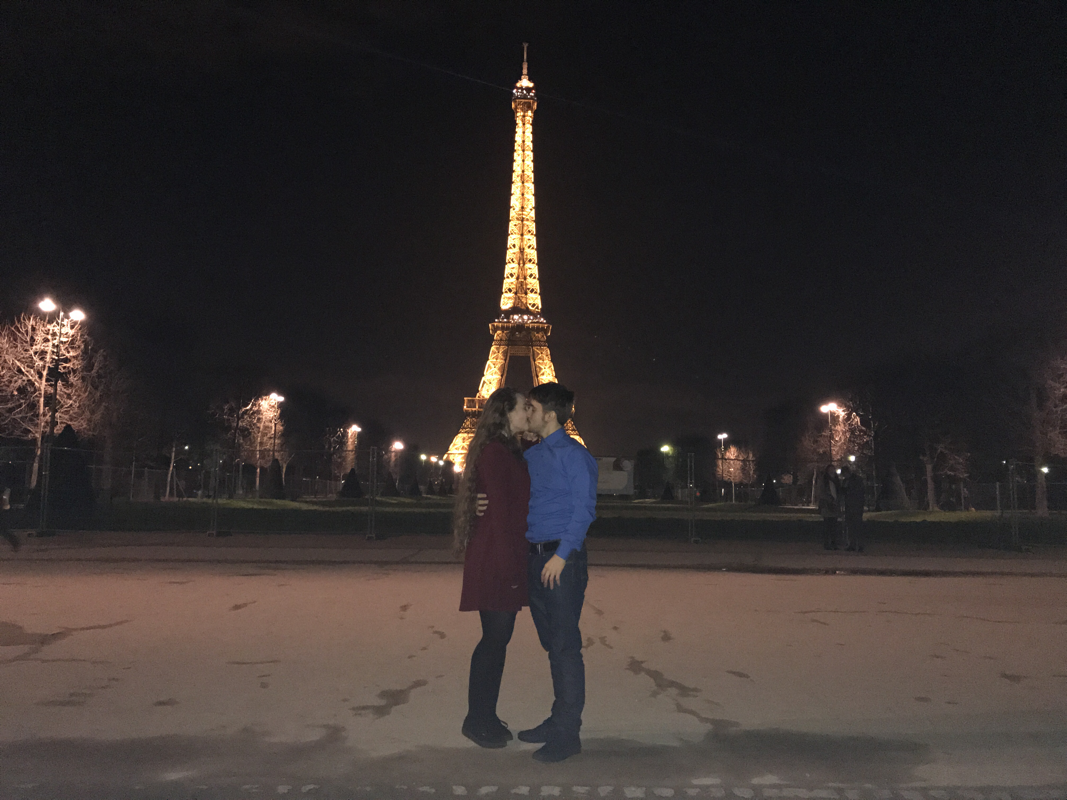
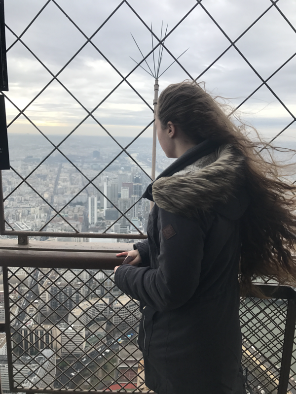
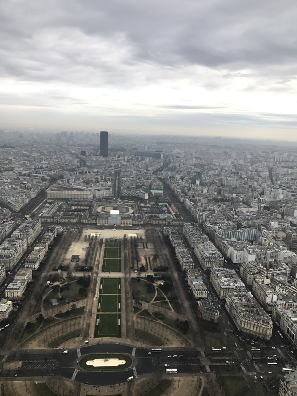
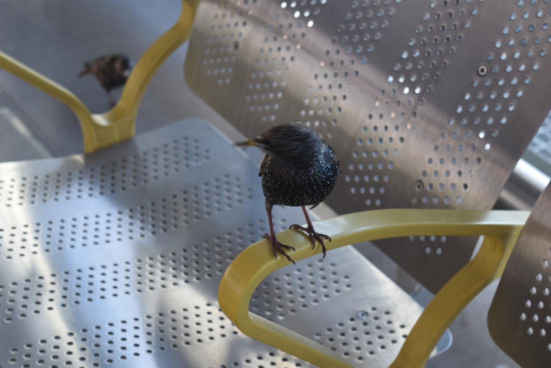
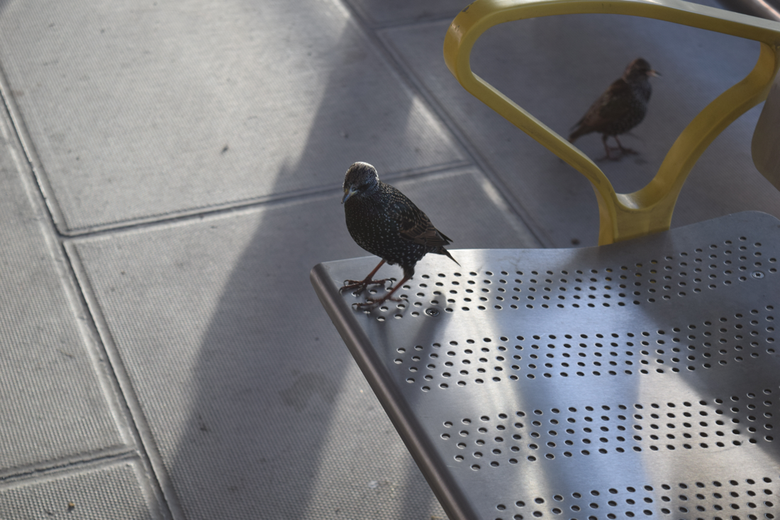
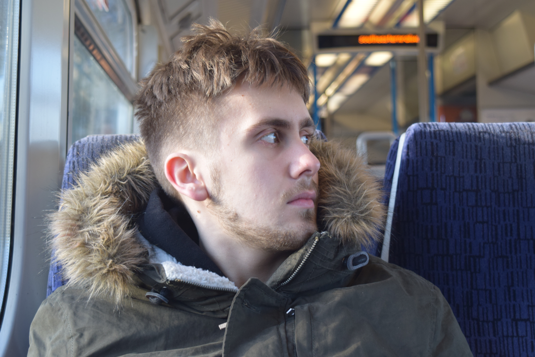
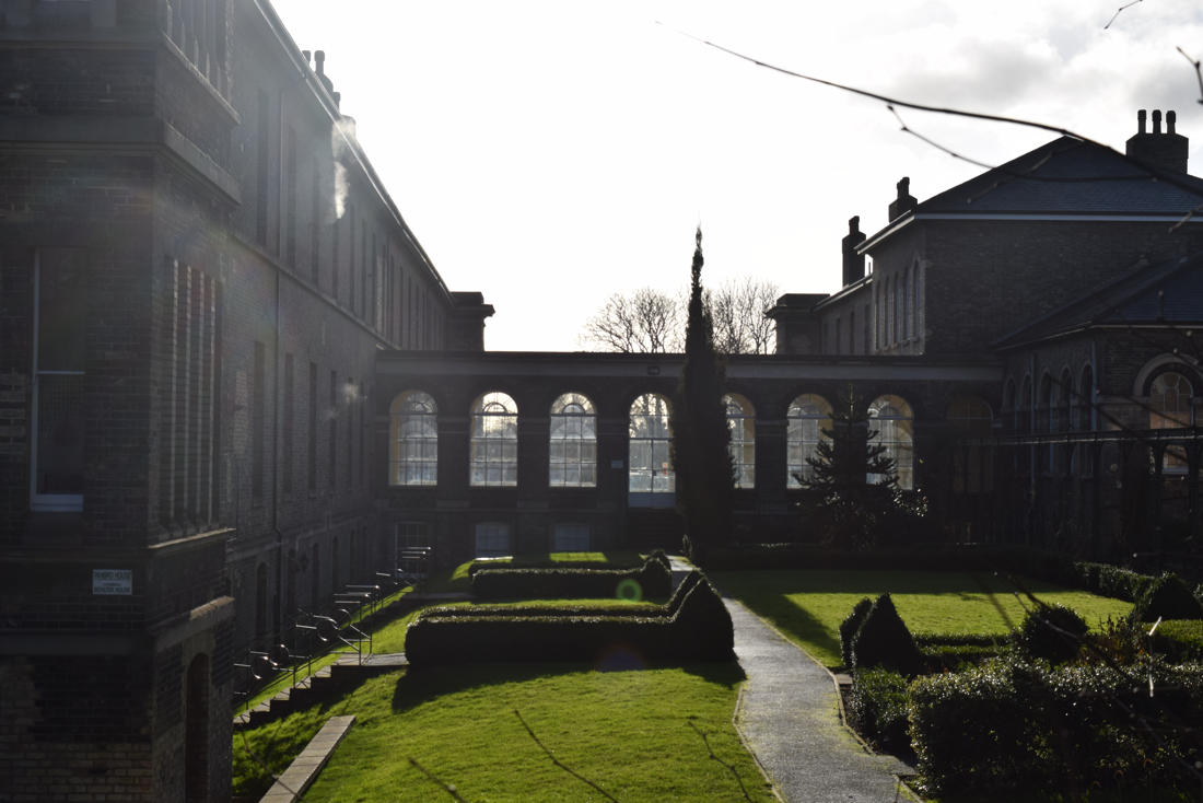
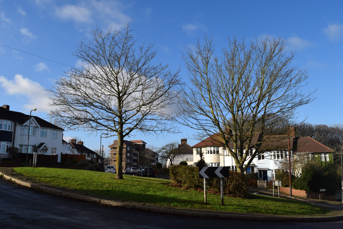
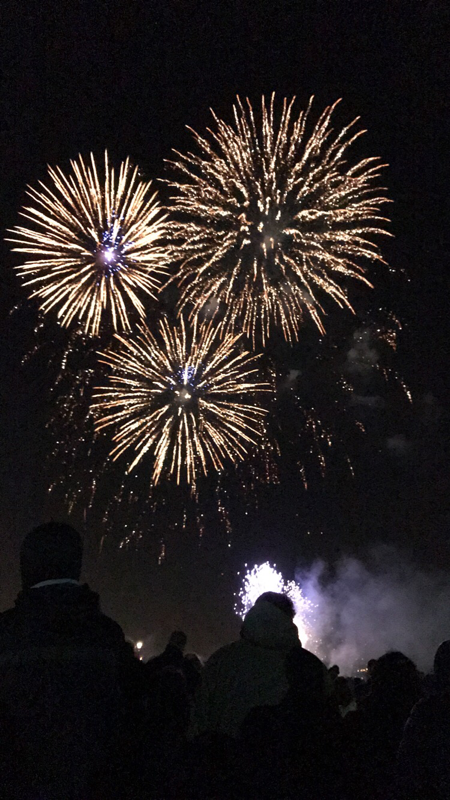
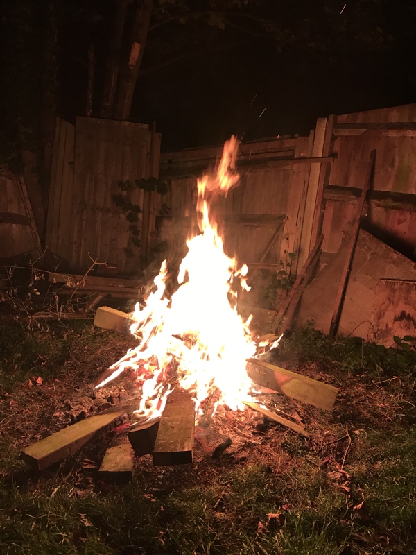
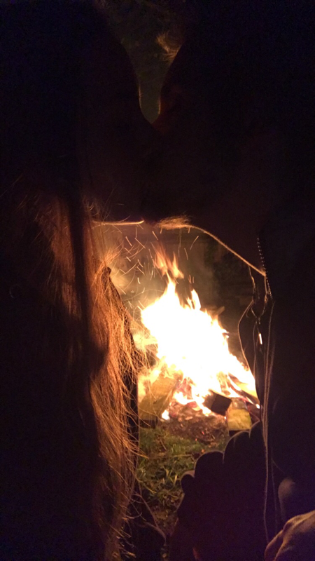
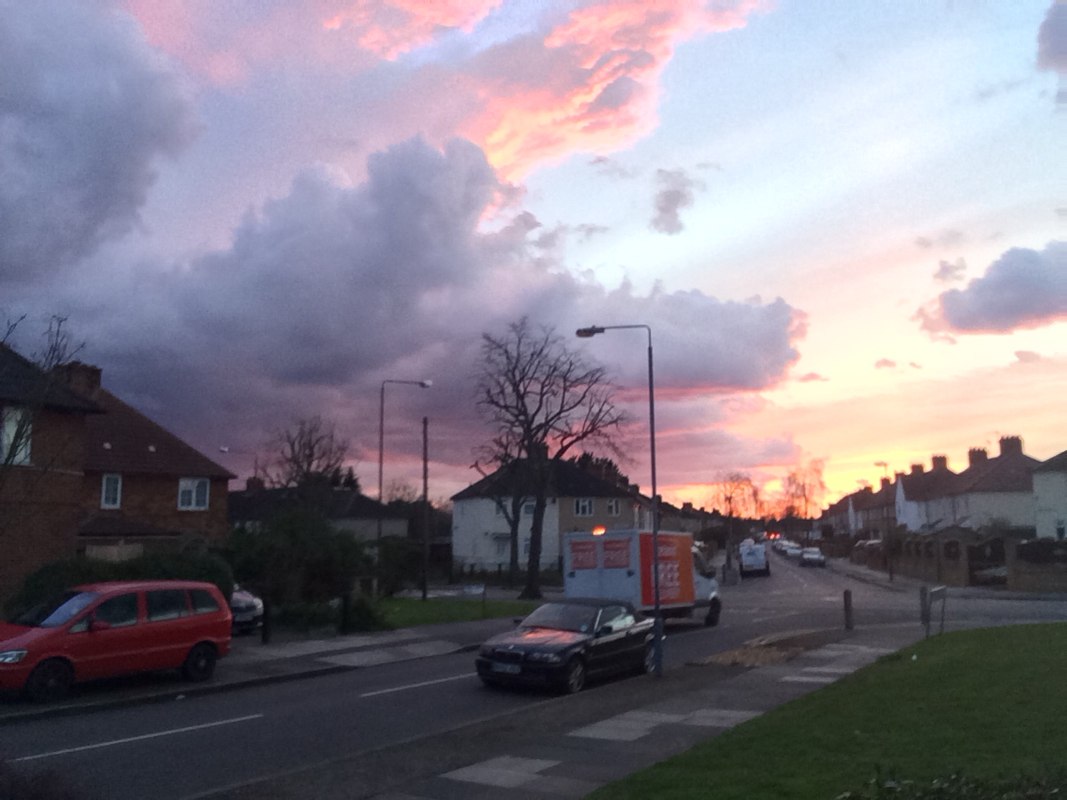
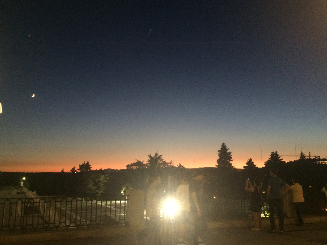
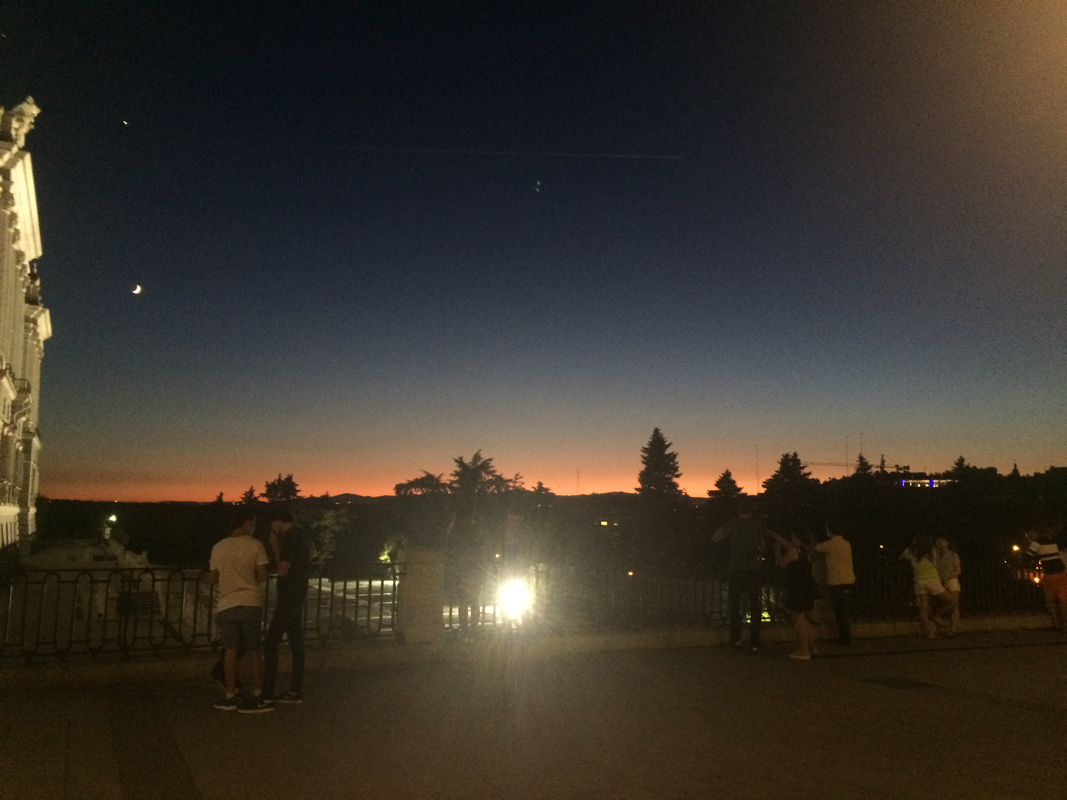
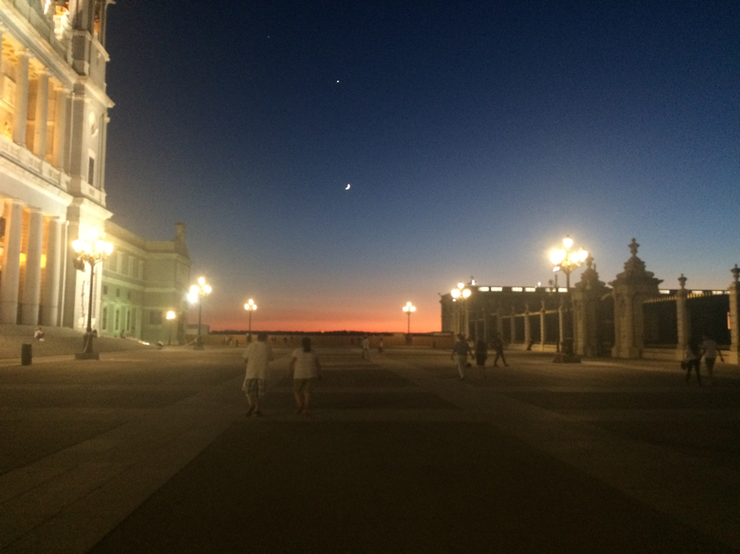
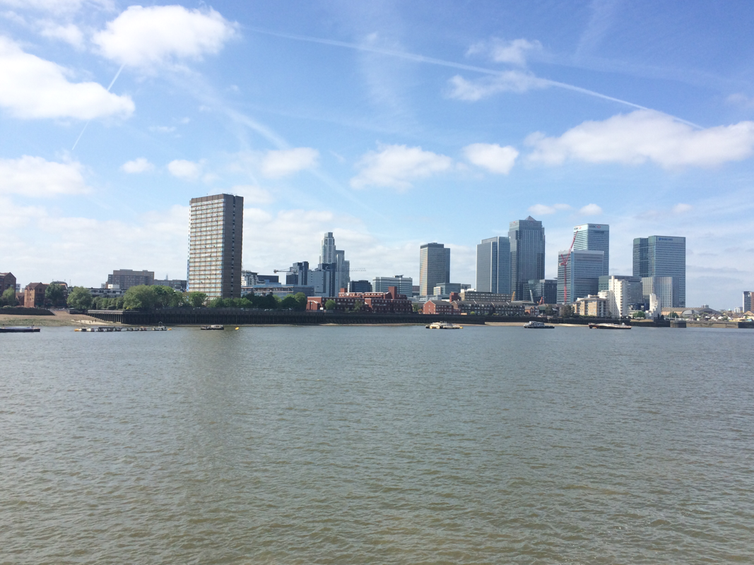
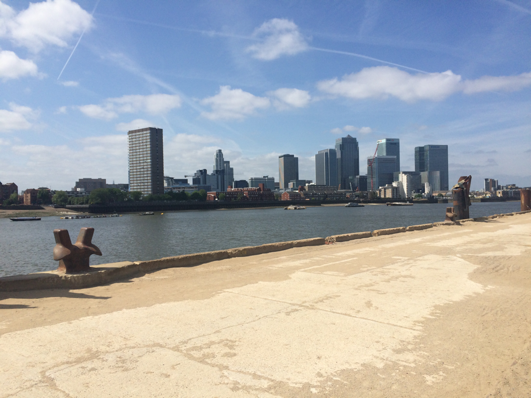
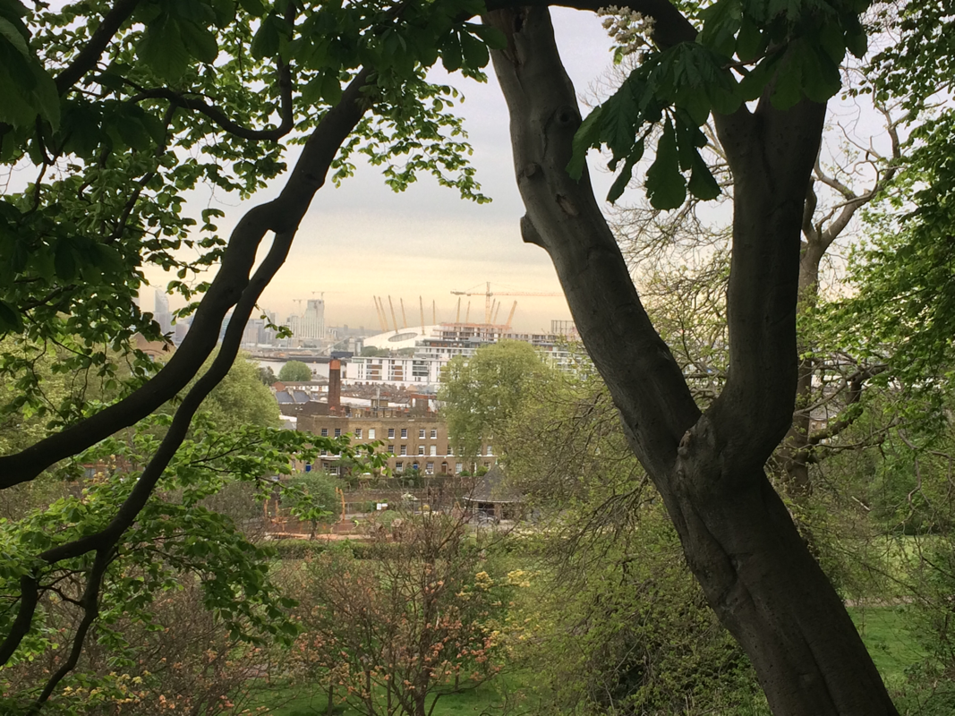
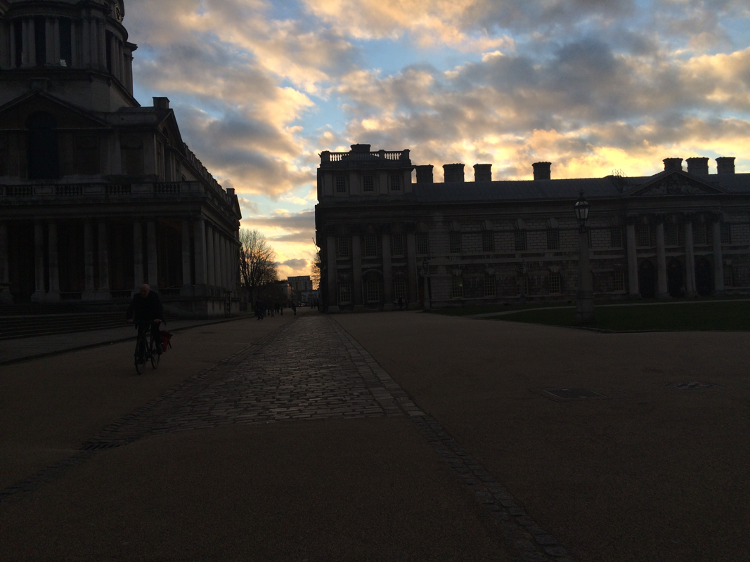
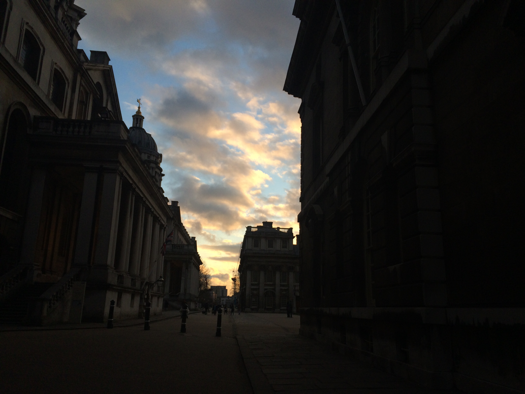
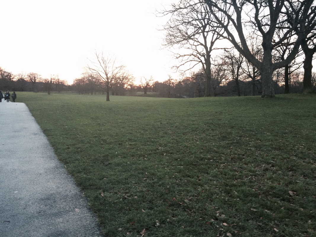
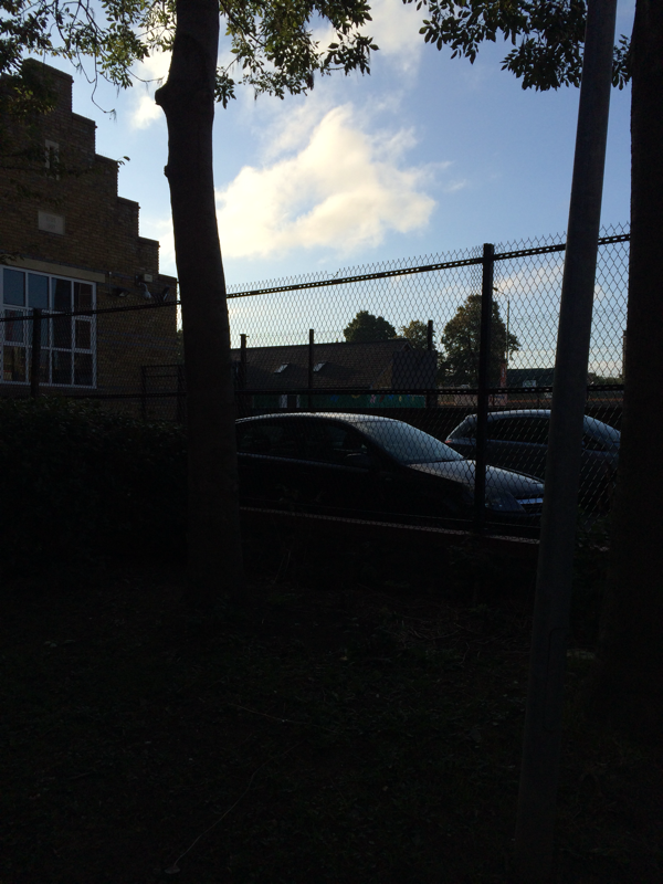
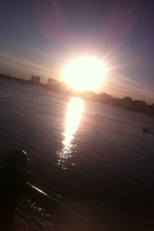
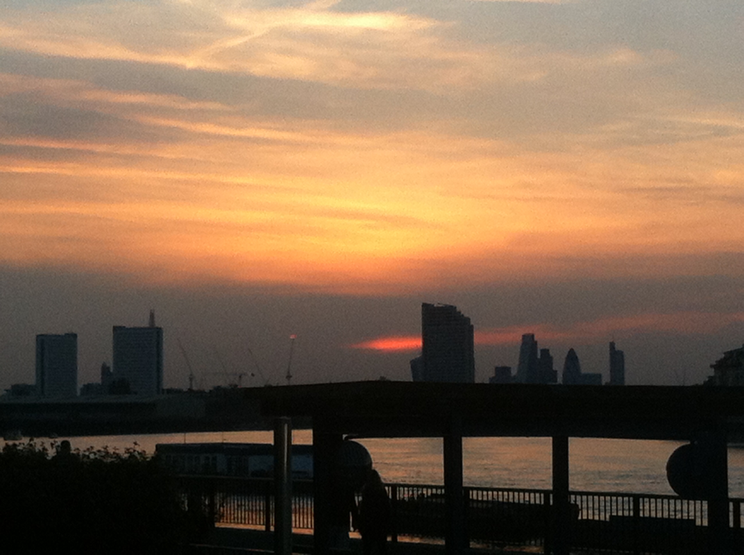
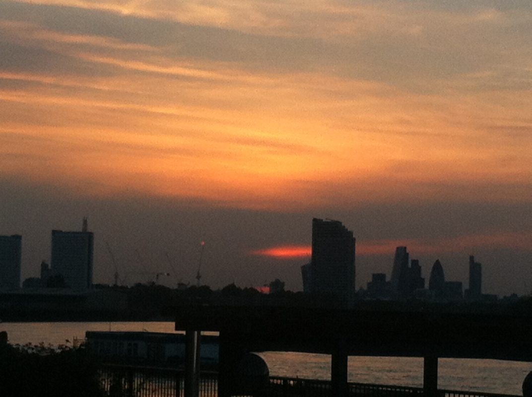
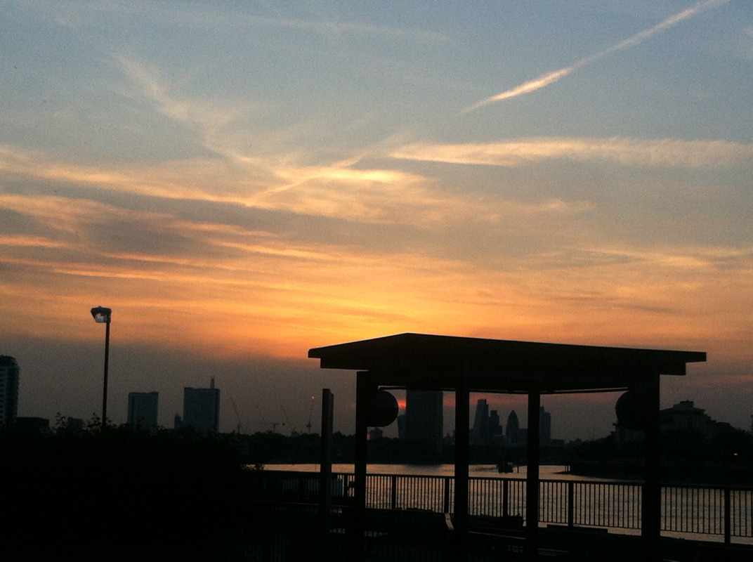
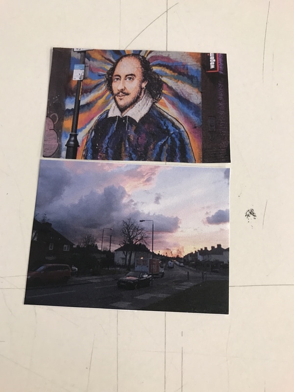
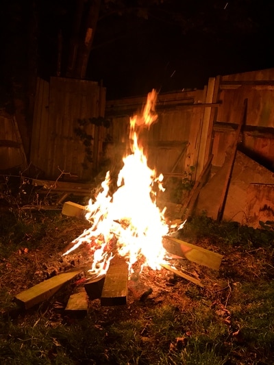
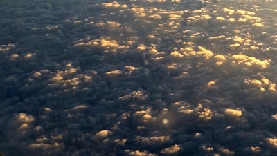
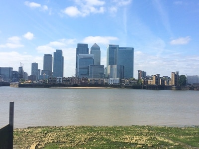
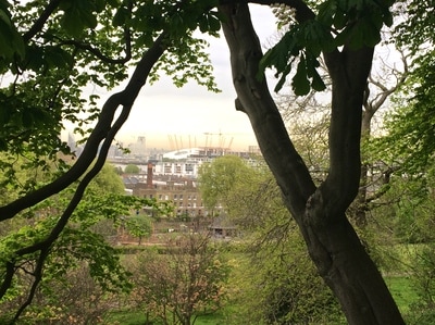
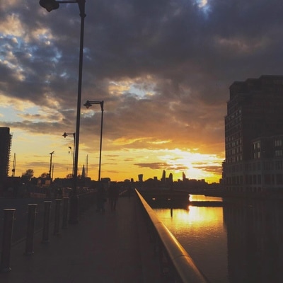
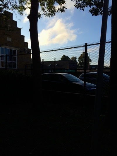
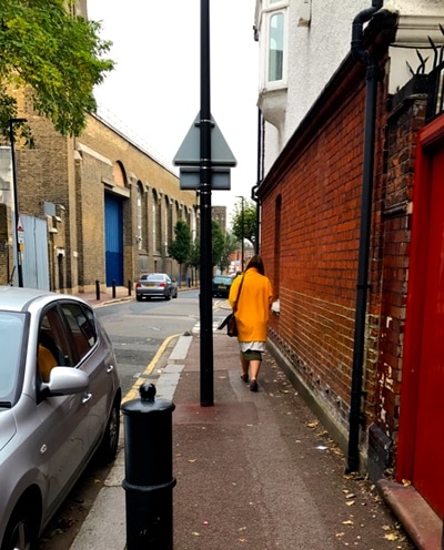
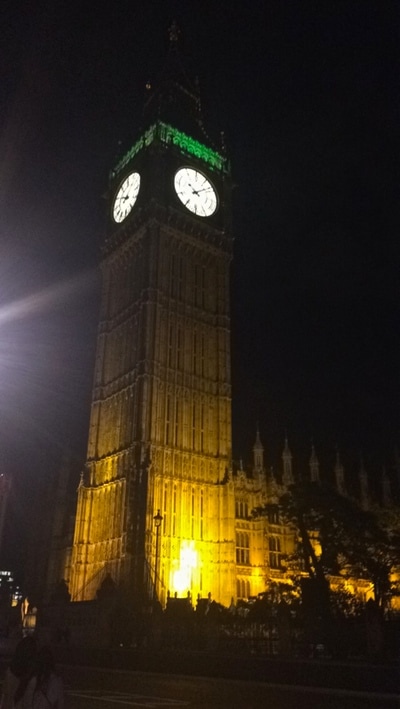
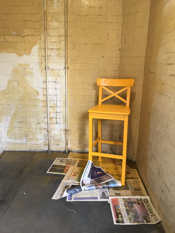
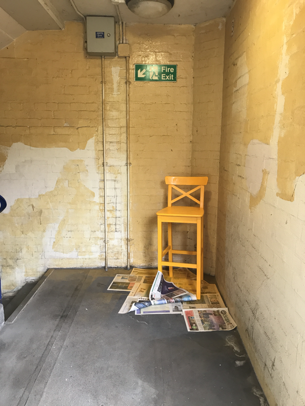
Today the task was to walk around and take pictures of things we observe this may be something that is spontaneous or something that we notice everyday. I decided to take some pictures of things I notice everyday such as, the scar on the boys head or the christmas tree that is still up in the photography room but then I also decided to walk around whist observing everything and take pictures of things I decided was interesting. This will be helpful because I will then print out the images and decided which images look best next to each other when printed. This is a good way of expressing yourself because all the images you have taken have no meaning they have just caught your eye but then when placed next to another image that has nothing to do with it the image then becomes special and each image brings out the beauty of the other.
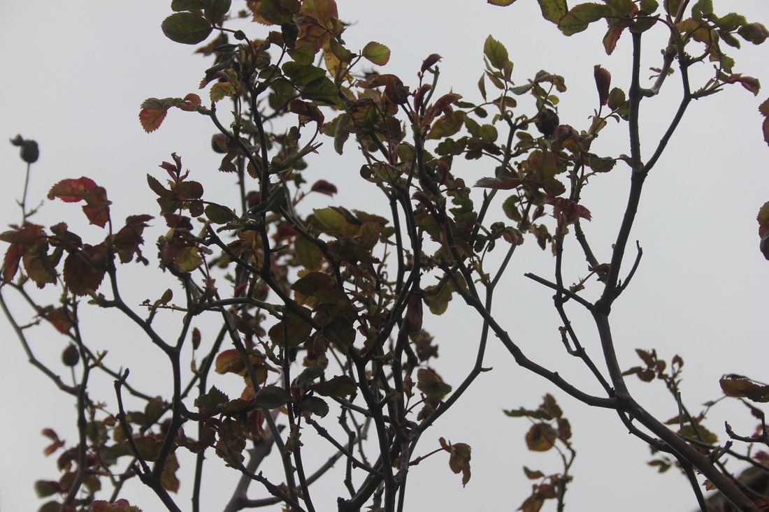
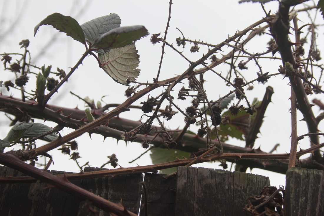
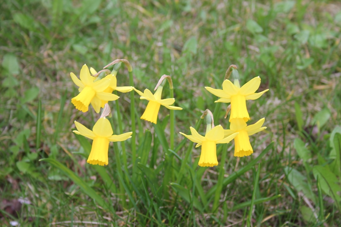

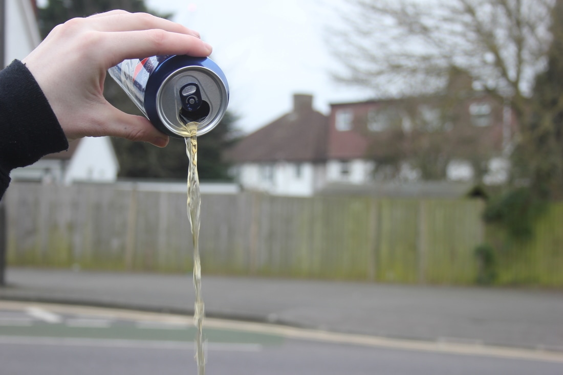
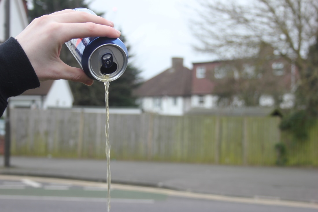
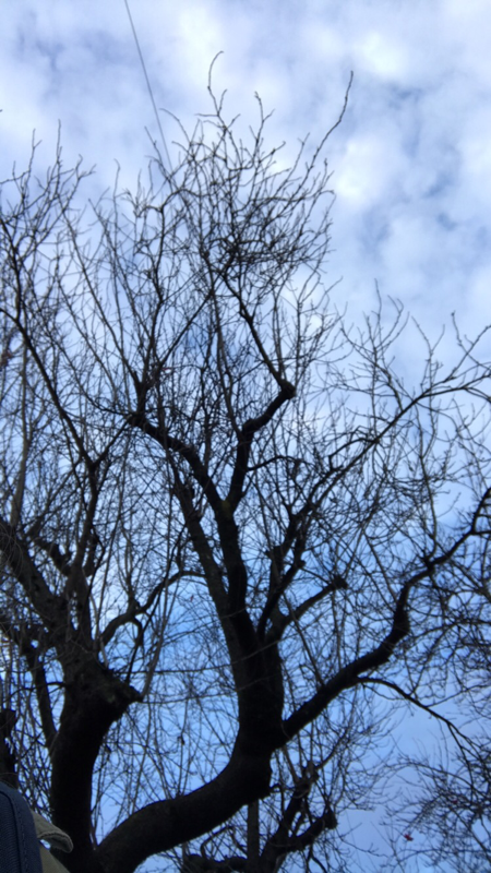
I set out to take some more images that were more carefully though of. This mean trying to look at things that were colourful or had a nice shape to them. I then printed out a contact sheet of all the picture and I'm going to use that to try fit some images together that with compliment or contrast each other. These will then be made into dyptics and will help towards creating images for my actual photo book.
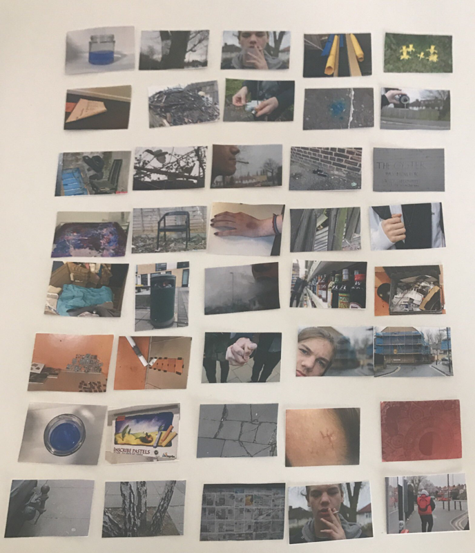
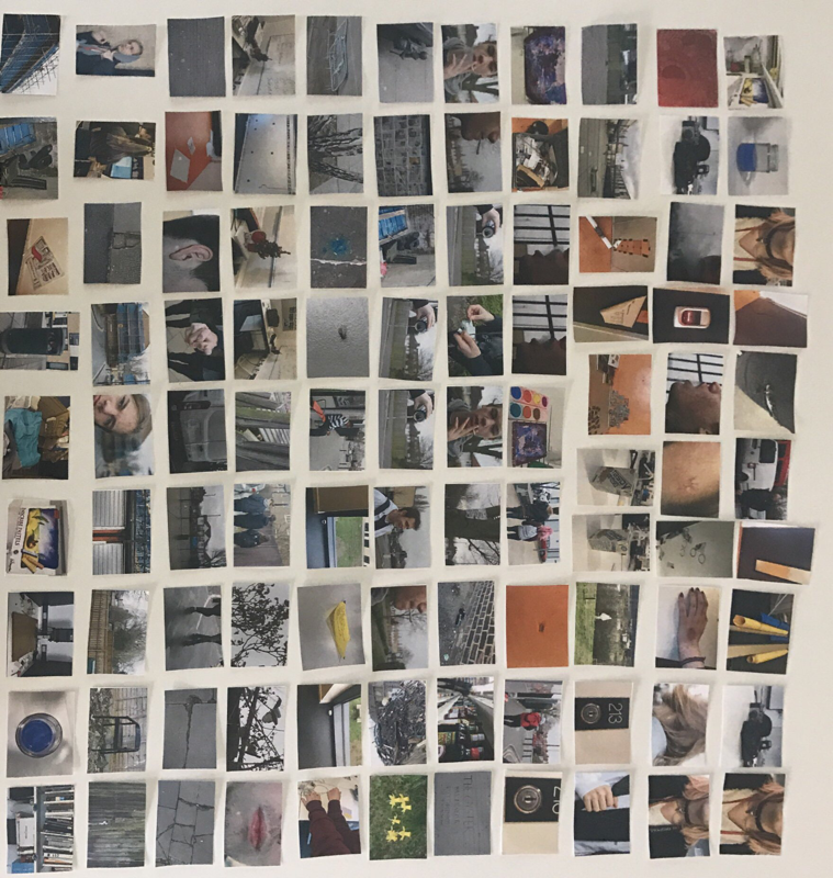
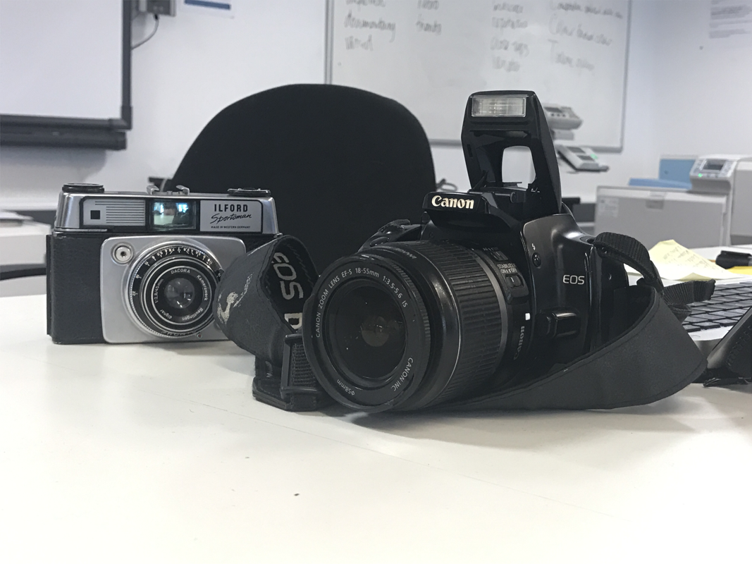
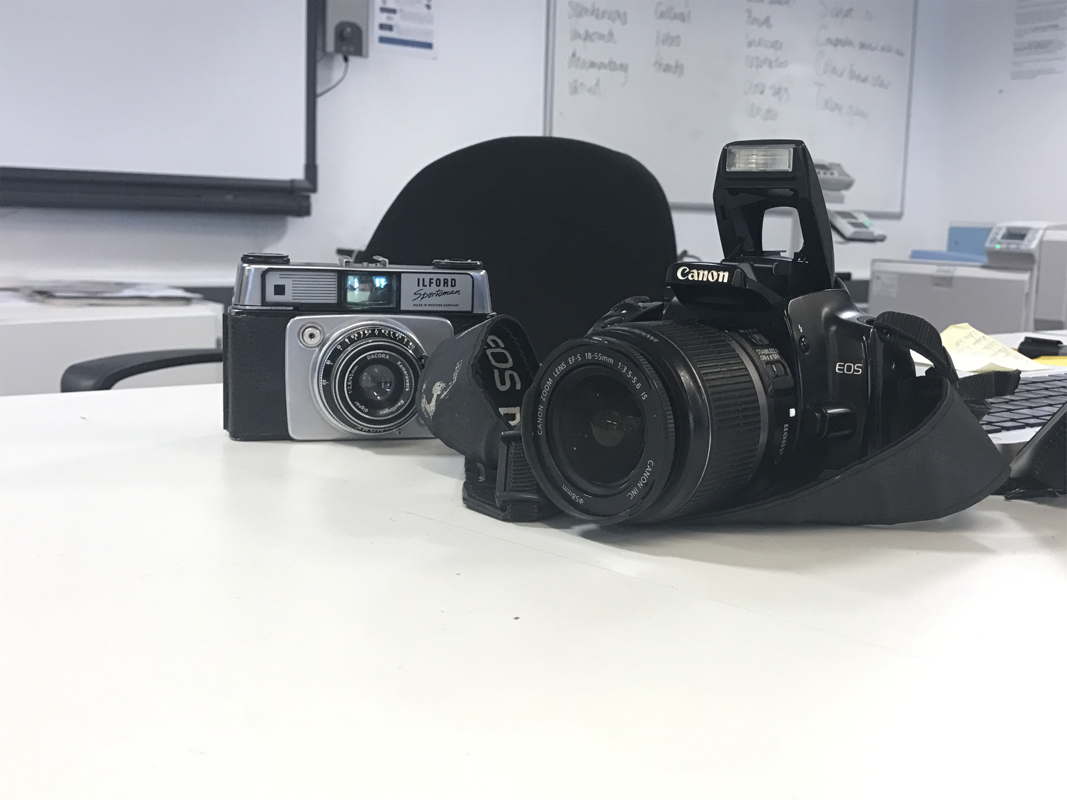
I started out by printing all of my photos off so that I could properly view them and decide which photos I believed would do nice into a sequence or dyptic.
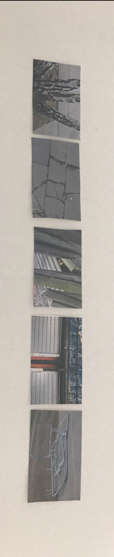
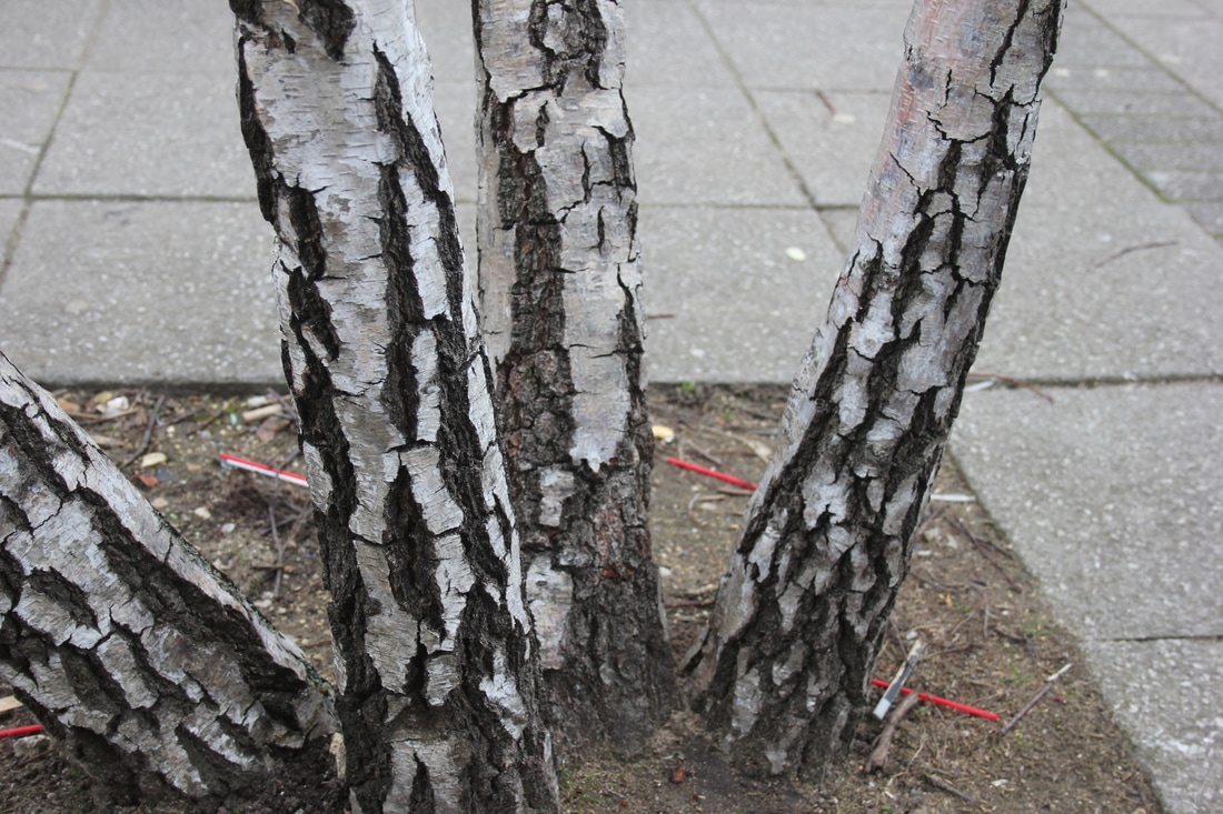
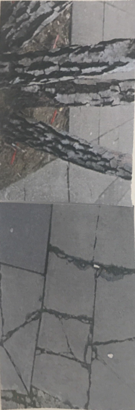
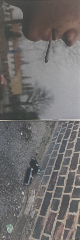
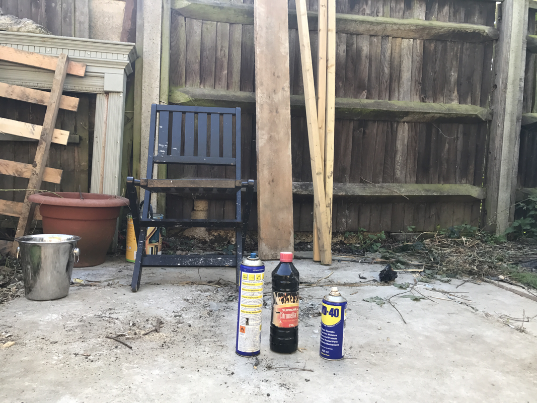
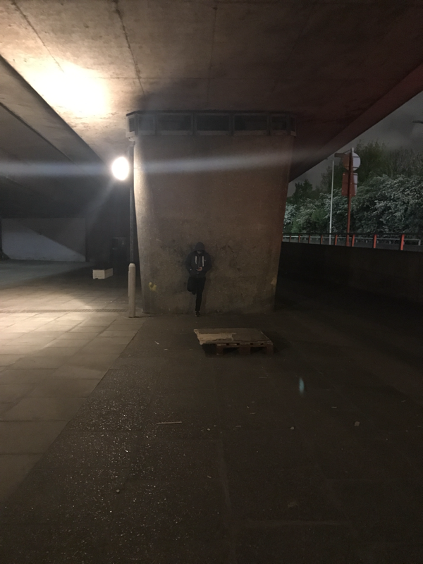
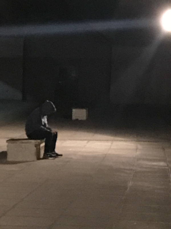
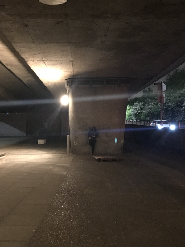
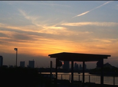
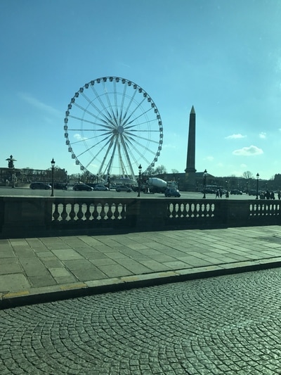
Once I had my photos selected I then had to further narrow it down to make sequences. As I had so many photos there were many options as to what could go into my sequences and so this made my decision tougher as to what to actually pick. Within my sequences I decided to base them all on different things. The first sequence I made was of the boy and this sequence was more about context than anything else although colour did match in all of them due to the boy appearing in all of my photos. The second sequence was more about colour and shape as in nearly all of the pictures the colour blue was presented. However, this was not the only aspects of the photos that I believed went well together, the fact that all of the pictures look rugged and messy made me feel like they belonged together and this is why I placed them together. On the third sequence I based the pictures a lot around line and shape as the cracks in the tree and ground are very defined and go well with other strong shapes. This for me showed they belonged together.
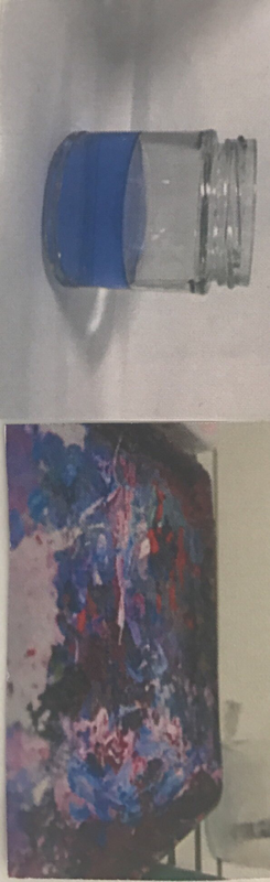
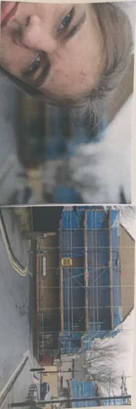
For my dyptics I used some photos from my sequence that I believed either complimented or contrasted each other. The easiest way I think dyptics compliment each other is through colour and so in a few of my dyptics I used colour to ensure they went together. However, in other I used shape.
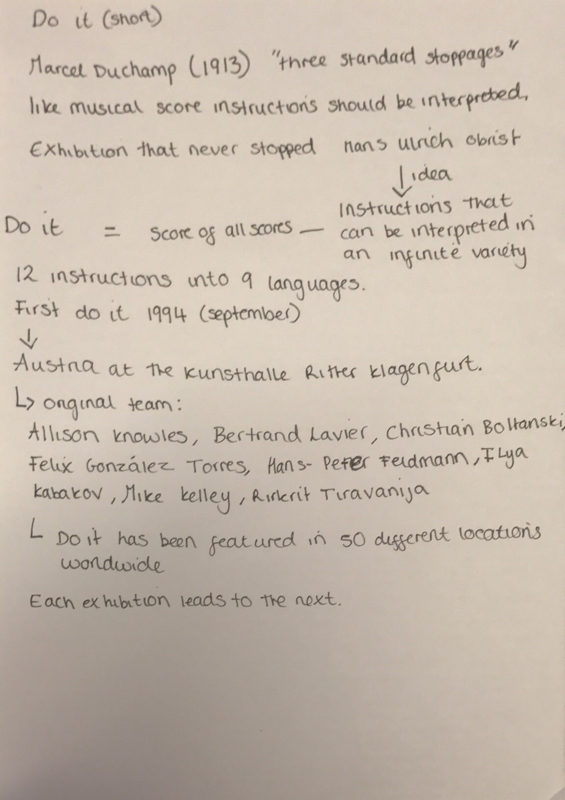
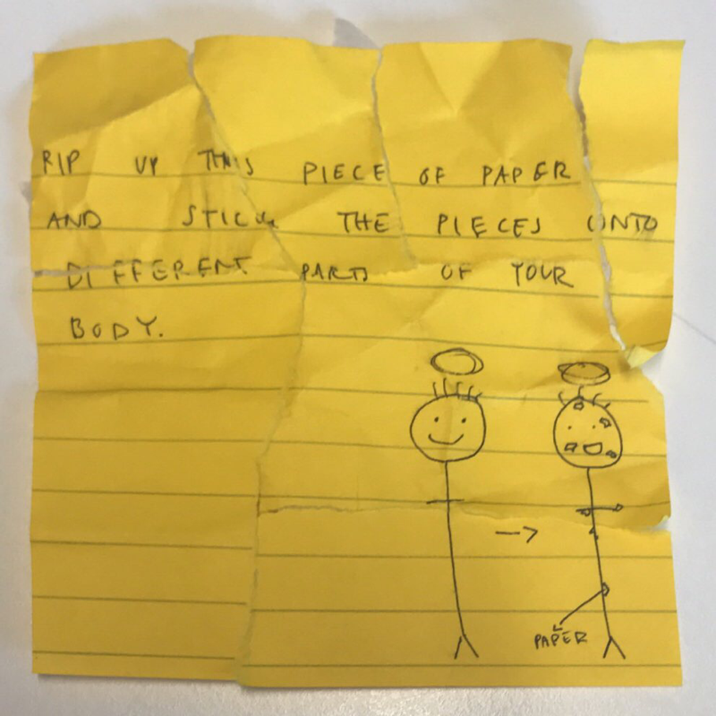
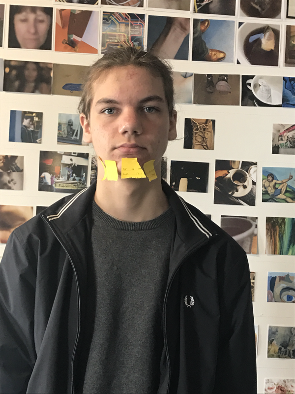
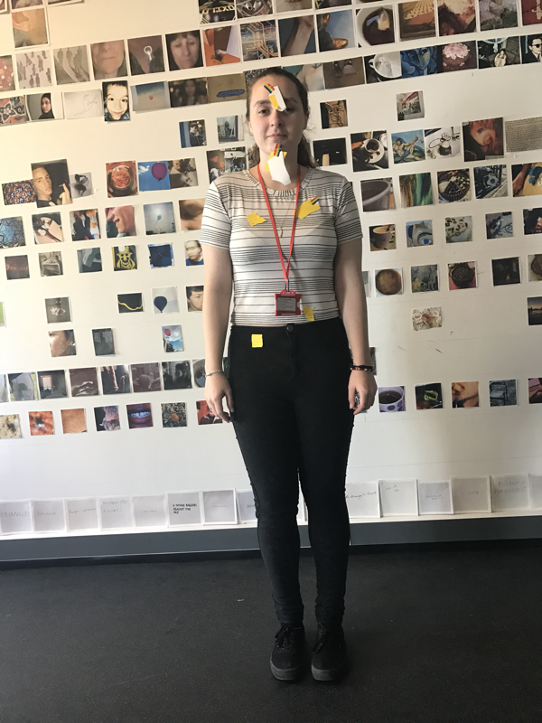
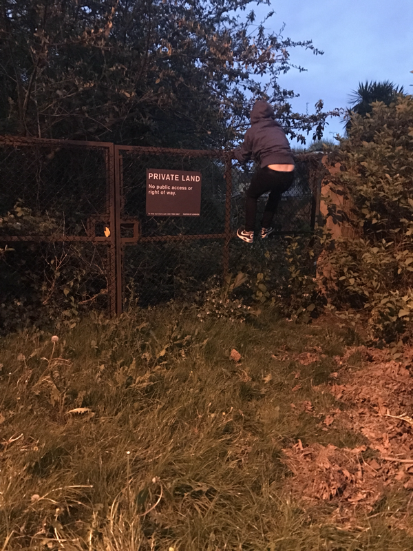
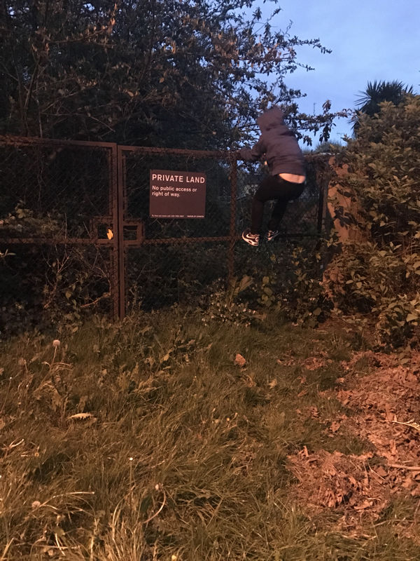
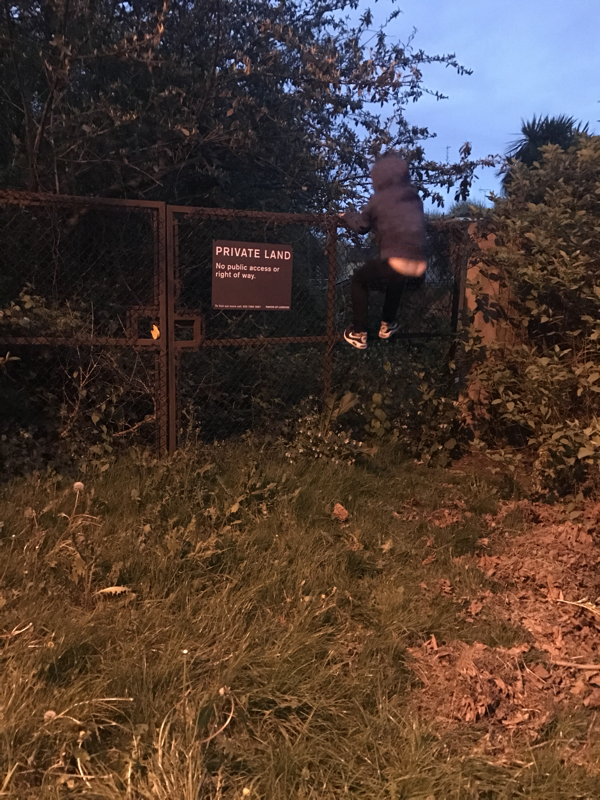
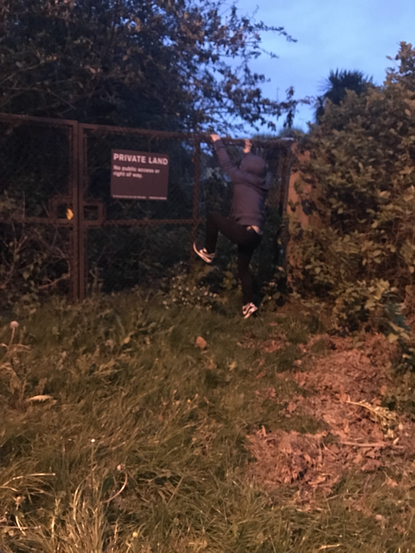
I started by taking notes on Do it the project itself to get insight into something I was going to have to try to recreate myself. In pairs we then had to come up with an instruction for someone else to follow and once this was done was given an instruction we the had to create. The instruction we were given was to rip up
Ideas so my photo book:
-I prefer the idea of having a hardback photo book instead of a zine as it believe it looks and feels nicer.
-I really enjoy when the pages are filled instead of having loads of negative space.
-I think sharing a message through a photo book is a really good and cool idea.
- I want to have some sort of writing at the beginning of my book to represent my theme/story.
-Quotes could be a good idea to have.
- Documentation photography interests me.

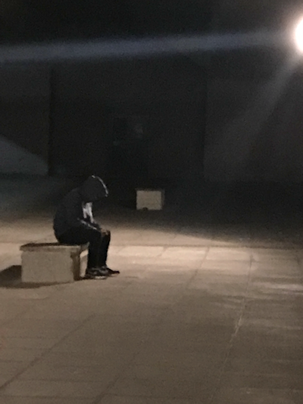


The task I had was to take 100 photos that could possibly fit into my photo book. I had already decided I wanted to make a photo book that evokes emotions from people and so I decided to base my book around something to do with teenage life but also having a dark twist to it. This is because many people go through a lot of hard times in their teenage years but they block their feelings away because they do not want to be judged. Therefore, in my photo book I want to portray something along the lines of life of teenagers with deep secrets or something similar to this.
Once I had printed all of my photos out I decided that I didn't not like them and they were too rushed to have in my photo book. I then started to decide on a new theme and what I want my photo book to look like. I really enjoy taking landscape photos, nature photos and also photos of people so this is what I wanted the main content of my book to be on. I decided I would use colour and shape as the main thing to link all of my pictures together.


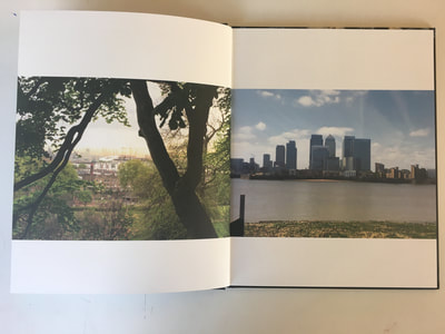
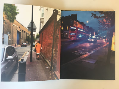
William Eggleston uses colour in his images to connect images that would not normally go together with each other. This relates to what I want to do as I am trying to use images that would not typically go together but work through the scheme of colour and shape. He also manages to crop his images to be framed really well and turn something that would normally be considered as boring and turn it into something interesting through the way he takes the image. William Eggleston normally has a cover which is surrounded by a strong colour and put into the middle of the book. This makes this photo stand out and also often links to the the colour behind the image which is also the back cover of the book. I really enjoy Egglestons images as they put something that is so unusual or considered boring next to another unusual image and create something so eye capturing and intriguing to look at. This is what I want to do in my photo book.
Making a mock up
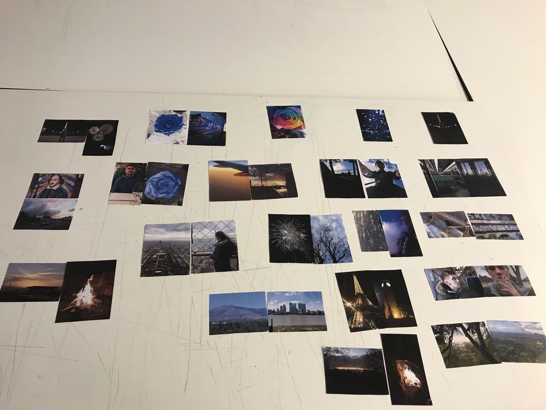
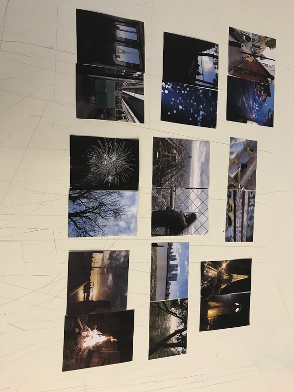
At first, I spent a lot of time trying to put some dyptics together and have photos that I believed would be of good enough quality to be put into my photo book. Then I realised that all the pictures I was placing together were too similar and I decided to separate my photos into pictures that were visually strong. These images were the images I selected to put in my first photo book as I believed they looked the best together and created the best looking pages.
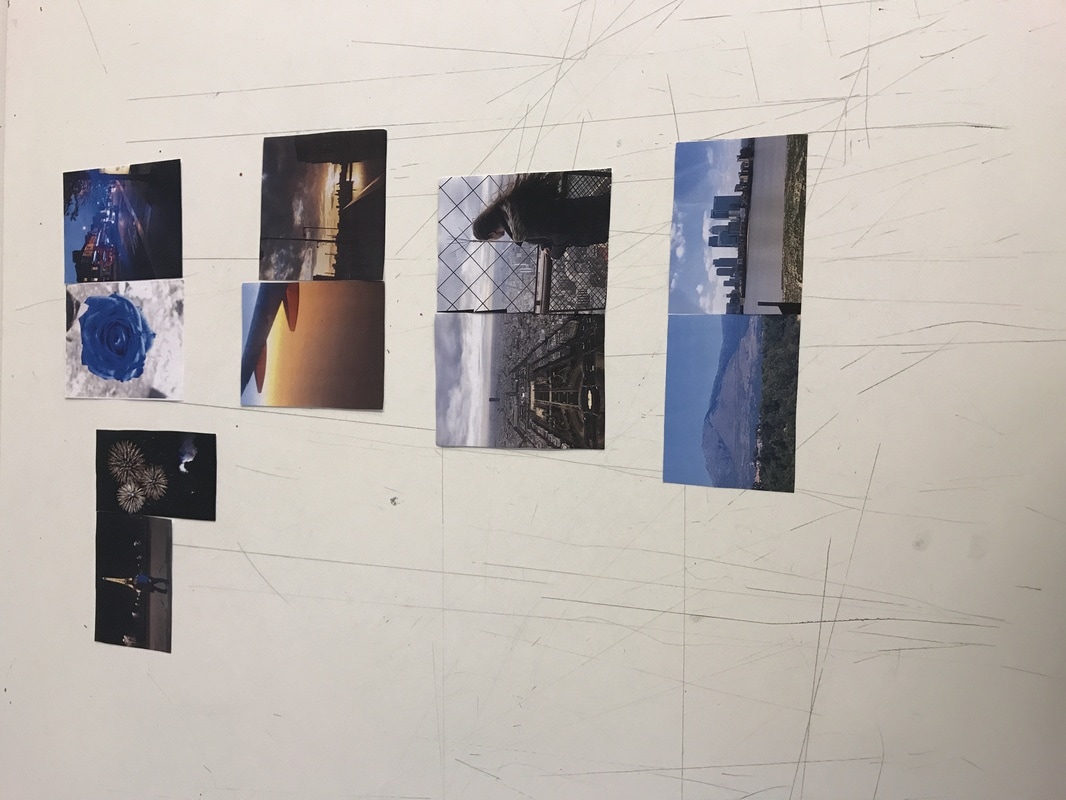
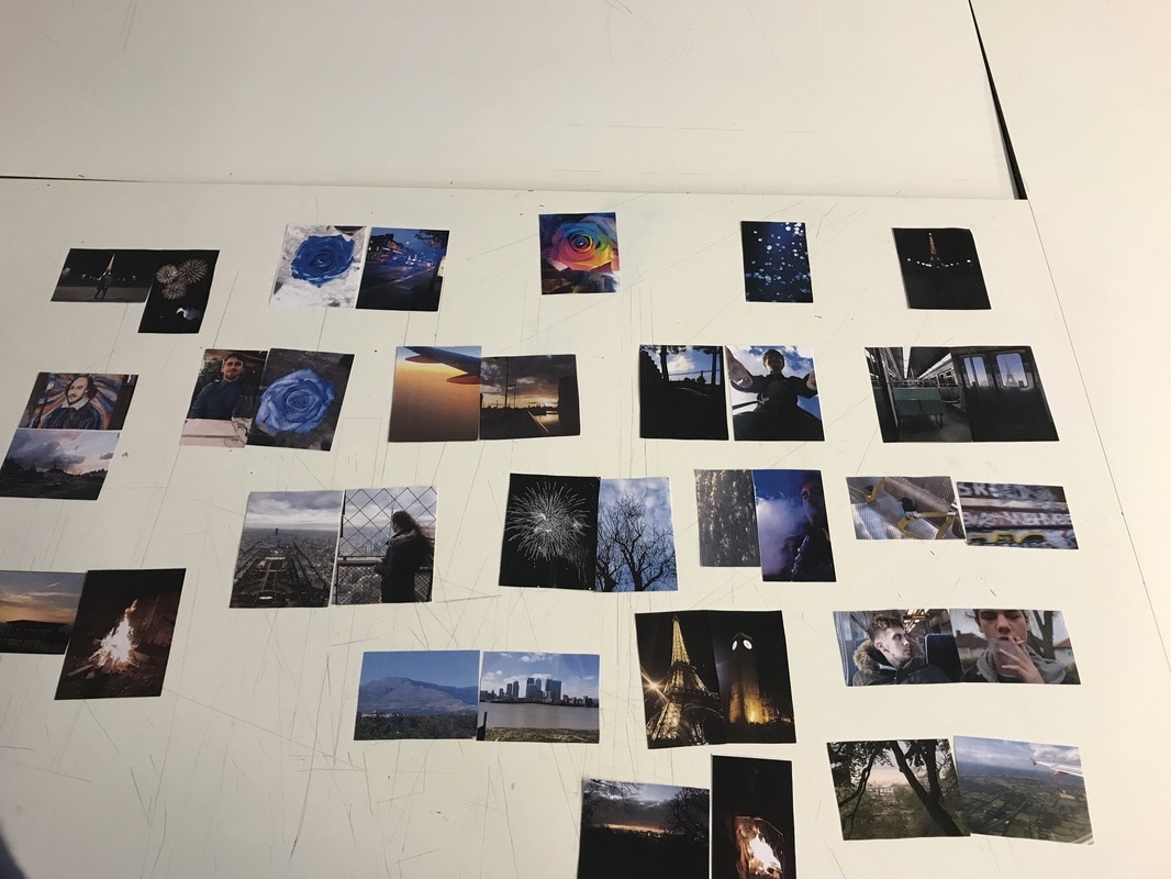
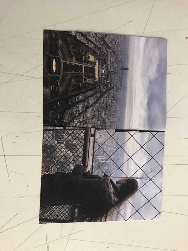
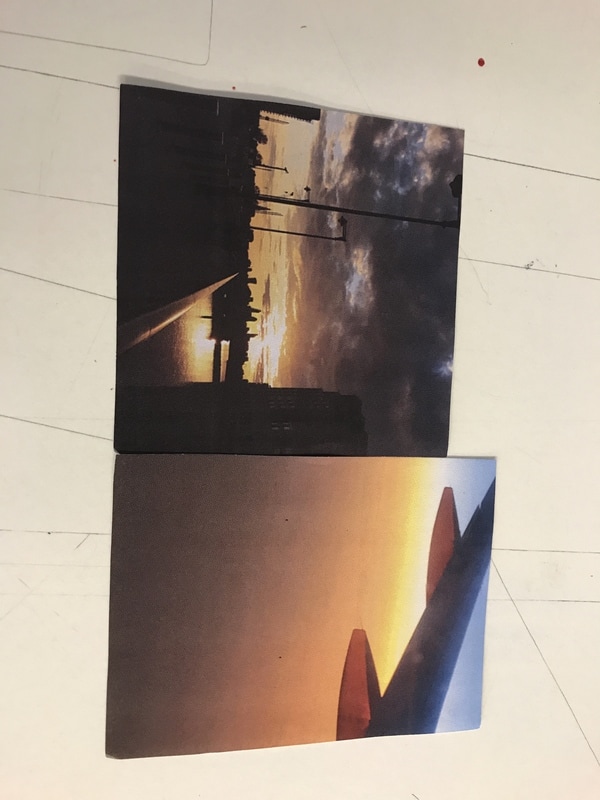
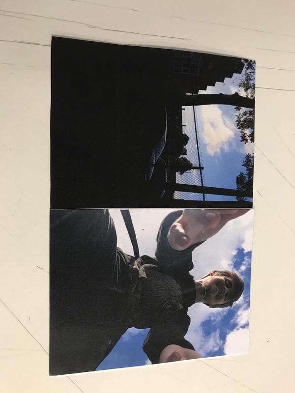
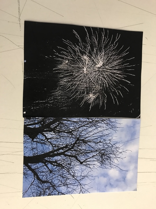
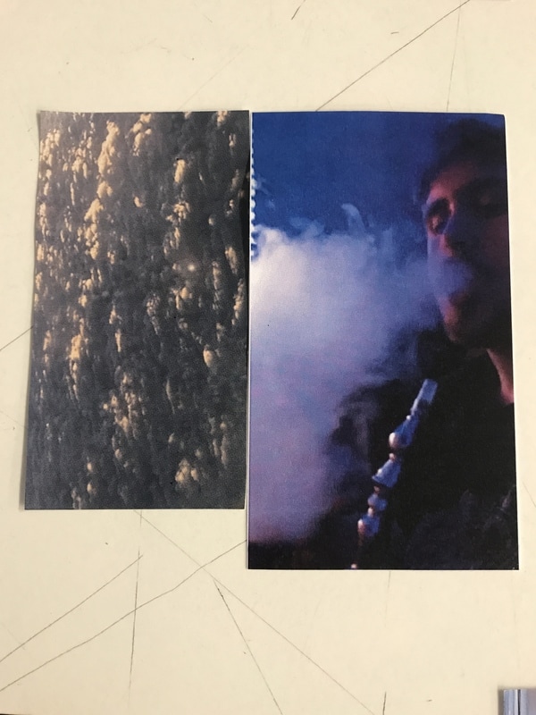
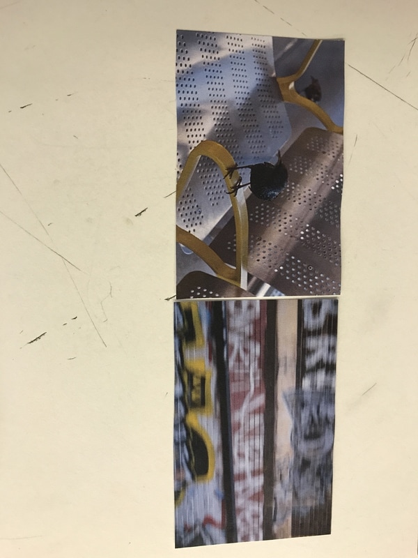
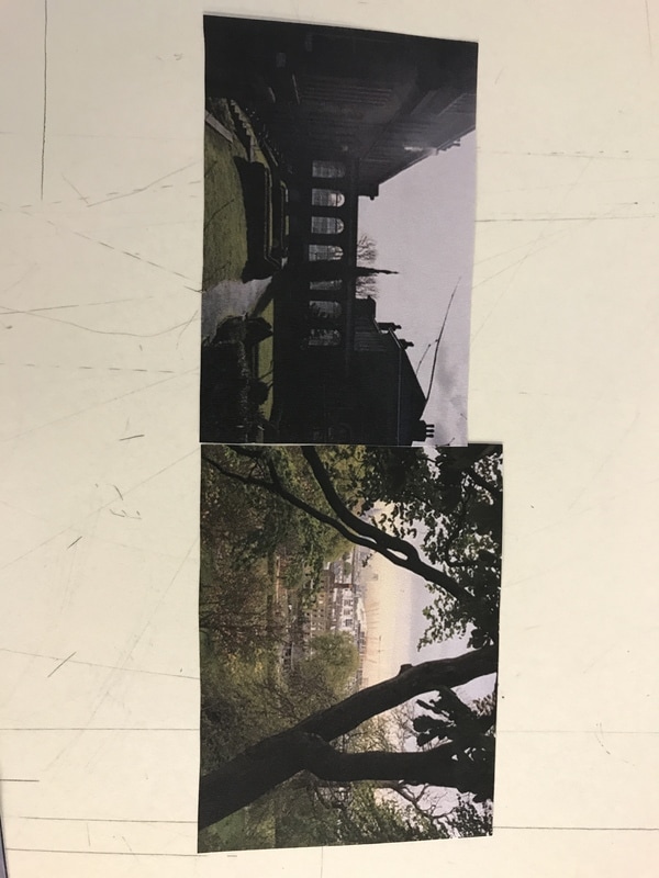
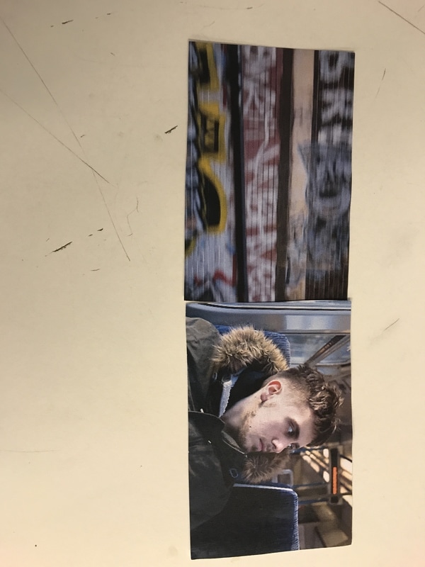
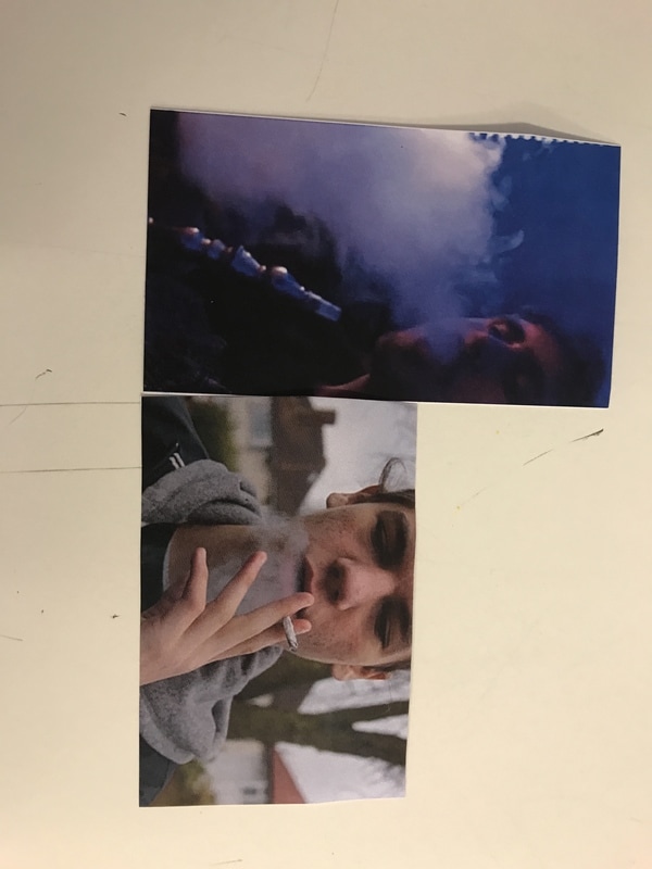
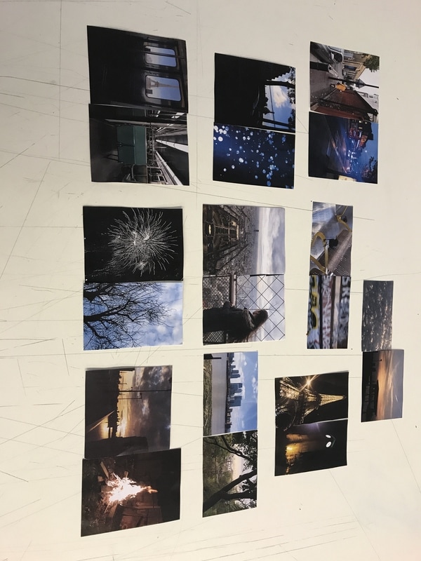
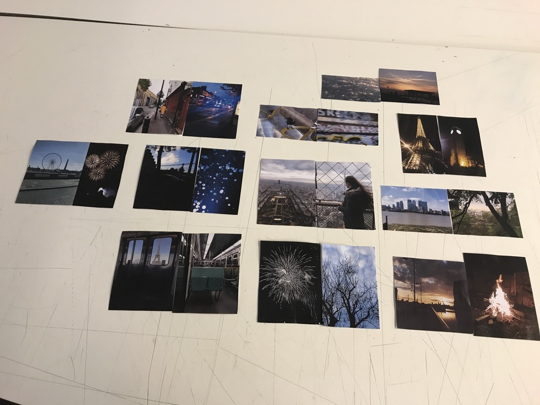
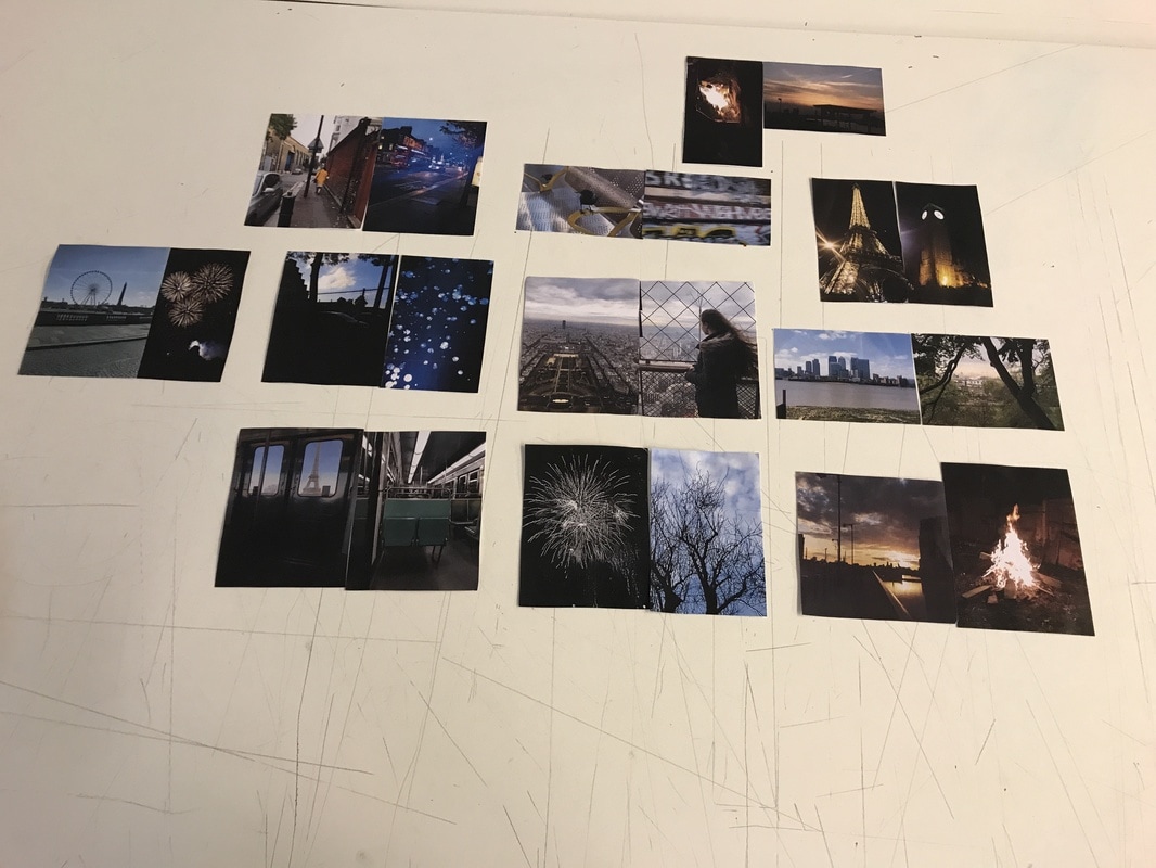
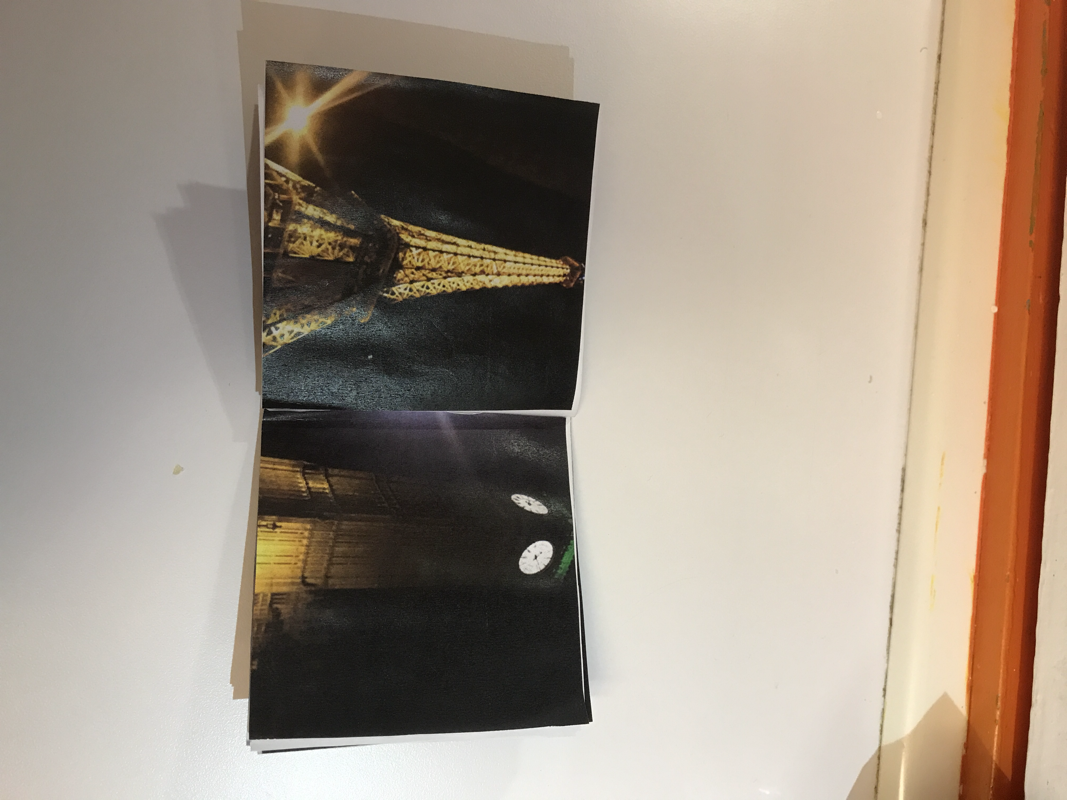
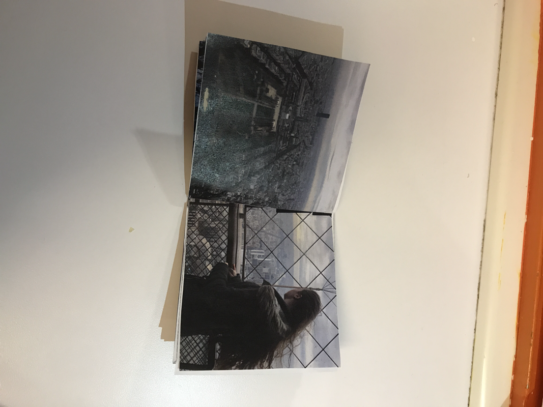
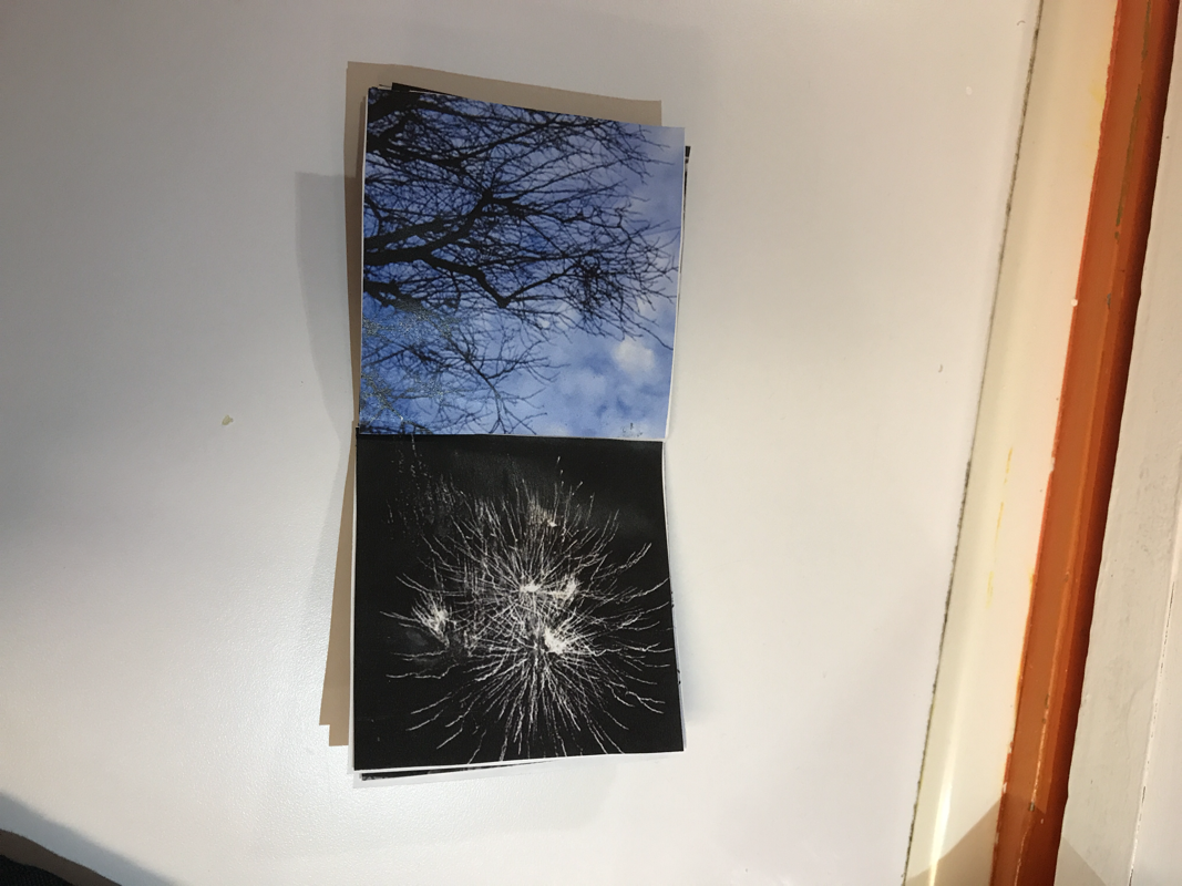
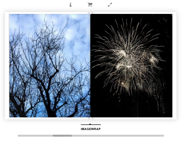
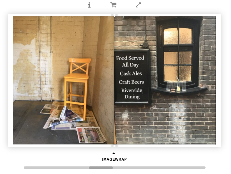
Images for my photo book:
Images for my photo book:

My first book:
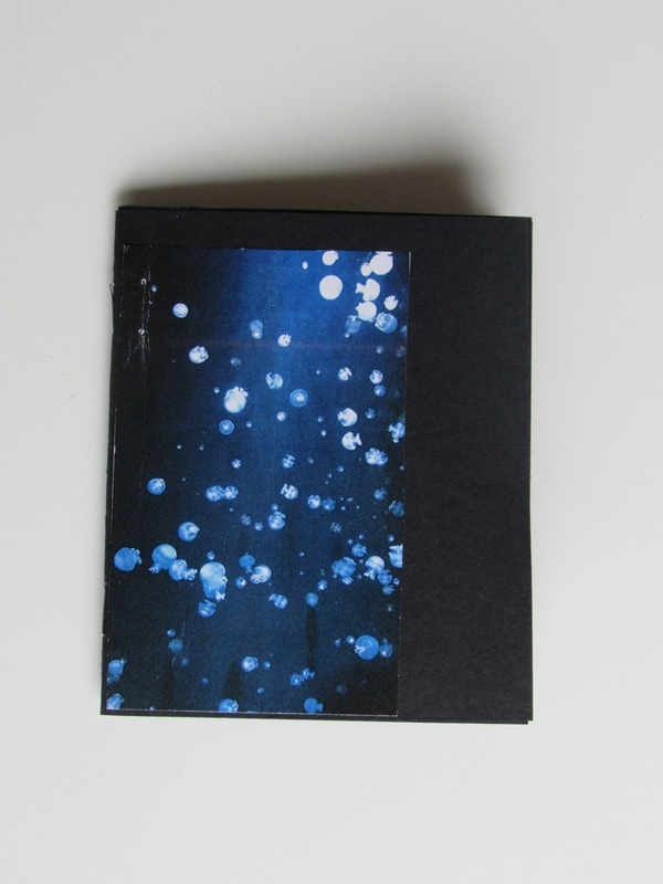
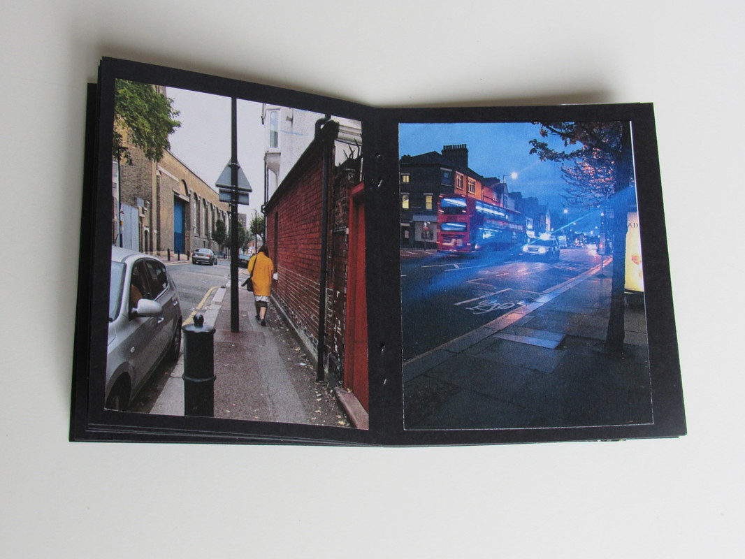
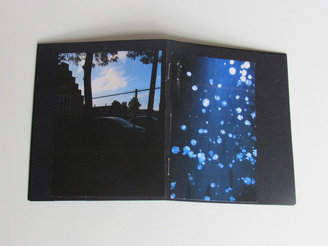
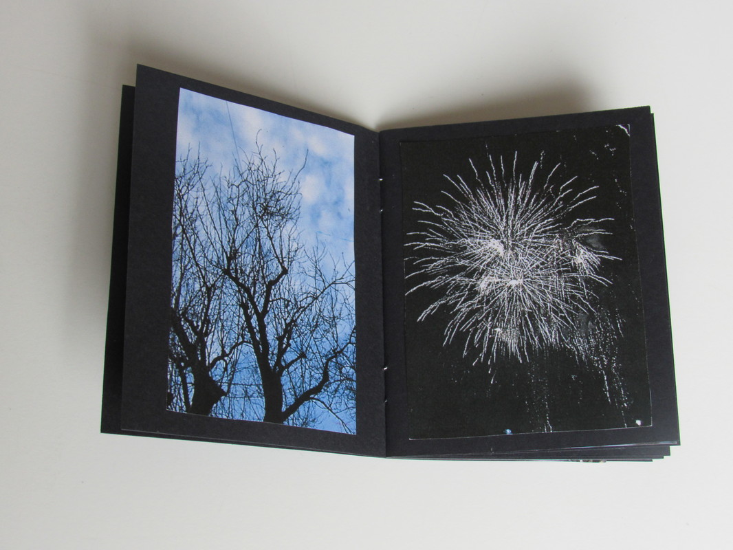
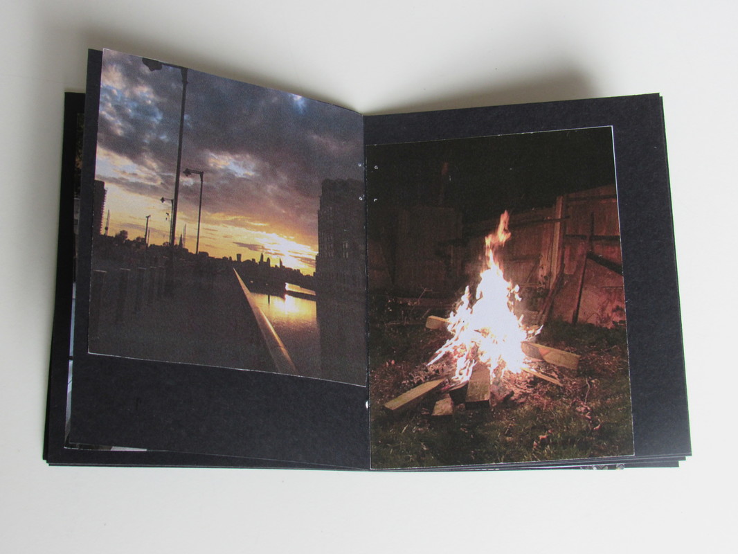
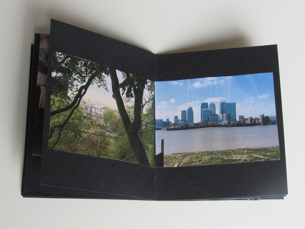
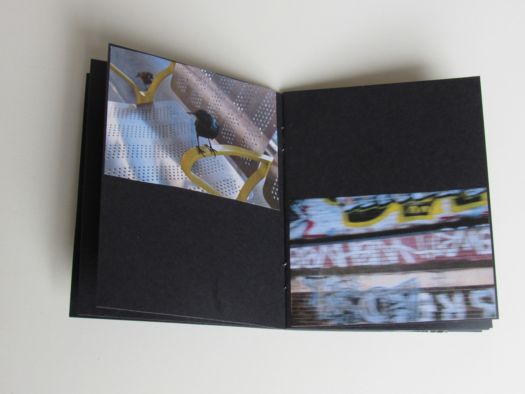
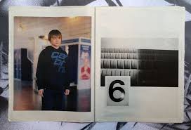
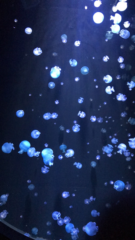
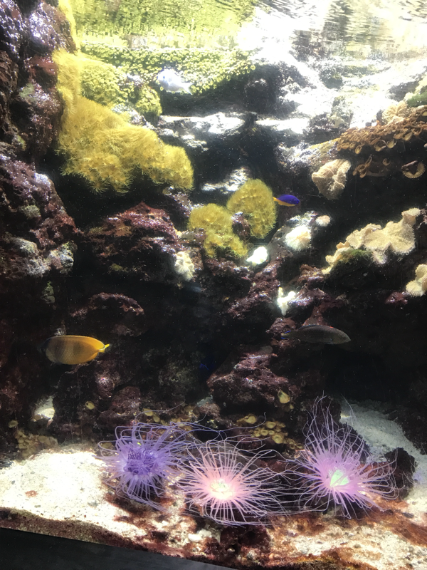
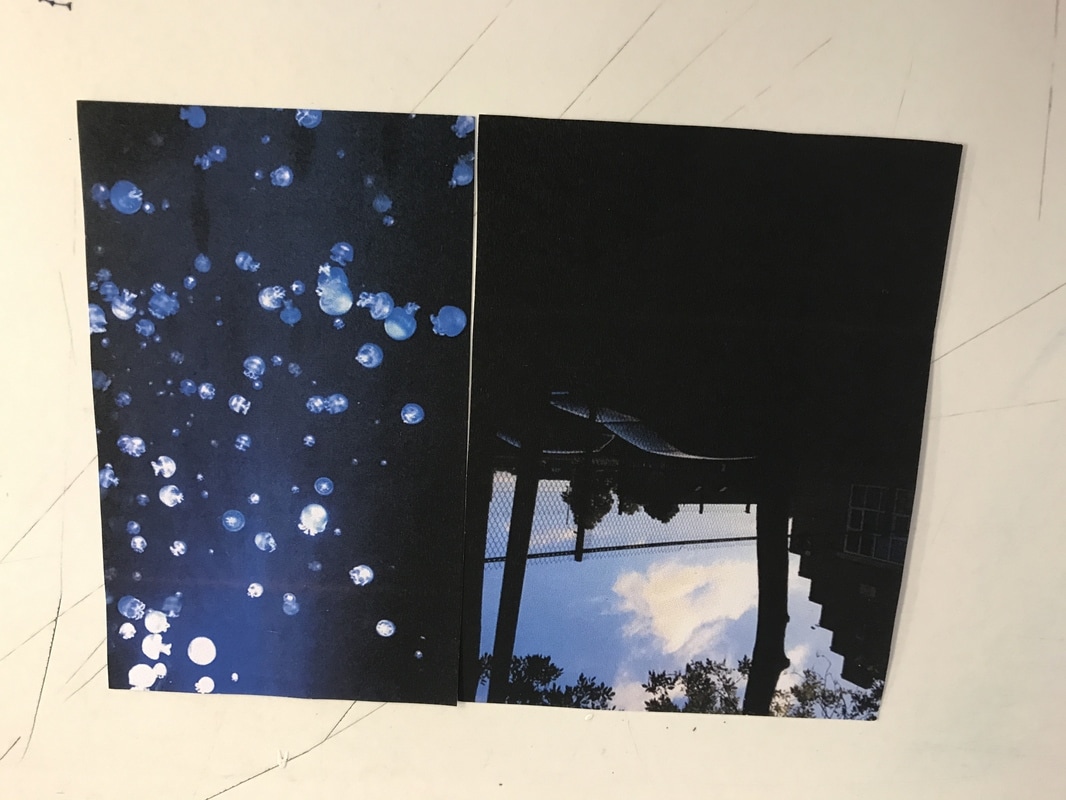
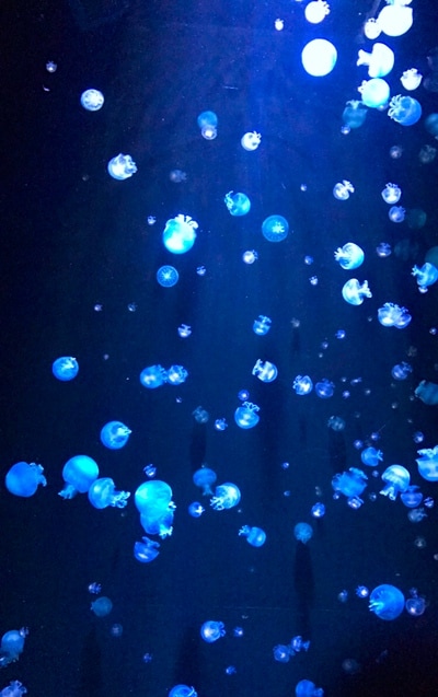
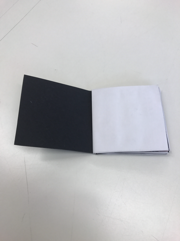
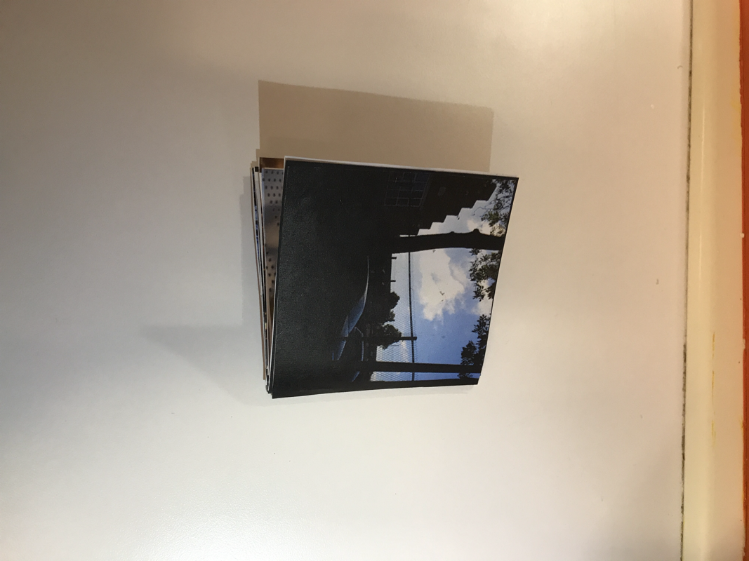
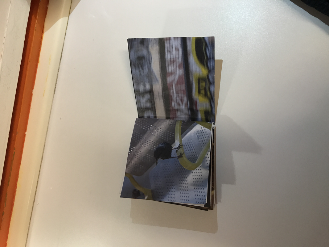
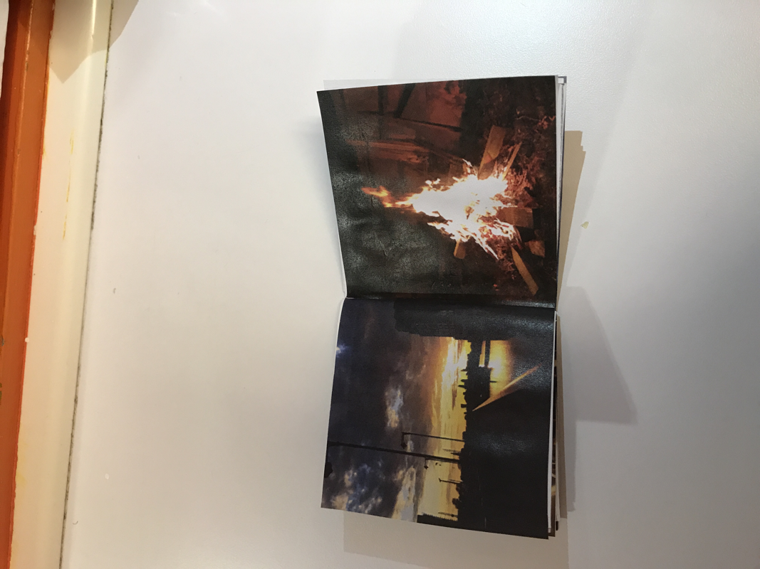
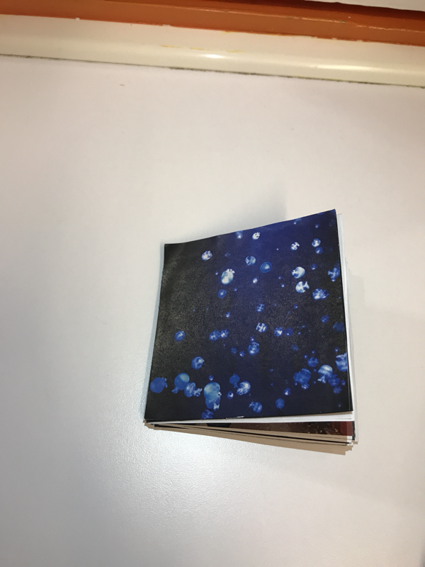
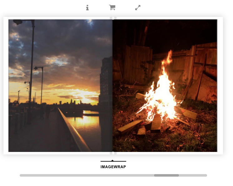
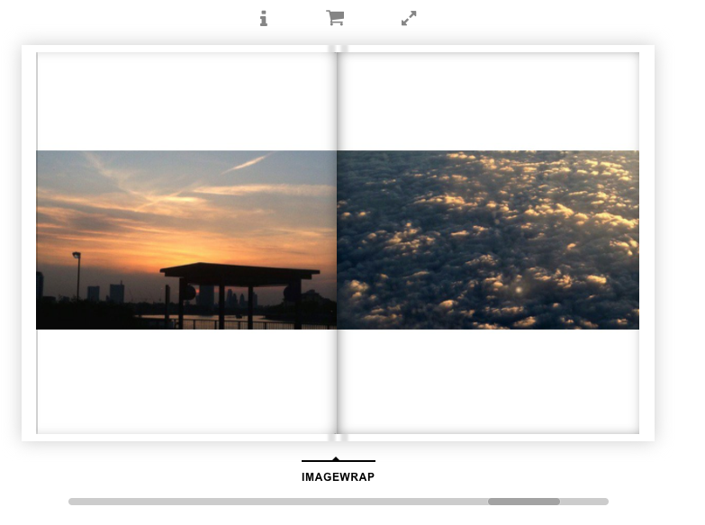
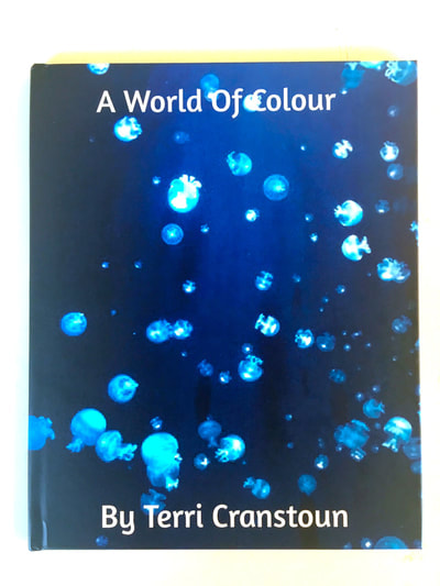
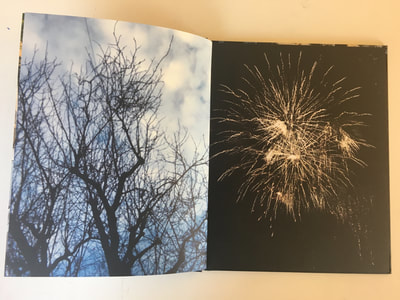
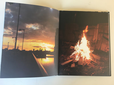
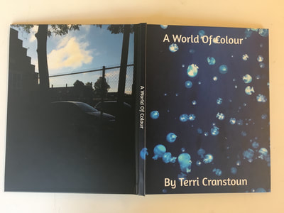
From my first attempt at my photo book I have decided that I would definitely prefer if my images were filling the page; this is because I do not really like the look of the negative space next to my photos. Another thing I would change if I did have negative space was having white paper instead of black as I believe it would bring out the colours in my photos more. However, I do really like all of my dyptics and this mini photo book has helped me to find my style. I do believe that this book has helped me progress as it has made me realise and have an idea of what I want my final piece to look like. Every image in my book links through colour or shape and I think this makes my pages intriguing as the pictures can contrast but still go together so well. The reason I choose the front cover to be the jelly fish is because I think the image is really eye capturing and bright.
I decided to make a second book which had different features to the first one so that I could compare the two books and decide which lay out I liked best. I do really like the idea of having the images full page as I believe it makes the photos look more professional and makes my images better quality. However, I do like the lay out of some of the images in my first book and believe that if the negative space behind the images were white it would make them stand out more. I also really enjoy the look of both square and rectangle books and so I think the only way for me to pick between them will be to make a mock book on blurb where I will be printing my book from. Also one thing I believe was better about my second book is the use of a blank page at the start of the book; I am also thinking about maybe putting a quote on that first page. Whilst planning my final photo book on blurb I will also be thinking about adding a few more pages to my book.

I took a few more images that I believed could be put together to match the style of my photo book. The style I have come to like is something that is unusual or interesting next to something that is quite busy. I have always enjoyed photographing things you would not see in everyday life but also landscapes; so being able to put them together through colour or the way the images are cropped or the shapes in the pictures really interests me.
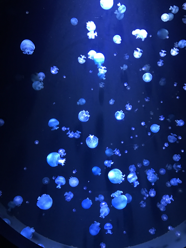
I have practised laying out my book on different occasions on blurb and have finally come to an arrangement on how I believe I want my book.
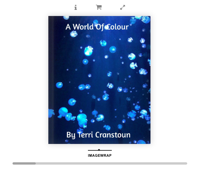
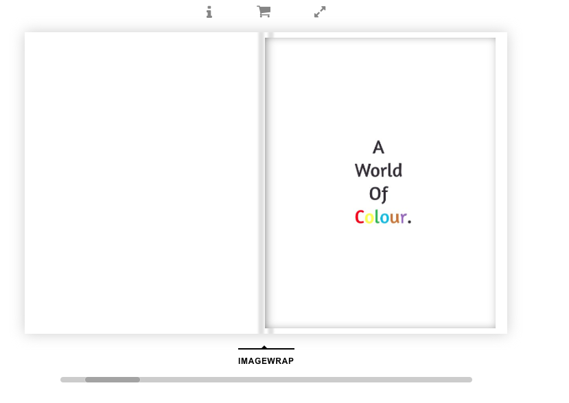
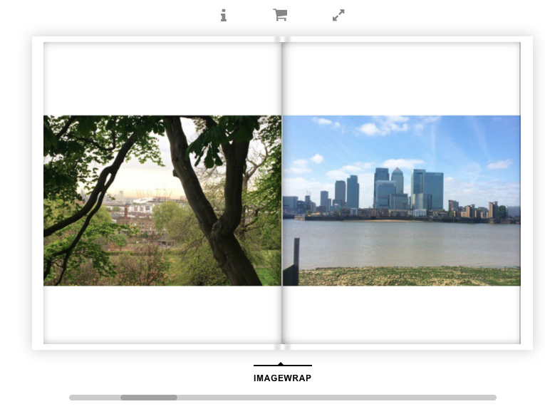
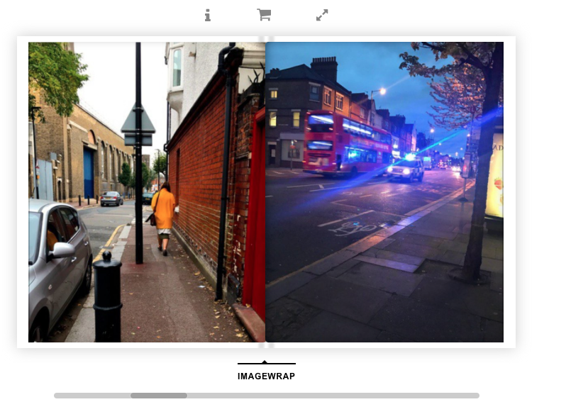
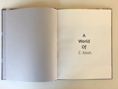
After a long time of editing my images and putting them into blurb in different orders I finally decided on how I wanted my images to be layer out in my book. The images flow through the book and I am really pleased with the final layout of my book. It also took me a while to choose a font and the size of the font so I changed my mind so many times and used a lot of different styles until I was finally happy with one. My images in my book all link through colour and this is why I decided on the title "A World Of colour". I believe this is the most suitable title for my book as it is the key feature that makes all of my images work as dyptics. I decided to have the jelly fish as my front cover because I love how bright and eye catching they are; believe they draw peoples attention to the book. I also really enjoy that I have some pages which are full but some that have a lot of negative space as I believe it suits the images well. One reason I like the white negative space behind the images is because I believe it brings out the colour in the images a lot and makes the photographs stand out. However, I really like full pages as it makes the photographs look professional and really stand out.
Evaluation
Evaluation of my book:
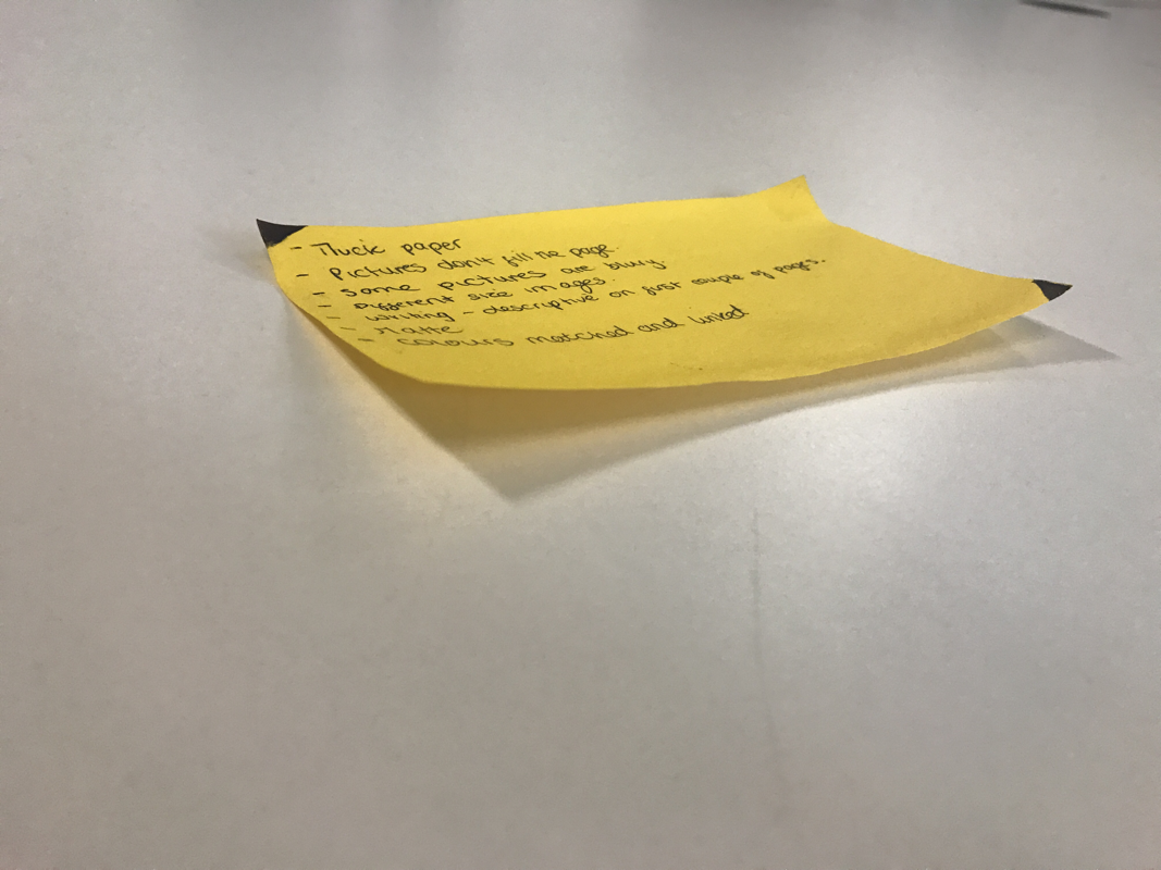
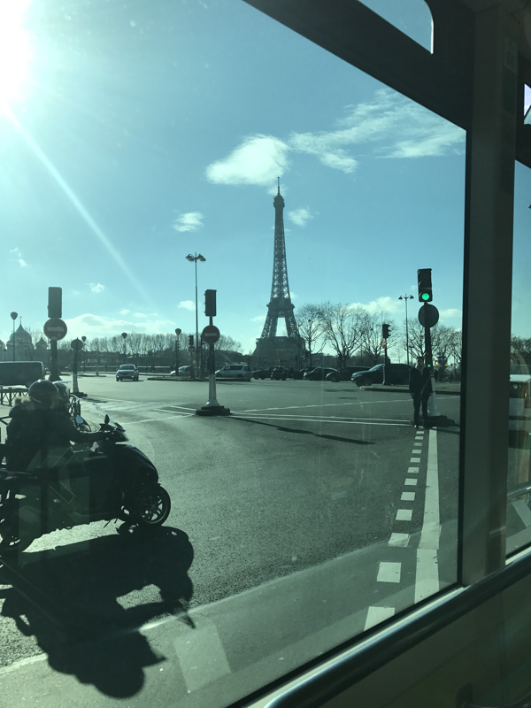
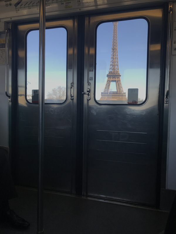
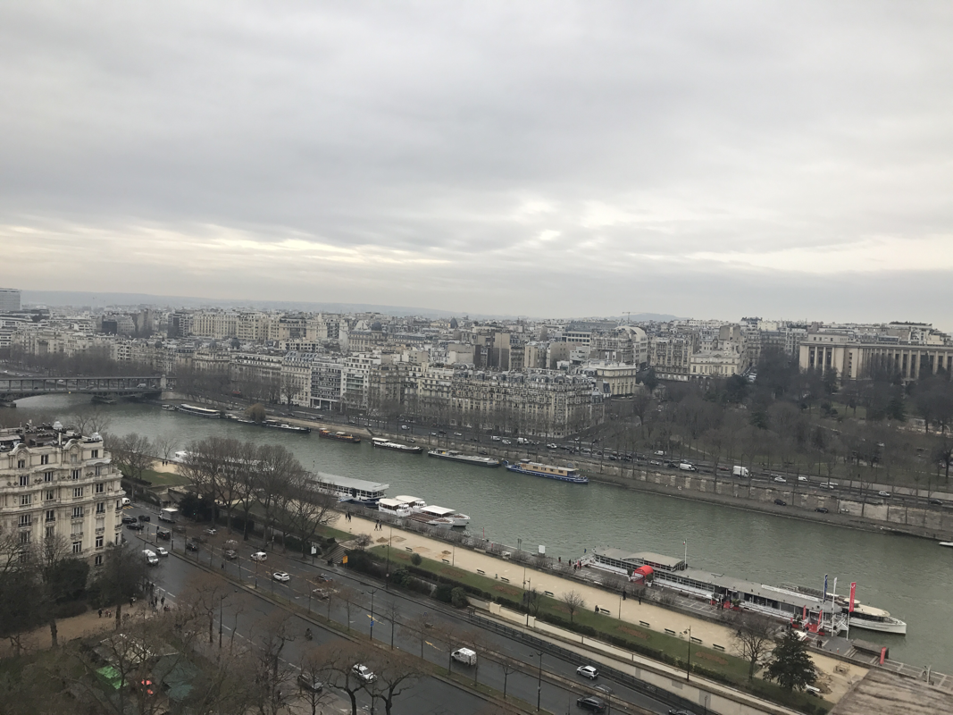
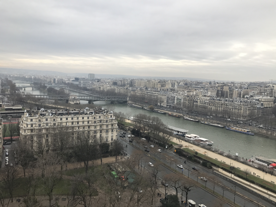
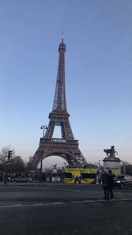
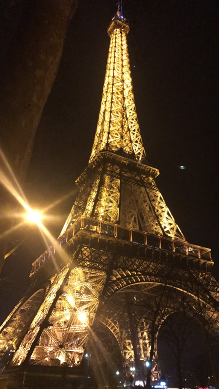
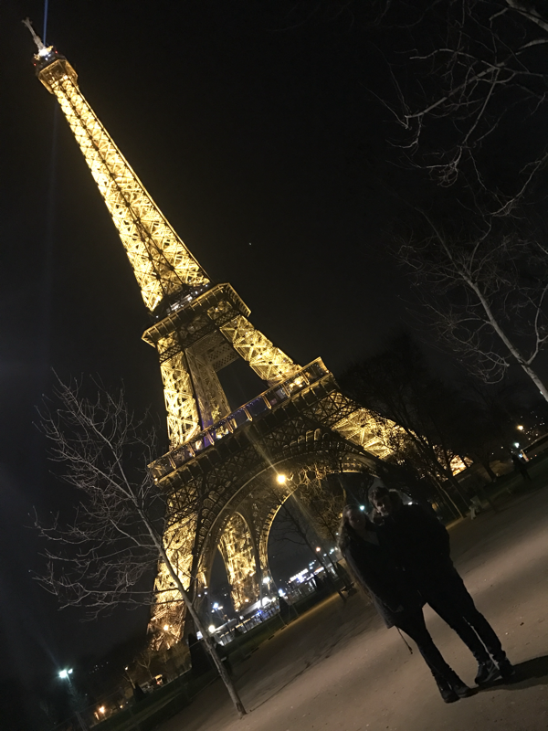
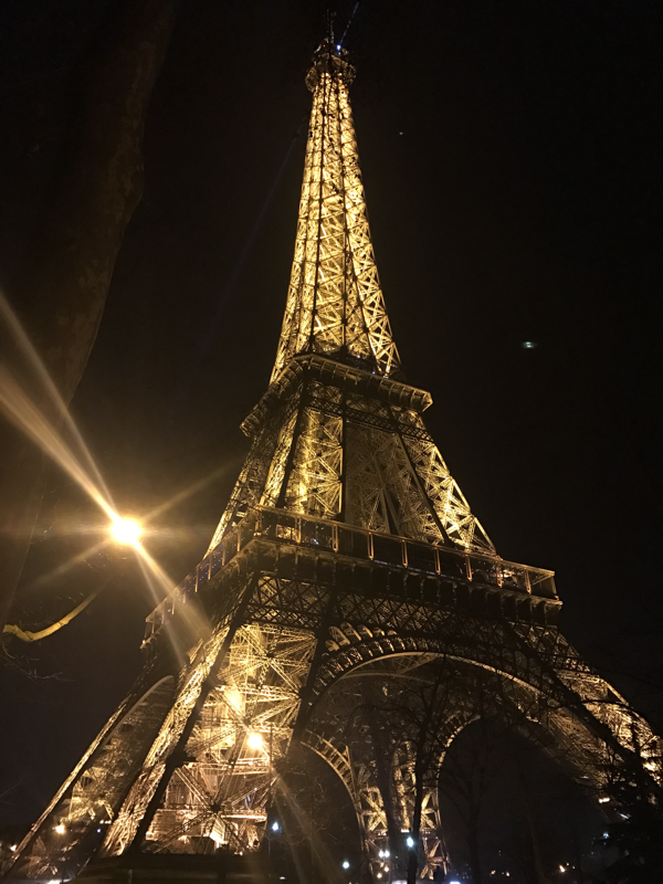
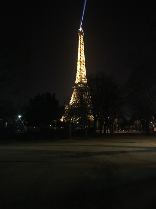
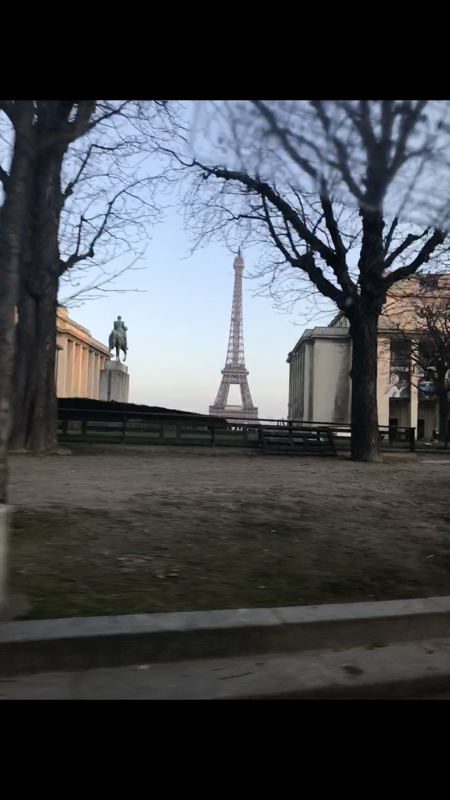
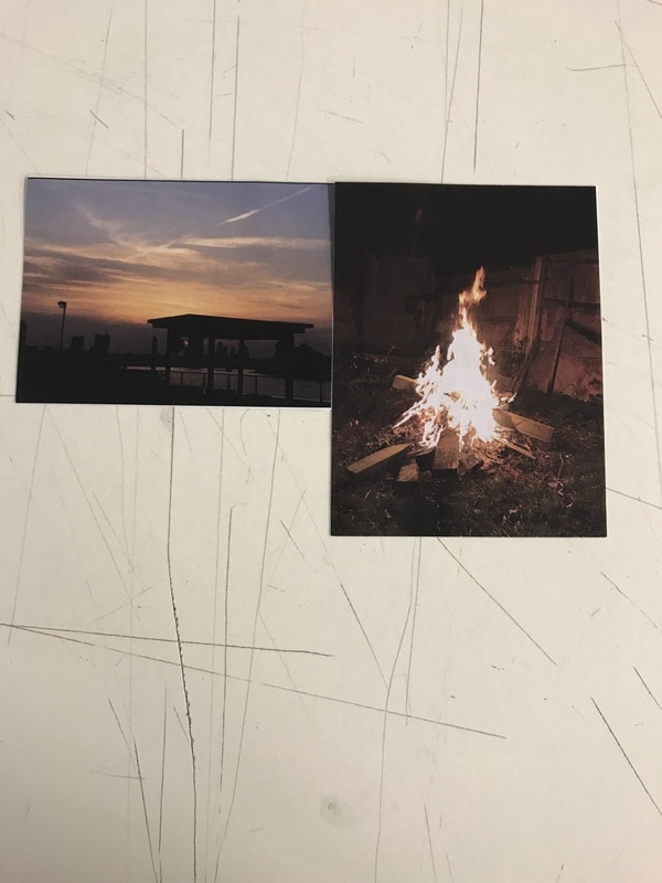
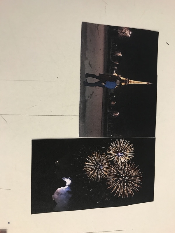
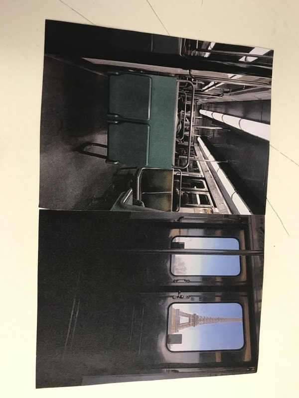
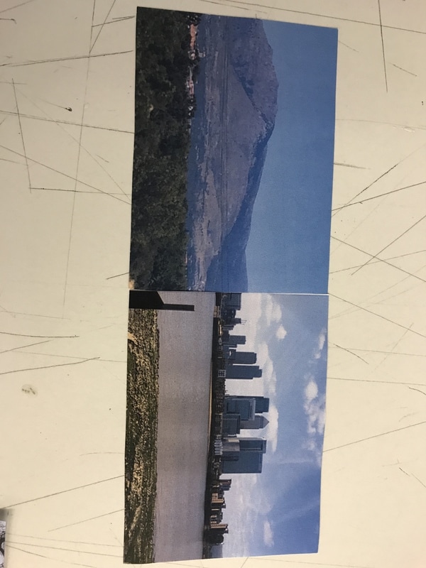
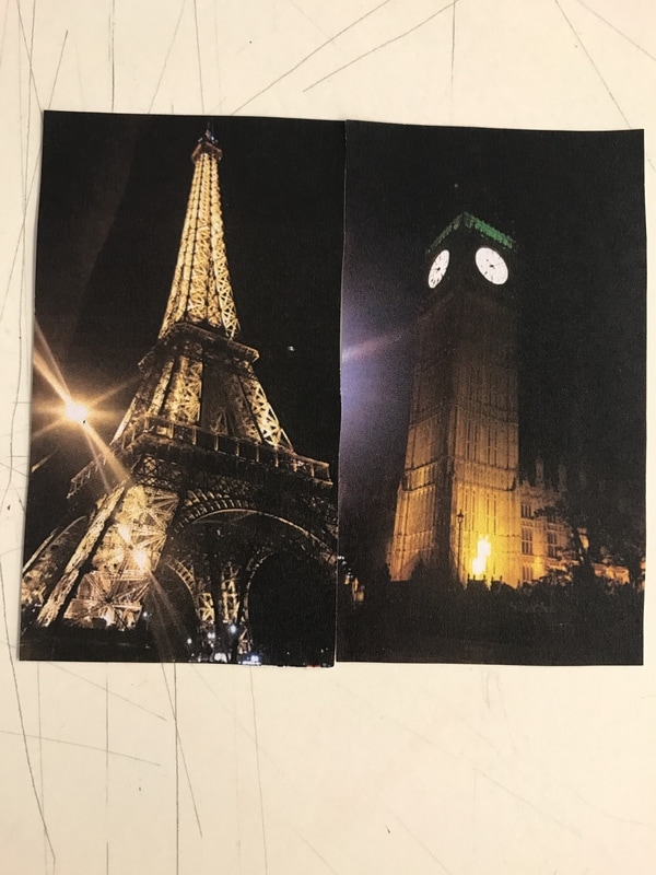
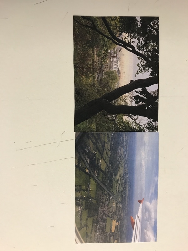
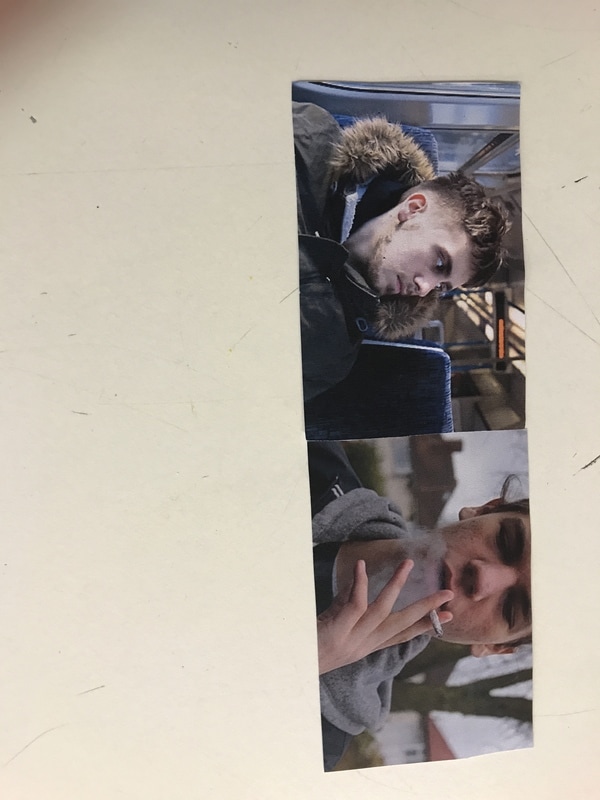
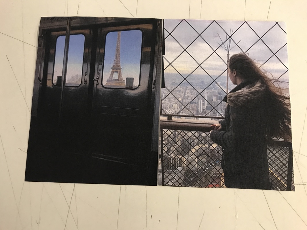
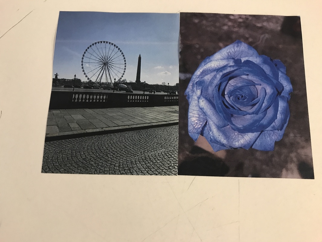
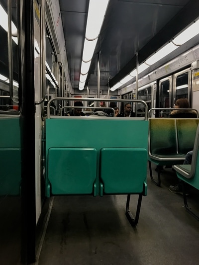
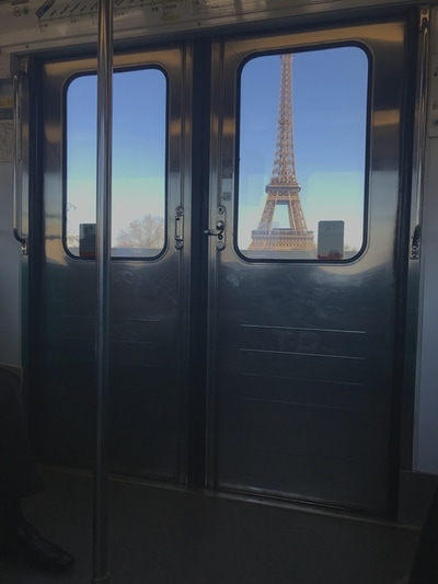
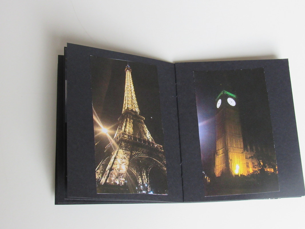
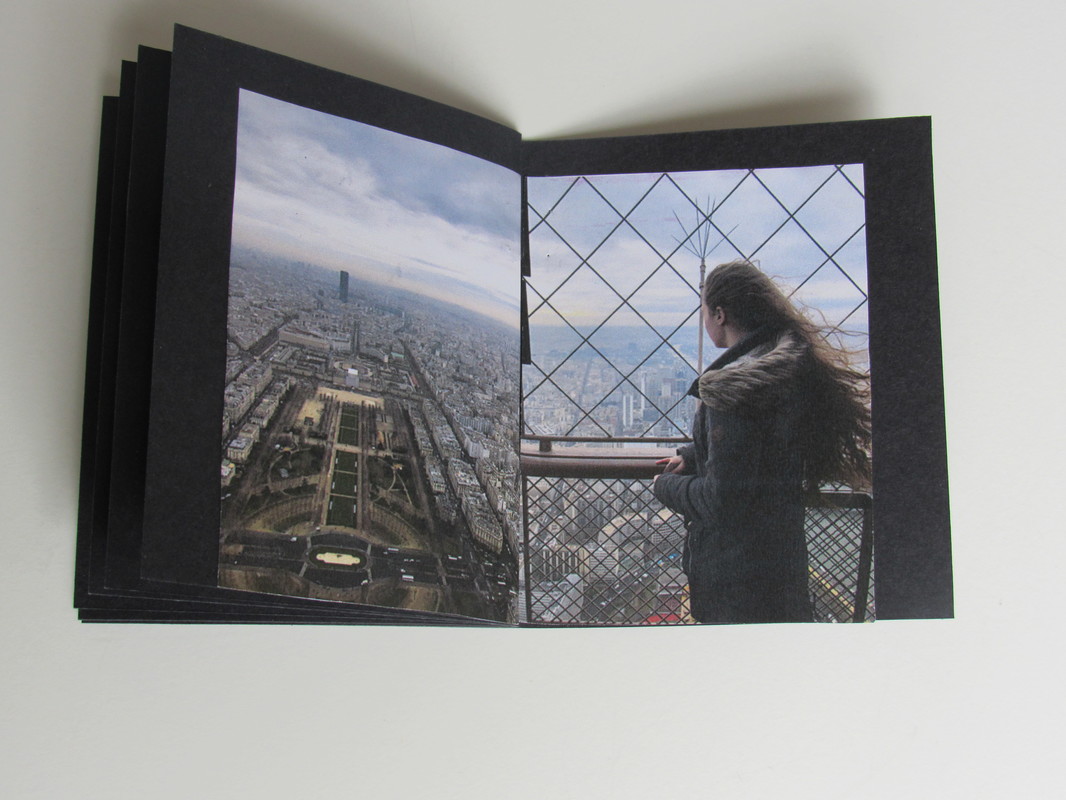
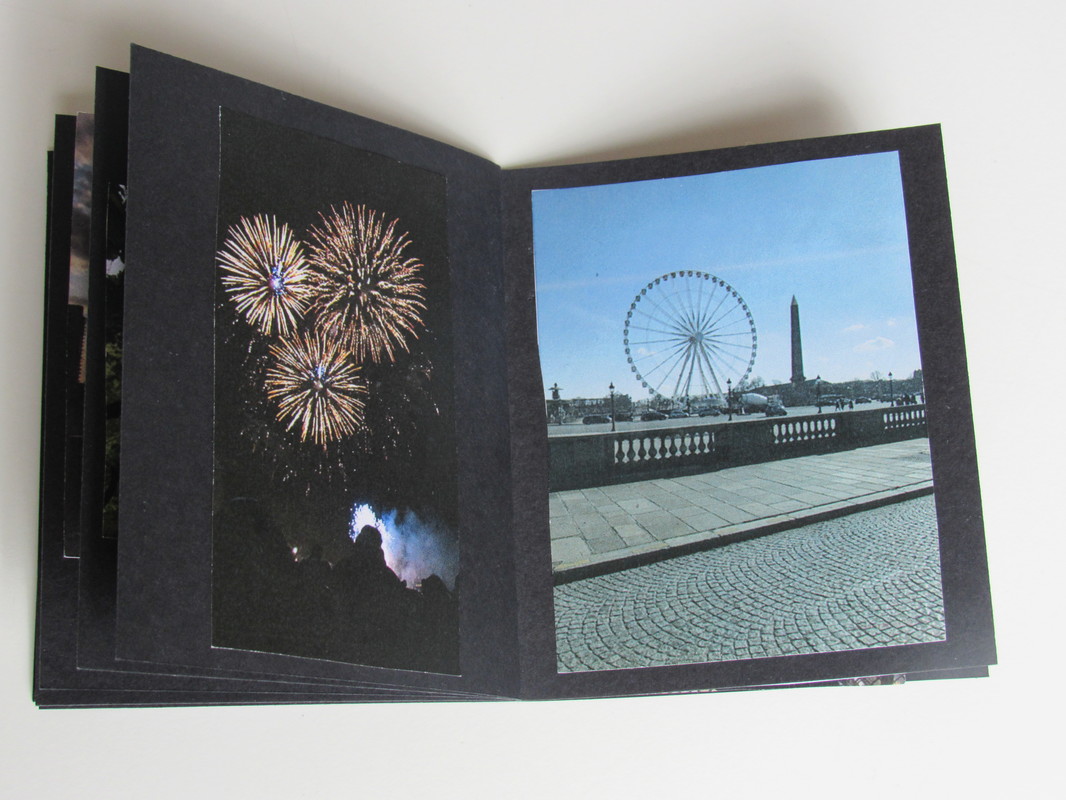
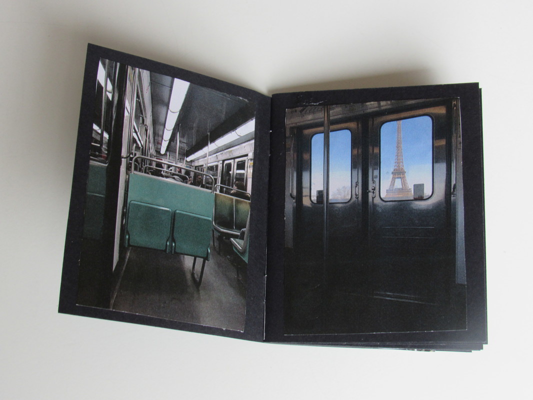
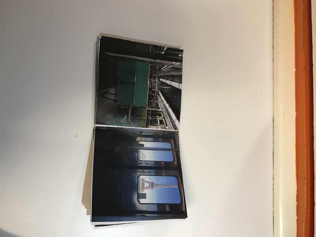
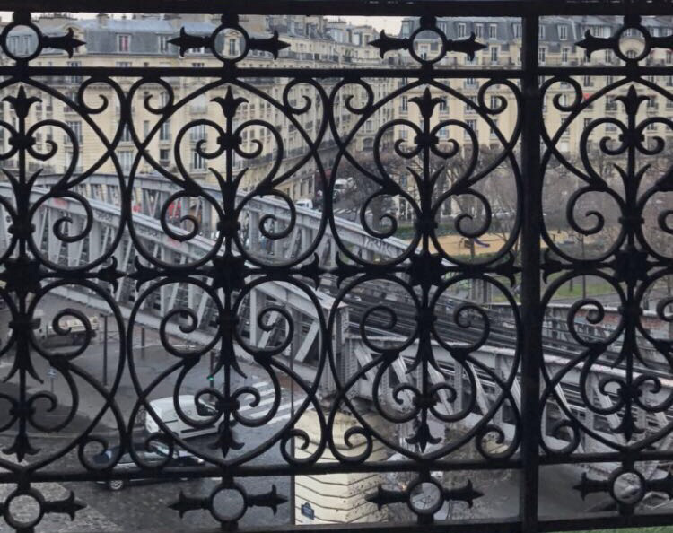
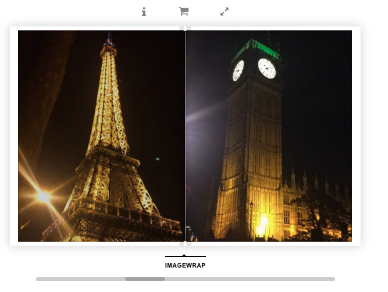
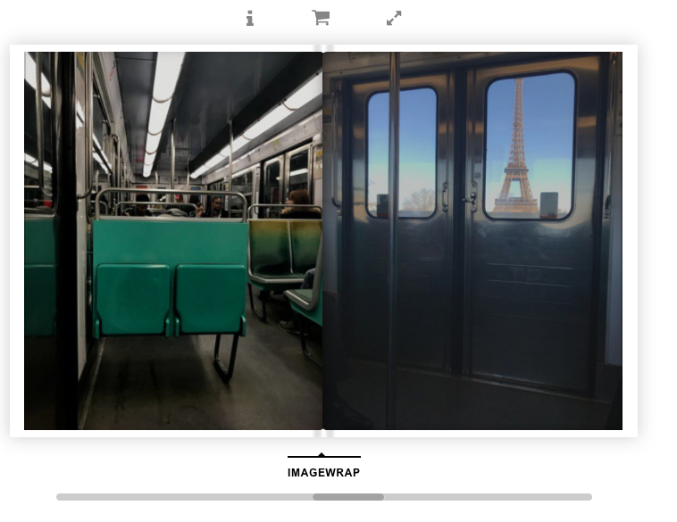
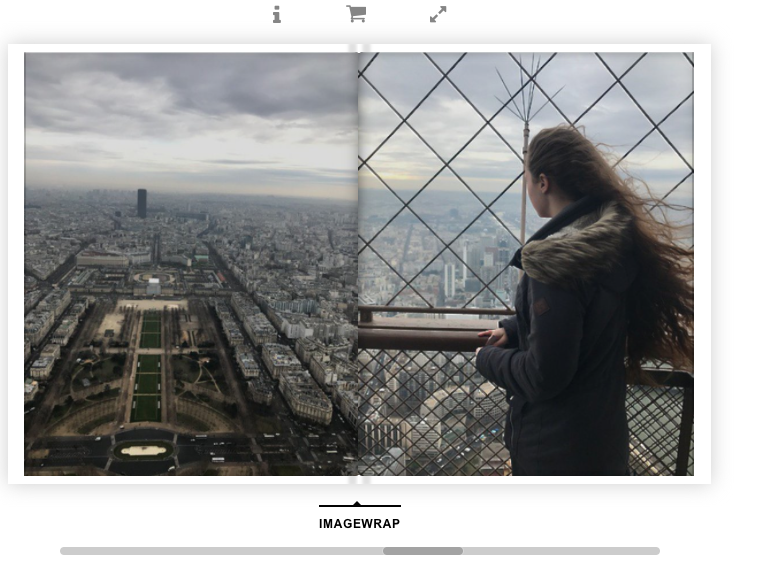
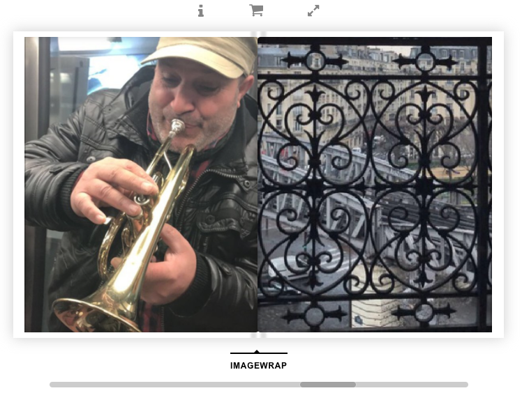
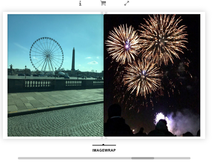
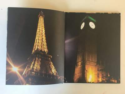
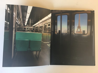
After a long time of looking and examining my book I came to the realisation that I wasn't too happy with my finished product. Whilst some of the pictures had very good aspects of photography in them I do not believe my book linked through a theme very well. Whilst making the book I believed that "A world of colour" was a good title as all my diptychs linked through a certain colour however, I have realised that colour is not always the thing on the page that catches your attention and so I no longer believe this is a appropriate title for my book; if I had the chance I would change it. Whilst the print of the book was very good the the pages felt very rich and nice to touch a few of my images that were close ups were grainy. This has taught me to be careful when choosing photographs and to always upload them from the original source of taking them otherwise the photographs may not come out how you would like them. It is clear to me that a lot of my photographs have good compositional and shape traits and maybe this should of been more of what my photobook was focused around. I also believe that sometimes I got too carried away and made the pages too busy, this is especially the case with the page of the landmarks. Looking at my photobook now I am not too pleased with all the pages in the book and believe that if I were to make another one I would focus on a specific theme better so that my photographs flow through the book. Saying this some of the diptych I have created are very pleasing to the eye and work well together. My favourite page is the picture on the train next to the one out of the train window with the Eiffel tower in the background. I believe these images compliment each other very well and have many aspects that look good together. Next time I would definitely have a more deep though process behind the theme of my photographs.
