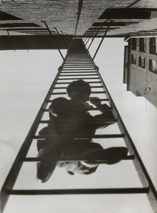
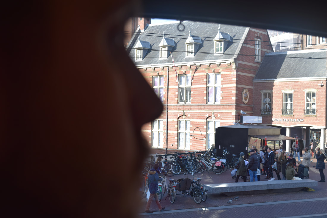
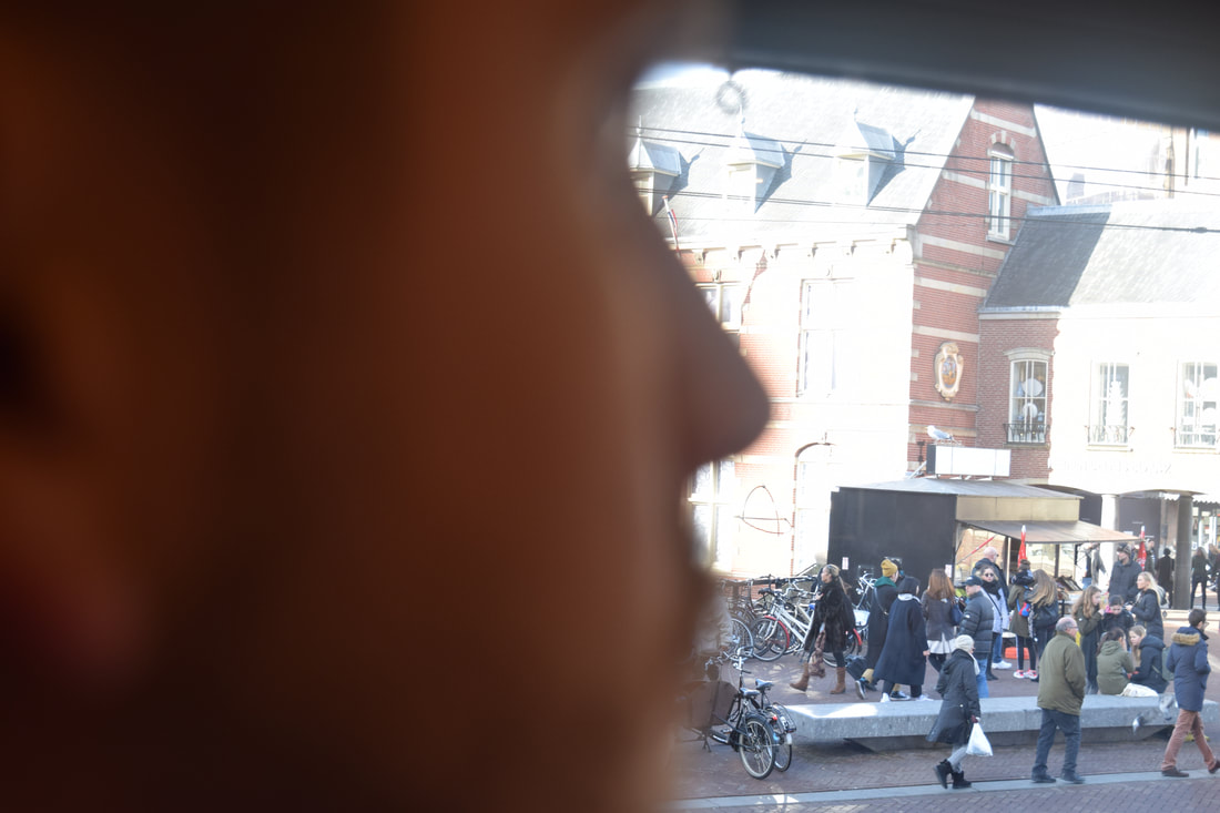
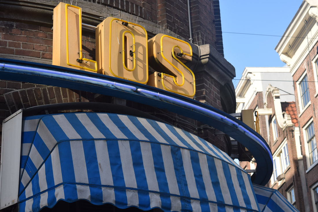
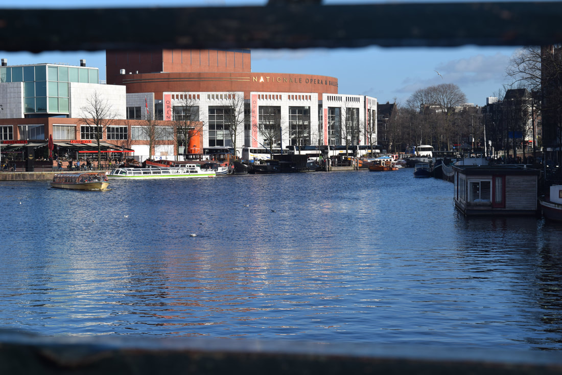
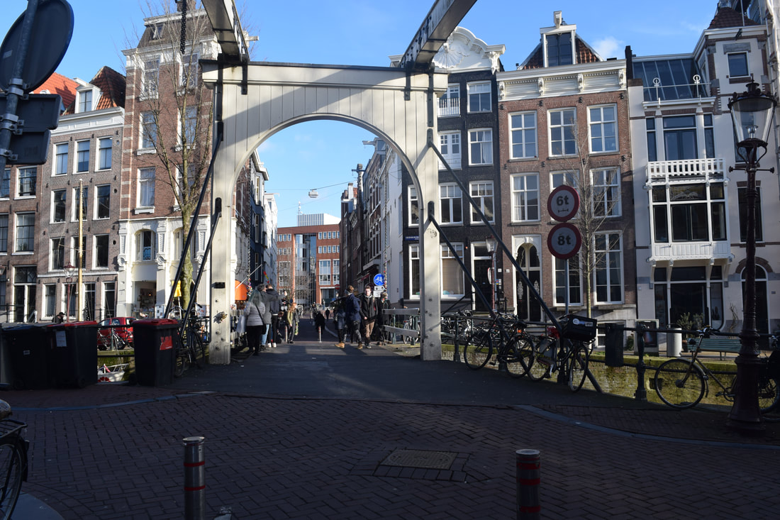
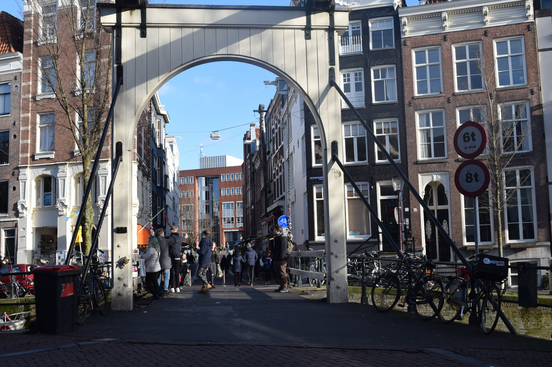
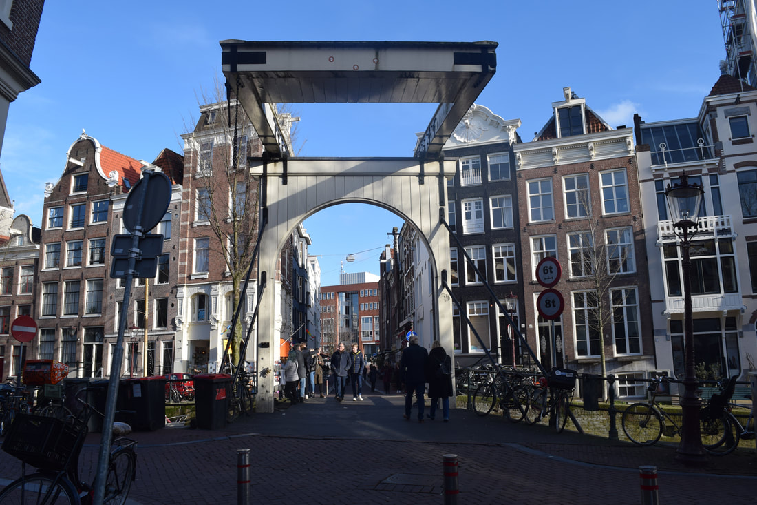
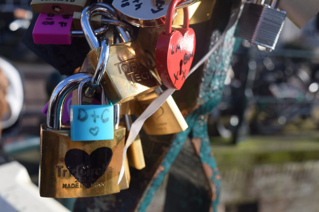
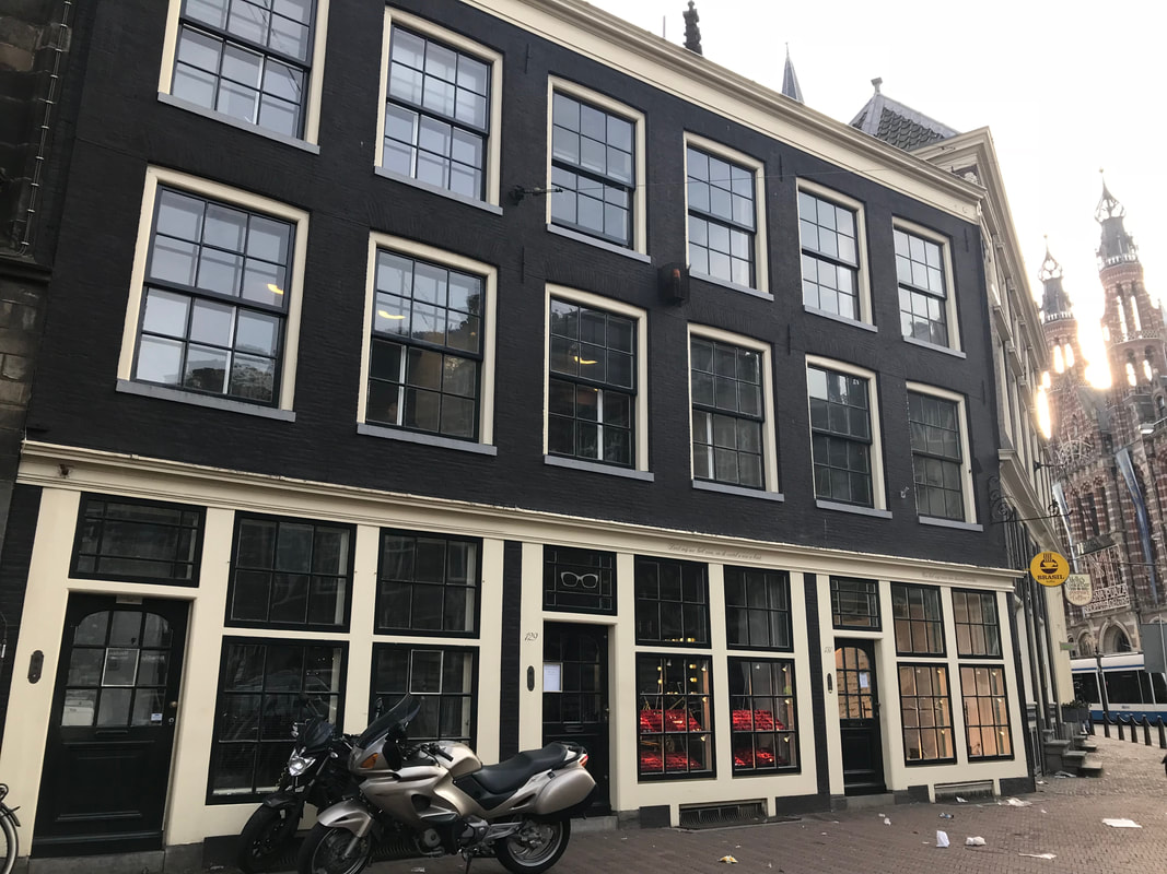
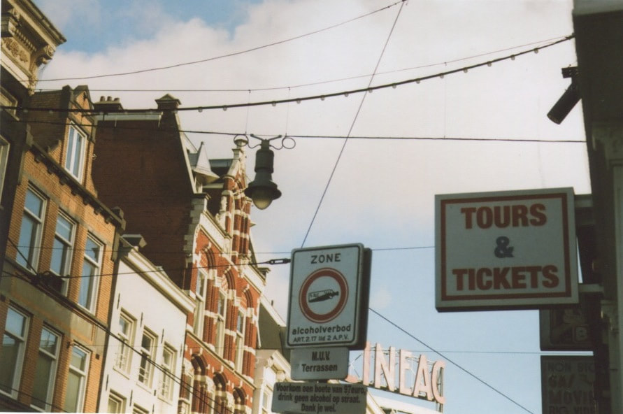
Unexpected perspectives is the idea of looking at the world from an unusual viewpoint to gain a different interpretation of the world and how it may look from a variety of angles.
The Radical eye - Perspectives:
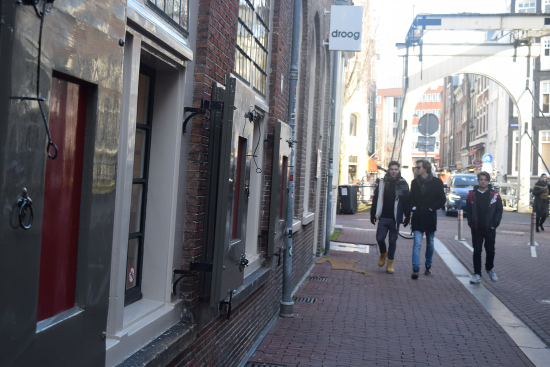
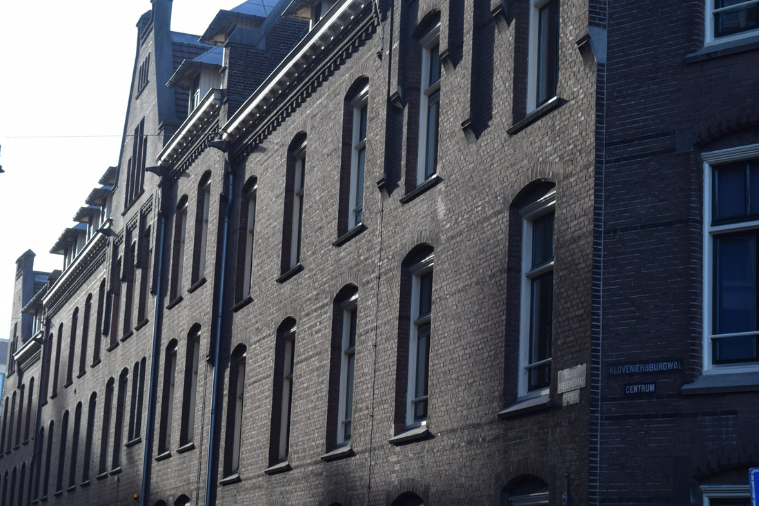
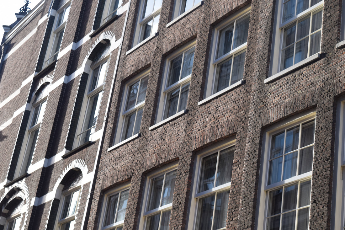
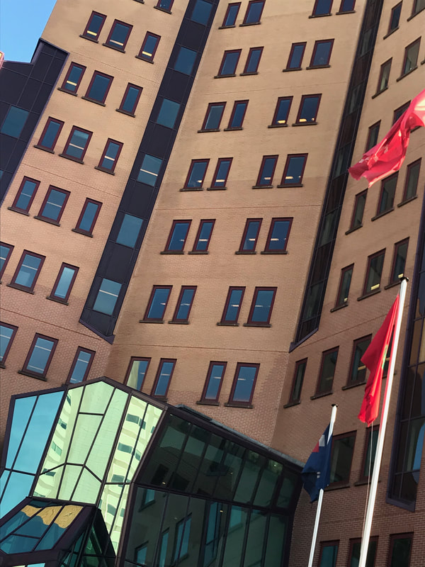
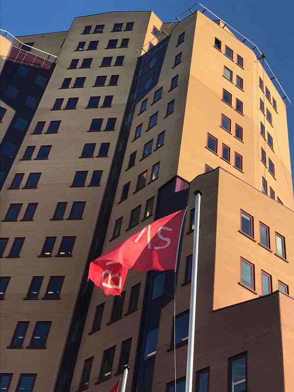
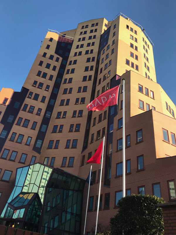
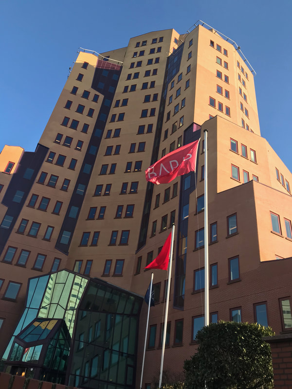
Photography at first was very repetitive and consisted of photographs that were constantly taken from cameras that were placed on tripods due to how heavy the equipment was. This often meant that photographs were taken straight on and often at eye-level meaning there wasn't a very wide range of different camera angles and viewpoints. The invention of the handheld camera then allowed photographers to take photographs from different heights and angles investigating how photography may differ when the perspective is changed. Osip Brik suggested that as technology was getting better and things in the world such as travel and the construction of buildings started to change so did photography. He suggested that people used to believe photography was just pictures taken at eye-level but as people started exploring the world more they took their cameras with them creating multiple opportunities for diversity in photography to increase.
Alexander Rodchenko:
Rodchenko's was a constructivist and a productivity and this meant that most of his work was based on practical, social purpose. Rodchenko used unconventional angles to take intriguing images that made people stare at his images for longer as the different viewpoint made it harder to perceive what is in the picture at first glance. Due to the timing Rodchenko used a Leica film camera that only shot in black and white. This will be interesting for my investigation as I can therefore experiment with how film and digital also affect the perspectives of things.
Rodchenko's photographs:
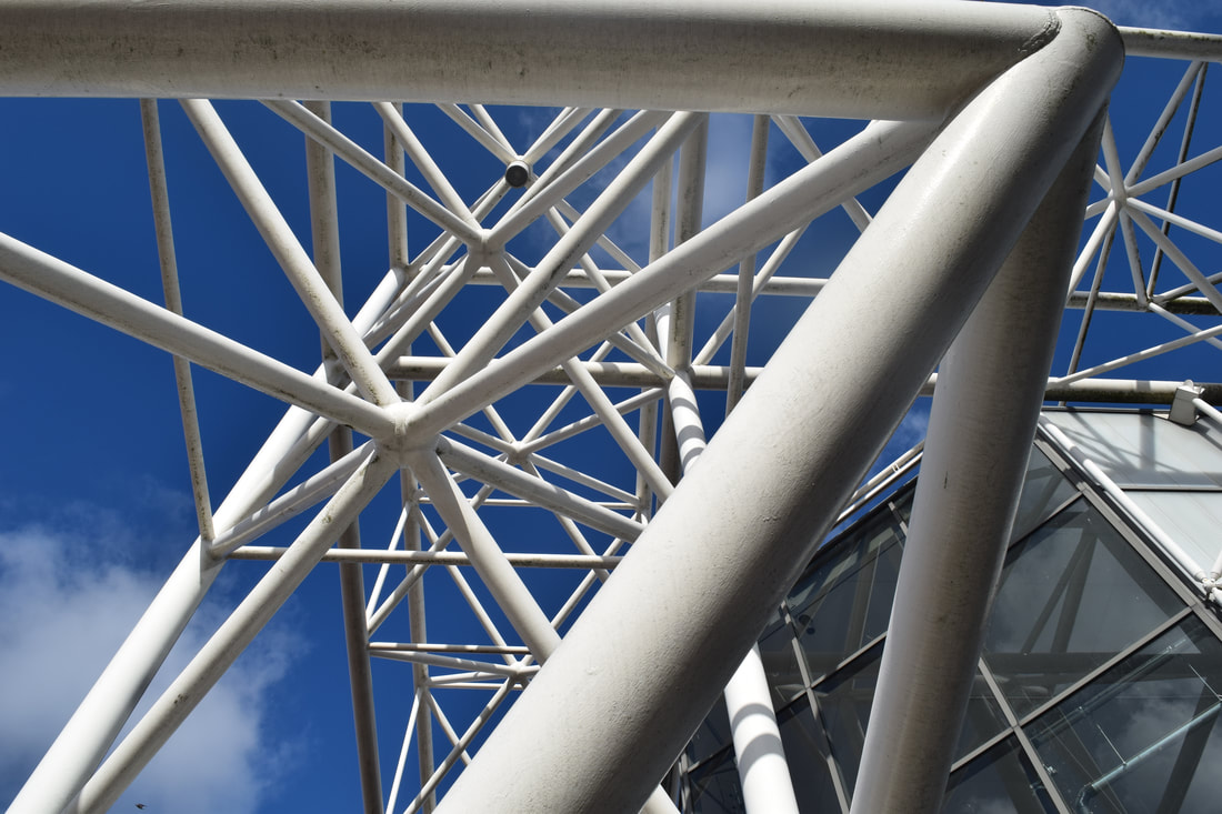
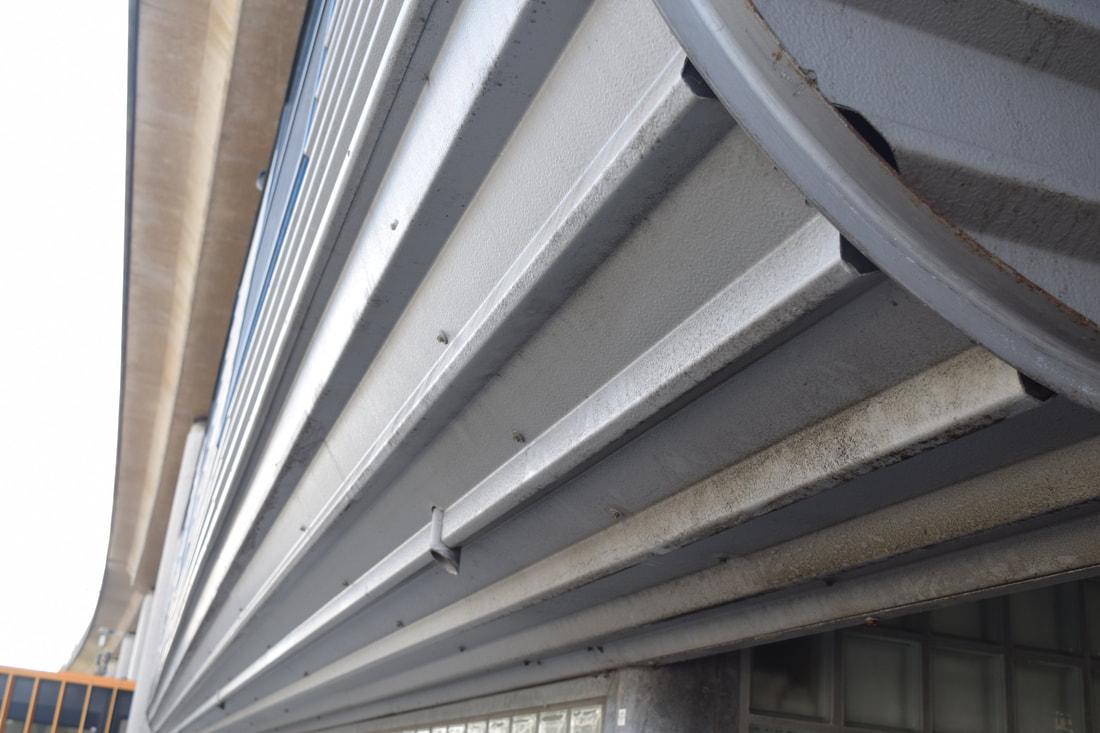
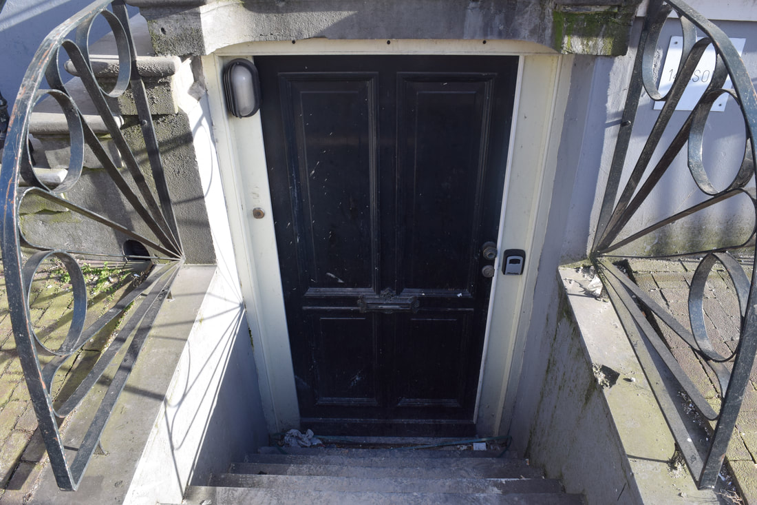
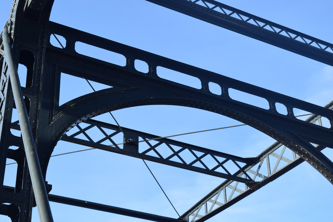
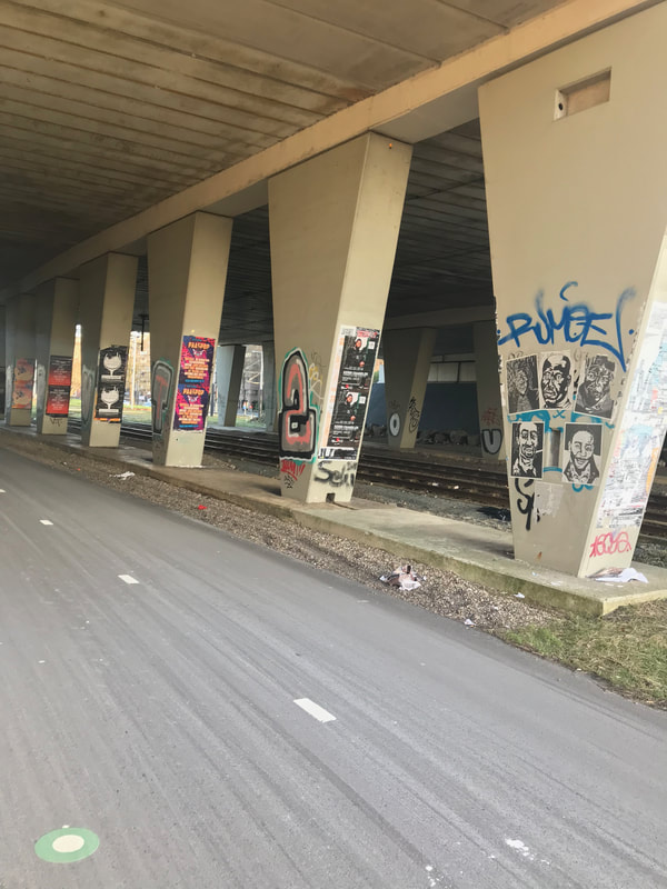
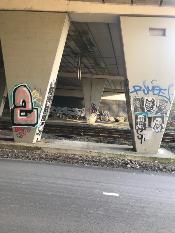
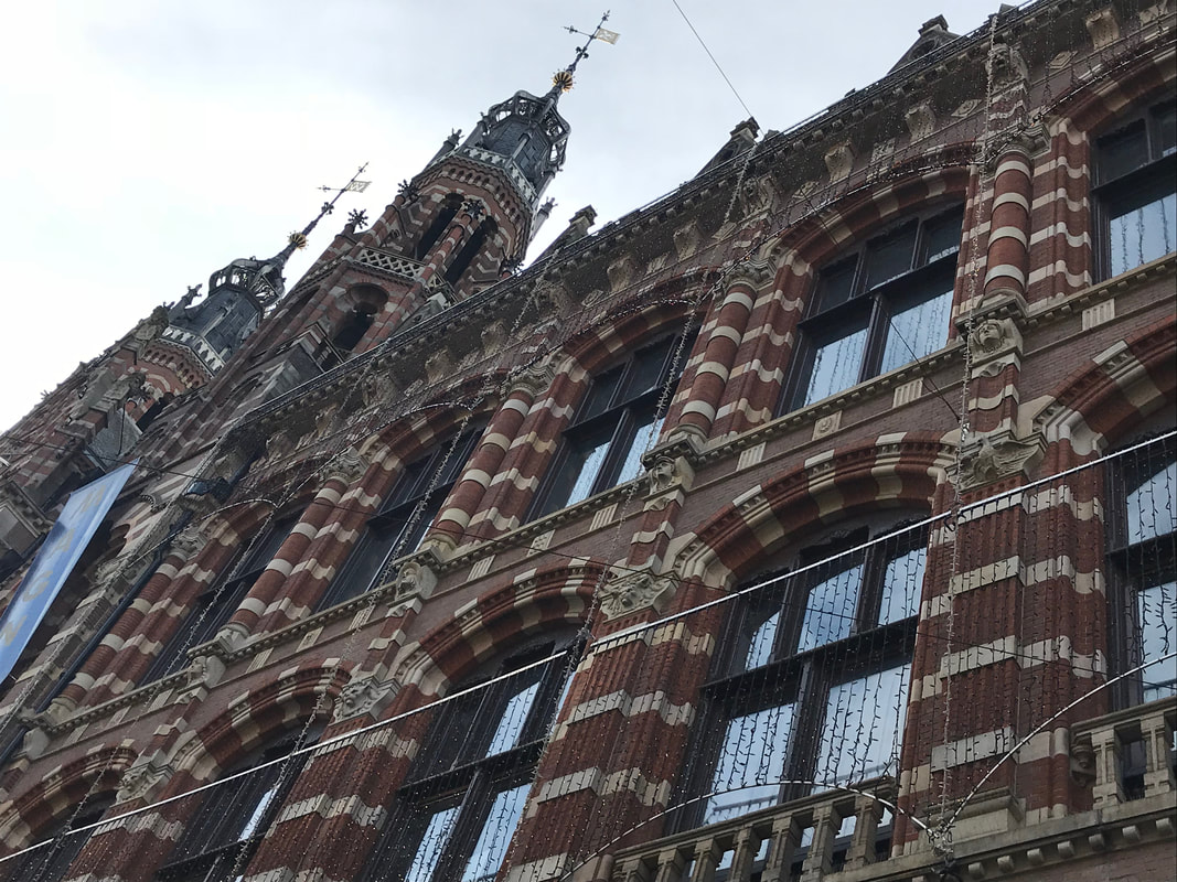
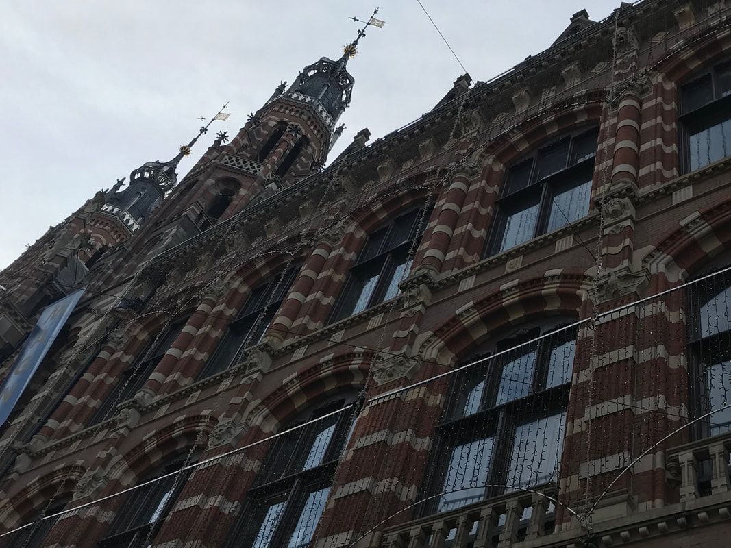
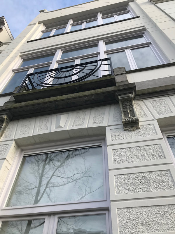
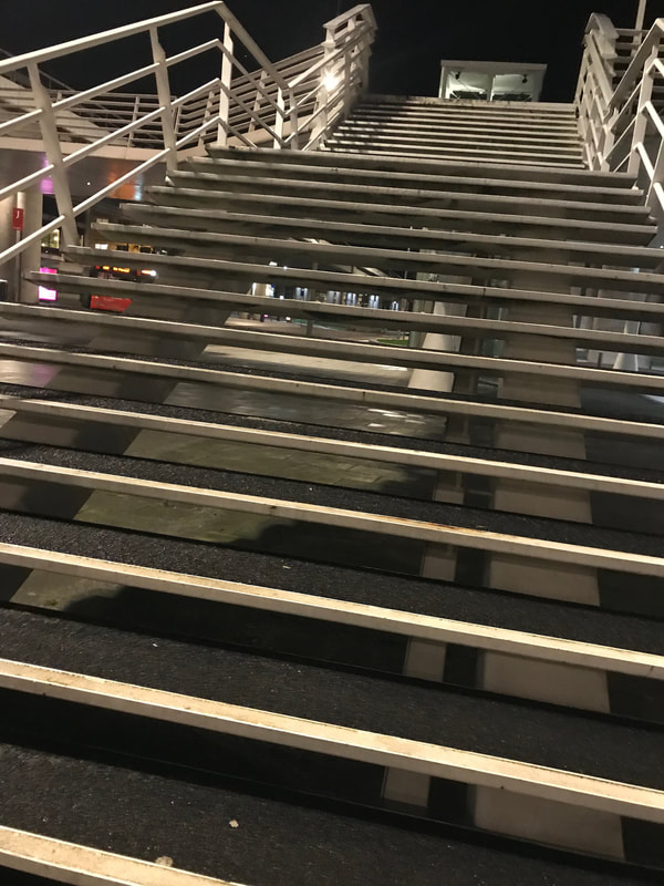
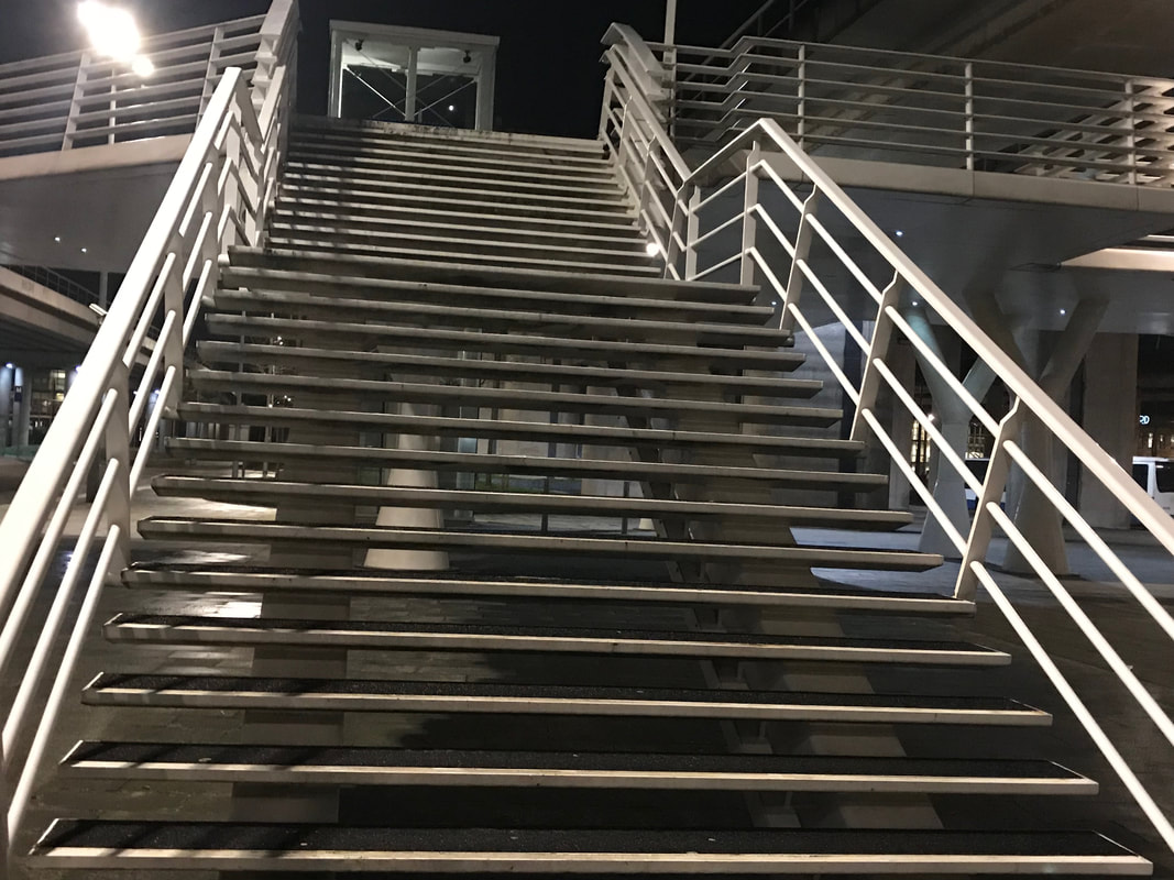
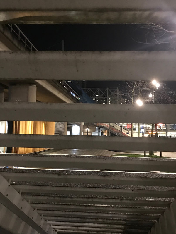
Rodchenko enjoyed shooting from two angles: from below upwards and from above downwards. This was mainly because he liked to explore with new angles that a handheld camera allows him to explore with rather than just taking conventional photographs that are taken straight on. These photographs being taken from unusual angles means that the viewer has to look at the image for longer in order to understand and interpret what the image is. This is because our eyes are not used to seeing things from this angle and so it takes longer for our brain to process what is happening in the images. Nearly all of Rodchenko's images contain vanishing point in them which gives his images good depths and also puts across a single-point perspective. This is the idea that things get smaller the further they are away. Rodchenko's images are also very geometrically pleasing as they are often of bold patterns and shapes which create aesthetically pleasing images which are often very abstract.
|
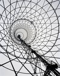
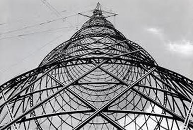
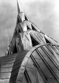
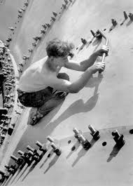
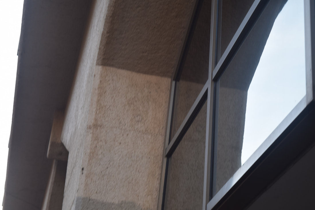
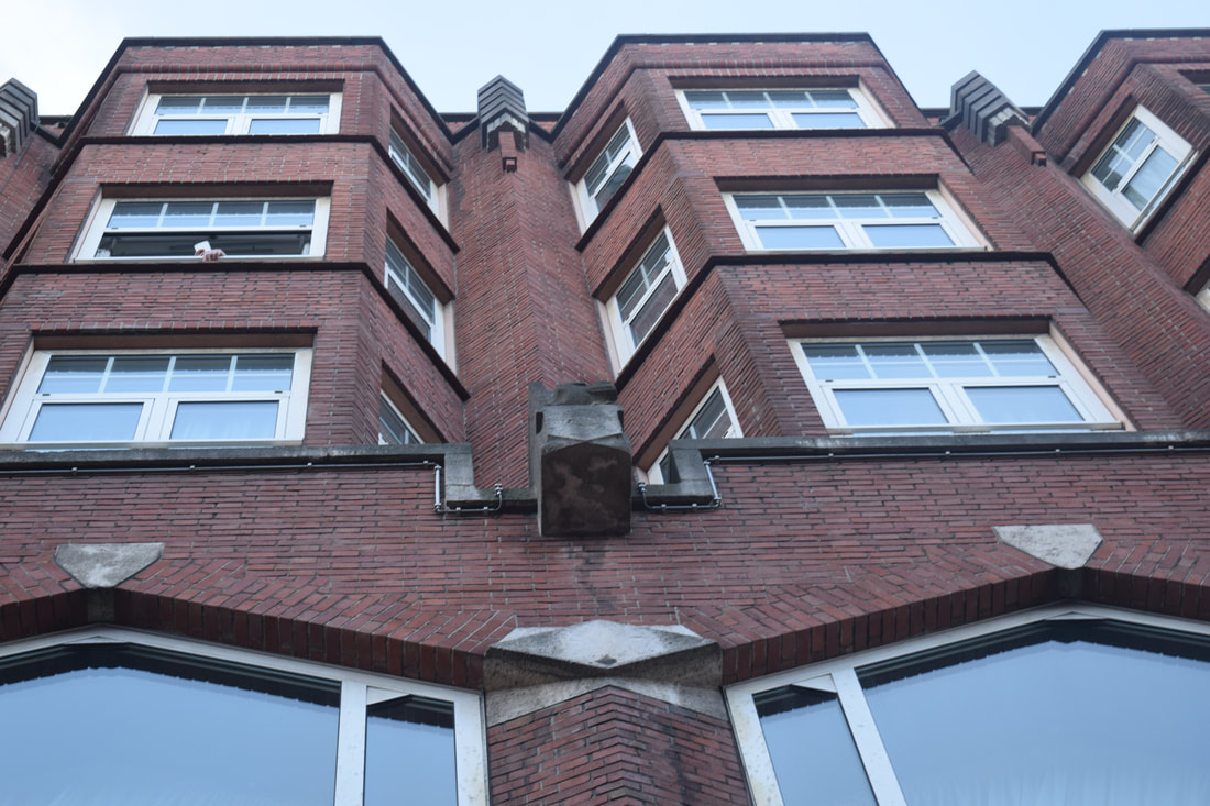
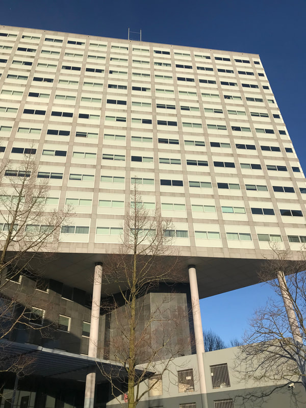
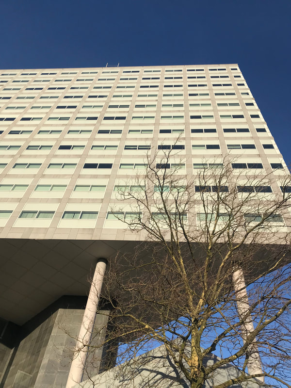
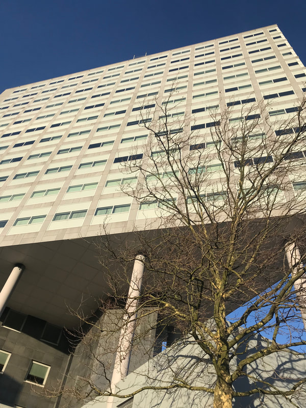
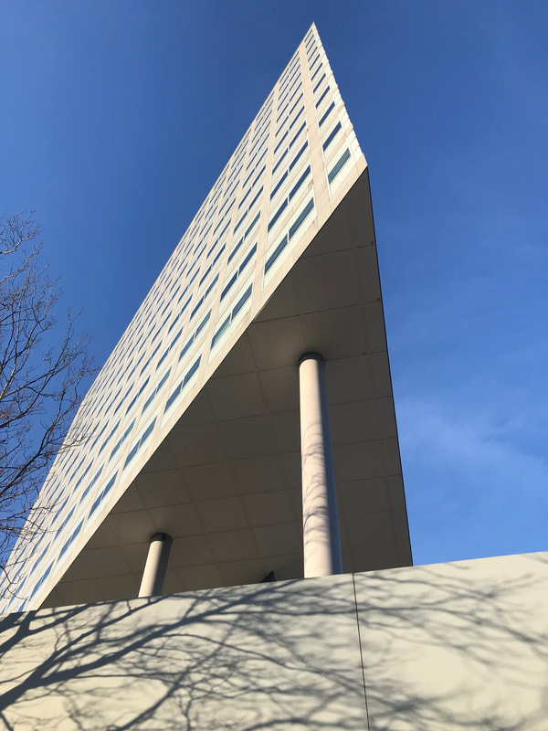
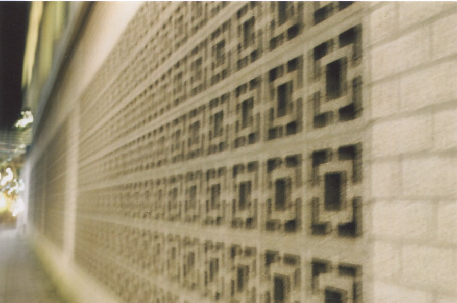
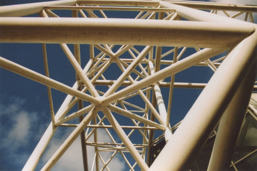
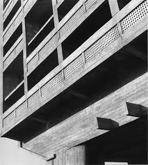
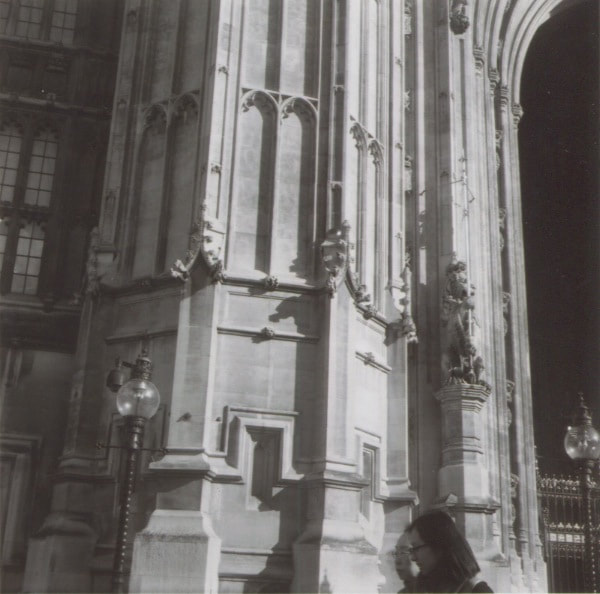
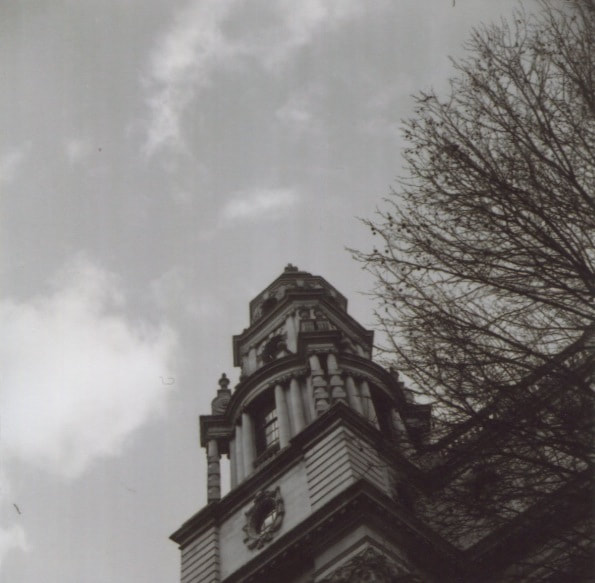
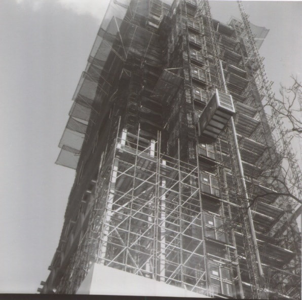
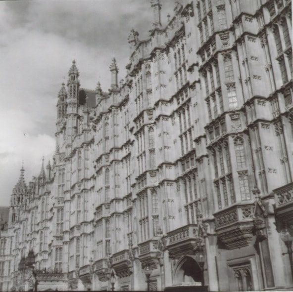
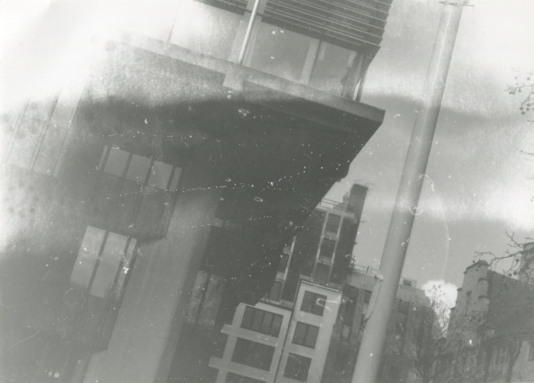
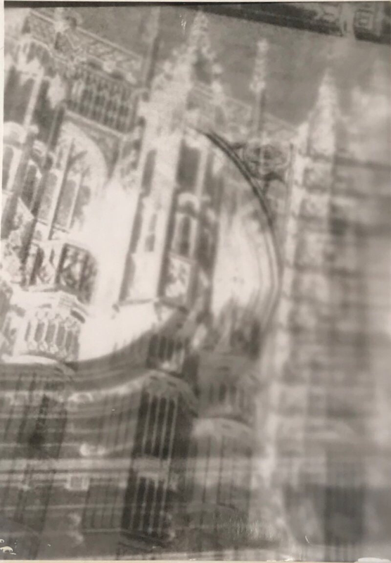
This image is a typical style of Rodchenko as it is taken from the ground up. At first glance of the image the viewer is not entirely sure what they are seeing due to the vase amounts of shapes and bold lines that are immediately thrown at them but then your eyes are allowed time to adjust and take hold of what the image is. This means the viewer automatically has to spend longer looking at this image that you might usually do on a conventional straight on image. The vanishing point in this image also give us a single point perspective and so make us believe that this construction is very tall and large.
|
Focus: The focus of the image is clearly on the structure that is presented in the middle as this has almost a dominant shape standing out due to the shadows being created from the angle of the photograph to the natural light.
Light: The lighting in this image is very neutral with darker areas around the construction as here light is being blocked from the camera creating a darker tone. As we can tell the light is natural and so there are areas of brighter lights in some sections due to others being blocked by clouds. Most of the light is soft and so it gives a smooth feeling to the structure in the middle of the image.
Line: For me line is the most important aspect of this image as it creates loads of different shapes and patterns that you eyes are forced to look at and follow up the structure. This picture consists of a variety of different types of lines which all have a different purpose in this image. The curved lines running through the structure and which consist mainly on the outline of the structure are bold and help the structure to stand out due to capturing the light correctly. The bold diagonal lines that create shapes running in the foreground, middle ground and background cause the viewers eyes to continuously climb up the shape until they reach the top. The little diagonal lines that are behind this create even more to look at. All of these various types of lines create many geometric shapes which are easy to look at due to the variety of negative space between them. The curved lines on the outside also create a vanishing point at the top of the image and this creates a very interesting single point perspective which captures the viewers attention. The perspective of this photograph being taken from the bottom up is emphasised due to the vase amounts of lines.
Repetition: The constant repetition of different types of lines creates a patterned of various geometric shapes which run throughout the photograph and continue from bottom to top.
Space: This image has a very large depth as it is taken from the bottom up and so the strong patterns and lines look like they get smaller as the image gets further away. This therefore to us gives us a perception that the object is very big and so creates a single point perspective.
Tone: There are a variety of different tones in this picture due to the lighting being natural and the picture being taken in black and white. This means that the greys, blacks and whites all stand out when presented. For example, the majority of the image is grey but the areas that have been blocked create a dark black tone which stand out. Also the parts of the image that are hit more with light are bright and so stand out among the grey's and blacks.
Artist similar to Rodchenko:
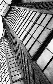
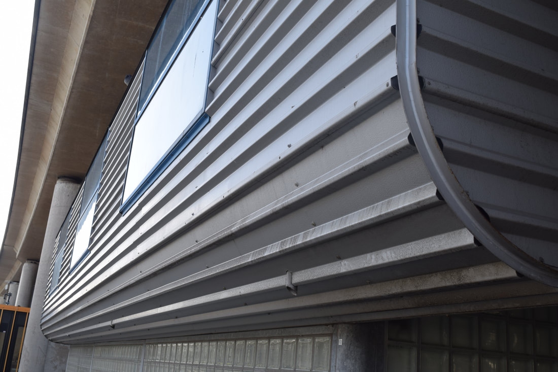
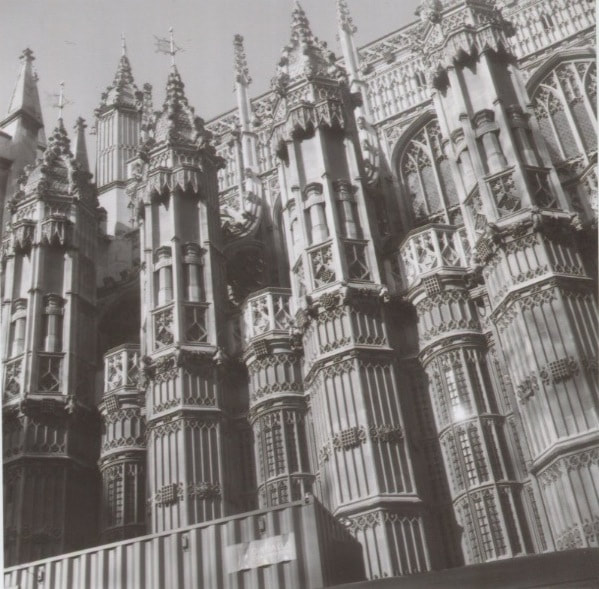
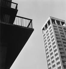
Margaret Bourke-white:
Bourke-white is another photographer that experiments with unusual angles to create effect. A lot of her images focus on people as well as bold lines and shapes. For example, she takes images at angles that make people look a lot smaller, buildings look a lot bigger or someone look like they are hanging when in fact this might night be the case.
Bourke-white is another photographer that experiments with unusual angles to create effect. A lot of her images focus on people as well as bold lines and shapes. For example, she takes images at angles that make people look a lot smaller, buildings look a lot bigger or someone look like they are hanging when in fact this might night be the case.
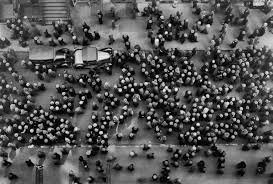
The angles of Bourke-whites photographs are often taken so that the camera is not is not just facing forward. She changes the framing of the photographs to make it appear like something is tipping over or that something is a lot bigger/ smaller than it really is. For example, the people on the street below look very small because the angle is facing directly down and is from high up therefore, changing how we perceive the people.
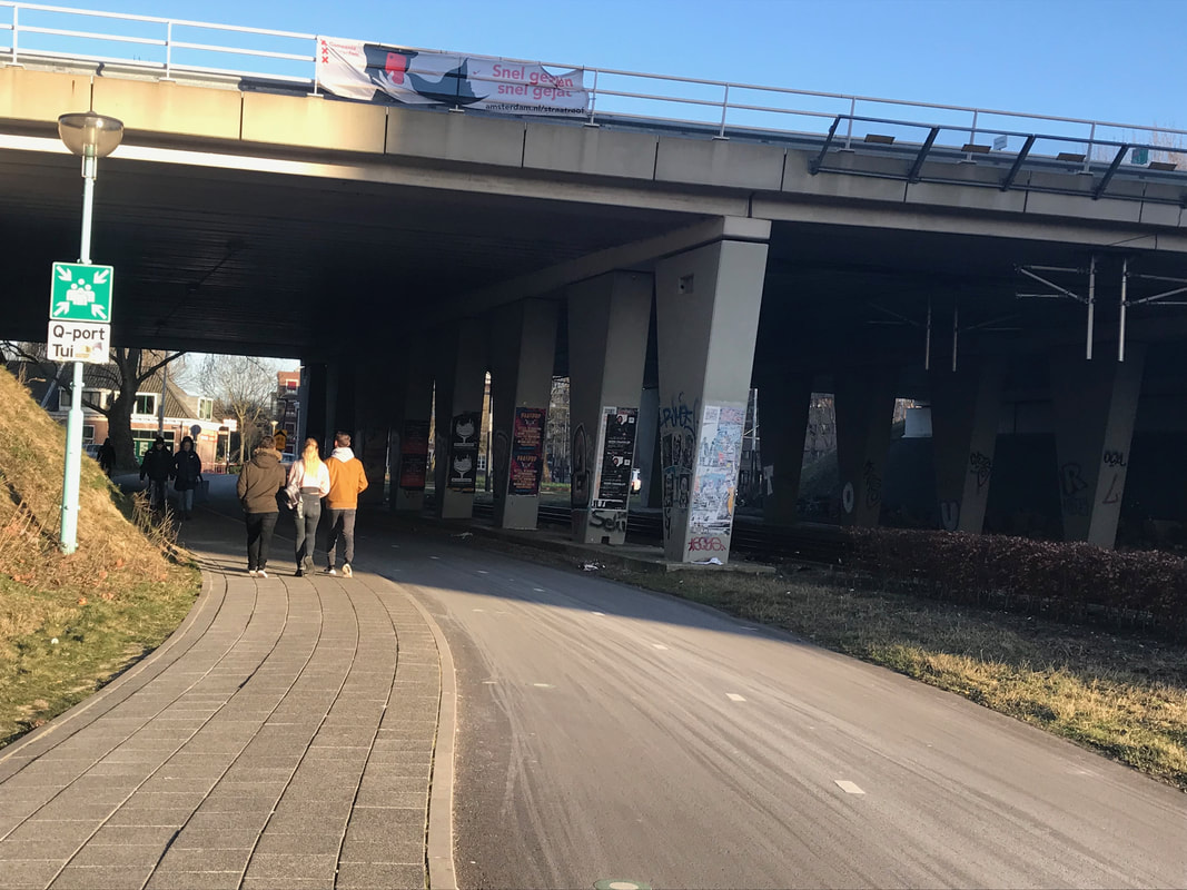
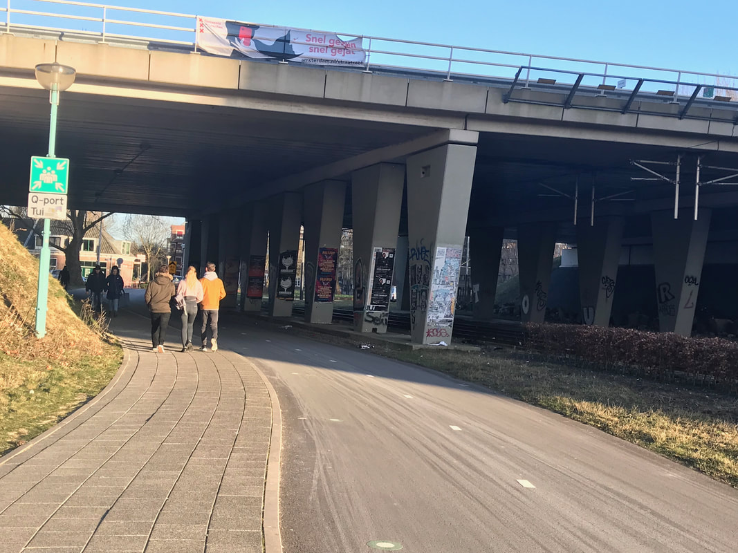
Bill Brandt
Brandt is considered to be one of the most diverse and dramatic photographers of the 20th century, at first focusing his photography on documentary photography but then moving to dramatic and surrealist photography that caused him to become a international inspiration. His images often use wide angle lenses and distortions which causes them to be powerful and intense. This means you become very drawn to the images that you see. Brandt's use of unusual viewpoints and lighting helped to broaden the boundaries of images and therefore create a different way for people to perceive images and also take them themselves.
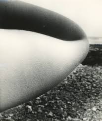
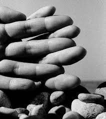
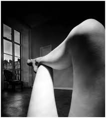
Brandt stated that using the wide angle Kodak camera he saw in a second had charity shop " created a great illusion of space, an unrealistically steep perspective, and it distorted. When I began to photograph nudes, I let myself be guided by this camera, and instead of photographing what I saw, I photographed what the camera was seeing." This meant that the shapes in the images were new to everyones eyes and no one had observed someone from these angles in photography before. This therefore, created a whole new perspective in photography.
|
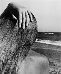
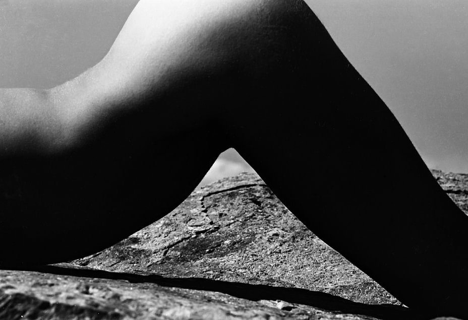
Brandt's nude photography are all taken at very close up angles with different amounts of the background and different amounts of the body showing. The body parts block out the landscapes forcing you to focus on the shape of the body part in front of you. However, it also causes you to try and look beyond the body part that is blocking the image and therefore draws your eyes to all different aspects of the image ( foreground, middle ground and background).
|
Focus: The focus of this image appears to be on the nude body part as it creates high contrast in the image and therefore, your eyes are drawn towards it. The body part also fills a lot of the image and so is the first thing you see when you look at the image.
Light: The lighting in this image appears to be natural as it is a photograph of a nude body in front of a landscape. You can tell by the shadows on the body and the light is blocked from some areas that the lighting is natural. Also by looking at the background you can see a variety of tones pointing towards to idea of natural lighting.
Line: The most apparent lines in this photograph are the curved lines that follow the shape of the body and this divides the photograph into 4 sections with one of the sections being further divided by a shadow. These lines force your eyes into all the different parts of the photograph. There is another distinct curved line that runs vertically through the picture and almost mimics the shape of the body causing your eyes to create a similarity between both the human body and the landscape.
Repetition: There is not much repetition in this image as most of the image is very close up and so blocks out a lot of detail from the background. However, there is a continuous curve that runs through the image as the body is bent.
Space: This image has a deep focus with all parts of the image being in focus but the different tones creating a difference between the body and the landscape. There is quite a lot of negative space as there is a sharp object placed across the screen which separate the photograph into many different areas and most of these just being negative space. This negative space is almost always in some sort of triangle and so causes your eyes to compare all the different parts of the image and therefore, observe the whole thing.
Tone: There is a variety of different tones in this picture one of them being black, where the body is shadowed from the sun and this means that no detail can be seen in this part of the image. However, this creates high contrast between other sections of the image and so is effective. The other colours such as greys are shown by the different amount of light that hits them and the brightest parts of the image that appear white are the parts of the body were the sun light are directly hitting.
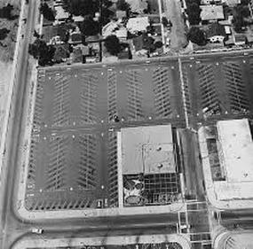
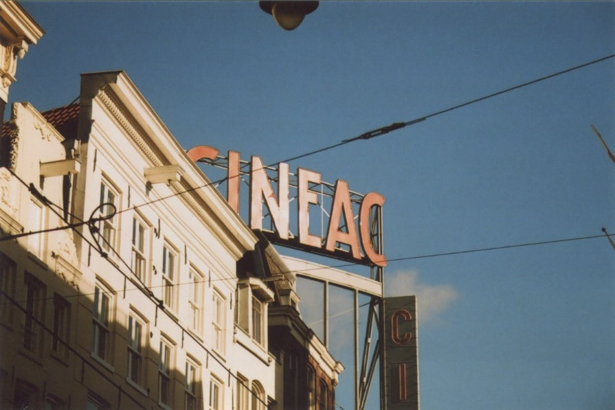
Ed Ruscha:
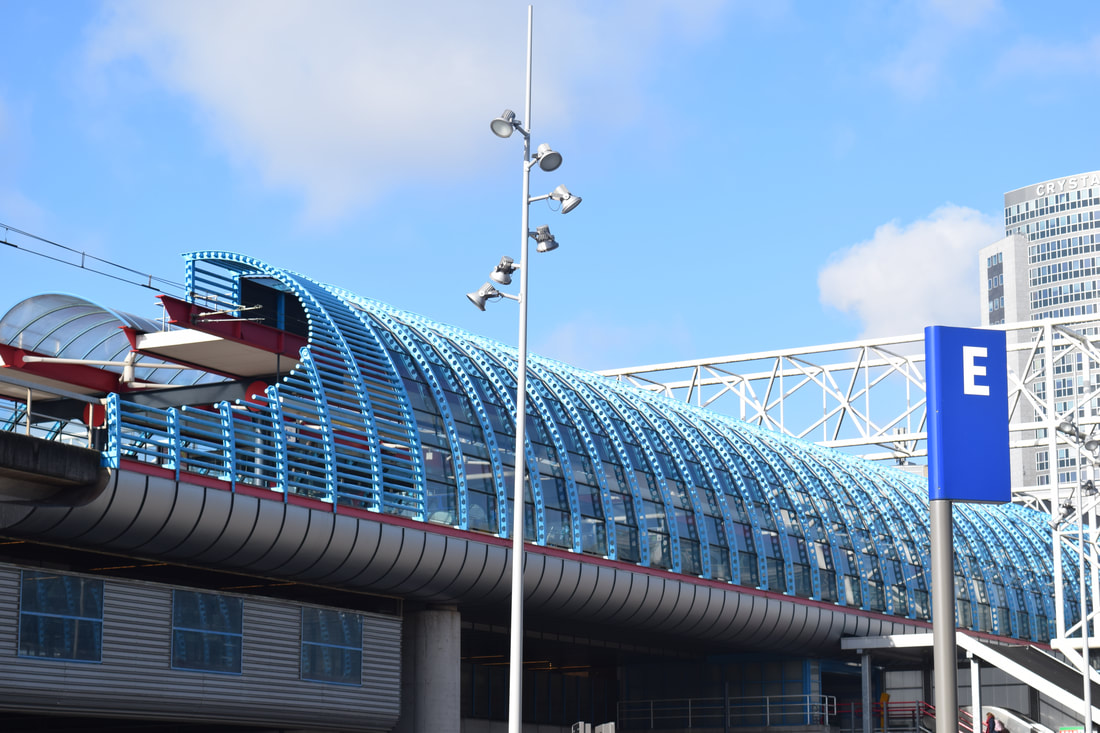
Ruscha tends to focus on basic subjects and take multiple pictures of this subject in different locations. This shows how similar different parts of the place he is photographing can be but also causes us to make comparison between the images and therefore, want to see the whole series. These photographs come from a series called " Thirty-four parking lots" and it takes an ariel viewpoint that creates a flatness to the photographs and cause our eyes to be directed to the details of the photographs.

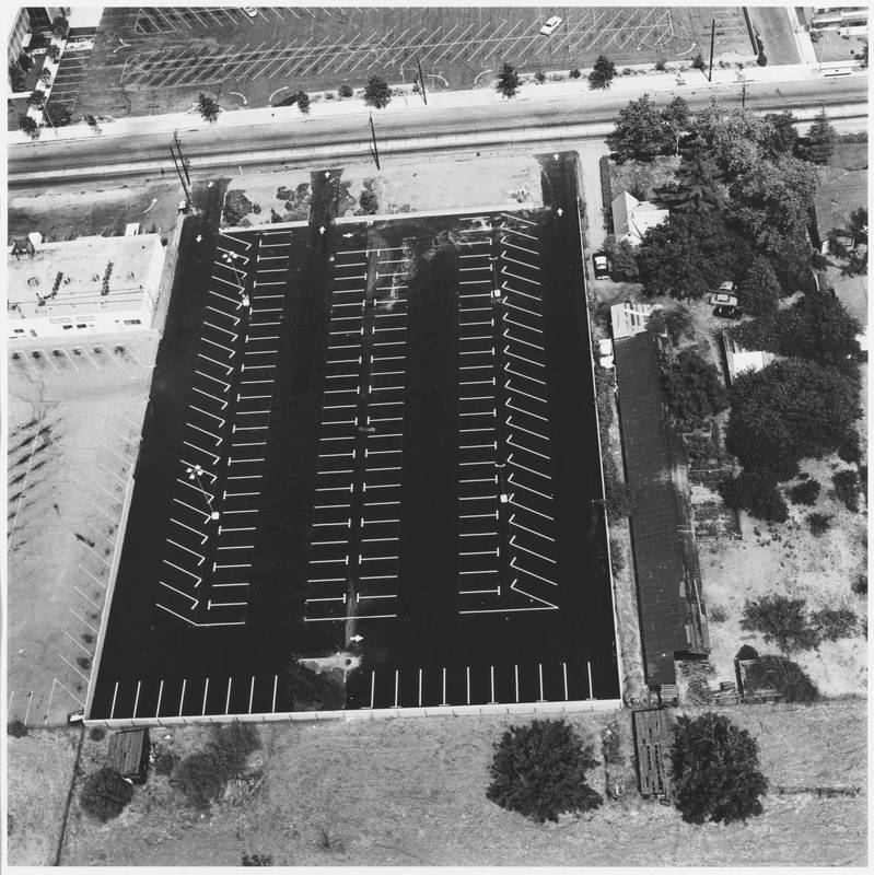
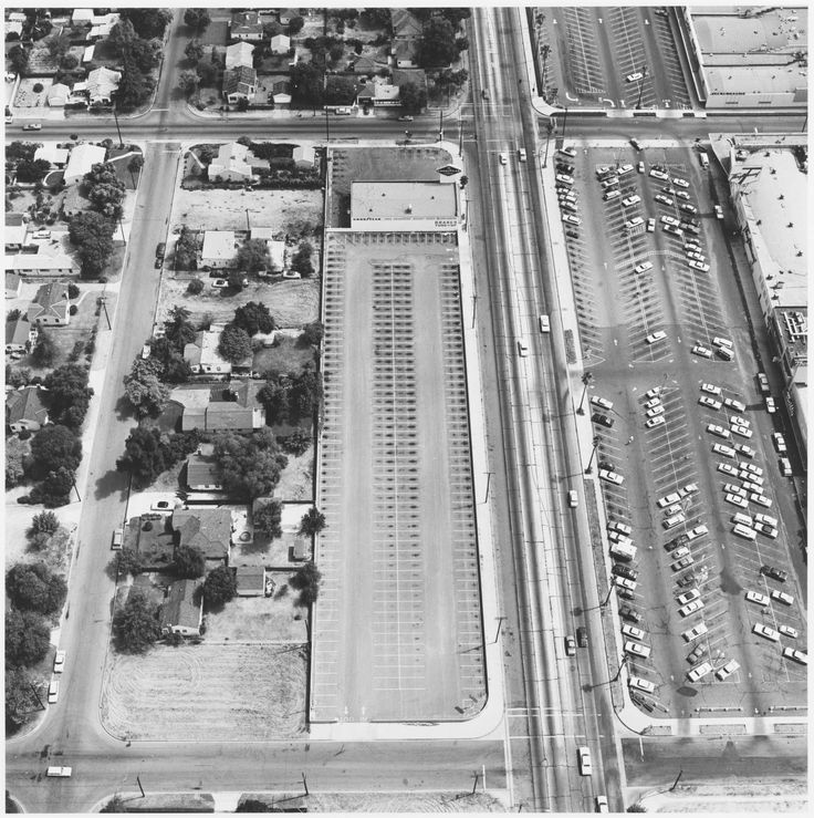
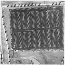
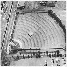
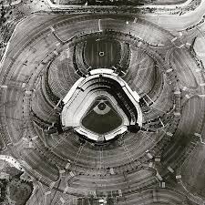
This series of images are all taken from an ariel view and so many patterns can be seen in the image. The ariel view allows us to see a large area as we are high up meaning more can be seen from the camera lens. This also means that some things are harder to see in detail as we are far away from them. As this series is taken of car parks it often shows a repetitive pattern from high up as we can see the constant markings on the floor where the car should go. Different types of are parks create different shapes yet all of the pictures still look flat due to the heightened angle of the photograph. Ruscha gain access to his photographs because he had a friend who flew planes which gave access to the Ariel view and this is what made it possible for him to take his images. Acessing heights like this would be very difficult as I do not know anyone who owns an aeroplane. However, I could go in to a really high building and take an image similar to these but they would not have the same feel as they will be behind a window.
|
All of Ruscha's images are taken from very far away and so all the objects mainly look two dimensional. This creates a lot of shapes and patterns and sometimes makes it hard to realise what you are looking at when you first see the photograph. The flatness of this image is what gives a two dimensional view and this is caused by the ariel perspective that the photograph has been taken from. This is not what we are used to seeing from a photograph and so our eyes have to look and observe everything before they can make a conclusion on what the photograph is.
|
Focus: The focus of this image appears to be on the space rather than a specific object. This is because the space draws your eyes to the image due to all of the lines and shapes created within this space. Your eyes are drawn here as it is an unusual pattern and so through deep observation you wish to figure out what it is.
Light: As the photograph is taken from an ariel view and is so far away from the subject it is clear that natural light is used. It would be very hard and expensive to use artificial light on a picture this big of scale.
Line: The lines in this image are very important as the repetitive diagonals make us question what is is we are looking at. There are also many strong lines from the buildings, roads and other objects which all create shapes that often appear to be flat due to how high up the picture is taken from.
Repetition: There is constant repetition in this image of lines and shapes from the car park and this creates interesting patterns which your eyes are drawn to as they are unusual. Repetition is the most common feature in this picture as most of the image consists of a empty car park which has loads of lines repeated throughout it.
Space: Due to the image being focused on different lines and shapes there is a lot of negative space between the lines and around the shapes of objects such as buildings. Although there is a lot of negative space the image still seems really full due to all of the lines.
Tone: There is a variety of different tones in this image and this is due to how the natural lighting and colours of the images clash to create the different tone. The buildings are very the lightest colour ( closest to white) as this is where most light would be reflected and so a lot of light gets caught here when the picture is taken. The ground is quite dark grey but has darker patches that almost fade into black which is probably due to shadows from blocked light. This means that there is high contrast between certain parts of the image.
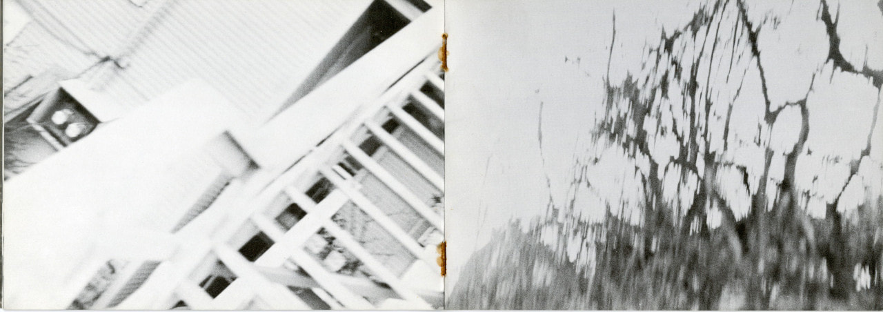
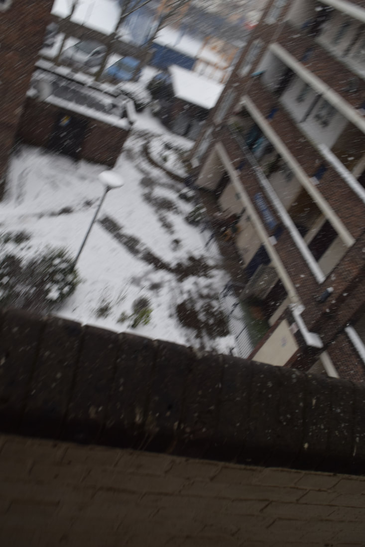
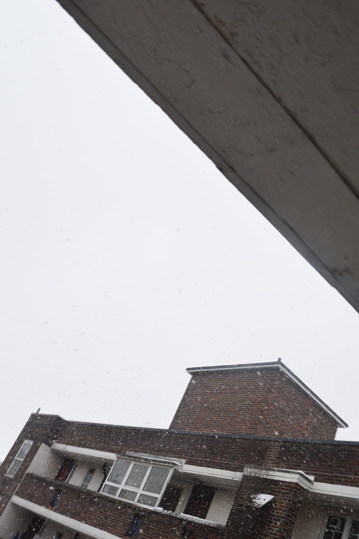
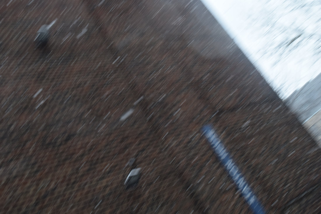
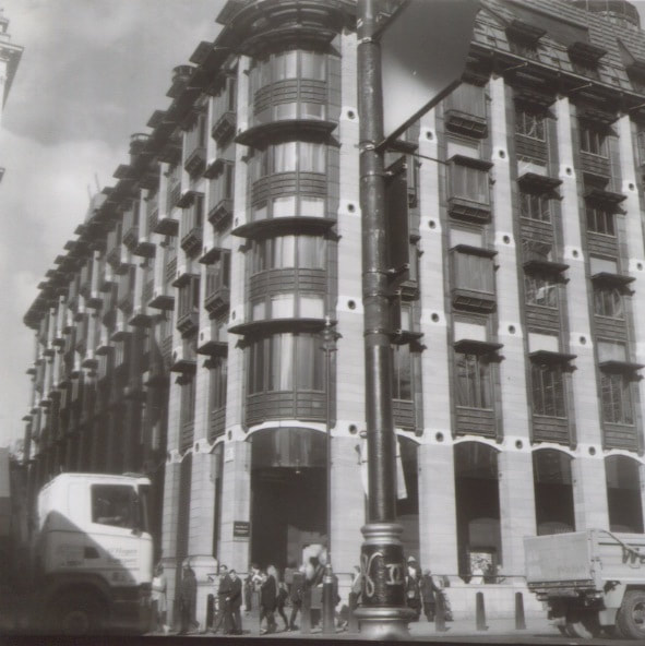
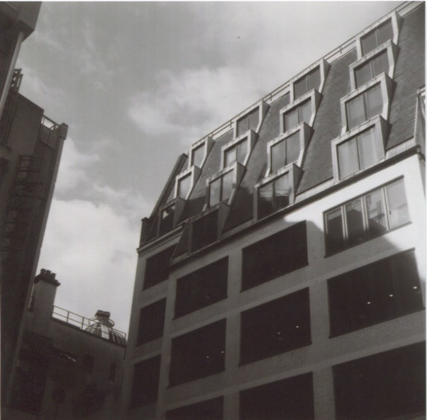
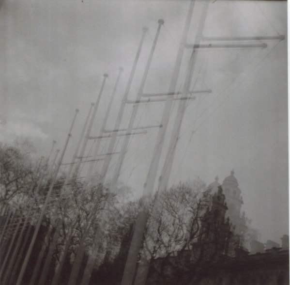
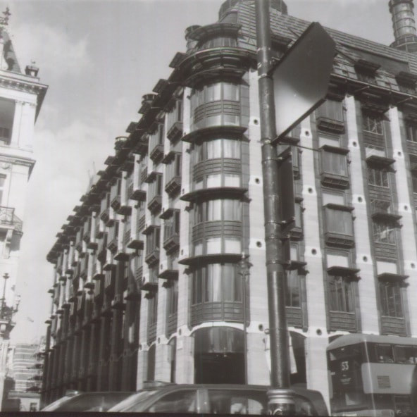
My response to Rodchenko's work:
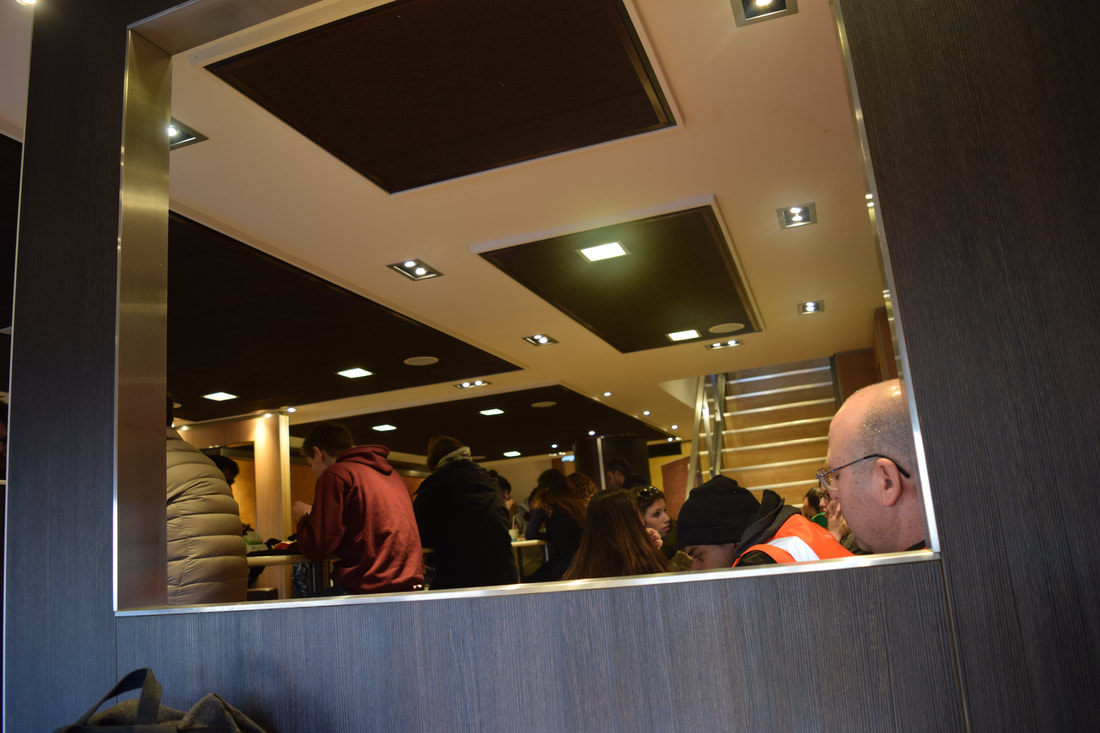
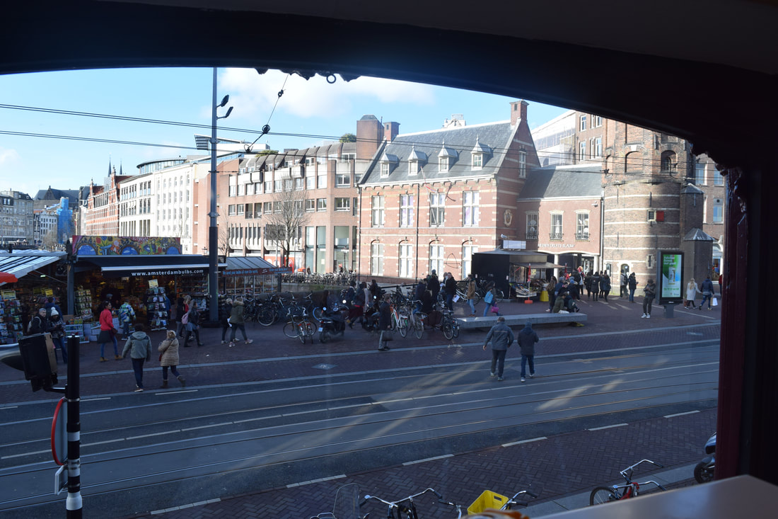
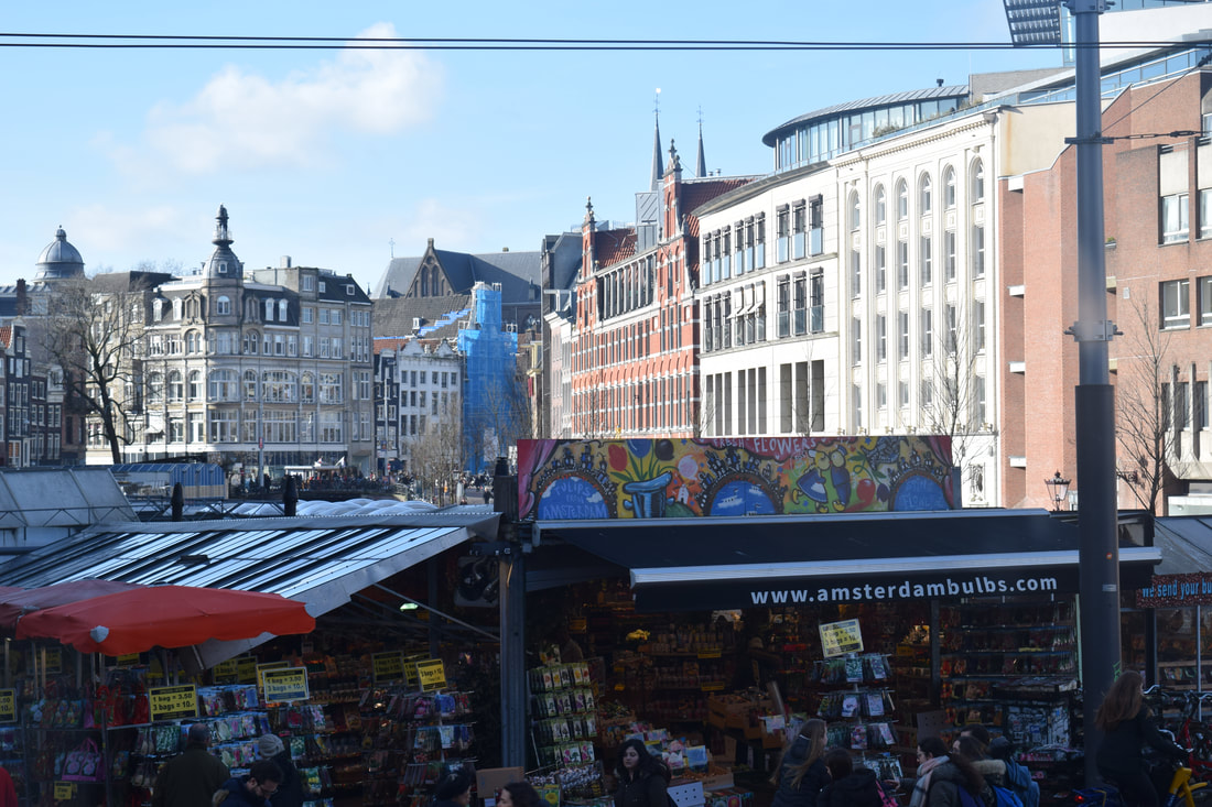
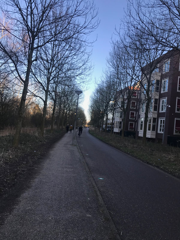
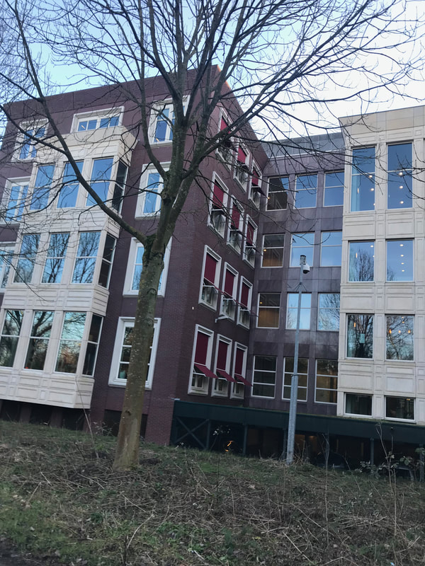
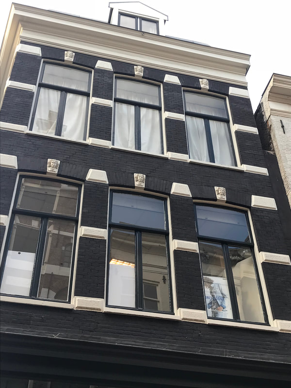
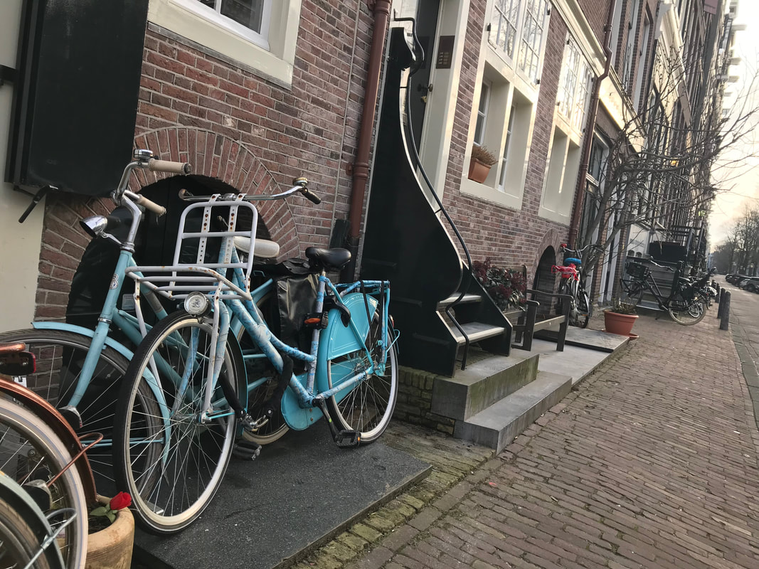
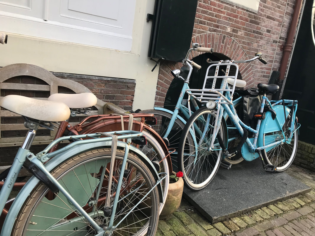
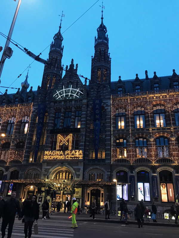
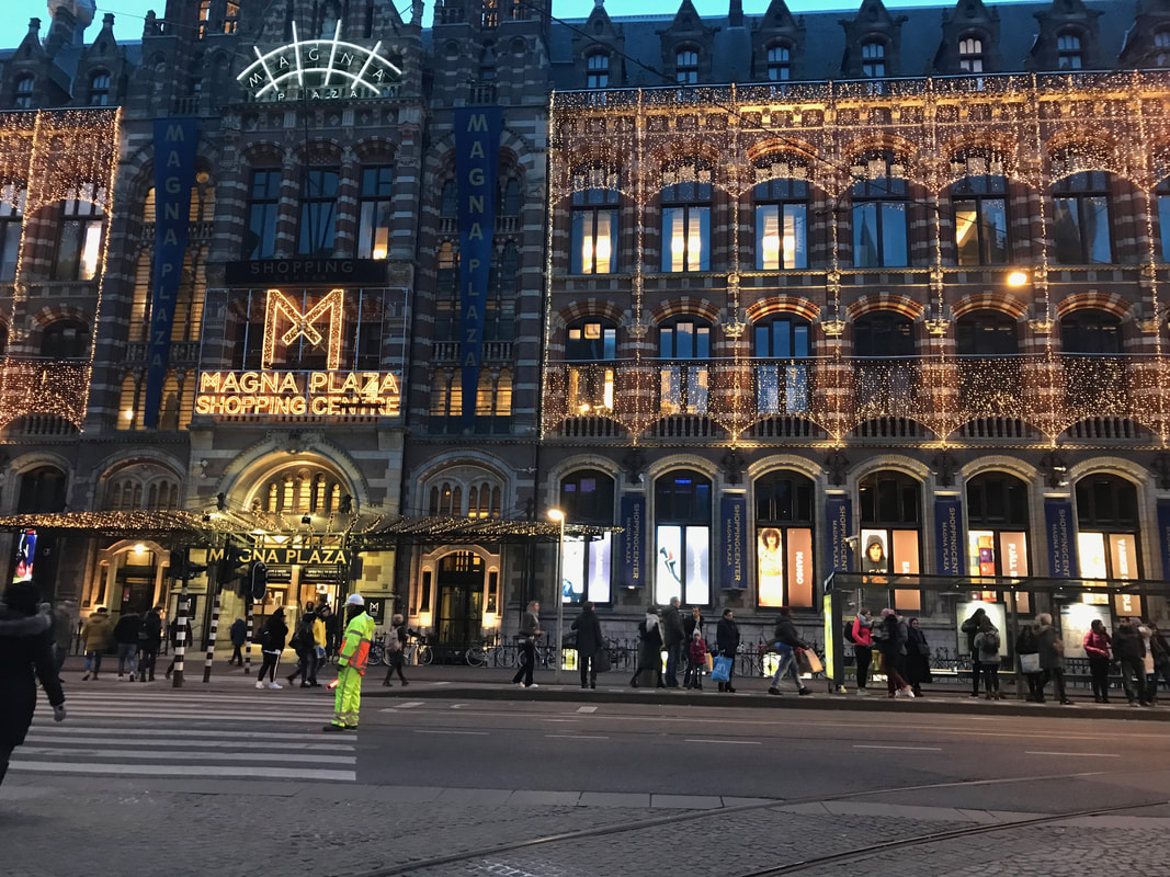
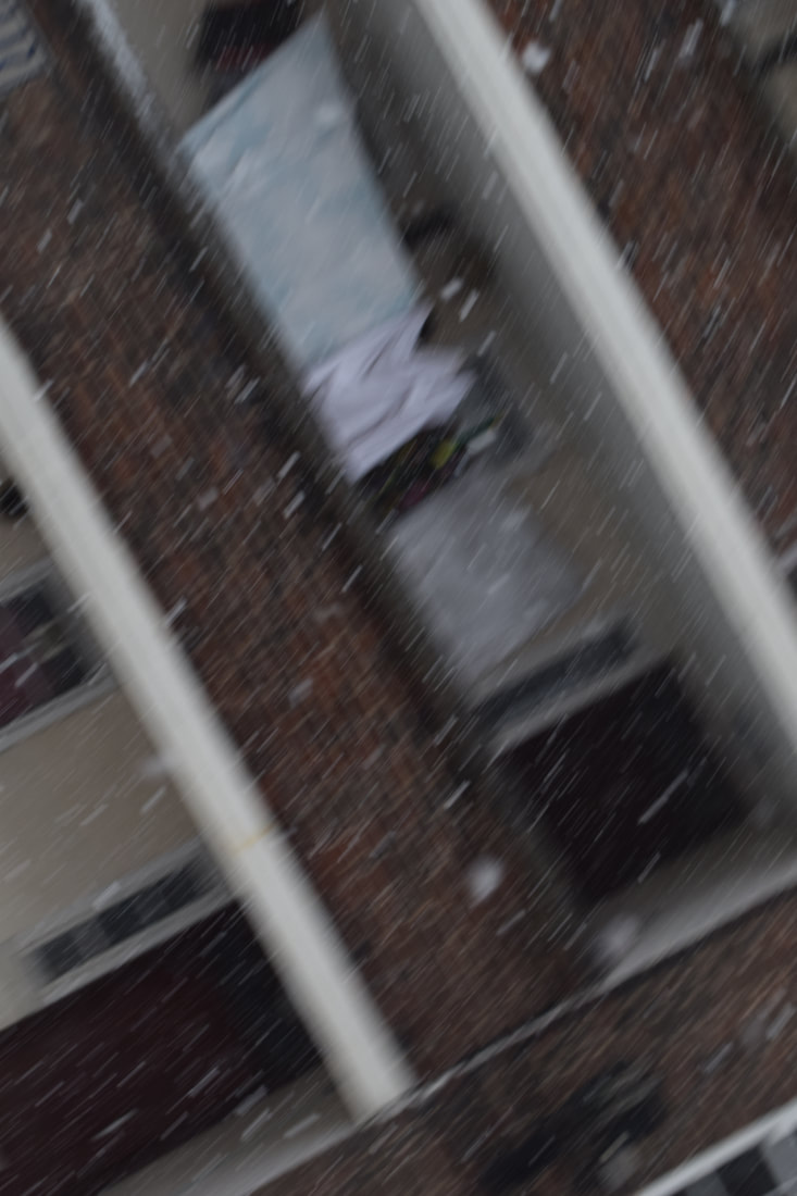
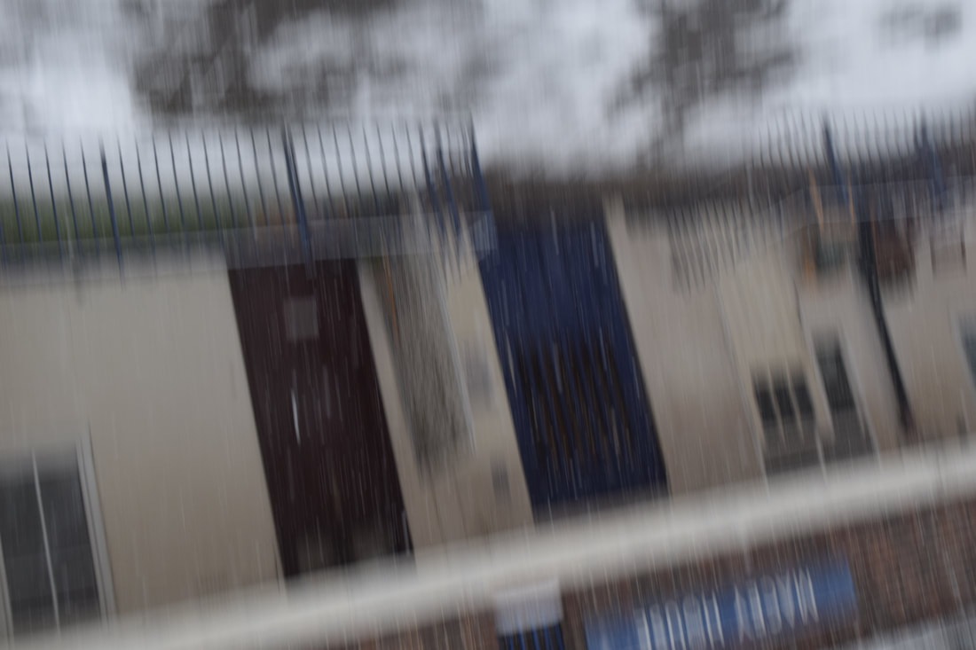
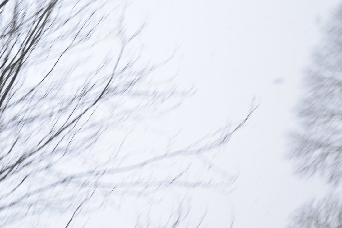
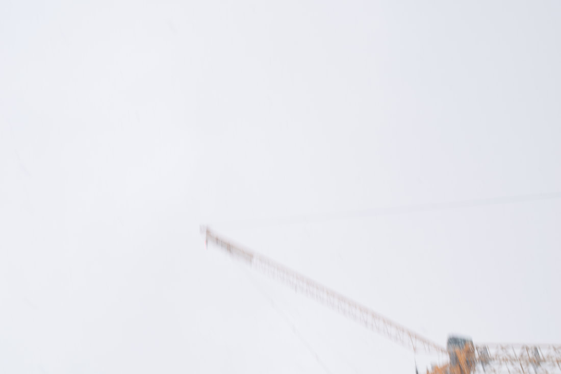
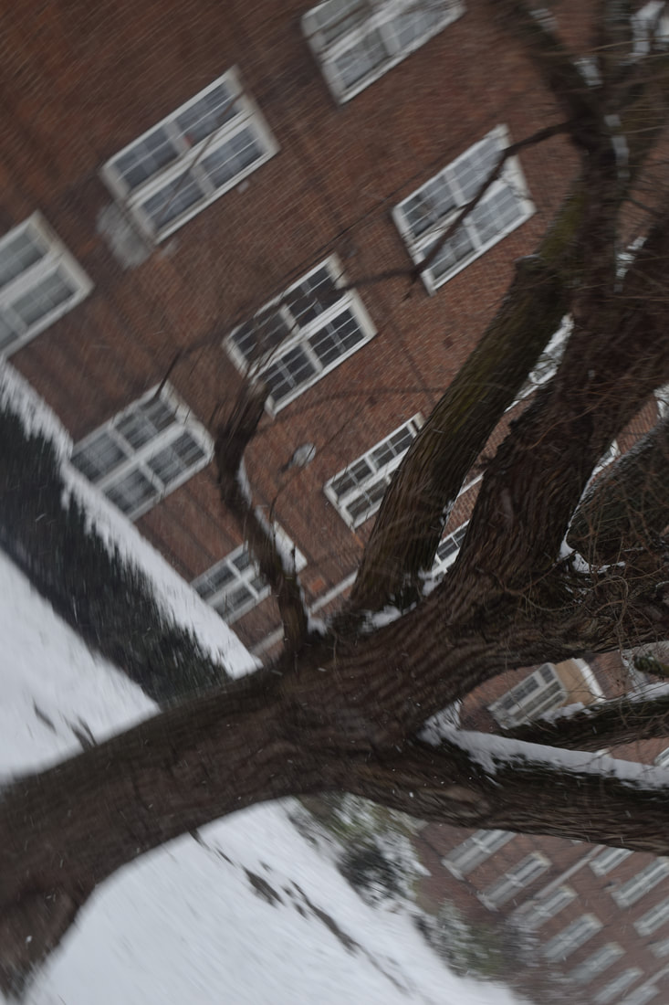
I wanted to attempt to use different types of camera's to see if I could get a similar feel to Rodchenko's photography. I took three shoots one on a digital Nikon camera, one on a canon film camera and the other on my iPhone. All of the photographs I have taken are shoots I have taken whilst on the go when on holiday. Taking photographs from different angles is interesting as sometimes it works very well yet other thing I believed it made it seem as though I haven't thought carefully enough about my framing. This has given me insight into how I may conduct my next shoot and the idea that I need to look more before taking my photographs and consider the compositional aspects even when playing around with angles and perspectives.
Digital shoot:
This was the first shoot I did responding to Rodchenko and while I believe some images were successful I believe I was still drawn to taking images at conventional angles and so only some of these images could be linked to my theme of unexpected perspectives. I believe I need to take more time composing my images and thinking about the angle of my images rather than the subjects I am taking pictures of. Whilst saying this I believe this shoot has also been successful as it
Iphone shoot:
For my second shoot I believe I took more photographs at the angle I was aiming to shoot my photographs at however, there were still many photographs that were taken at a conventional level and this meant that I was getting better at being experimental with my photographs but I still needed to explore more. I also believe that I need to explore different heights in my photographs and not always take them from the bottom up but try taking some from the top down. I believed this would be interesting as if I could find a building or something high and take a picture looking downwards it will affect many aspects of the photograph such as, depth.
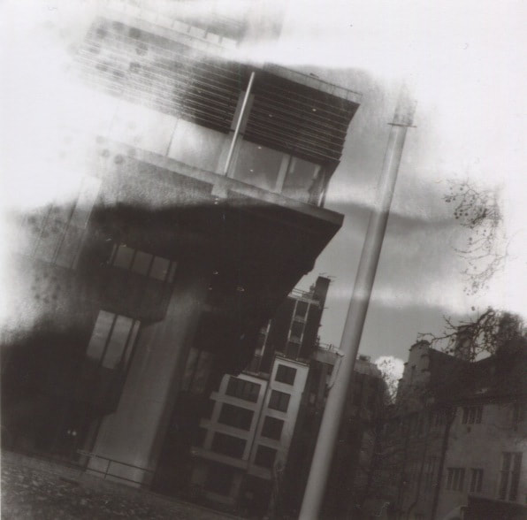
Film shoot:
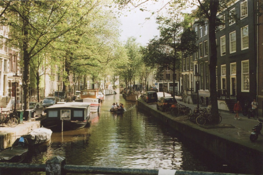
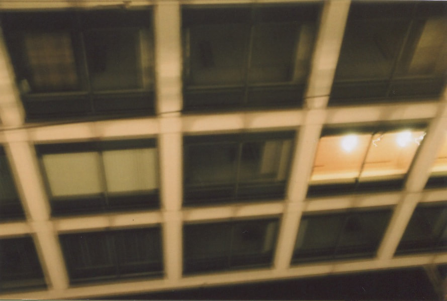
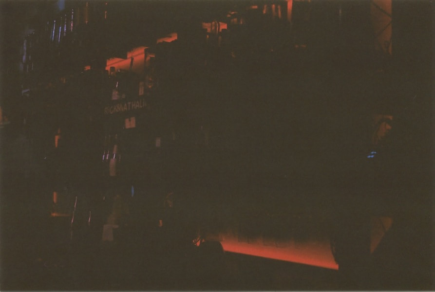
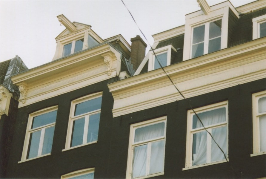
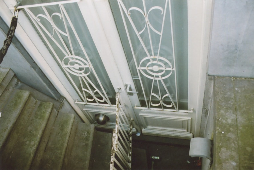
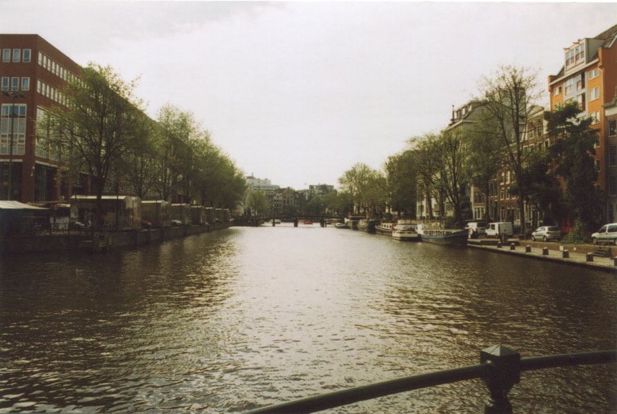
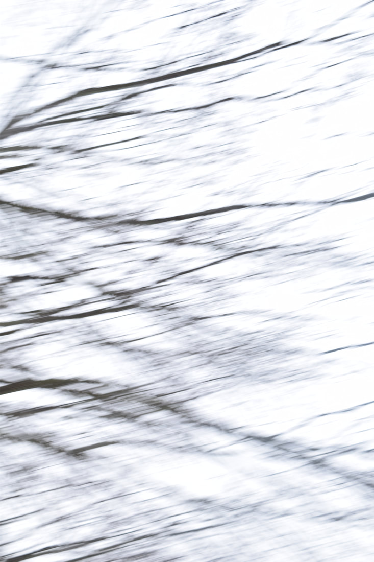
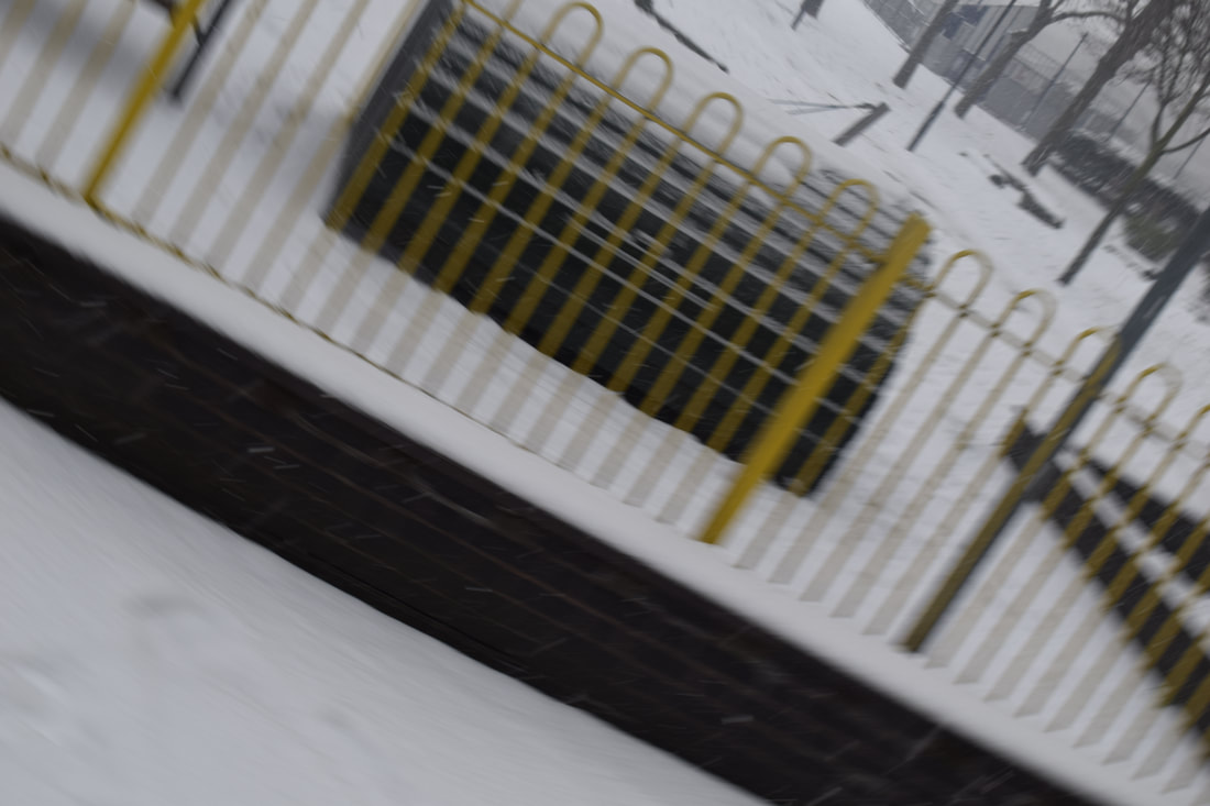
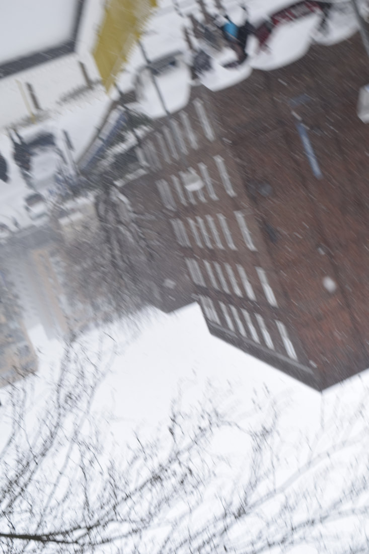
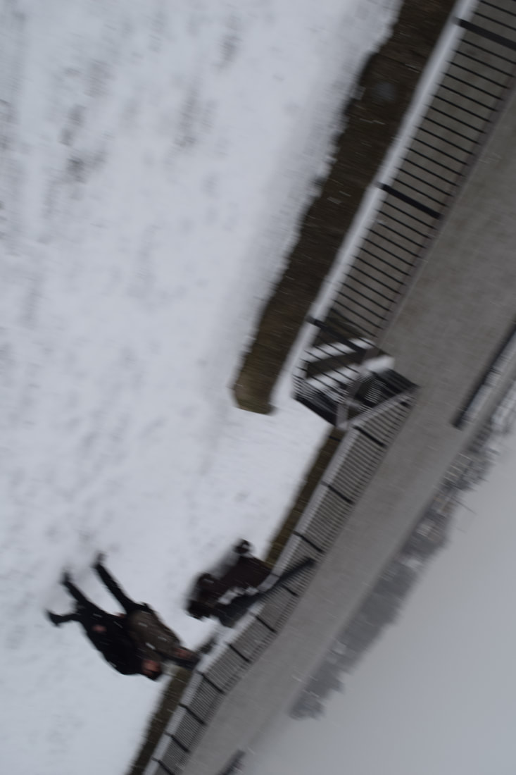
Out of all of my shoots I believe that my film shoot was the most successful shoot as I believe it portrays my theme the most. While some of the photographs are still conventional images taken straight on, I believe that the film camera made me look more and therefore, take images that fit more closely to my theme as I had a limited amount of photographs. Whist trying to take images similar to Rodhenko at angles looking up and angles that look downwards I also experimented with blur as this is not a conventional image that someone would aim to take. I believe that the blurred images were really successful as it is hard to tell what the image is focused on and therefore created a unusual perspective. Also the film provided a very good quality which I enjoyed experimenting with and my favourite images are the ones that are meant to resemble Rodechenko's as I believe these are the ones that are very well composed and draw the eye to them.
Iain Baxter&
Baxter was one of the first photographers to experiment with putting a timer on the camera and then throwing the camera in the air to take a photograph. This means that the photographer is no longer in control of what is going to be photographed and all the images taken will always come out slightly different because the photographer is not likely to ever throw the camera in the same exact same place. This can be experimented in many ways as you can throw the camera in many ways. For example, the height you throw the camera, the angle you throw the camera, if you spin the camera, if you put the timer on for a longer time, etc.
Baxter's images are far from conventional and due to the vase amount of them being out of focus due to the motion and the photographs not being specifically focused on one subject that could be considered to be "wrong" photographs. This is because they are very different to conventional photographs that are in focus, have a subject matter and have been framed to emphasise a specific subject. All of these photographs are very abstract and it is hard to tell what the intention of these photographs are but I believe this makes them interesting. It makes people look closely at the photograph to try and understand what is going on within the picture. All of the pictures seem quite fuzzy and out of focus and this makes me feel like I'm moving when looking at the images as it is hard to focus on one image for too long; to me this is because the images feel like they strain your eyes. It almost gives you a feeling of being dizzy or spinning around and this gives people a different perspective on photographs as it not only provides something to look at but also gives you a weird feeling of sickness due to the images feeling like they are moving.
For me, I believe it will be interesting to experiment with throwing the camera and allowing the camera eye to be in control as then there will be no images that are extremely similar due to the variety of techniques I can use to throw the camera. Another good experiment I could do is experimenting in different areas for example, in a estate vs in a park. They will create very different images as there will be different objects and shapes around for the camera to capture. Also taking images at night compared to in the day time will create very different images due to the different amounts of lights . This means I can create a variety of abstract images that have a very different perspective of photography.
My response:
I enjoyed experimenting with throwing my camera in the air as I was never sure how my pictures would come out and what part of the environment it would catch. Also I enjoyed how different areas of some images are in focused compared to other photographs that are completely out of focused and blurred. This means that it is completely random as to what will be the subject of the image. What I believed was very interesting was the different shapes and patterns that are captured within the images as when you throw the camera the images often become distorted and this means it is hard to make out what the image is of. This means that people are forced to look at the images more and for longer in order to figure out what the image is. These images are definitely a good example of a unexpected perspective as you never know which way the images is going to come out e.g if it will be upside down or not. Also you do not know how much of a subject you will capture, if it will be in focus or not and also what height the image will be taken at. This means that there are many factors that are taken out of the hands of the artist and therefore make the image random and abstract.
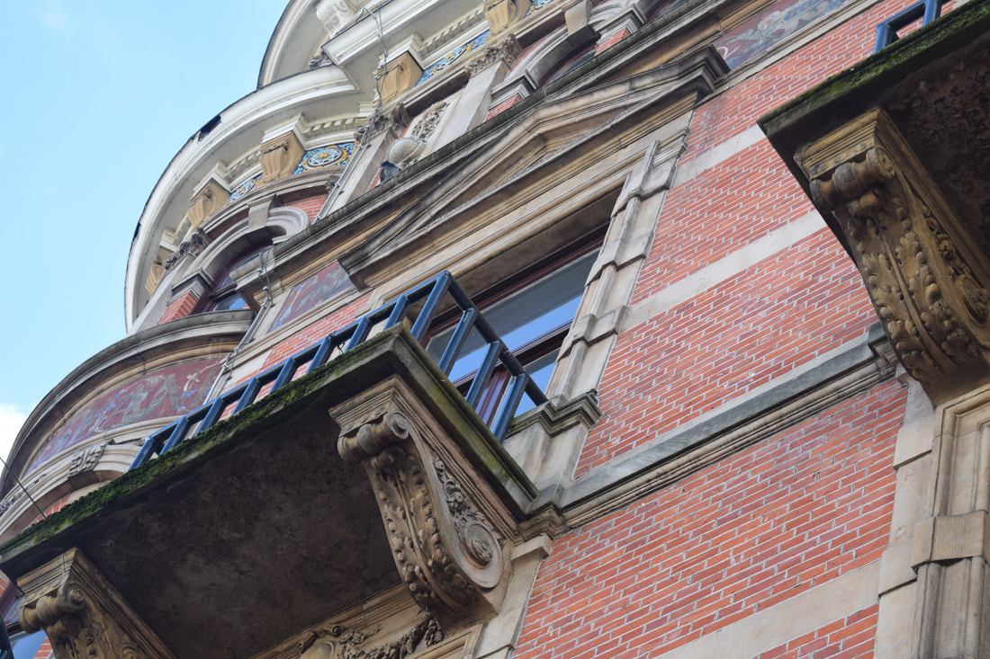
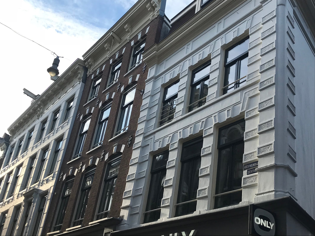
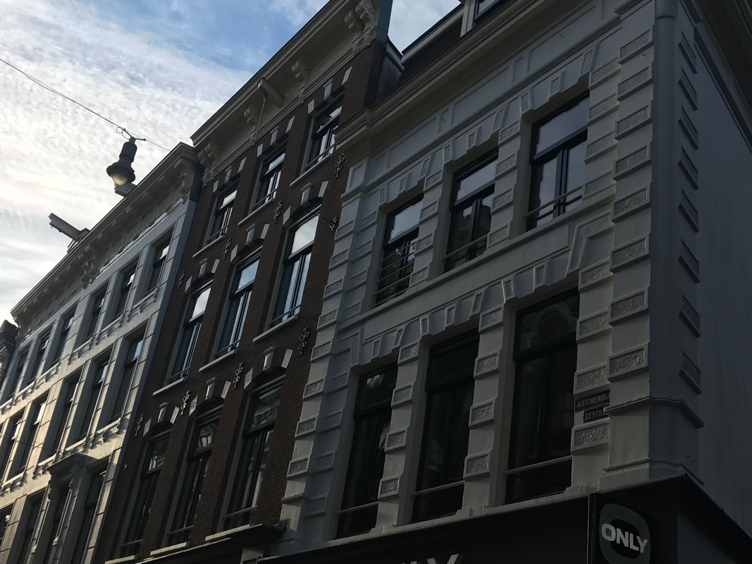
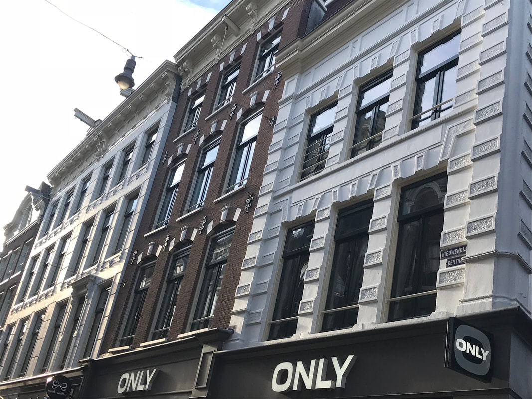
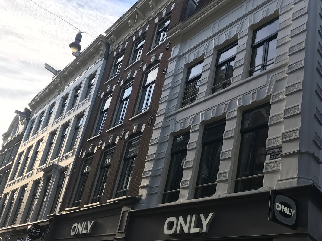
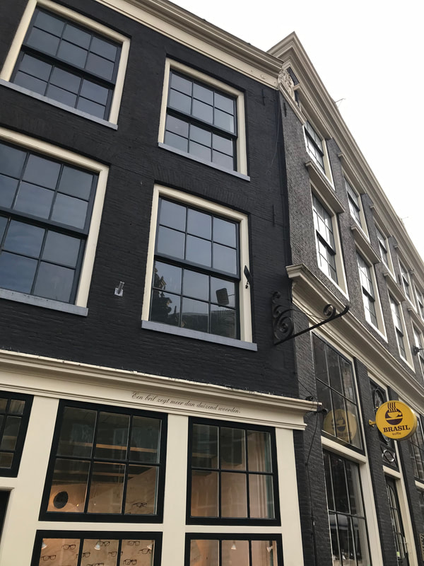
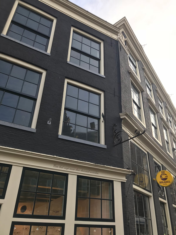
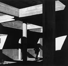
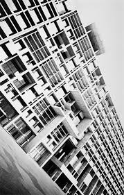
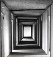
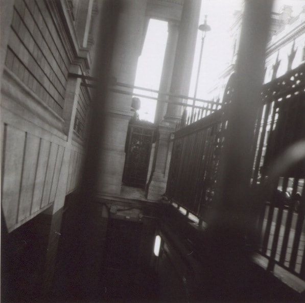
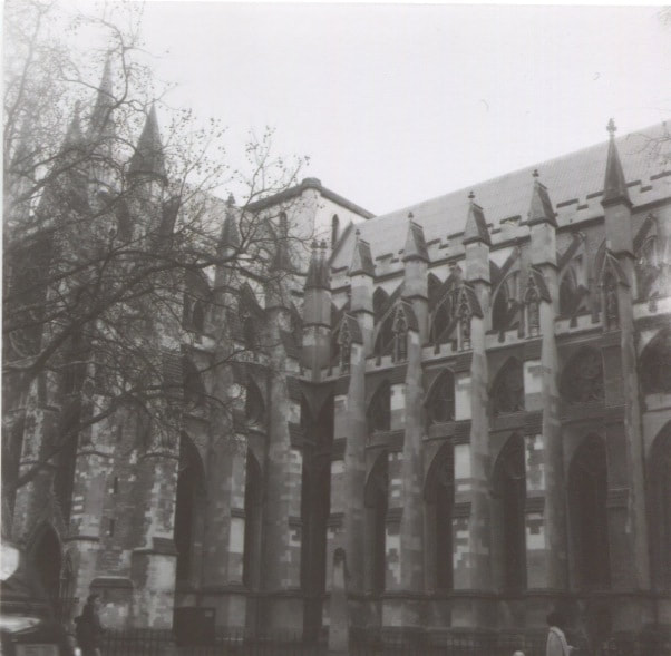
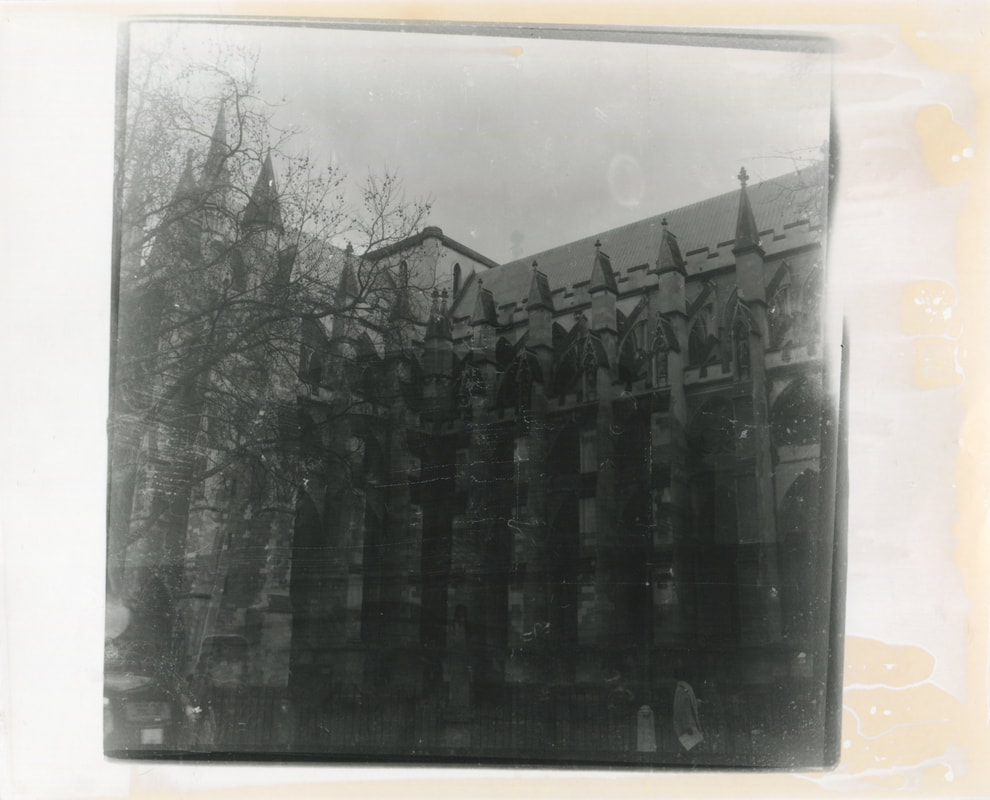
Lucien Herve
Looking at my photographs I realised a lot of the photographs were taken of architecture as structures were what Rodchenko generally focused on and this lead me to took around for other artist that related to architecture. I came across Lucien Herve who had taken many architectural images from unconventional angles too. He focused on the composition, shapes, framing and lighting to give his photographs a abstract look and feel. Herve photographs where taken to almost look like photographs and this was due to his humanistic outlook on architecture which created an emphasis on the lights and shadows and made his images feel poetic.
Herve's images have inspired me to try out a twin- lens reflex camera which is similar to what Herve used to shoot his images. These types of camera's may have been common to use back in the 70s and early as there were no digital cameras. However, in todays society people mainly use digital cameras that are easily portable and can take pictures very quickly without having to think very must about the placement of the camera or the settings the camera is on. One of the reasons I want to experiment with a twin-lease reflex camera is because it will make me look for longer at the subject I want to study and not be so rash about taking photographs as I will only have around 12 per role. I will also have to change the aperture and light settings on the camera myself which is not very common in todays society as we now have film camera that manually change the settings. This will be a good challenge as if I do not set up the camera correctly then the images will not come out right.
The reason I am drawn to Herve's images is because of the shapes and different tones in the images. They tones look like they have carefully been selected as if he has painted or drawn the images his self. This gives his images an aesthetic look as it shows he has carefully picked the way in which his image has been framed aswell as the composition of them to ensure the image looks like it flows all the way through. This draws your eyes to the image as there is constantly something to look at.
In my images I aim to create the same affect by using the twin-lens camera as this will make me take my time before taking a photograph due to the fact I will only have 12 per role. The size of the film also makes me consider the difference between how the image would look on a conventional camera that is rectangle compared to one that is square.
My Response:
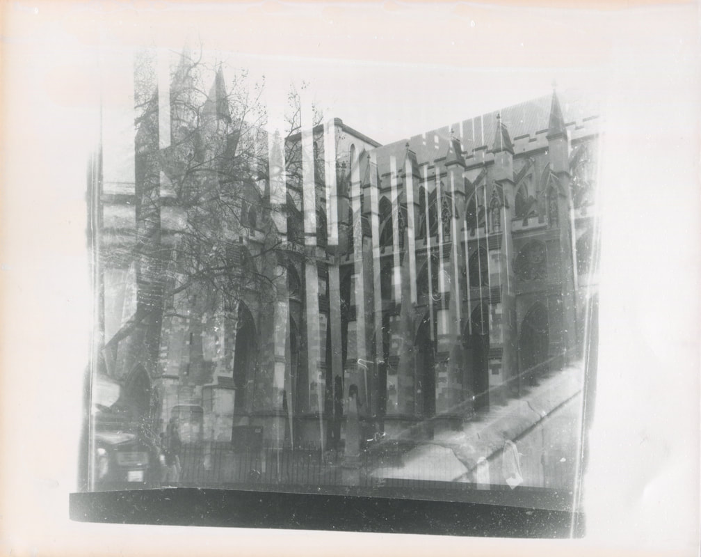
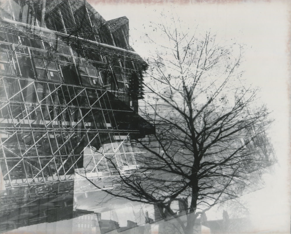
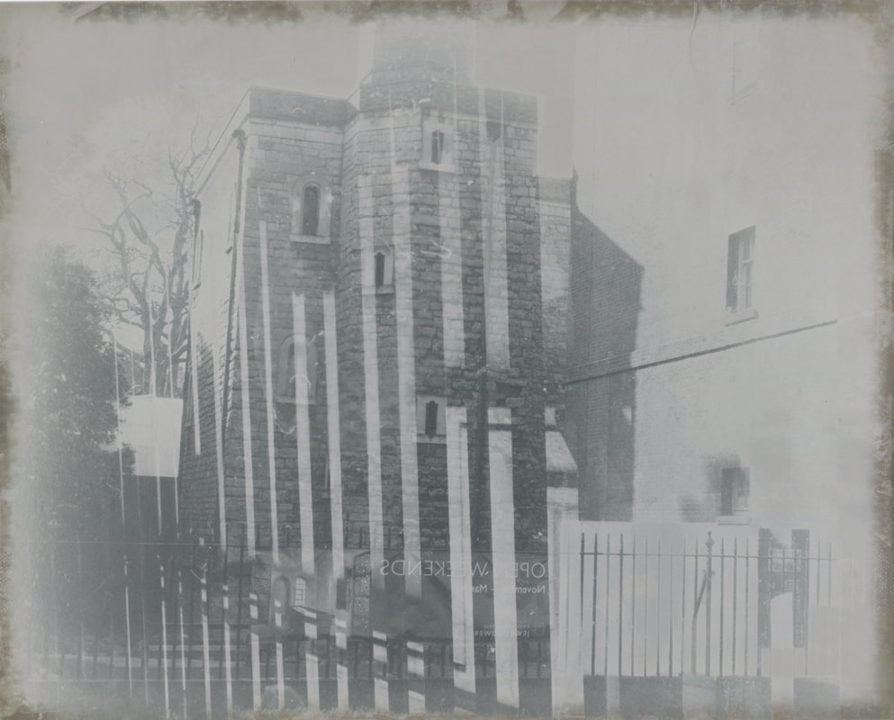
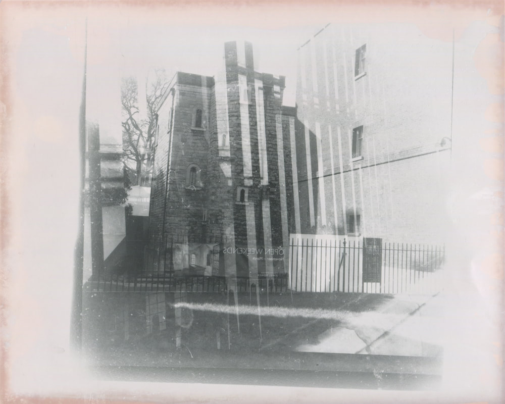
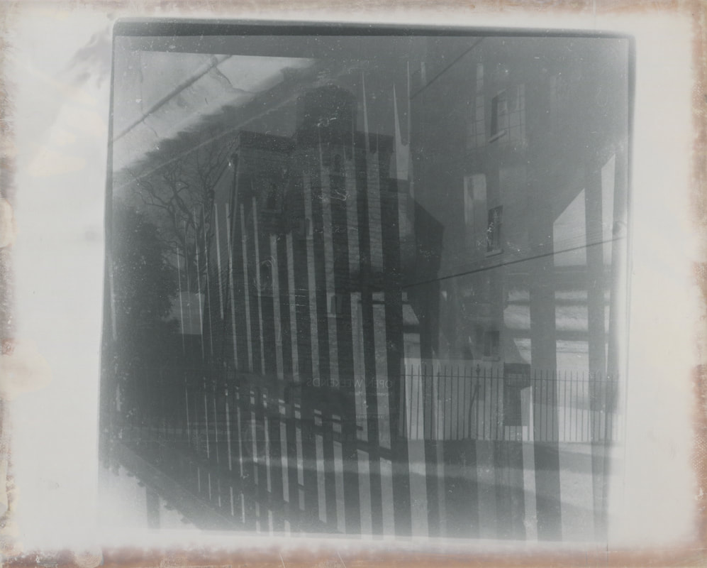
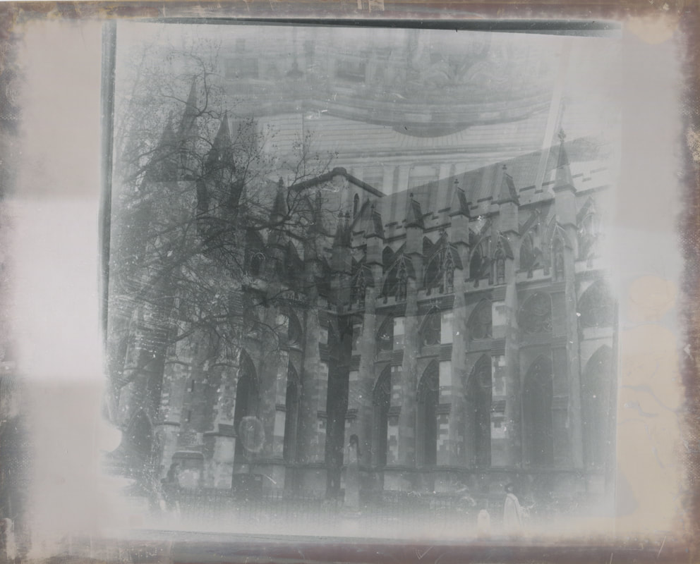
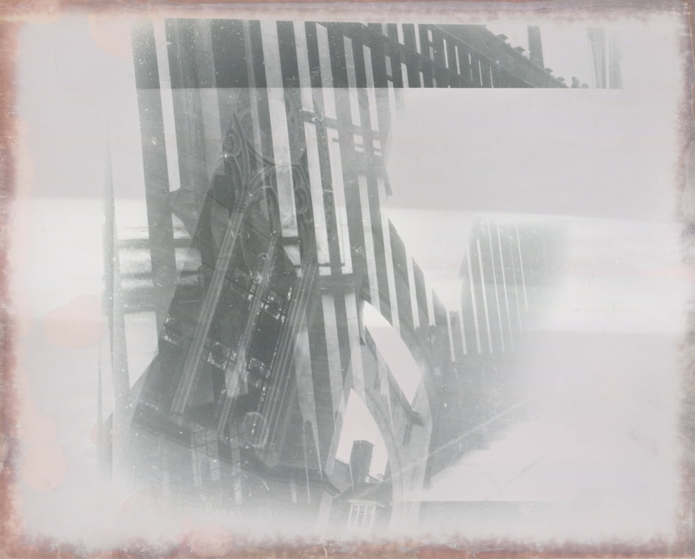
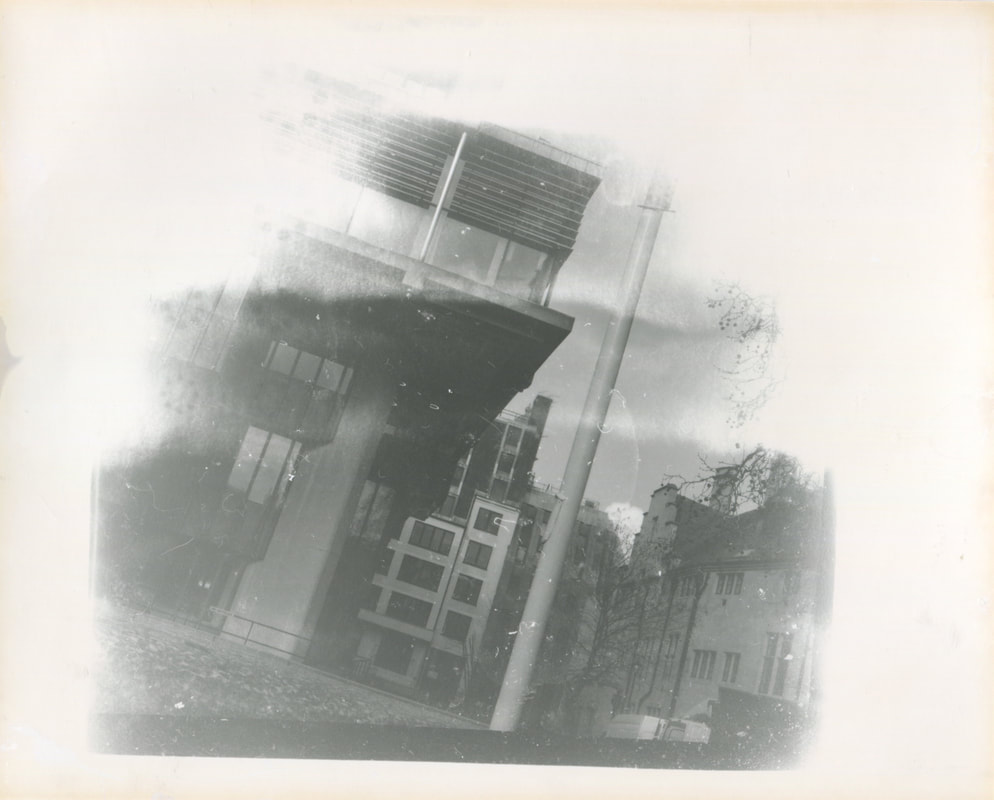
I really enjoyed my first experience of using a Twin lens reflex camera as I believe the quality of the photographs were incredible. I loved everything about the photographs from how they felt to how clear the images were. Whilst out on this shoot I was made aware of the fact that you could doubly expose the images so that two images will be put onto one print and this really excited me so I also go the chance to experiment with double exposure whilst on this shoot. This shoot taught me the importance of stoping and looking and ensuring everything is set up correctly otherwise the picture wouldn't come out in focus or would be over/under exposed. The reason I believe these images link to the theme of unexpected perspectives is because in todays society everything is often done for you on a digital camera and you can take as many images as you want without actually having to set up or think carefully about what you want. Where as, with the TLR you have to take a lot of time deciding on what you want your subject matter to be and then set the camera to the right aperture and camera speed in order to get a good picture. Using this camera means you have to compose your image exactly how you want it and this makes you think a lot more. Also the fact you only have 12 images per role means that you are very selective with which images you take as you do not want to waste any. This for me is way different from modern technology as most people take hundreds or images in a shoot and don't use a tripod because they can easily delete or retake their image if they did not like it.
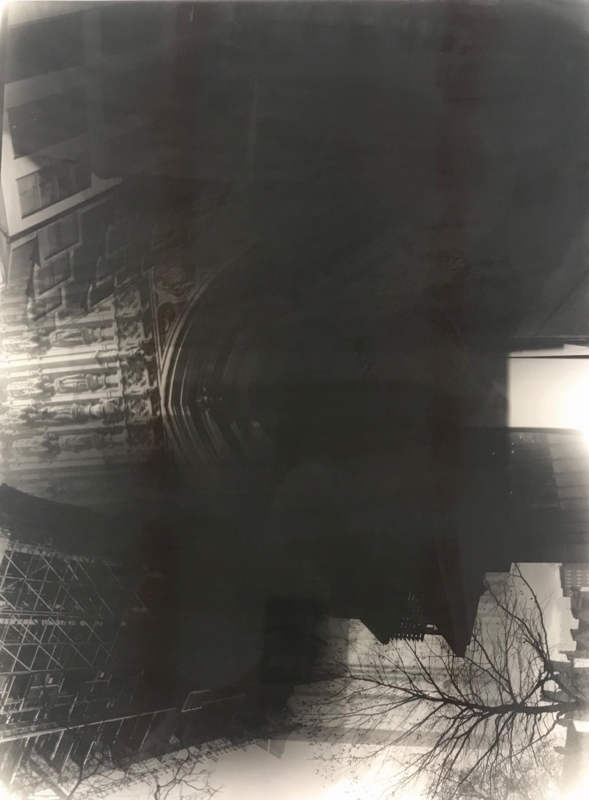
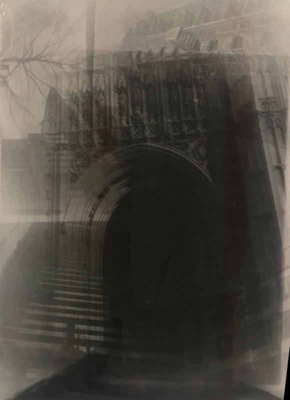
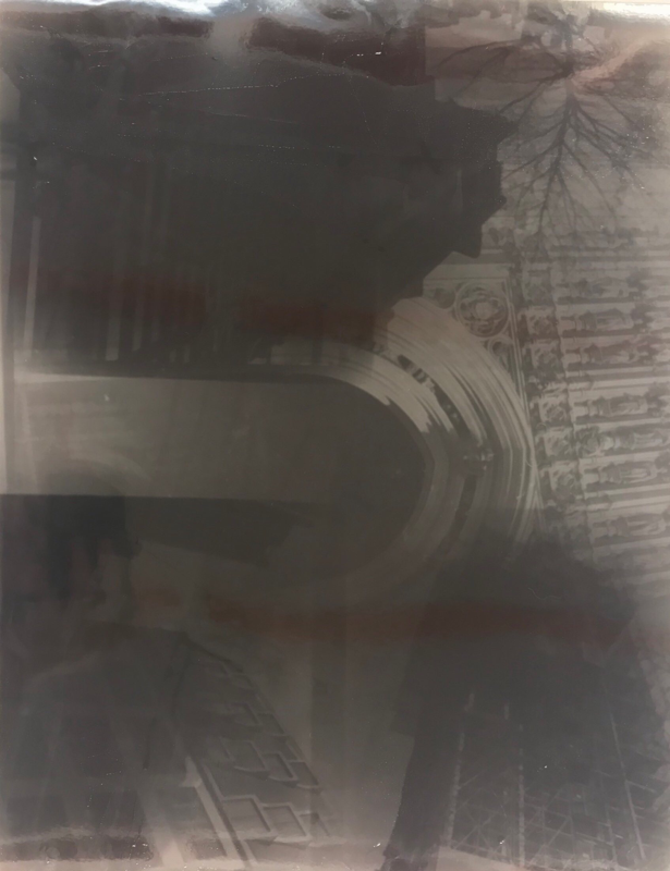
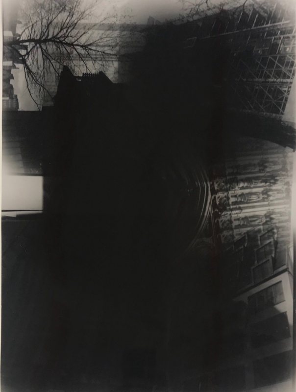
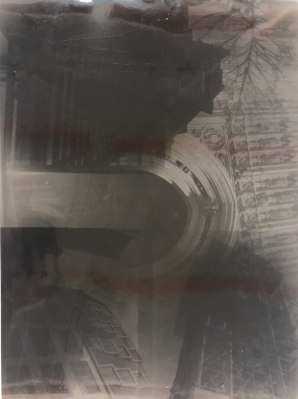
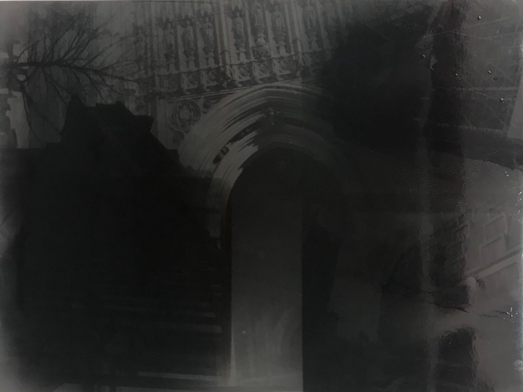
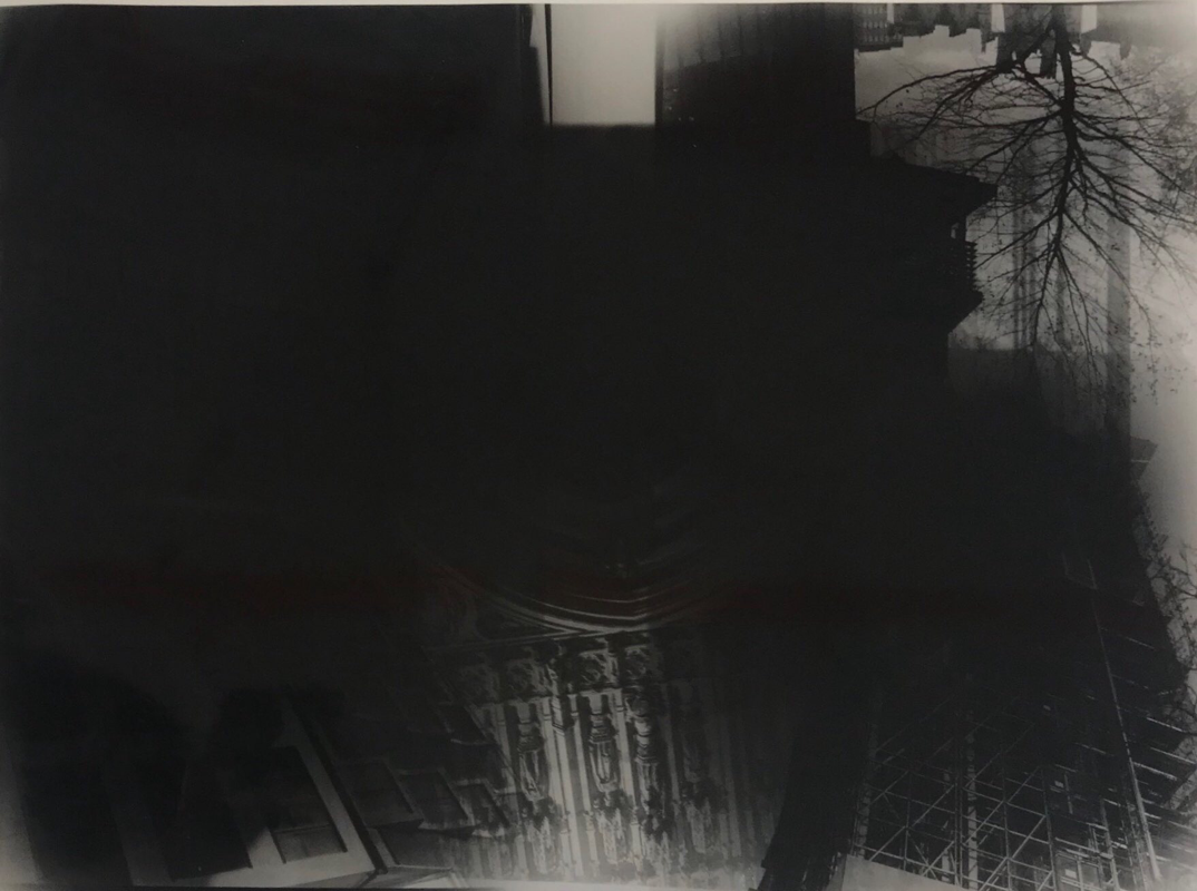
My Favourite images:
My Favourite images:
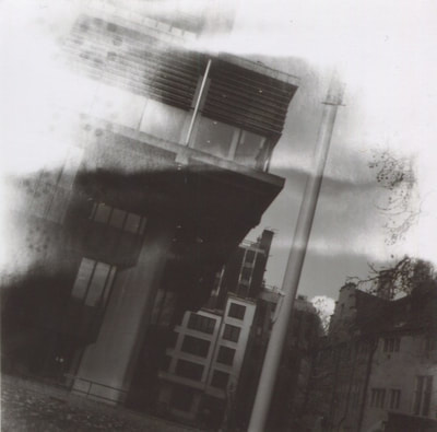
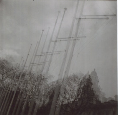
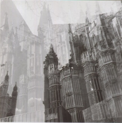
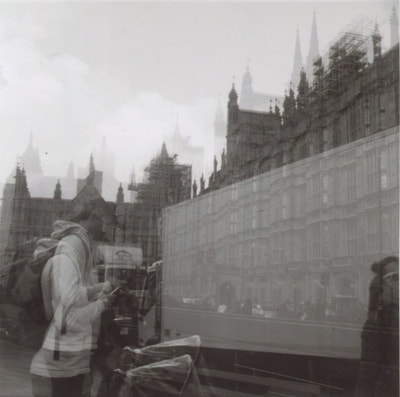
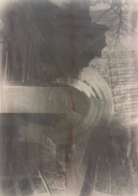
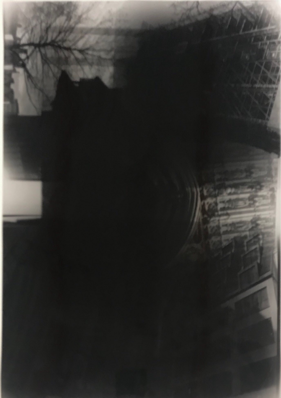
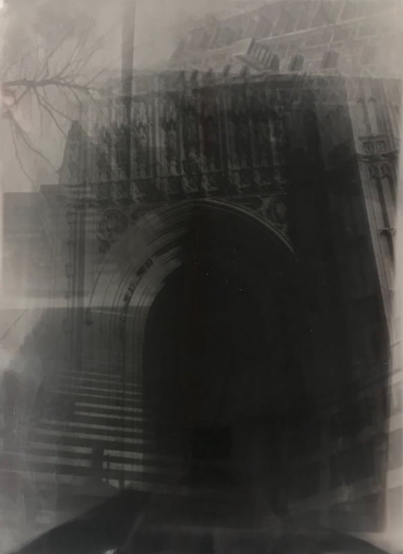
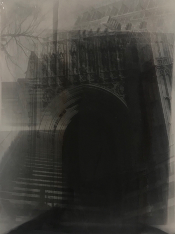
The reason why these images are my favourite images is because I believe they automatically draw your eye to them because at first glance it is hard to tell what is actually going on. The effect of the double exposure makes the image really interesting as there are random shapes and patterns that make each other stand out. The double images also often covers the page and so this means the eyes cover ever corner of the images as wherever they look there is something new to look at. The faint effect of the double exposure also causes you to look harder at the image as you want to know what was happening in both images not just the one that is clearest. These double exposures inspired me to what to experiment with my negatives in the dark room and see if I could create a similar affect.
Experimenting with my negatives:
At first I had to play around with the enlarger to try and get the correct light intensity and timing. My first few attempts did not come out too well and I realised that I had the light intensity too high and so it took me a few attempts to adjust the enlarger to the right light intensity and correct timing so that I got an image. Whilst I was doing this I wasn't experimenting with two negatives at once but just one to ensuring I had a good contrast between black and white on the photographic paper. Once I was happy with the contrast I started to constantly used the same f stop (8) with the same amount of time ( 9 to 10 seconds). There were two different ways of creating the doubly exposed photographs: One was to place two negatives into the enlarger and expose it for a long period of time i.e 9 seconds and the second was to expose the first negative then switch the negative and expose that one on top of the same piece of photographic paper. In my opinion, I preferred to place two negatives into the enlargers and then I could compose the image in some sort of way and I also believe this gave better contrast on the photographic paper. I really enjoyed playing around with the negatives as I think that they create intriguing abstract images that can only be made from my specific negatives. They also link to my theme of unexpected perspectives as you are not entirely sure how they are going to come out until you develop them and then you have to adjust in order to make the image the way you want.
More experiments:
More experiments:
For this dark room experiment I decided that I wanted to experiment was using paper negatives. For this I first printed the images I wanted onto paper and took this into the darkroom. I then placed the image face down on the photographic paper and exposed it to light for different amounts of time. At first I experimented with 4 seconds on an aperture of 8 however, this came out a bit underexposed and so I upped the timing to 6 seconds to try and create more contrast on the image. After I was happy with my negatives I then decided I wanted to create a false positive and so I used my photographic paper that I had already exposed on and place this onto of a fresh piece of photographic paper. I then exposed my photographic paper for 6 seconds however, this also came out underexposed as the paper was thicker and so I needed to expose it for a longer time to allow light to travel through. I decided to up the timing to 10 seconds and this created a really good contrast on the photographic paper that I was really pleased with.
I decided I wanted to try multiple of experiments in the dark room and this was one that really caught my attention for my finale piece. I had large photographic paper and used it to expose multiple different pictures onto it to try and create interesting patterns. My first attempt came out really dark and so you couldn't see much of the detail in the image. I exposed each image for 5 seconds and the light intensity was quite high at an aperture of 4 so for my next attempt I decided I would turn down the light intensity to 5.6 and only expose each image for 3 seconds. This image came out better with a variation of greys to blacks and the formation of interesting shapes. However, I still thought the image was too dark. I therefore decided I would have another attempt but 2 seconds of exposure per image. While this image was my favourite image I still believe that I could get better contrast from blacks to whites within my images. This led me to thinking of exposing each negative for different amounts of time.
